It seems like only yesterday Google did away with the drab design of the Android Marketplace and replaced it with the one we all know and tolerate. They’ve done it again, though more in the way you say, “that naughty child has done it again,” after spilling his milk or punching one of his classmates.
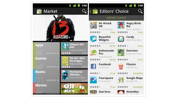
The company has started to roll out a new swipe-friendly version of the Market complete a interface design that takes many of its cues from the Windows Phone 7 Marketplace, though certainly more in style than substance. It’s a little busy to look at upon first glance, but it certainly offers more upfront — Top Paid, Top Grossing, Top New Paid, Editors Choice, Staff Picks — than the previous version.
For us Canadians, we lose out (for now) on the ability to buy and rent movies, and purchase eBooks from the Google Store, but it’s for the best: there’s plenty of good app and game content to choose from. One issue we found was that the My Apps button, long available directly from the Marketplace homescreen, is now relegated to a context menu. This doesn’t bode well for those who are holding out for a removal of the buttons at the bottom of Android devices in Ice Cream Sandwich (Android 4.0), since forcing people to use it in a native Google app is a pretty strong endorsement, but we’ll have to see.
If you’re brave, you can go exploring (download link) in the new Marketplace now. If you don’t like it, you can always uninstall it from the Settings/Applications menu. The one caveat is that you must be running Android 2.2 Froyo or higher.
There is a quick demo video by Google after the break.
Source: Android Developers Blog
MobileSyrup may earn a commission from purchases made via our links, which helps fund the journalism we provide free on our website. These links do not influence our editorial content. Support us here.
