


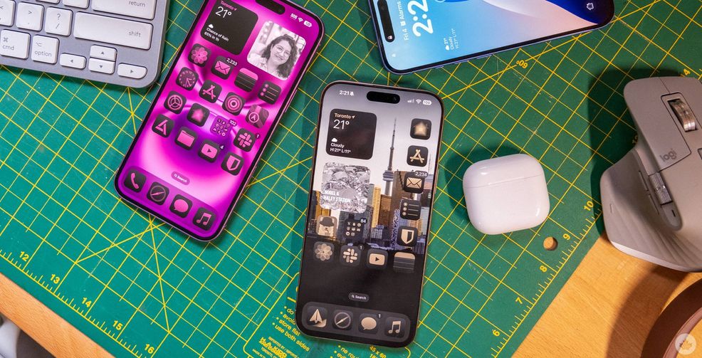
iOS 18 has been out for a few weeks, and it’s my favourite iOS update in years based on two key updates.
The first is RCS support. While Apple may have glazed over it at WWDC now that all my friends are using the update, I’ve been able to experience its full power, and it’s been glorious. There still seems to be some bugs to work out with how Apple handles text message forwarding to group chats from my Mac or iPad, but as a whole, it just made my group chat a lot better. Being able to send full videos to both my friends at once instead of sending them to my friend Joey (iPhone user) with the instructions to “show this to Dom” (his roommate and Pixel user) has been awesome.

I don’t care that much for typing indicators or read receipts, but high-quality images and videos make everyone feel like they’re on the same level, and it’s awesome.
You can’t hate on customization
Beyond that, Apple has almost accomplished my dreams of complete iOS customization. With iOS 16, Apple allowed us to customize our lock screens, which was awesome. Now, in iOS 18, we can add our own shortcuts to the lock screen, revamp the Control center and even move app icons anywhere on the home screen. Since the new iPhone 16 series I’m using right now has a dedicated camera button (plus you can swipe towards the left to open the camera from the lock screen) so, being able to add a shortcut to the third-party camera app Halide has been really handy for when I want to quickly take a nice RAW photo. I’ve remapped my Action button to drop down a menu that includes smart home controls and a flashlight when I’m at home, and acts as a flashlight when I’m out and about. So, I also removed the flashlight shortcut from my Lock screen and replaced it with quick access to Shazam.

My home screens have also been super fun to organize and create with custom-coloured icons depending on the background. That said, this part of the interface is tricky to use, and it has a lot of holdover code from older versions of iOS. For instance, right now, I have a slice of the home screen open to reveal a picture of the CN Tower, but every time I download a new app, it plants itself right into the gap, even though I’ve clearly left it open for a reason. It would also be nice to tie app layouts to home screen wallpapers like you can with the lock screen and Focus modes. Technically, you can set different home screens to go with different Focus modes, but that’s pretty tedious, and I don’t really want to have to set up Focus modes just so my apps can adjust to my background image. Another holdover from the previous versions of iOS is how the apps on your home screen react and move around, making it way harder to set custom layouts than it needs to be.
One thing I do like a lot is the icon tints. They don’t go with every wallpaper, but when you lock in a look, it really ties things together. I still think Google has done more with Material You, but I hope this is a stepping stone in that direction for Apple because I love the idea of one theme following me around the Apple ecosystem from my iPhone, to my Mac and maybe even as far as the Apple TV. At the end of the day, I’ve seen a lot of negative comments about tints online, but I’d take the freedom of customizing my iPhone how I want over the rigid rules in place in previous iOS updates any day.
Other updates

I’ll tap into some other updates I’m loving lightning round style here.
 Features
  Features
  Features
  Features