


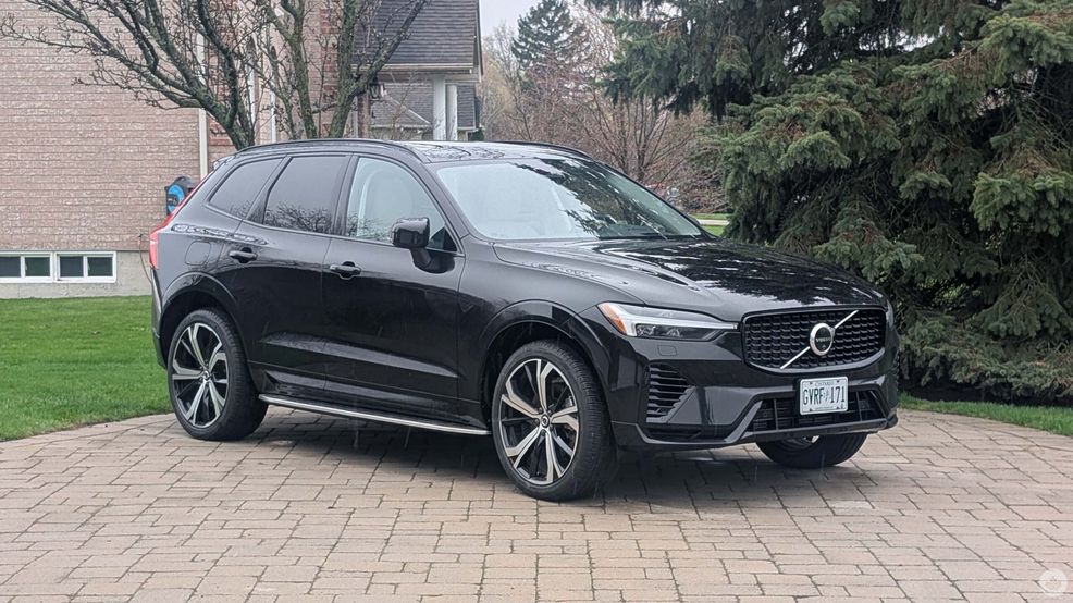
Volvo handed me the keys to a 2025 XC60 for an exclusive peek at the company’s all-new Car UX that Volvo recently rolled out to customers.
I spent some time with the XC60 using the old user experience (UX) before taking the vehicle in to get the update so I could compare it with the Car UX. However, there was a hiccup with the update process that shouldn’t impact most people, but is worth mentioning just in case. In order to test the old UX, Volvo had to delay the update multiple times, which resulted in needing to take the car to a service centre when it was time to complete the update. For most people, it should be a simple over-the-air (OTA) process, but it’s worth noting that repeatedly delaying the update could cause issues.
With that out of the way, let’s talk about my experience with it.
Comparing the old and the new
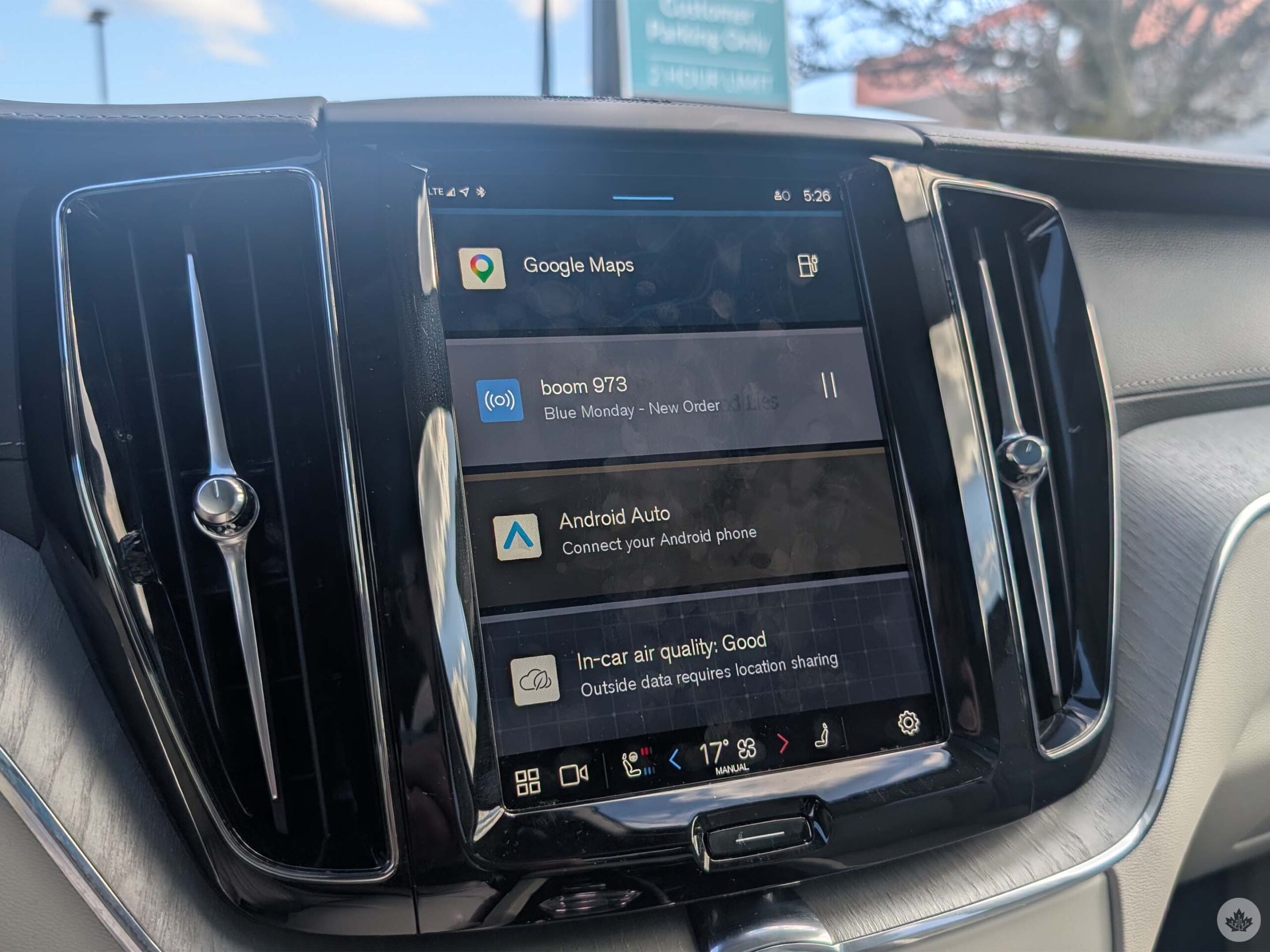
The old Volvo UX.
Starting off with the old UX, it wasn’t honestly that bad to use. The features were all pretty easy to access, and I got used to them within the first few minutes of driving home. My only real gripe with the old UX is that the actual menu itself was kind of useless. I often found myself backing out of the menu just to switch to a different option (from maps to radio, or to the app grid layout).
Which, thankfully, is exactly what the new update fixed.
The new Car UX removes the idea of a separate menu and combines everything into an almost Android Auto-looking screen (great for familiarity, in my opinion). The map remains at the top, while Bluetooth and Android Auto connectivity appear in status bubbles below. Under that, different accessible modes and features appear, and they come and go depending on what you are currently doing. What remains familiar from the old UX is the climate control system. The gauges didn’t undergo a major change; it was really just some aesthetic tweaks.
Interestingly, updating to Car UX also unlocked a heads-up display that most likely wasn’t active before — and it was a neat surprise I enjoyed.
Living with Car UX
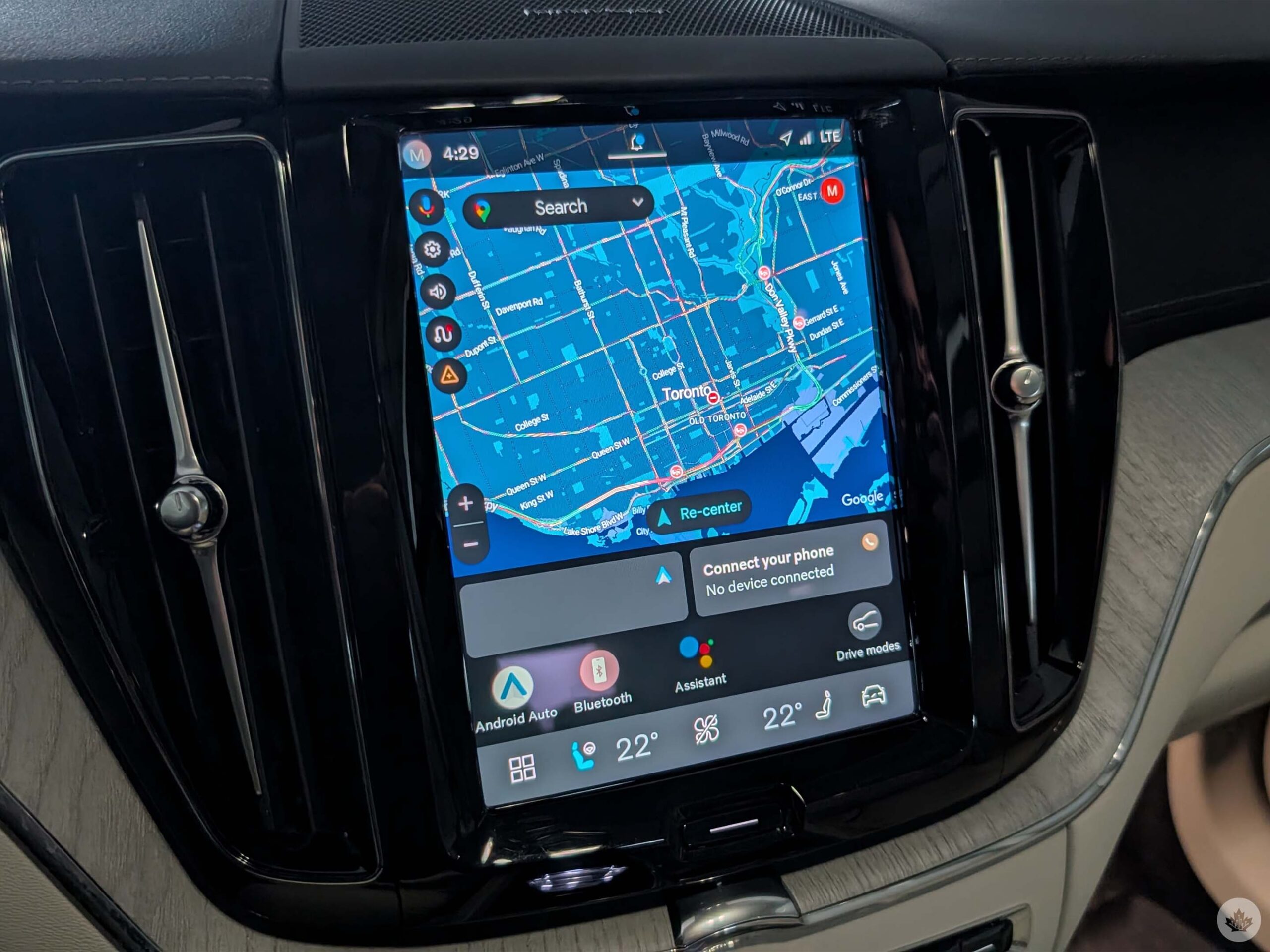
Volvo’s new Car UX
Speaking of features I enjoyed, I really liked the updated gauge cluster. Not only was Google Maps visible from the gauge cluster, so you could easily see your upcoming turn, but a sign showing the speed limit of the road you’re on was also on the gauge cluster and in the previously-mentioned heads-up display, which I found really handy, especially when making trips into the city.
Even my girlfriend, who got to mess with it a lot while I was driving us around, really enjoyed using the new UX. She enjoyed the accessibility of everything and actually liked being able to mess with all the seat and climate controls directly through the screen. The UX update also reduced the space the climate and seat control pop-up took up while using it, so it was nice to be able to see which song was playing on the radio while my girlfriend was messing with the many ways to adjust her seat.
Now, let’s shift over to the (few) grievances I had.
Although I mentioned earlier that features come and go from the main bar depending on the situation, that’s one of my main complaints about the UX. Often, with the old UX, I could quickly toggle the camera at the push of a button; however, the update moved it to one of the new feature bubbles, which makes it a pain when navigating tight parking lots or narrow streets. Android Auto and Bluetooth also remain buttons in this menu, which is a bit odd, given that they already have their own bubbles above the bar.
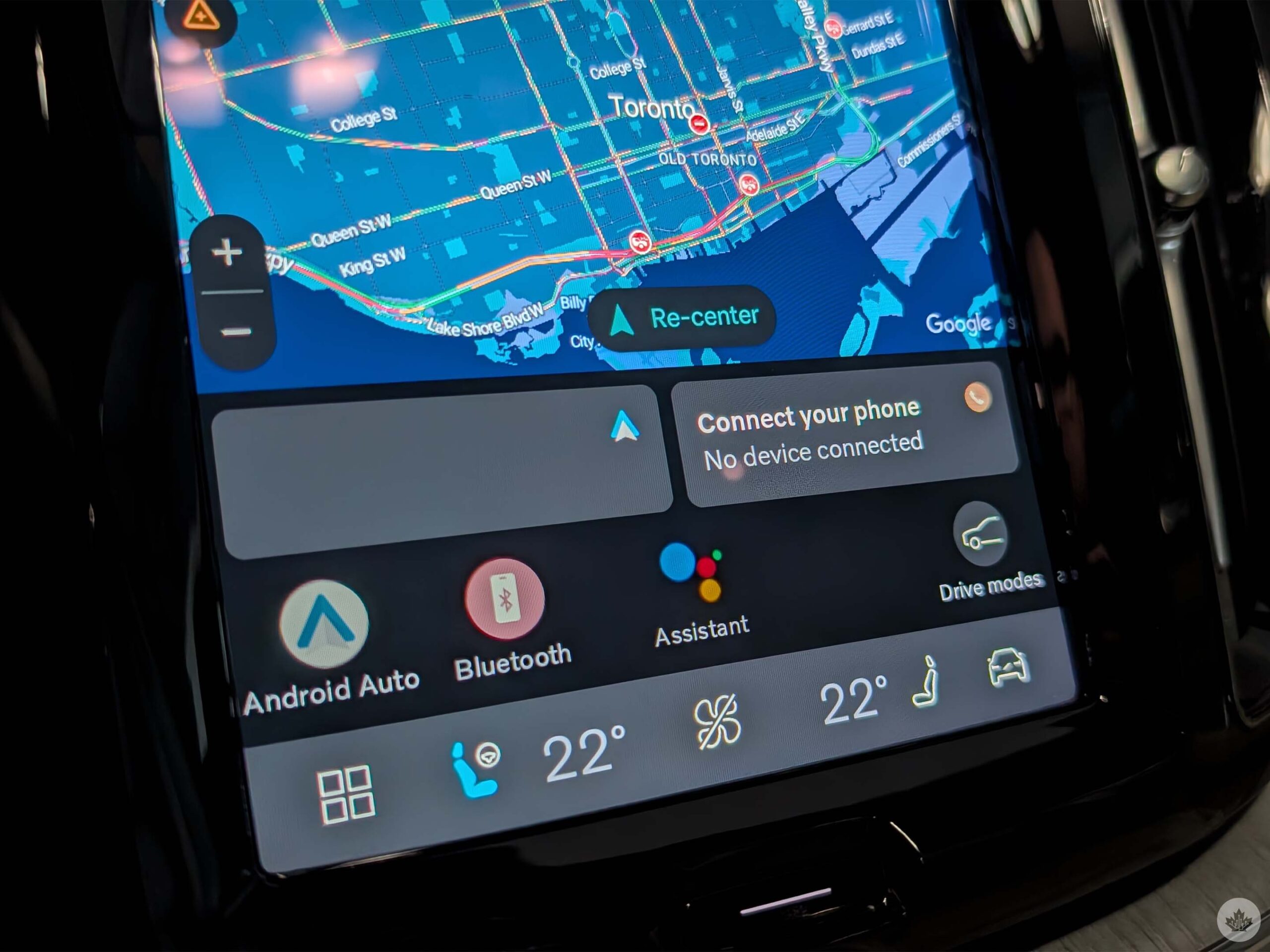
Further, I had some connectivity problems when it came to hooking up my phone to the car itself, and I found that Android Auto kept randomly cutting in and out, no matter the device I hooked up to it. This happened before and after the Car UX update, and I’m not sure if this was related to a faulty cable, USB port, or a deeper issue with the vehicle.
The final thing I noticed while I had the vehicle may affect users of older Volvo models eligible for the update. As I mentioned above, I had to take the vehicle to Volvo to get the update, but the XC60 didn’t receive the update all too well. It had a ton of hiccups while the update was actually happening. As a result, the new Car UX ran somewhat slowly at times, alongside some glitches here and there. I only mention this because I saw owners of older Volvo models who updated to the new UX experienced slowdowns similar to or worse than mine.
Overall
To summarize all of this, I actually enjoyed my time with Volvo’s new Car UX. I think it is a welcome change for Volvo vehicles, and I am honestly impressed by how much the company has improved its in-car experience across a wide range of vehicles while still focusing on what it offers customers who want the latest and greatest.
 Reviews
  Reviews
  Reviews
  Reviews