


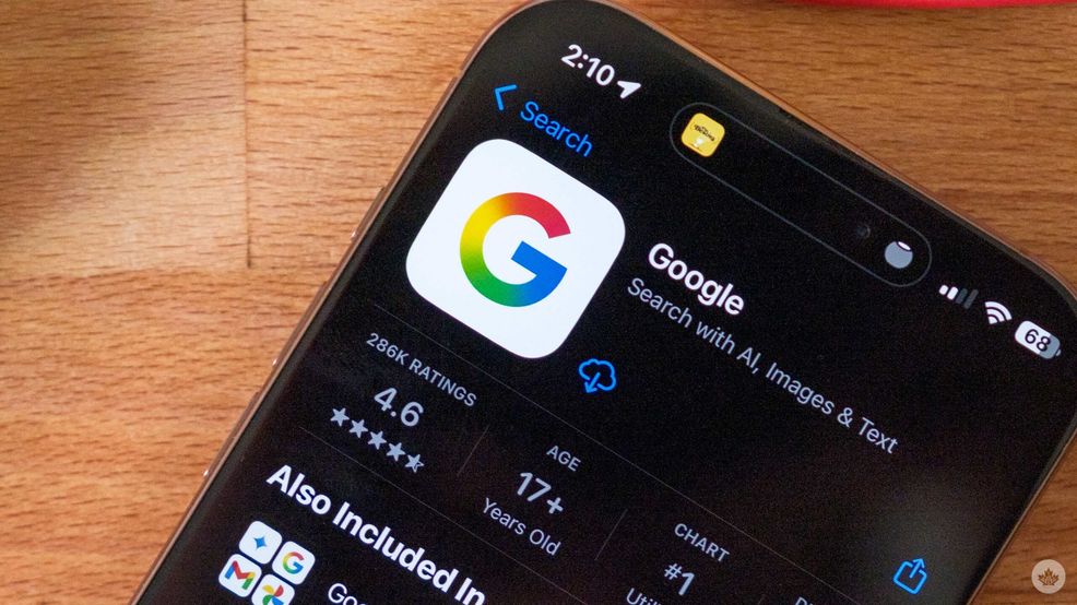
Google has updated its Search app on Android and iPhone with a new logo that uses gradients instead of the four colour blocks it’s been using for over a decade.
Google hasn’t shared much of the thought process behind the change, but the company has adopted gradients in its design around the Gemini AI tools, suggesting this change could be related to AI.

The old Google logo
However, gradients have also made a big comeback in graphic design over the past few years, so this could be as simple as Google catching up with the times.
However, what worries me is whether this change will trickle down through the other Google Logos. Will Maps get the gradient treatment? What about something smaller, like Google Fit? Time will tell, and perhaps Google will share more at I/O later this May. However, if you are curious about what that might look like, someone made a mockup on Reddit.
Via: 9to5Google
 News
News  News
News  News
News  News
News 