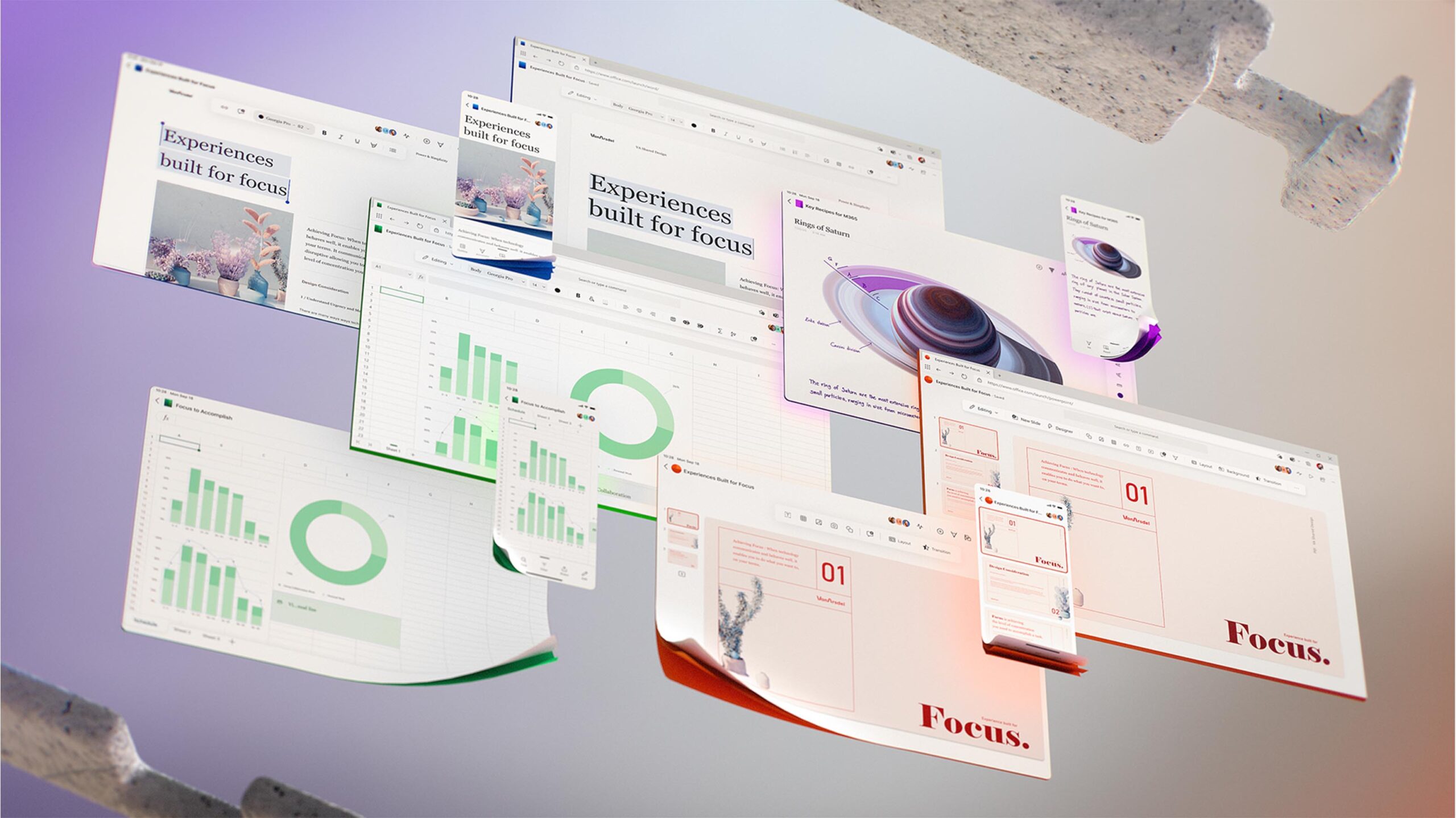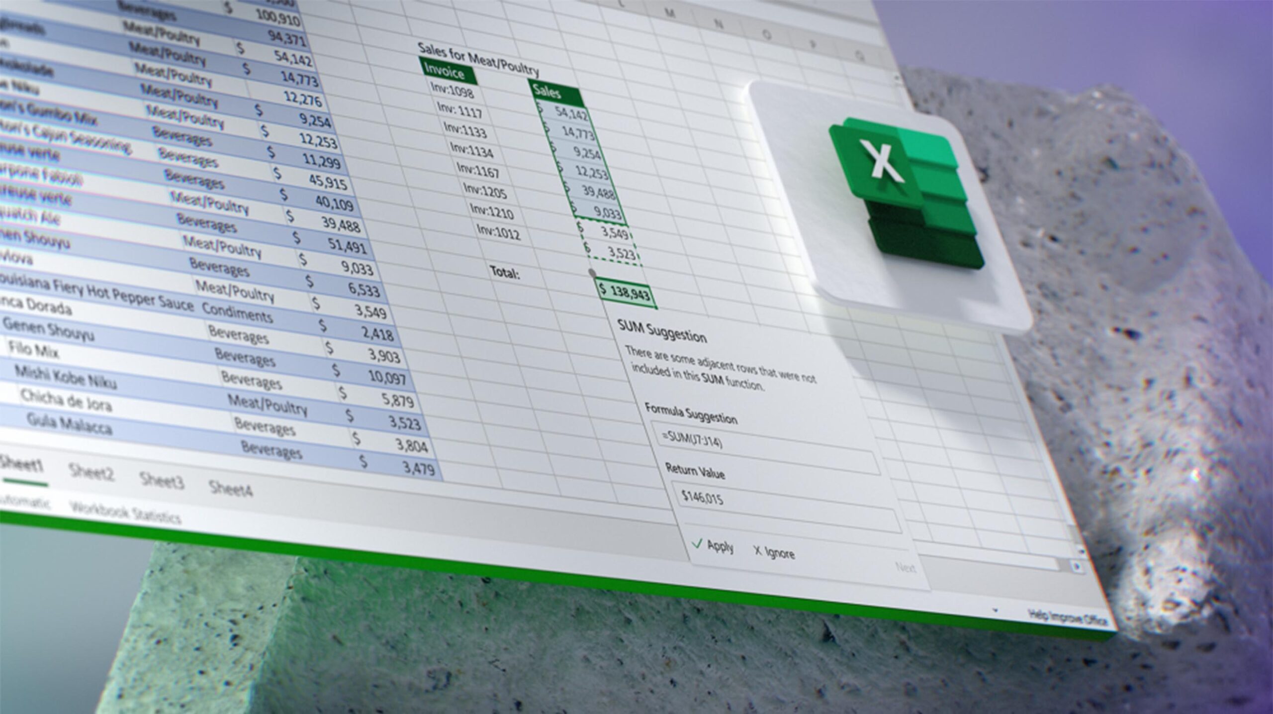
Microsoft has teased its plans for the future of Office’s user interface.
In a lengthy blog post from the company’s corporate vice president of design and research, Jon Friedman, Microsoft laid out snippets of Office’s future. That includes a move towards a smaller, more contextual ribbon interface and apps designed to help users focus on work.
“The next wave of Microsoft 365 UX changes will go even further by fading brand colours from app headers and exploring adaptive commanding. This lets you move a simplified toolbar around the screen to wherever you find it most helpful, using progressive disclosure to contextually reveal commands,” wrote Friedman.
Microsoft’s Office apps have long used a ‘ribbon’ toolbar pinned along the top of the app that gave users quick access to tools. Now, it seems Microsoft is ready to break with the ribbon in favour of a smaller, simpler way to access these tools. On top of that, the company wants to offer contextual commands based on what you do within the app.
Although much of what the company teased is part of an ongoing exploration, some design details will roll out within a year or two.
Microsoft plans to shift away from app-specific colours
Another significant change is the removal of app-specific colours. Currently, Word sports a deep blue title bar, while Excel is green. Each interface has a colour. Microsoft is toying with dropping those coloured bars for an app logo that identifies each platform. This simplifies the interface and would contribute to a more unified feel across the Office suite. That seems to fit well with Microsoft’s vision for Office.
Another interesting tidbit of Microsoft’s design tease is it shows almost all the Office apps within its new Edge browser, not as standalone apps — excluding, of course, the teases of mobile or tablet versions.
Microsoft has long offered its Office suite on the web along with traditional desktop apps. However, the company also has a history of rolling out features to its web apps before bringing them to the desktop apps. Although there likely isn’t much meaning behind these teaser images using Edge, I could see Microsoft using its web apps to test out these dynamic new Office experiences before bringing them to traditional desktop apps.
Plus, a focus on web and mobile apps — as implied by the teased UI changes — makes sense for Microsoft. On the one hand, the pandemic has already reshaped many of the company’s products. On the other, Microsoft’s rumoured plans for Windows 10X as a device focused on web apps that can stream legacy desktop software shows a clear priority for a shift away from traditional platforms.
The pandemic will certainly impact these changes

Still, it’s not clear when Microsoft will bring these changes to the web, Office apps or other parts of Microsoft 365. As mentioned up top, Friedman suggests some of these changes will arrive within a year or two, but the company is still exploring other changes.
On top of that, the ongoing COVID-19 pandemic will likely impact how Microsoft does the Office redesign. The pandemic has already impacted its other products significantly and led to all-new features packed in Teams that were never part of Microsoft’s original plan.
Ultimately, we could see an entirely new, more focused Office suite in the coming years, one that’s also designed for remote and mobile work.
MobileSyrup may earn a commission from purchases made via our links, which helps fund the journalism we provide free on our website. These links do not influence our editorial content. Support us here.


