


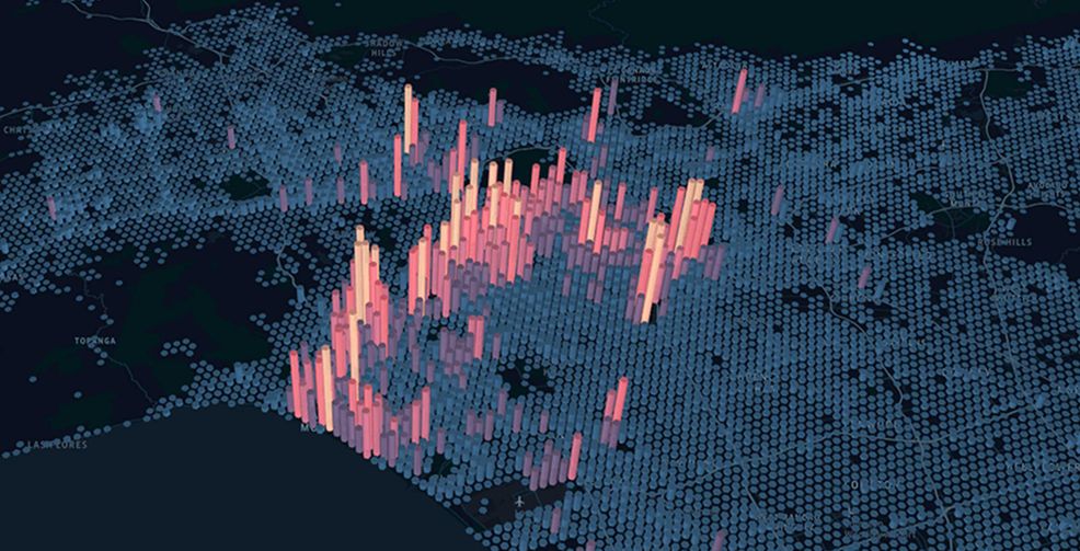
Uber’s engineering arm has released a new product called kepler.gl.
Kepler.gl is a website that visualizes user input data on a map. The results are some really beautiful maps.
Uber claims that users can build these maps in just a few minutes, but it depends on how much data you already have prepared.
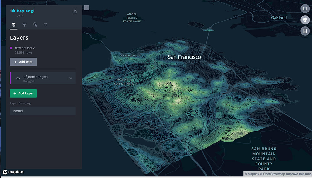
There are quite a few different ways to map data. Uber has shown off a point arc map, a heat map, hexbin maps and more.
To learn more about how to use this tool check out the website Kepler.gl

Source: Uber Engineering
 News
 News
 News
 Gaming
