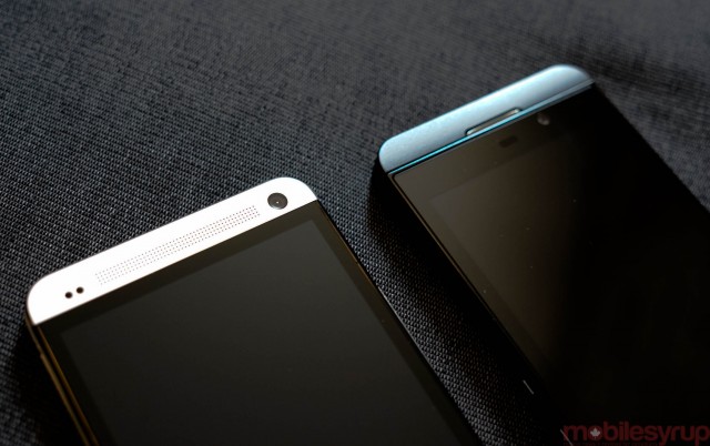
Everyone seems to be going on and on about how HTC stole the One’s design from BlackBerry, or vice versa. Whatever. It’s a baseless argument because next to one another the two devices look nothing alike.
I’ll give you the delineated portions above and below the screen, and yes, they both share rounded corners. But the two devices look and feel nothing alike, from the sheer size differences to the various materials used in their manufacturing.
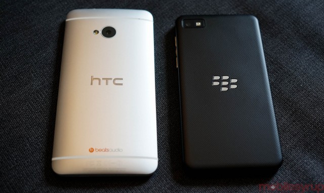 The back portions also reveal innumerable cosmetic and stylistic opposites; the One is rounded and smooth, with a non-removable back cover and a centred camera sensor. The Z10 is flat, with a rubberized matte black removable cover.
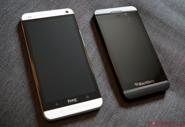
It’s also noteworthy that HTC makes use of the space above and below the LCD screen better than the Z10; the front-facing camera and speakers are placed there, facing the user.
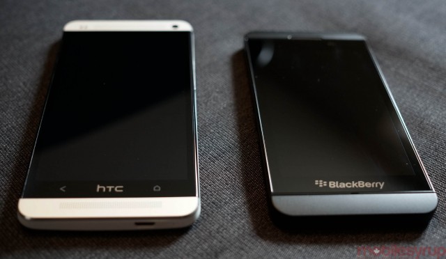
The BlackBerry Z10 is noticeably shorter and thicker than the HTC One, and doesn’t feel quite as substantial. Not to dismiss its build quality — it is a sturdy device in its own way — but the One is masterfully built.
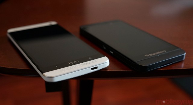
I’m sure no one is actually accusing the two companies of cribbing design notes, but the two devices indicate a change in direction for many OEMs: rounded corners, unadorned faces, soft edges and premium materials. The HTC One gains the advantage in build quality and materials, but the Z10 is far easier to operate with one hand and its removable battery is a boon to productivity.
MobileSyrup may earn a commission from purchases made via our links, which helps fund the journalism we provide free on our website. These links do not influence our editorial content. Support us here.


