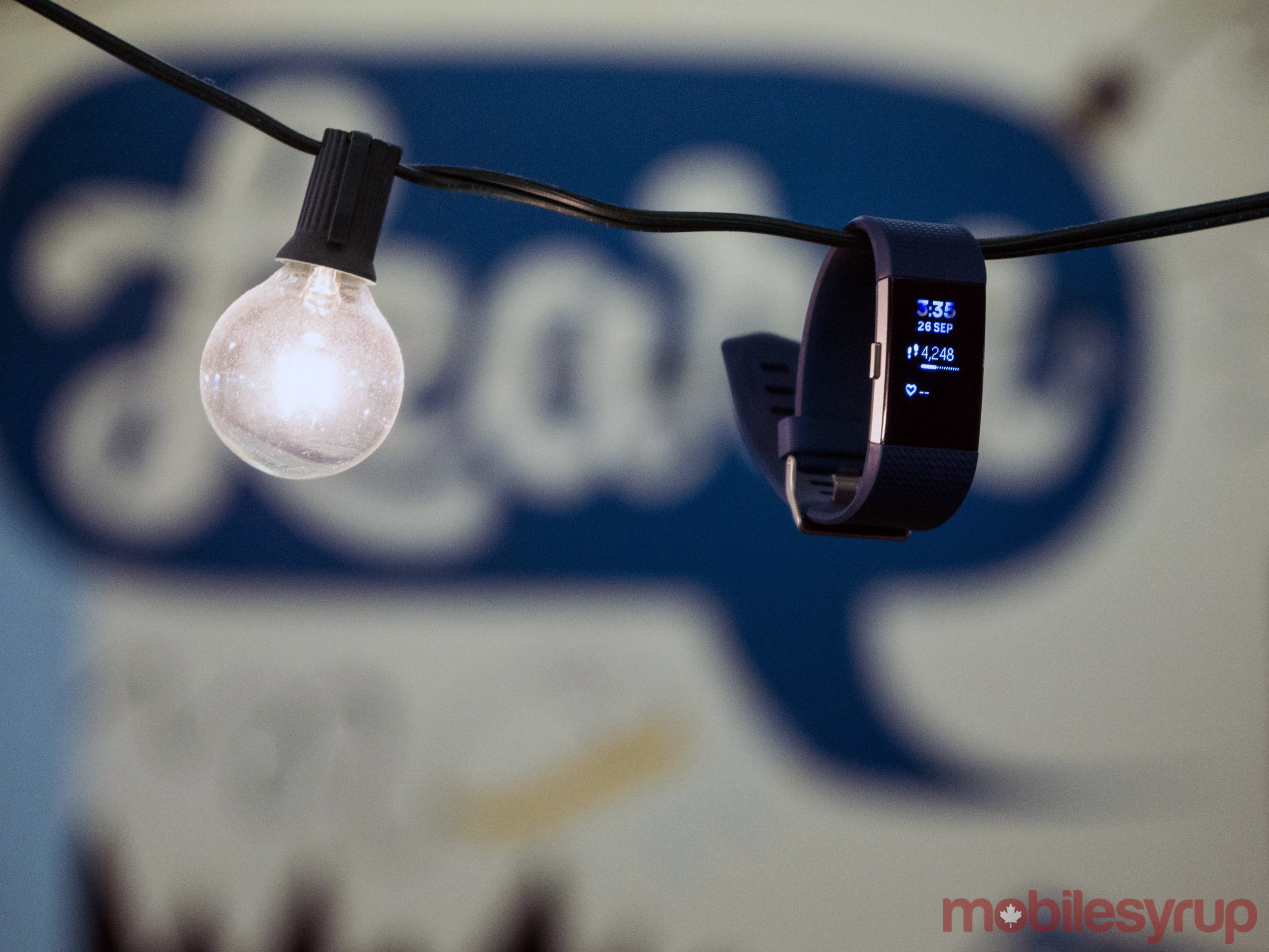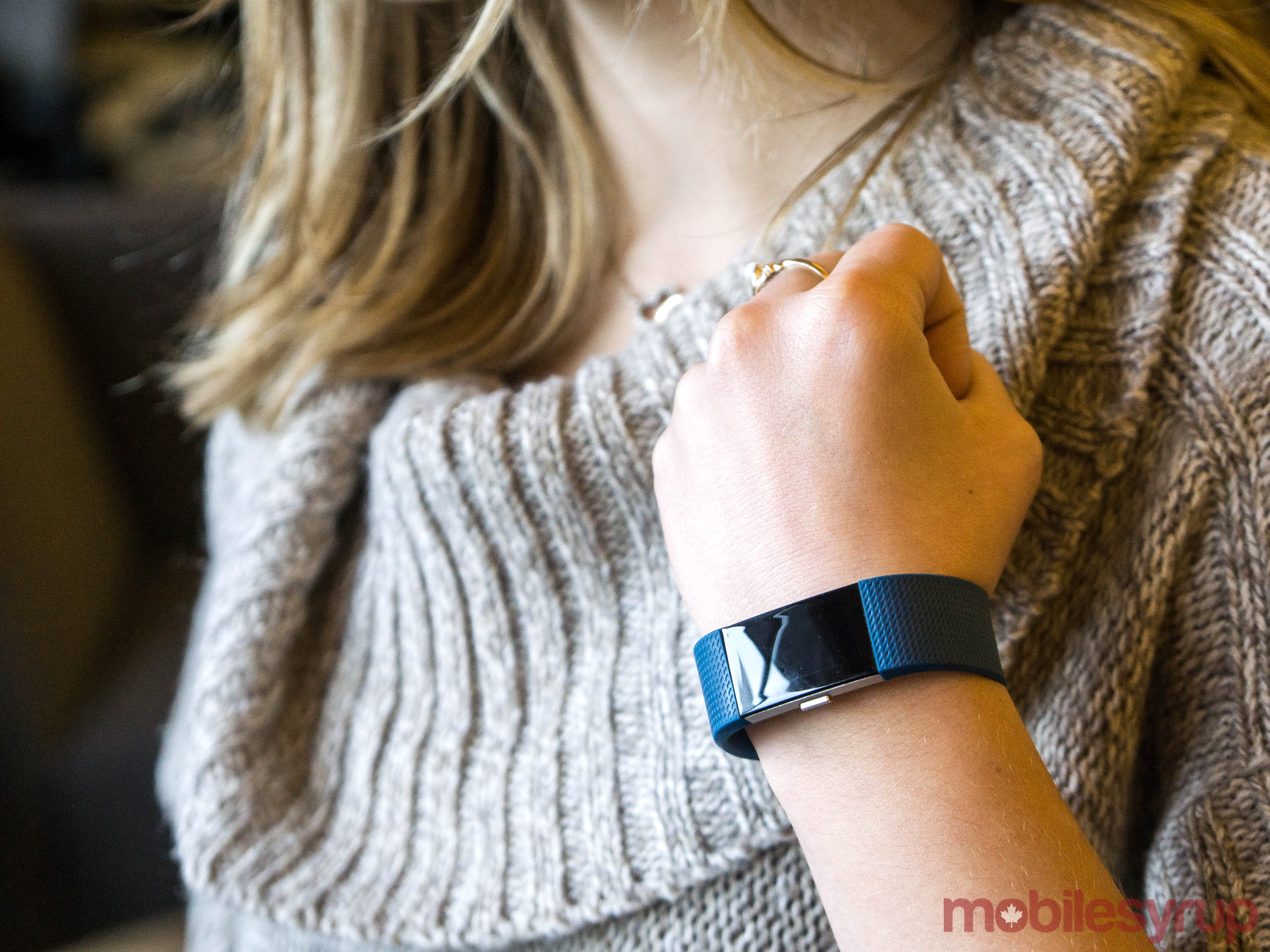
The Charge 2 is Fitbit’s best fitness wearable to date.
It improves on its immediate predecessor in a number of ways, both big and small, and does so while making Fitbit’s most popular tracker more appealing to Canadian consumers.
However, it’s not a homerun. A number of missing features, and, perhaps more significantly, compelling competing options from companies like Samsung and Garmin, mean the Charge may no longer be the go-to fitness tracker for most people.
Specs
- Monochrome OLED tap display
- Bluetooth 4.0
- PurePulse heart rate monitor
- Multi-sport tracking and automatic excercise recognition
- Call, text and calendar alerts
- Connected GPS
- Automatic sleep tracking
- Five-day battery life
Hardware
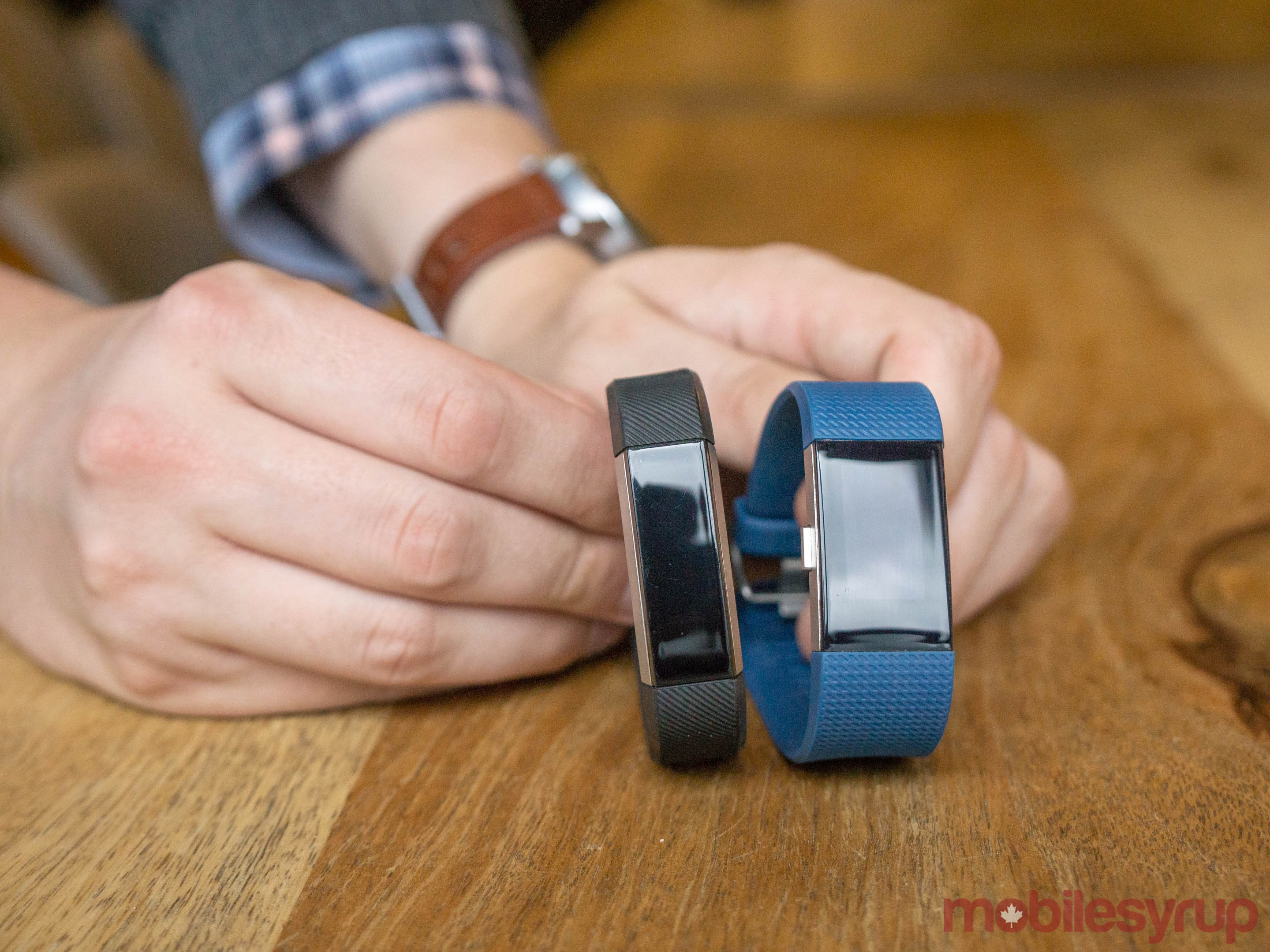
At first blush, the most notable difference between the Charge 2 and its two predecessors is the addition of more screen real estate. Compared to the Charge and Charge HR, the screen on the Charge 2 is four times larger. From a design perspective, this, as well as the fact the Charge 2’s internals are housed within a stainless steel case, make the Charge 2 look like an oversized Alta; in fact, Fitbit’s new fitness tracker borrows a lot of the Alta’s better ideas.
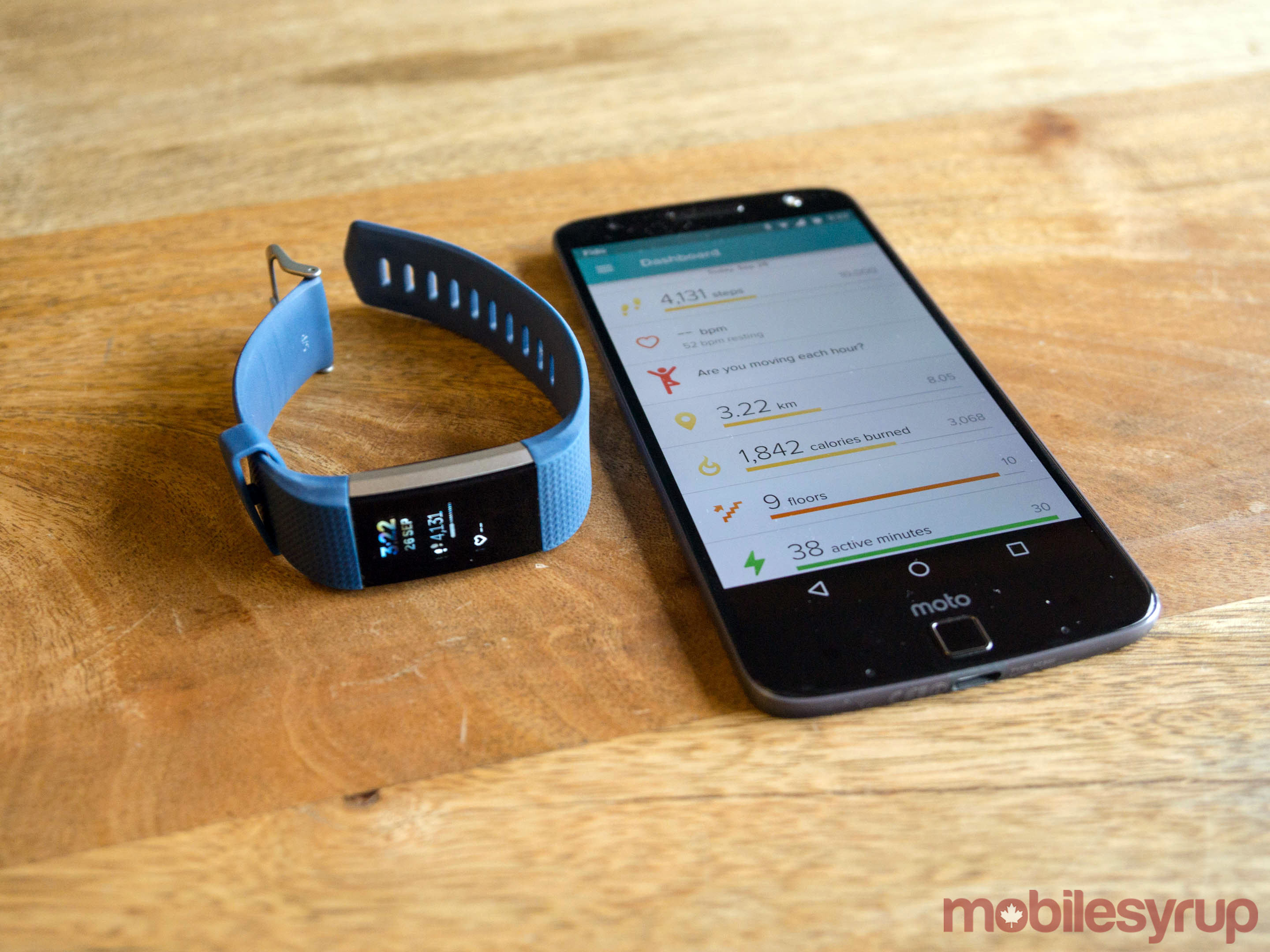
The more practical benefit of the increased screen real estate is that the Charge 2 is able to display more information on its display. Clicking the Charge 2’s side button shifts its interface between one of five main screens. The first screen works as a watch face (there are multiple watch faces to choose from via the Fitbit mobile app) and displays stats like step count, current heart rate, distance walked, calories burned and more.
Tapping the screen — the Charge 2, like the Alta, uses a tap display, not a traditional touch screen — moves between subscreens. This is how users can see secondary stats like stair count, and flip through different activities on the exercise screen. There’s no way to adjust the brightness of the display. Thankfully, the Charge 2’s screen is always visible, even in direct sunlight. Battery life is also excellent and most weeks I was able to get a full five days of battery life.
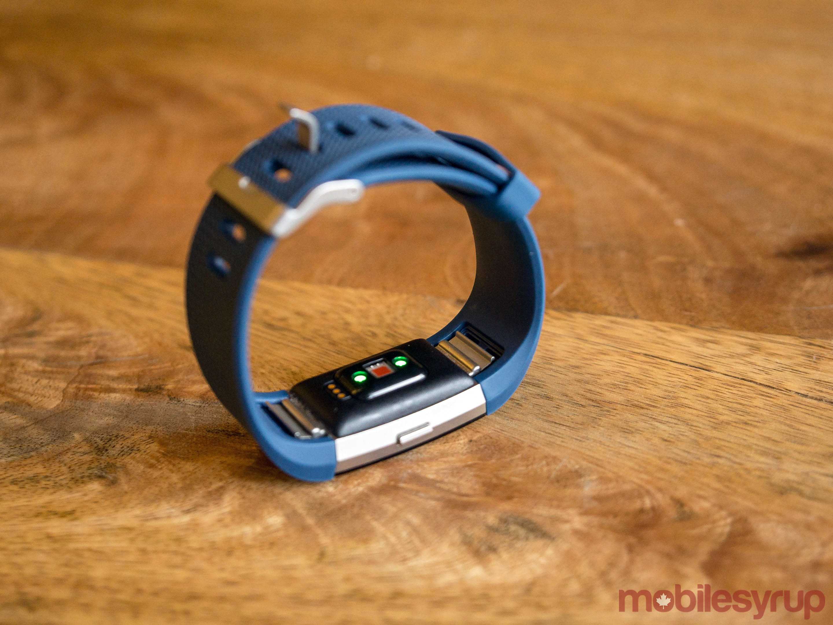
Underneath the display is the Charge 2’s other major new (or, depending on how one looks at it, returning) feature: a heart rate monitor. With the introduction of the Charge 2, Fitbit has stopped shipping two different versions of the Charge that are differentiated by the inclusion of heart rate tracking in one model and the lack of the feature in the other. Now there’s just one model that does everything. Underneath the display, new Charge 2 owners will also find the wearable’s other Alta-inspired design cue, interchangeable bands. Clips next to the heart rate monitor allow the user to swap out the included elastomer band with a number of other bands from Fitbit and the company’s third-party partners.
When doing a workout, the company recommends users wear the Charge 2 tightly under their wrist to ensure the heart rate monitor is able to get an accurate reading. During my own workouts, the Charge 2 could get a bit tight, but overall I never found the device a nuisance to wear.
The addition of a heart rate monitoring sensor opens up more accurate calorie burn tracking and two new features. The first of these new additions is a guided breathing exercise feature.
You can choose between two- and five-minute variations of the same exercise. After measuring your current heart rate, Charge 2 displays a circle on-screen that continually expands and contracts over the course of a selected exercise. This circle represents the ideal breathing rhythm based on your individual heart rate. Sparkles start to appear on-screen as you get closer to perfectly matching the suggested breathing rate. I found the exercises had their intended effect, even when I didn’t manage to breathe perfectly in sync with my Charge 2.
The addition of the heart rate tracker also allows the Charge 2 to generate an estimate of the user’s peak oxygen uptake. Better known as VO2 max, Fitbit calls this stat “Cardio Fitness” to make it more approachable to users — and with good reason as VO2 max is one of the best ways to measure a person’s cardiovascular health. Normally, one has to run on a treadmill while wearing an oxygen mask to complete the test. However, the Charge 2 is able to generate an approximation based on a combination of the user’s resting and active heart rate. It’s able to refine that estimate if the user completes a run while their smartphone is feeding GPS data to the Fitbit app.
Normally, you have to run on a treadmill while wearing an oxygen mask to complete the test. However, the Charge 2 is able to generate an approximation based on a combination of the user’s resting and active heart rate. It’s able to refine that estimate if the user completes a run while their smartphone is feeding GPS data to the Fitbit app.
I didn’t have the opportunity to verify the accuracy the VO2 max estimate the Charge 2 gave me, but I was told by a company spokesperson who had been able to compare the score he got from his Charge 2 with the results from a treadmill test that he got similar scores.
In my case, the Fitbit app told me I could improve my Cardio Fitness score from “good” to “very good” by losing around three kilograms, and by increasing the intensity of my cardio workouts. I imagine most users probably won’t end up using this feature only because it’s hard to find — the screen that displays the Cardio Fitness stat is hidden within the heart rate tab — but I appreciated be given concrete goals to work toward.
In terms of actual heart rate monitor performance, I didn’t get the sense the Charge 2 could replace a dedicated heart rate monitor. I didn’t have a dedicated heart rate monitor to use for comparison, but when running at one of my gym’s treadmills, which did have a heart rate monitor, there was a discrepancy of about five heart beats per minute between what the treadmill told me and Charge 2’s were reporting.
One piece of hardware missing from the Fitbit’s feature set is built-in GPS. To make up for the fact, the Fitbit app can pull GPS data from your smartphone. Some reviews and posters on the Fitbit community forums have said their unit has given them inaccurate distance readings. I didn’t have this problem; both my step counts and actual distance traversed were accurate (I manually counted my steps to ensure I was getting an accurate count), but then again I didn’t go on any complicated hikes. For what it’s worth, Fitbit says it’s working on the issue.
The Charge 2 is also not waterproof, and it doesn’t have internal storage to let it double as a standalone music player. So for better or worse, anyone that buys this fitness tracker will need to take their smartphone with them when they decide to go on an outdoor jog or bike ride.
Software
Despite its enthusiast-focused feature set, the Charge 2 is one of the most approachable and friendly consumer electronic devices I’ve used. Pick it up after not wearing it for a number of hours and there will be a pleasant greeting on-screen; hit your step goal, and a spaceship shooting towards the heavens is waiting for you. Like Apple and its other competitors in the space, Fitbit isn’t so much selling a device here as it is a lifestyle, but the company does a good job of making everyone feel welcome, no matter their fitness goals.
Overall, the software works well. The separate sport profiles work really well, and I didn’t experience any bugs during my time with the device, though one major oversight in terms of functionality is that there’s no way to pause a workout. Given the routine type of interruptions that can happen during any workout — like a shoelace that needs to be tied — this is a major annoyance. Also, the Fitbit app can push smartphone notifications like call, text and calendar alerts to your Charge 2, though I found these hard to read.
The App
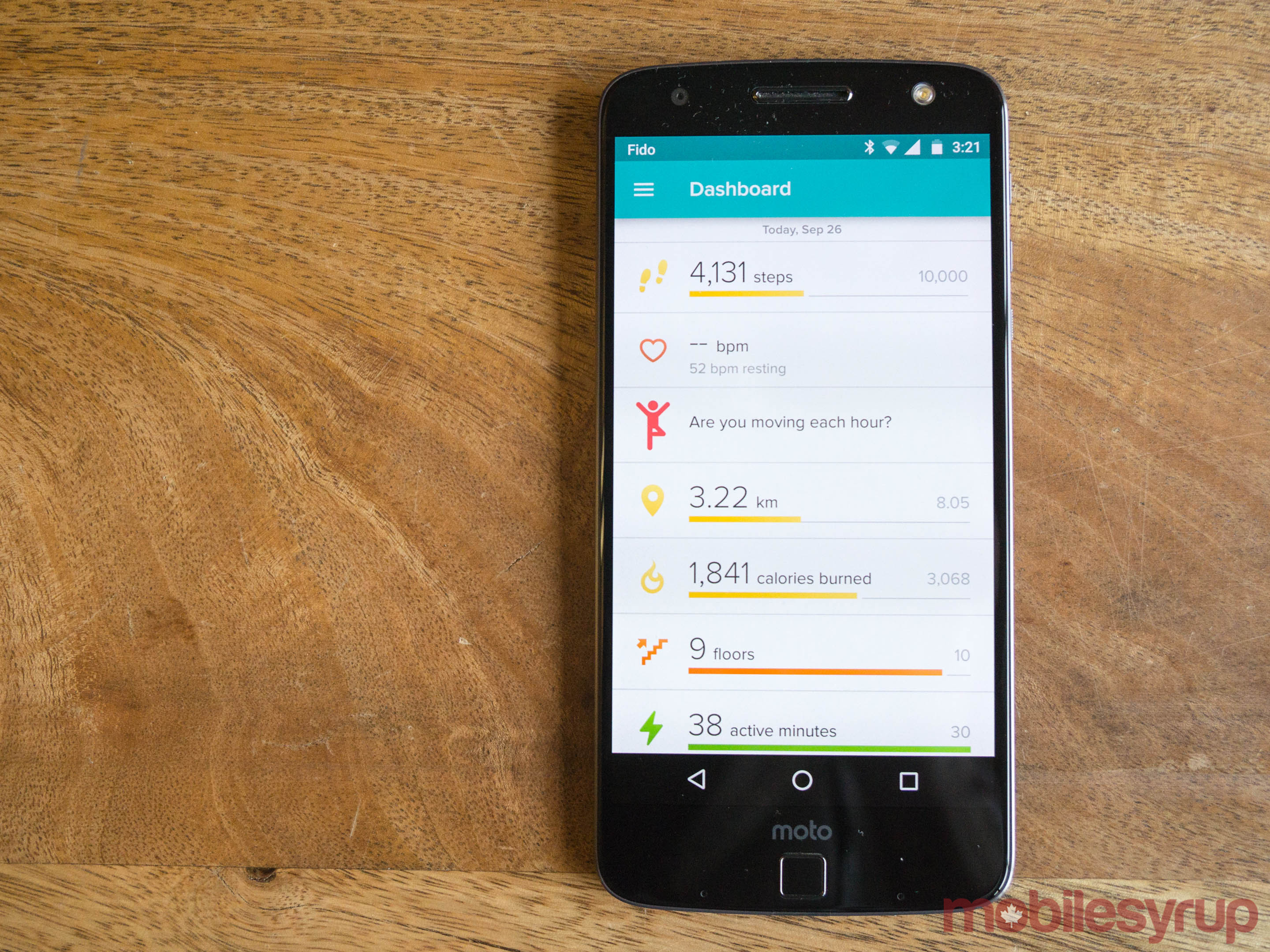
Since Fitbit released the Alta, prior to the Charge 2 its most recent device, the company has redesigned its iOS and Android app. The most notable difference post update is a customizable interface that allows app users to add and remove sections of the main dashboard.
For example, I make sure to drink a lot of water each and every day, but I don’t think it is necessarily useful or healthy for the average person to excessively track water intake. So I removed that section from my dashboard. All other sections, including major stats like burnt calories, can be removed and later re-added in the same way. It’s a small but welcome change that helps to declutter the app and focus on stats that are important to the individual.
Another relatively new addition relates to a suite of sleep-related features. One of the Charge 2’s best features is its silent alarm clock, a feature it shares with other Fitbit Wearables. Back in June, Fitbit updated its mobile app to allow users to set wake up and bedtime targets. In addition, the company introduced a new notification that, based on the user’s sleep target, reminds them to start winding down for the night at the appropriate time. According to the company, a more consistent sleep schedule leads to better sleep overall, which in turn leads to a number of other health benefits. The company recommends users first wear their Fitbit to sleep during the weekend to get a good estimate of how much sleep their body naturally needs.
These are small additions, but I actually found the sleep-related features to be one of the more compelling reasons to get a Fitbit. It’s really easy to convince oneself to stay up late, even if we all know the cost of doing so, which is exactly where the sleep notifications help. Since enabling sleep notifications with the Charge 2, I’ve done a better job of going to bed at a consistent time. The silent alarm also makes for a far better alarm than any loud alternative.
One new app feature Fitbit just launched alongside the Charge 2 is called Adventures. These are single person challenges Fitbit users can embark upon to motivate themselves to complete a particular step goal. For instance, one of the Adventures has Fitbit owners embark upon a 15,000 step virtual tour of Yosemite National Park’s Vernal Falls.
Completing certain step milestones within the adventure rewards the user with 360-degree panoramas of several scenic points along the trail. In the case of the various Yosemite Park Adventures, the panoramas were shot by Chris Burkard, one of my favourite photographers. I started these challenges merely to see more of Buckard’s work but ended up finding them a fun challenge to take on during the weekends. Some users will get more out of competing with their friends, but as someone who has had self-esteem issues most of their life, I found challenging myself a much better alternative.
Otherwise, this is the same app that Fitbit has shipped alongside its trackers for some time now. It’s easy to navigate, nice to look at and it’s clear Fitbit is attempting to move its software towards providing more actionable suggestions users can take to improve their lives.
Conclusion
I found the Charge 2 to be an excellent device that included exactly the things I wanted in a fitness tracker. I’m not a swimmer, so I didn’t mind the fact it wasn’t waterproof. I enjoy working out, but I’m not preparing for something as intense as a triathalon, so the lack of GPS and pinpoint accurate heart rate tracking was a non issue.
Of course, for some those missing features will make the Charge 2 a non-starter.
Moreover, While the Charge 2 is both a better device and potential purchase than the two fitness trackers it replaces, it enters a crowded market filled with a number of other compelling devices. For example, for just $50 more than the Charge 2’s $199.95 asking price, Canadians can purchase the Samsung Gear Fit 2. It’s missing some of the Charge 2’s excellent software features and it doesn’t work with the iPhone, but it does include a built-in GPS chip and comes with 4GB of internal storage, which means users can safely leave their smartphone at home when they go for jog outside. With an IP67 certification, the Gear Fit 2 is also useful to both swimmers and other athletes alike.
Still, if you’re on a Fitbit right, particularly one of the two older Charge models, and you like how the company goes about things, then the Charge 2 is a worthwhile upgrade.
Pros
- Bright and large screen makes it easy to see all parts of the Charge 2’s interface
- Customizable user interface lets users focus on the activities they do most oftern
- Sleep tracking features and silent alarm are great additions
Cons
- Lack of built-in GPS and internal storage mean you still need to bring your smartphone on outdoor activities
- Heart rate tracking didn’t seem overly accurate
- Compelling alternatives with more extensive feature sets exists for not a lot more money
MobileSyrup may earn a commission from purchases made via our links, which helps fund the journalism we provide free on our website. These links do not influence our editorial content. Support us here.

