


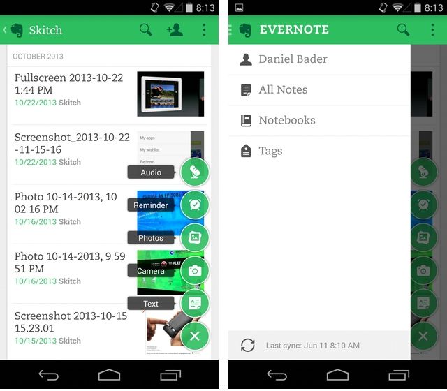
Evernote is rolling out a new app design to members of its Android beta program. Featuring a toned-down colour palette, pop-up action tool and traditional left-sliding bar, the changes are subtle but important.
While the overall cleaner look is what most will immediately notice, it’s the dynamic, hovering action button which, when pressed, brings up a list of options like Text, Camera, Photos, Reminders and Audio, making for a far less cluttered experience. Over the years, Evernote has gained numerous functions, but many were essentially hidden in Android, relegated to the top-right “three-dot” button usually reserved for menu options.

Unfortunately, the new design does not include the missing features, like business card scanning, that iPhone users have been taking advantage of recently, but we’re holding out hope it won’t take too much longer to cross over.
In the meantime, heavy Evernote users on Android will likely enjoy the coat of new paint, along with quick access to the side menu bar. The app feels a lot faster, too, with nary a groan or pause when moving between screens.
If you’re interested in signing up for the Evernote beta, head to Google+ and opt-in.
 Gaming
  News
News  AI
AI  AI
AI 