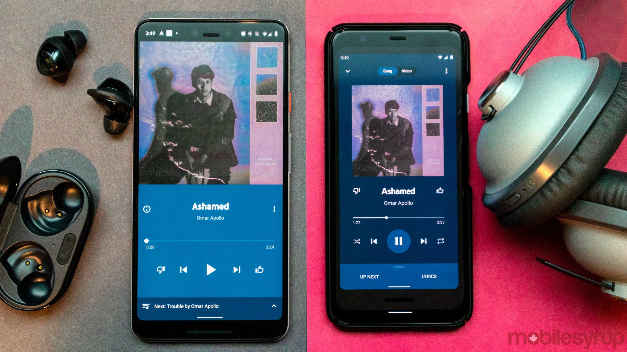
YouTube Music’s divisive redesign that was announced in early March is reportedly rolling out now.
When the new look was first announced there were some perks, including more buttons on the Now Playing screen, which is a big plus.
That said, the minimal design of the previous look was a fairly integral part of its overall design. I also wish that the track information text was left-aligned instead of centred.
The final new feature is that some songs now show lyrics when they’re being played. Unlike Apple Music, the lyrics don’t scroll along with the music for karaoke.
I haven’t received the update on Android and iOS yet, but Engadget says it’s rolling out now.
Source: Engadget
MobileSyrup may earn a commission from purchases made via our links, which helps fund the journalism we provide free on our website. These links do not influence our editorial content. Support us here.


