What do you do when your main competition in your country of origin is beating you in every metric that counts? You try to be bold and do something different. That’s the LG G5, in a nutshell — a device that aimed to reorient what a smartphone could be, except that vision has yet to come into focus in 2016.
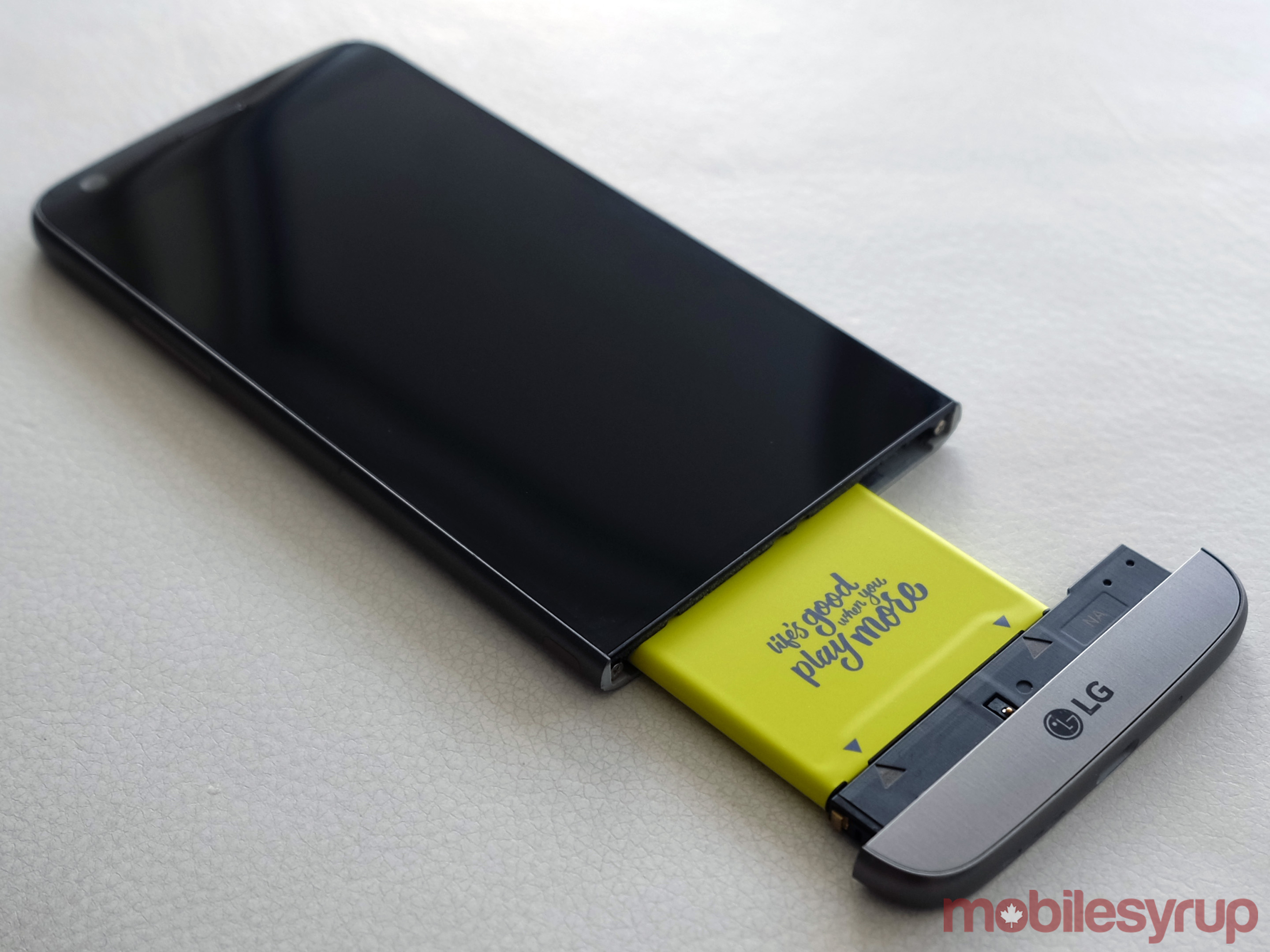
The modularity included in the G5 was a pretty novel idea. Attach a compatible peripheral to the battery, slide it in, and you have a phone that now does something its existing hardware couldn’t do, otherwise. However, as we’ve seen so many times before in the mobile space, proving you can do something you think is practical doesn’t mean it is practical to the masses.
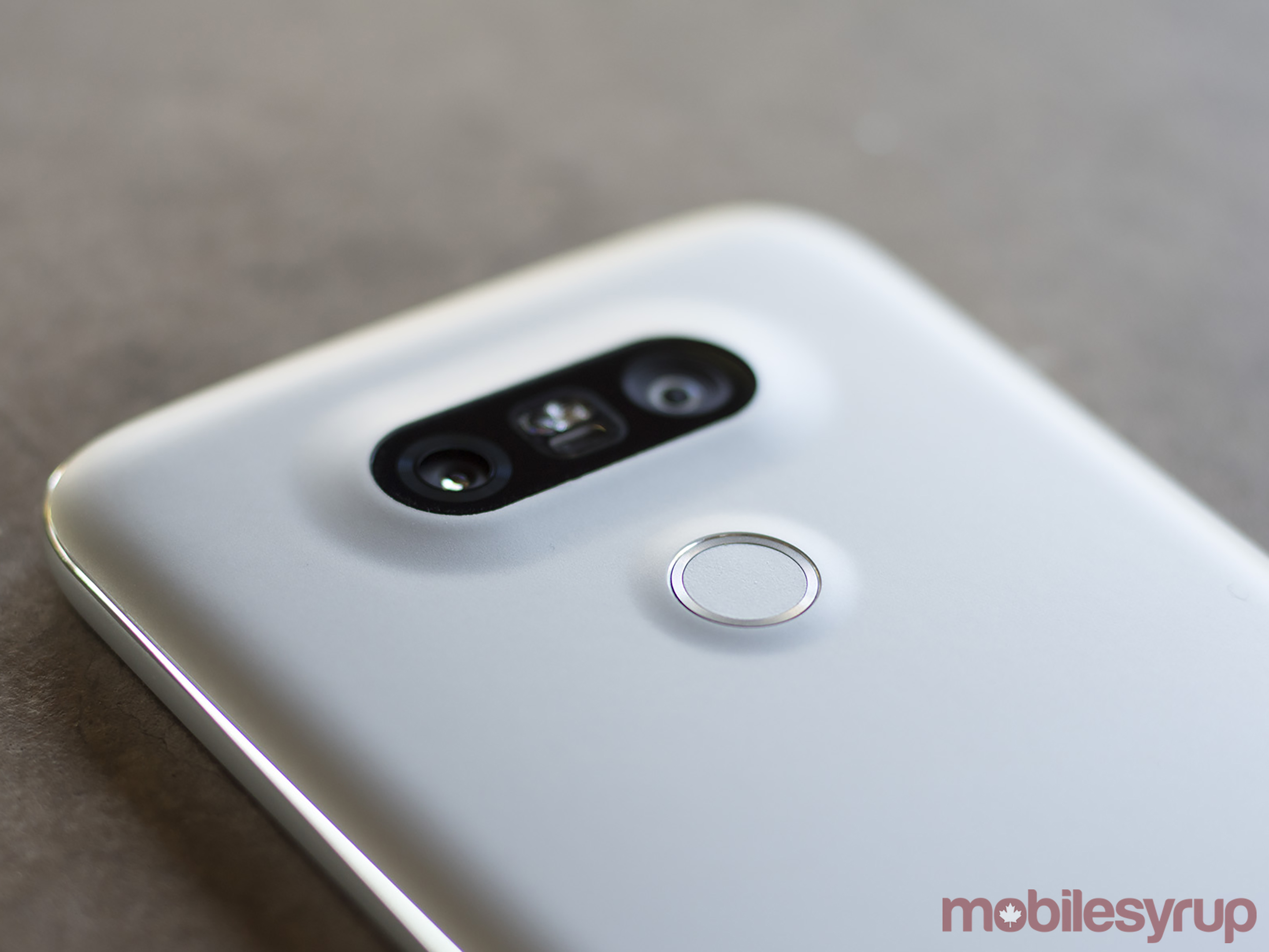
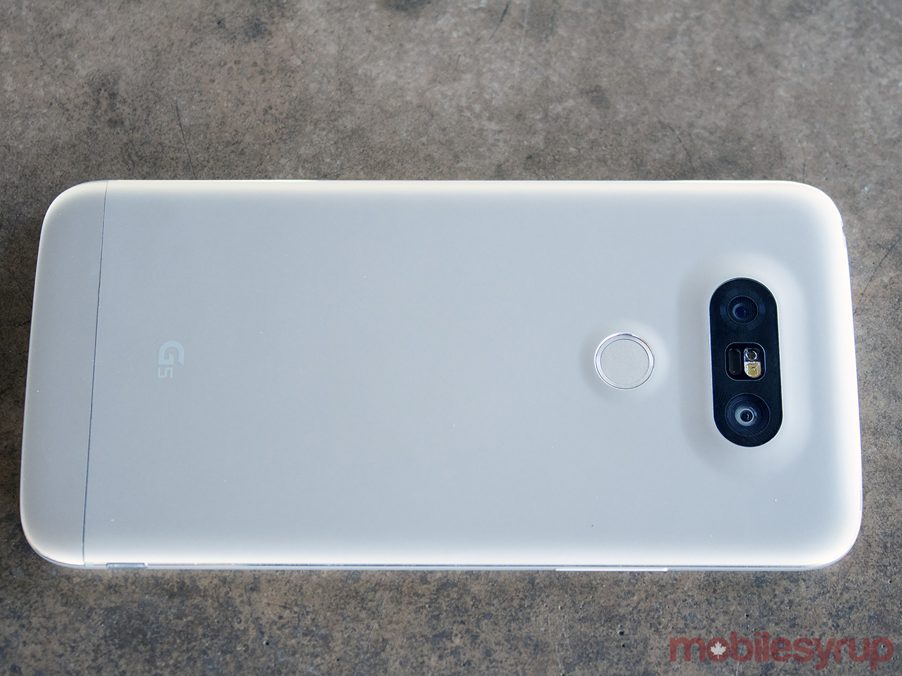
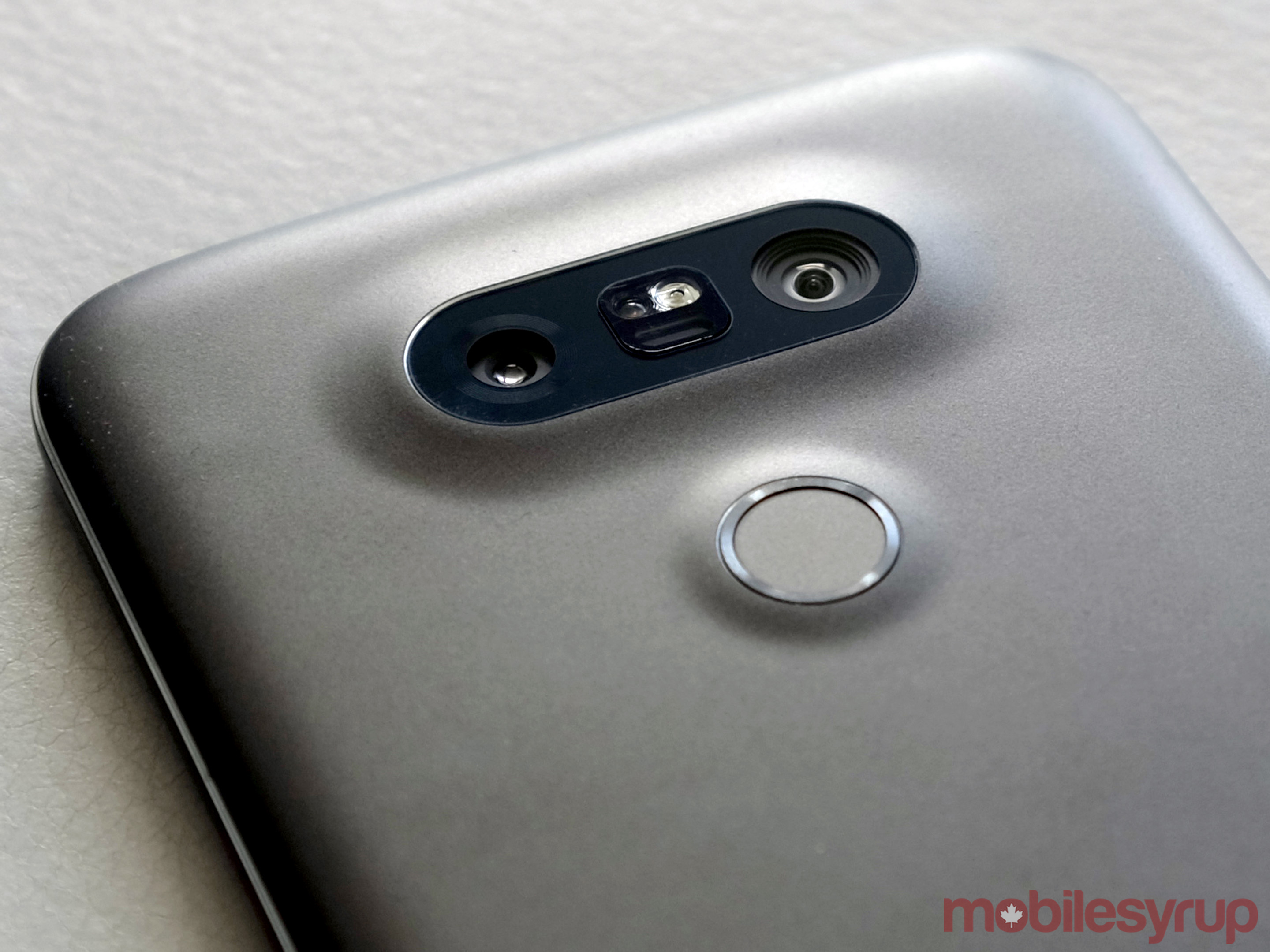
While the modularity was the identity the G5 was designed to carry this year, it was still meant to be a highly competitive smartphone, regardless of the Transformer-esque design philosophy. Unibody metal, free of any antenna bands on the back, coupled with a neat dual-lens system, gave this phone something to work with visually.
How would this unusual marriage of hardware modularity and software flavouring work together to augment LG’s image, while eliminating the issues that have plagued the company’s devices in the past?
The device
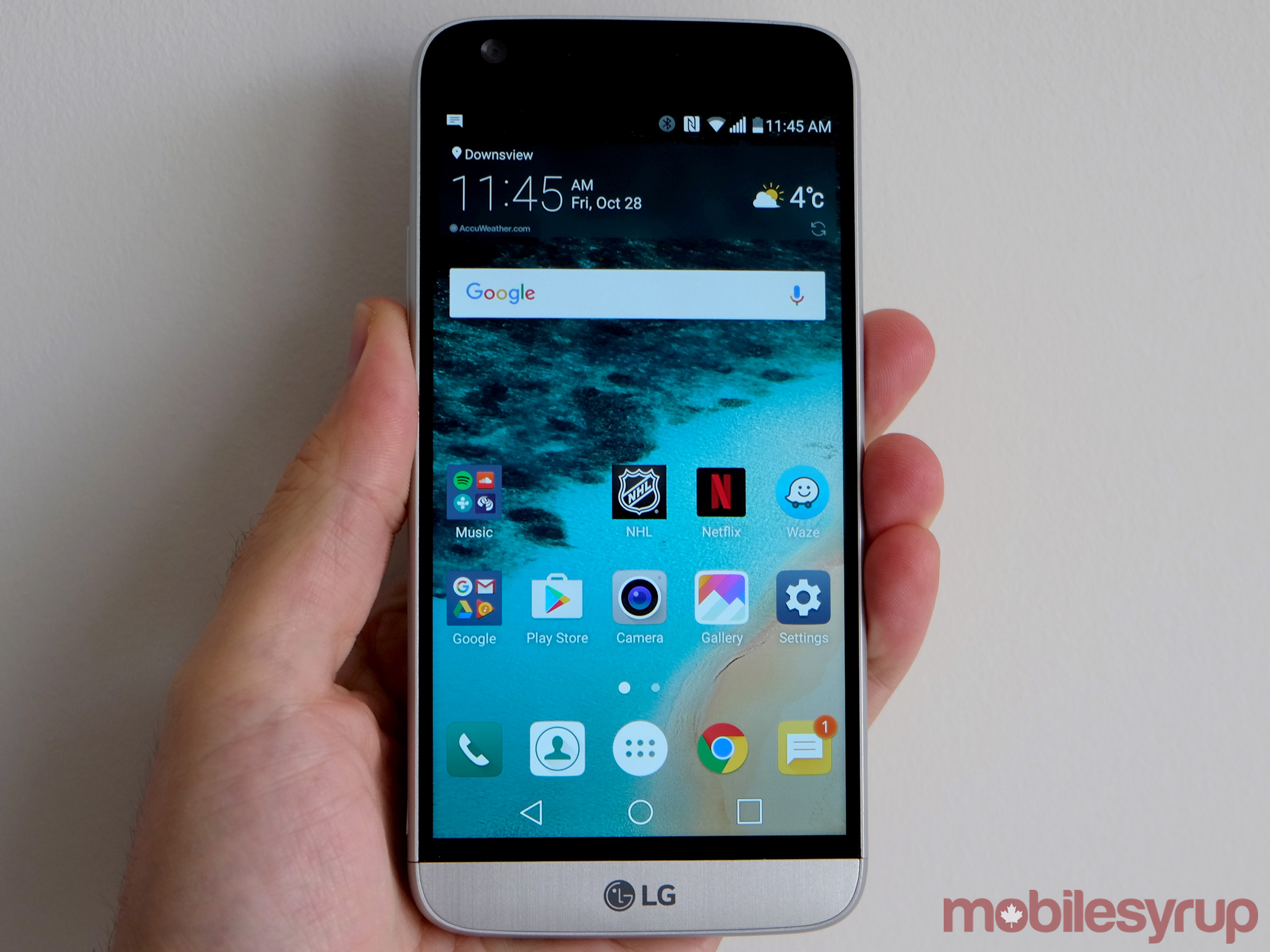
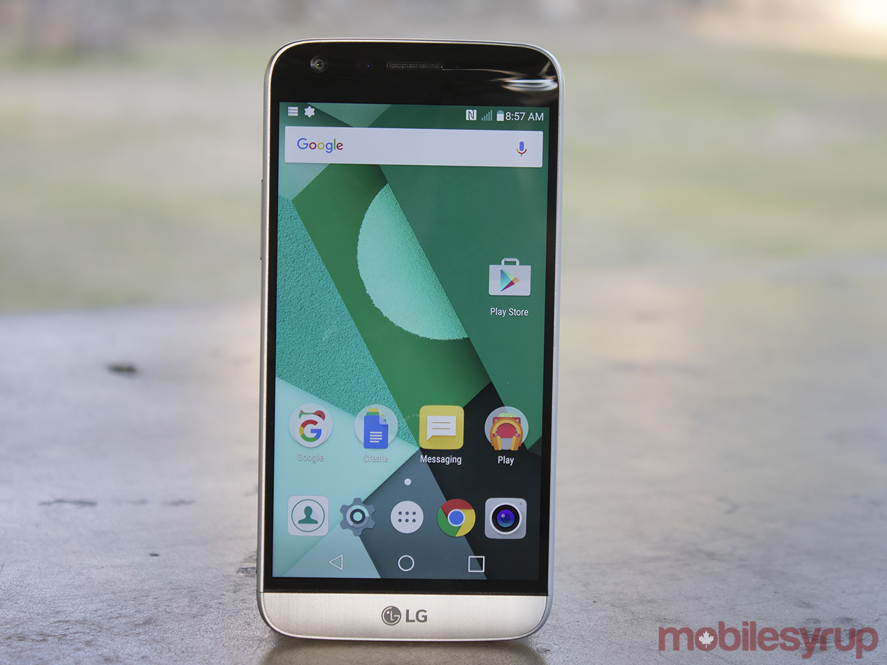
My first hands-on with the device was at Mobile World Congress in Barcelona, and with a review unit in hand shortly thereafter in March, I’ve used it often since then. The all-metal body is fine, though I have come to agree with those who say it’s missing something in its design that doesn’t make it look as nice as others.
I do miss the leather back of the G4. Metal edges with a leather back would’ve been great, but of course, uniformity trumped everything else, and with modularity being the cornerstone here, the leather had to go along with the plastic. Plus, room had to be made for a fingerprint sensor that could blend in, thereby moving the volume buttons to the side. The lack of antenna bands is unique, even at this point. Other phones try to hide them as much as possible, but none have melded them into the back like LG did with this handset. Adopting USB-C cemented the company’s embrace of the new port.
At this stage, any flagship phone with a removable battery is unusual. That rarity could appeal to the subset of users who demand that kind of flexibility. At 2,800mAh, the G5 uses a smaller battery in comparison to others in its class. Easily replacing it with a new one does offset that, in my view.
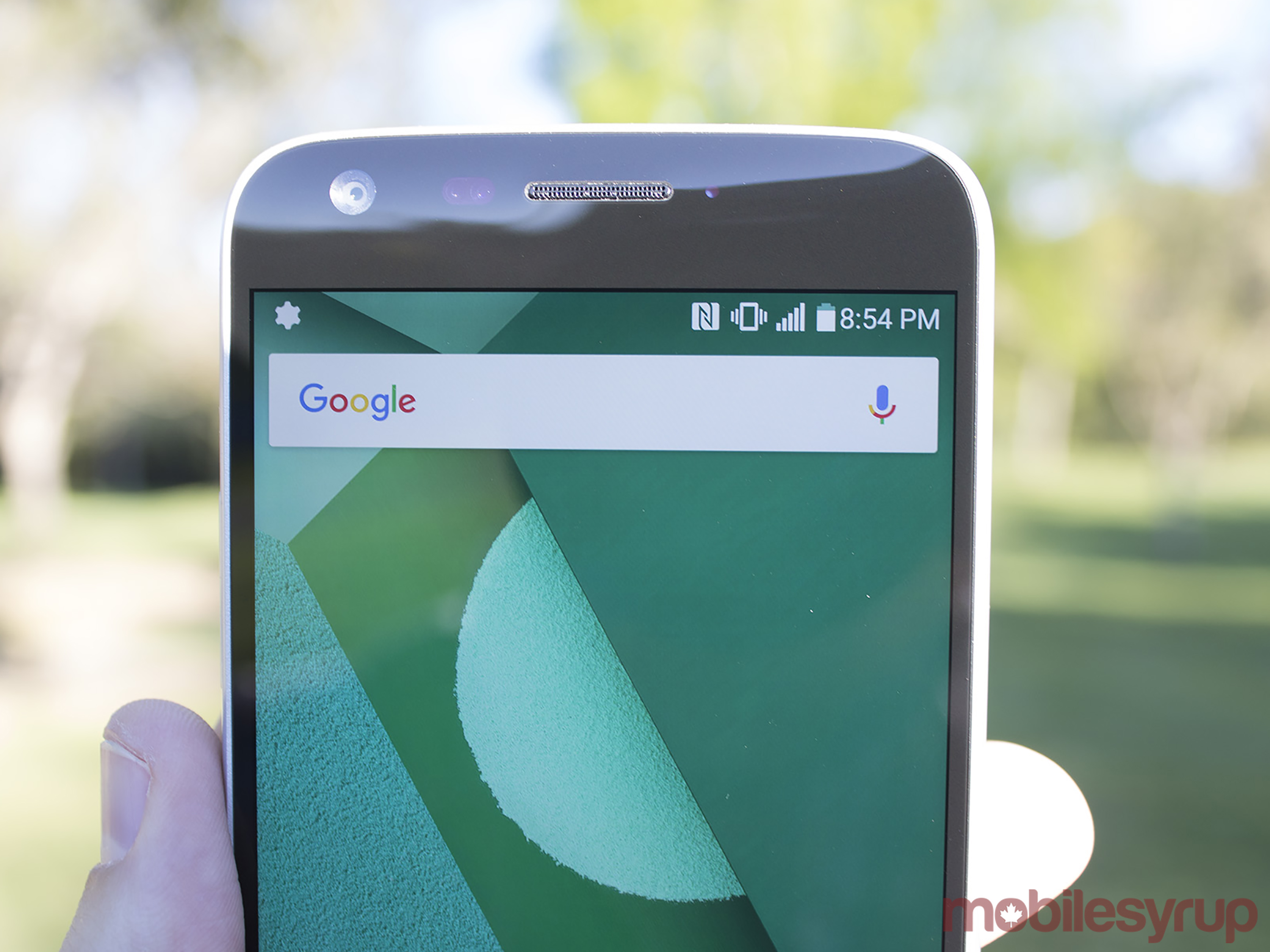
A brighter — and more responsive — IPS display, slightly reduced to 5.3-inches, was to be an improvement. The Snapdragon 820 chipset, coupled with 4GB of RAM, 32GB internal storage and improved software were to provide a more robust user experience.
This has been LG’s Achilles heel for years. Good hardware hindered by questionable software implementation. The G3 and G4 had their issues in that regard, and the G5 needed to whirr like a well-oiled machine. More than just tinkering, rigid optimization was required.
After all, outside of the second wide-angle lens, the camera hadn’t changed. Same image sensor, same lens, same aperture. Other than a couple of additions, the interface was barely touched. Shooting anything at 135-degrees on a smartphone is one of those things you’re glad to have, if only because vistas and big groups are easy to capture. With the prowess of the G4’s camera still intact, save for some weird flaws, adding that lens is a win that I’ll touch on later.
It bears noting that the G5 was supposed to be the face of LG’s “Friends” family of devices. Separate from the modules that could attach to the phone, these included a 360-degree camera, VR headset and more.
The software
Where Samsung has learned to lighten the load on its TouchWiz interface to let Android breathe with its originality, LG has been slower to get the message. There’s been progress though. Compare the G3 to the G4 and the differences are obvious. Compare them to the G5, and the contrast gets starker.
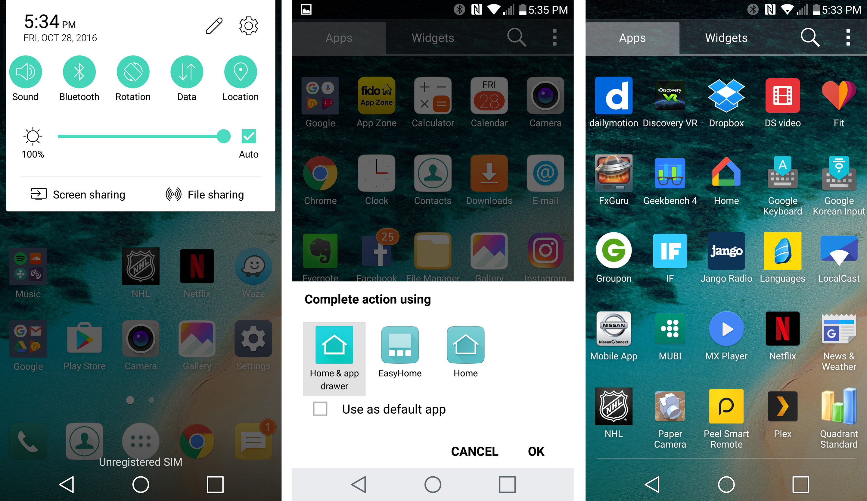
Except there’s a realization that the company needs to come to: its own apps simply aren’t good enough. Rather than throw them out front and centre, like before, LG chose to reduce the impression of any bloat by keeping those apps in the background. They’re easy to find, but who is actually looking for them? QuickMemo+ is fine for a notes app. I never used RemoteCall Service, SmartWorld or LG Health. LG Backup is fine for switching from an older LG phone to the G5 or vice versa. Quick Help is a reasonable shortcut to learning about the phone’s features or accessing the user guide.
Other than the battery saving options, I pretty much ignored the management suite of apps. Making them entirely removable and elective as downloads would be wise to do moving forward. Additionally, this business of updating LG’s apps separately from Google Play is also something that should probably be abandoned. The silver lining, however, is that I could ignore those updates, while having Google Play update all the other installed apps automatically.
Thankfully, no proprietary LG app layout appears when swiping right from the home screen, as has been the case before. Giving the user a binary choice on things like that usually goes over well.
Initially, LG jettisoned the app drawer entirely, choosing to go with an iPhone-style side-swiping layout. It understandably met with plenty of derision from Android users who wanted something inherent they could work with. Not long after the phone’s launch, a software update brought it in, making it wholly elective to please everyone.
Other stalwarts continue on, like waking up the phone by double-tapping the screen. Adding a fourth button to the navigation bar at the bottom is another unique option not everyone else uses. These are, in many respects, LG treatments that have stood for the last few years.
Much like Samsung, LG also chose to include an always-on display for the time, date and basic notifications (indicated by logo). Wisely, the company turned it off by default, allowing consumers to decide if they wanted to have it or not. Since this is an IPS panel, the text doesn’t have to shift around, like in the Super AMOLEDs of the Galaxy S7 and S7 edge, because burn-in isn’t an issue here.
The camera
In my opinion, the G4 had the best overall smartphone camera of 2015. Its manual mode was outstanding, as I noted in an article about the device months after it launched last year. A mix of great optics, wide aperture, solid interface and, seemingly, the colour spectrum sensor, helped to produce some of the best mobile images I shot last year. It was my go-to point-and-shoot, bar none.
This year, the competition stiffened substantially. Samsung brought serious game to the arena with a fantastic camera in the Galaxy S7 and S7 edge. HTC bolstered its camera right back to contention with its flagship One. More recently, Apple boosted its camera, particularly with the iPhone 7 Plus, while Google has outdone itself and others with the Pixel and Pixel XL cameras. Even mid-range handsets are pushing pixels better than they ever have before.
LG chose not to mess with the components, other than to add the 135-degree wide-angle lens in the rear, alongside the regular 75-degree one. A simple tap in the interface switched between them at will. Fast and seamless, it was easy to shoot with one or the other. The regular lens shoots at 16 megapixels, while the wider one shoots at 8 megapixels. All modes and features on the software side apply to both lenses.
Much was made of Apple adding a second lens to the 7 Plus, particularly because it chose to go in the other direction — closer to the subject with a 2x optical zoom, rather than further away from it. Both have their upsides, and while it would be awesome to have three lenses to cover it all on one phone, that’s clearly not the case.
The wide-angle lens was perfect for shooting a wide scene without taking a step back. Considering how limited real estate can be when shooting long vistas or large architecture from tighter spaces, the wider viewpoint is more than handy. Simply put, shots I got with it would have been impossible with other phones.
Add that to the manual mode, and the G5 has a camera setup that belongs in elite territory. The controls are still the same, with output and quality that outputs excellent images. I shot with confidence at all times with the G5 — except for one instance.
I’m not entirely sure why, but the G5 struggled more in auto mode than the G4 did. It shouldn’t happen, especially when the components are the same, but subsequent software updates haven’t fixed the overzealous ISO levels used in those images. It’s most prominent in really bright or darker settings, making images appear washed out or noisy. In manual, the results are like night and day. Using those film filters LG added within manual mode helps with being creative and adventurous when shooting.
The sad part is that most consumers have neither the knowledge nor the inclination to shoot in manual mode. A shame, really, because the true prowess of a smartphone camera is easier to measure when more control is in your hands. The problem for LG is that the G5’s prowess is not widely understood. I purposely asked about the G5’s camera posing as an interested customer in different kiosks and stores — and didn’t encounter one person who knew what the camera could do. And that’s in spite of the fact the G4 was selling well at a lower price.
As it stands…
Despite its merits and relative successes, the road has been bumpy for this phone. A simple search online draws in a number of threads on various complaints. Some of those refer specifically to the modules themselves, while others target the phone itself. Anecdotal examples, or patterns of ineptitude?
For me, the G5 has been a workhorse, showing no real signs of malfunction, like those described online. Even the pre-production unit I had held up well. Battery life isn’t exceptional, by any means, but it has been better than I would have expected from its size.
Criticism of the device’s appearance is naturally subjective, but it’s not what ails the G5. A pretty device doesn’t necessarily always mean it feels good to hold, or that it works consistently well. I’ve always cared more about performance than looks because the tangible difference between the two is obvious. When a phone starts crapping out, it matters little if it can still win a beauty contest.
The G5 feels a lot like that to me. I found the modularity concept to be cool in theory, except Motorola has taken a more practical approach that works better with its Moto Mods. LG’s modules haven’t grown in number since, and its Friends products were overtaken by other vendors’ more robust and effective units. The inconvenience of forcing a restart to change modules didn’t resonate, and in fairness, I doubt it would have even if Samsung had opted to take the same approach.
Reports from South Korea, albeit unconfirmed by LG, indicate the company will ditch modularity with the G6 next year. Hardly a surprise if that’s true. Q3 sales numbers showed a $381 million (U.S.) loss in the mobile division, due largely to lower demand for the G5.
Samsung’s embarrassing Note 7 debacle should be an opportunity for LG to curry favour with consumers who previously felt its Korean rival was the place to be for Android. It opens the door more for the upcoming V20 than the G5, but when you’re trying to build brand awareness, either would suffice.
The G5 is a solid phone, despite the identity it is saddled with. The fingerprint sensor is great, the camera is superb, the software much improved and the feel of the handset more than comfortable. The main trappings are there, however many didn’t get to experience them so far.
MobileSyrup may earn a commission from purchases made via our links, which helps fund the journalism we provide free on our website. These links do not influence our editorial content. Support us here.

