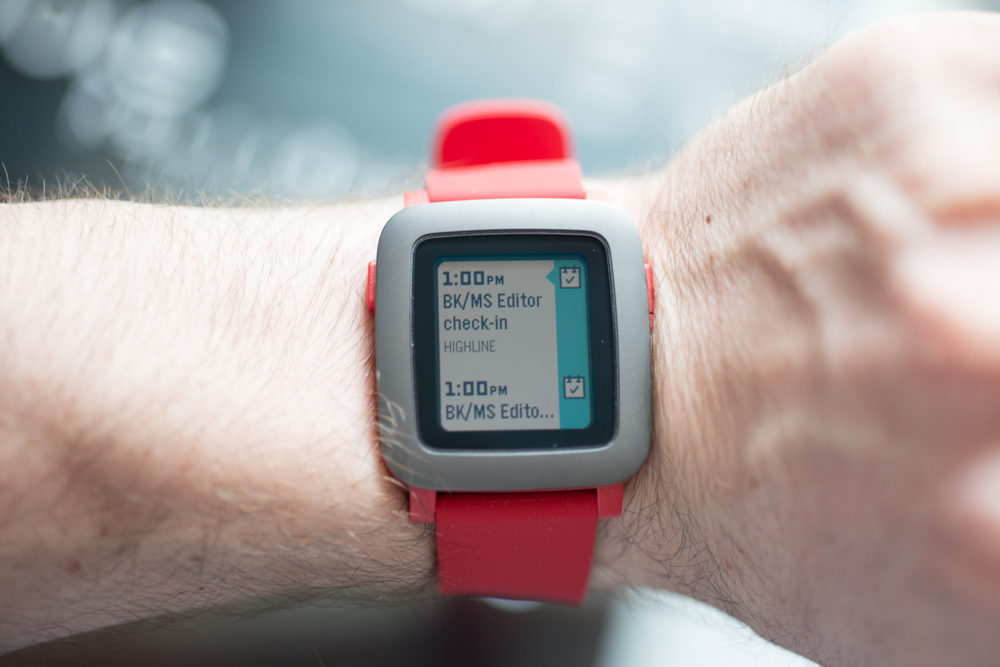
One of the most significant software improvements featured in the Pebble Time over its predecessor is the smartwatch’s intuitive user interface.
According Eric Migicovsky, Pebble’s CEO, the wearable’s positively received Timeline UI, featured in both the Pebble Time Steel and Pebble Time, is headed to the original Pebble and Pebble Steel in beta form this December.
Timeline turns Pebble’s UI into a scrollable stream of content organized by how recently it is received. The feature essentially allows developers to tap into a chronological overview of major events. This makes navigating through multiple notifications, as well as apps, a simpler process. Beta Timeline features will be opt-in only when the feature launches next month.
Earlier this year Pebble confirmed that Timeline was coming to the original Pebble, but at the time, a release date was not revealed.
While bringing Timeline to original Pebble devices might seem like a minor update, it’s a perfect example of the company’s commitment to supporting older Pebble models through software updates.
In addition to the Pebble Time and original Pebble, the company also recently launched a circular smartwatch called the Pebble Time Round.
Related reading: Pebble Time review
[source]Wareable[/source]
MobileSyrup may earn a commission from purchases made via our links, which helps fund the journalism we provide free on our website. These links do not influence our editorial content. Support us here.


