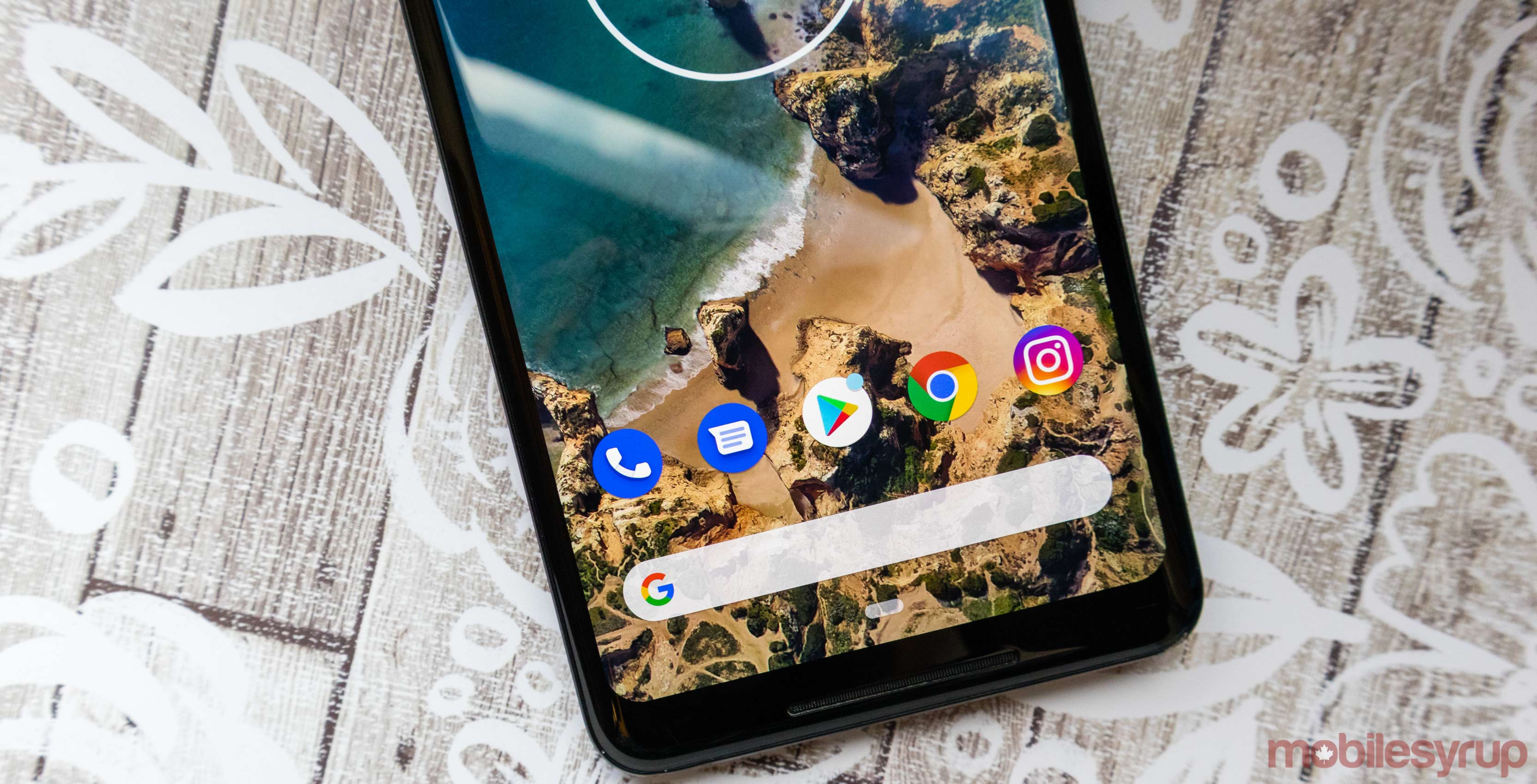
The Android Messages icon is getting a slight Material Design change, according to ‘davidjlosi’ on Reddit.
The update is currently rolling out, according to a variety of users on Reddit, though it hasn’t reached my Pixel 2 XL yet.
The icon is very similar to the previous design, though the text bubble is smaller than it was previously, and there’s also less of a shadow behind the bubble. Further, the colour of the blue matches Google Duo and the Contacts app icons now. Additionally, the lines representing text are blue and not grey now.
According to Android Police, the update comes with a new ‘Automatic previews’ setting. Now users can select to show only web link previews, instead of previewing a complete message. The previews will include links, places and other content that the app can recognize
The update also comes with Google’s recently announced Messages search interface that allows users to search categories and contacts.
For those who cannot wait for the rollout, APK Mirror does have the version 3.6 available, though as always, download it at your own risk.
Source: Reddit, Via: Android Police
MobileSyrup may earn a commission from purchases made via our links, which helps fund the journalism we provide free on our website. These links do not influence our editorial content. Support us here.


