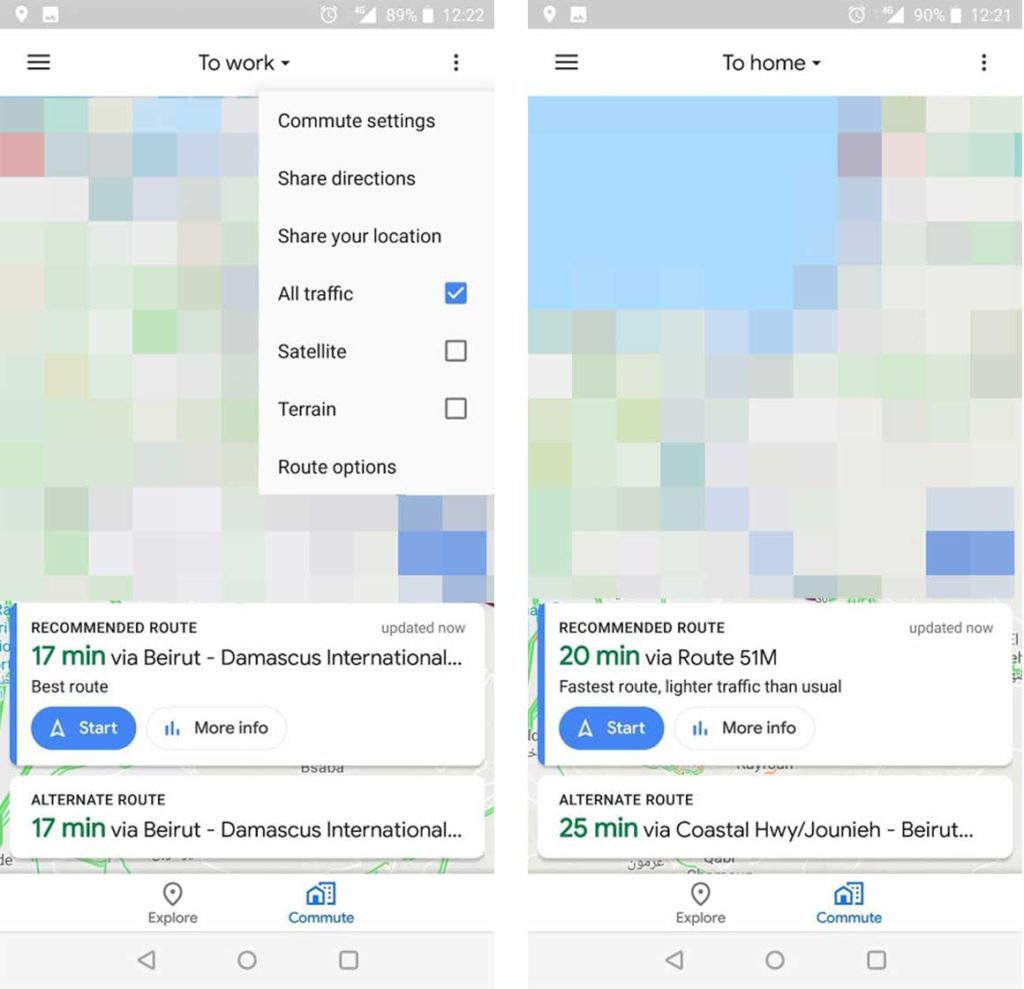
Google Maps is testing out a slightly new design that replaces the ‘Driving’ and ‘Transit’ menu tabs with a single ‘Commute’ tab.
The new tab seems to be a server-side A/B test since it isn’t rolling out to everyone. In the new design, there are only tabs for ‘Commute’ and ‘Explore,’ trimming down on the options quite a bit.
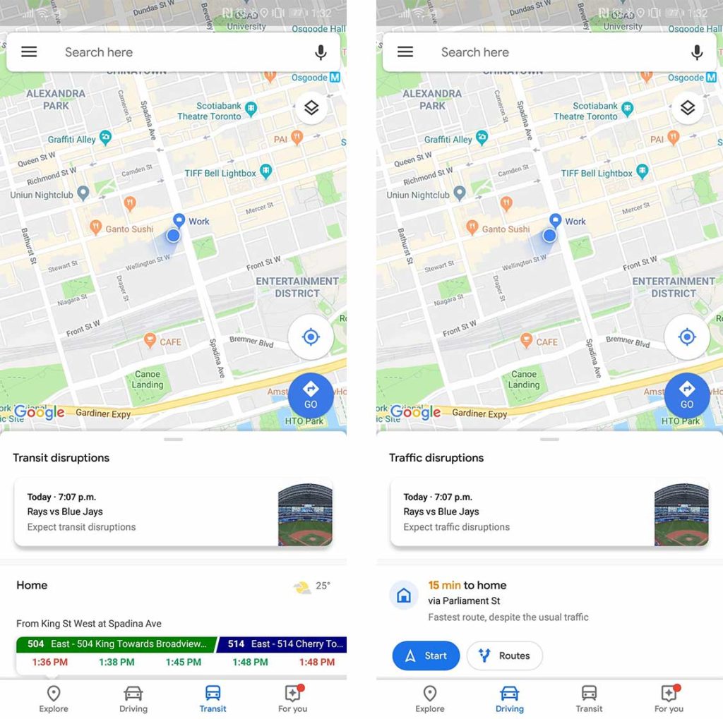
Currently, Maps offers contextual Home and Work routes based on location and time of day. For example, when I’m at work, the app shows me the fastest way to get home, or vice versa. It also shows different result depending on if ‘Driving’ or ‘Transit’ is highlighted.
Google has consolidated the rest of the information from the two older tabs into ‘Commute.’ It’s unclear if this makes it harder to move between one form of transportation-specific directions and another.
Ideally, this update streamlines the process for people who take similar routes to-and-from work every day.
Two screenshots from the current version of Maps for comparison.
When the traveller hits the ‘Commute’ button the search bar swaps with a drop-down menu for saved locations, such as home or work. The recommended route card is updated too. It’s larger now, while a smaller sub-card offers an alternative route option.
All of this was reported by Android Police who claim to have tested out the new design once. Android Police users who have claimed to test out the feature argue that the new look is “too limiting as it excludes other uses of navigation.”
Image Source: Android Police
Source: Android Police
MobileSyrup may earn a commission from purchases made via our links, which helps fund the journalism we provide free on our website. These links do not influence our editorial content. Support us here.


