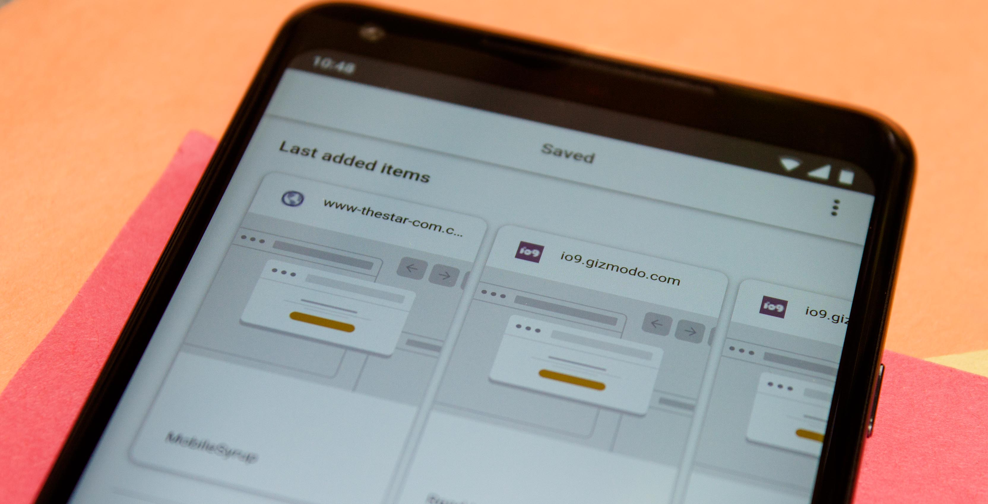
The Google app’s ‘Saved’ feature is getting an update today.
Saved was introduced last October as a bookmarking and read-it-later service in the Google app. Users could save results from within the Google app as well as pictures from image search and Google Maps results.
Now Saved features a new look and a faster saving process.
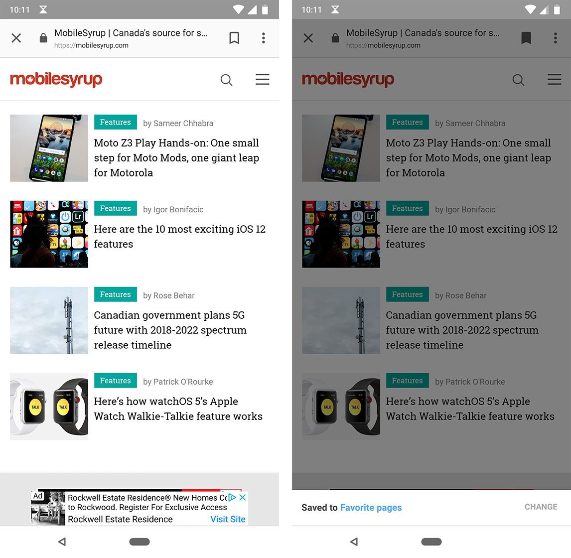
When a user saves something now, it will go to a Favourites folder by default. Users can save an item in a different place if they want.
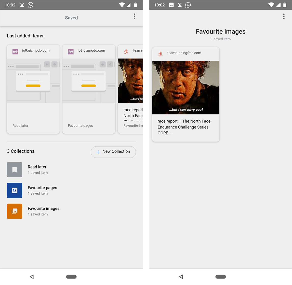
Users can access the Saved page by opening the Google app and tapping the fifth ‘More’ tab. After selecting the Saved option from the menu, users will be greeted with a carousel of recently added items.
Below the carousel is a list of the user’s collections. Users can add new collections as well.
The app has a new look as well. The new look features small, rounded cards. The new cards form two rows. The old style takes the whole width of the phone.
Furthermore, the item’s URL, title and collection are listed alongside a preview image.
Finally, Google removed the option to add notes. A menu also gives users the ability to delete or move items in bulk.
Saved isn’t the most refined as far as bookmarking tools go. However, it’s advantage lies in the integration into Google. The integration makes it much easier to quickly save something for later.
Unfortunately, Saved feels hidden. For me, I use the Google app most through the search bar on my home screen or by swiping into the Google Feed beside my home screen. I can’t access Saved easily from either of those places.
For Saved to really see use, it should be prominent and easy to access right from search. There’s certainly space for it there.
Source: 9to5Google
MobileSyrup may earn a commission from purchases made via our links, which helps fund the journalism we provide free on our website. These links do not influence our editorial content. Support us here.


