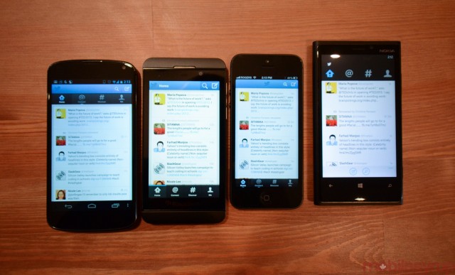
Since the new Twitter for Windows Phone app was released yesterday, I thought it would be a good idea to compare the official apps on all four major smartphone platforms: iOS, Android, Windows Phone and BlackBerry 10.
While there are a number of similarities between them all, both in terms of design and features, it’s clear that iOS and Android have been shown the most love. Not only are they updated regularly, they’re usually updated together, meaning their development cycles are in sync. Windows Phone, on the other hand, has been largely unpredictable, with few major updates coming between the end of 2010 and 2012. BlackBerry 10 launched in January with an official Twitter app pre-installed, but it failed to match its peers in terms of performance, stability and features.
Twitter for Windows Phone 2.0 is a huge improvement over the previous version, and in a refreshing change, doesn’t mimic iOS and Android in design. While it maintains the top navigation bar found on Android, it does away with the blue tab at the top; the homogenous colours between the icons and the menu bar make it appear as if the app is wasting space.
But the app feels like a natural fit on the Windows Phone platform, with easy gesture-based navigation, smooth scrolling and blissfully non-existent loading times. It’s definitely a worthy upgrade, and may in fact replace Rowi as my go-to Twitter app for the platform.
MobileSyrup may earn a commission from purchases made via our links, which helps fund the journalism we provide free on our website. These links do not influence our editorial content. Support us here.


