Gmail for Android has been rumoured to receive a redesign for some time, and some thought that it would even arrive during Google I/O last week. Instead, we were issued a number of refreshed Google apps, including Play Music, Play Magazines, Play Books, Google Earth and others. Among all these refreshed apps was a unified look, with a left-side navigation bar that includes three lines at the top left — referred to internally at Google as the “hamburger.”
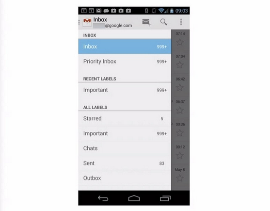
Android Police was looking through some slides from just-released I/O developer sessions and came across a slide showing a newly-updated Gmail for Android interface with, as you may guess, the same left-side sliding bar.
The new look does away with the bottom access bar, bringing the Compose and Search icons to the top right of the screen. There no drop-down action bar to switch between labels, either, as all the main app navigation has been moved to the slide-in menu.
Gmail for Android, while an advanced and competent email client, hasn’t received a significant redesign since October 2011, when Android 4.0 Ice Cream Sandwich was introduced. Since then, the company has largely unified its design language, both for its own apps and for third-party apps across the ecosystem. This upcoming design refresh may look minor, but it’s a significant step forward in terms of functionality and ease-of-use.
Hopefully it gets released soon. What do you think of the upcoming Gmail redesign?
Source: Android Police
MobileSyrup may earn a commission from purchases made via our links, which helps fund the journalism we provide free on our website. These links do not influence our editorial content. Support us here.


