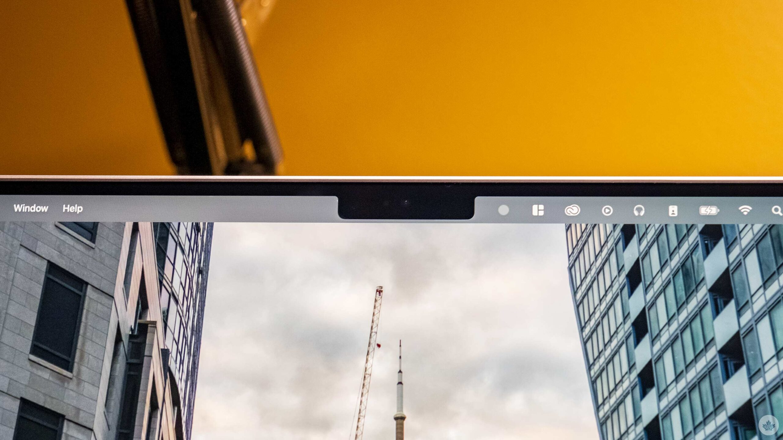
If you’ve seen Apple’s new MacBook Pro (2021), you likely have an opinion on its display notch. While it’s not a significant issue for most people (including myself), there are some inconsistencies in how the notch works.
For instance, if an app has lots of taskbar options, then there’s a chance that you might lose one under the notch, as illustrated by a very joyful Quinn Nelson from Snazzy Labs.
https://twitter.com/SnazzyQ/status/1453143798251339778?ref_src=twsrc%5Etfw%7Ctwcamp%5Etweetembed%7Ctwterm%5E1453143798251339778%7Ctwgr%5E%7Ctwcon%5Es1_c10&ref_url=https%3A%2F%2Fwww.theverge.com%2F2021%2F10%2F27%2F22748371%2Fapple-macbook-pro-notch-issues-inconsistencies-apps
I’d expect most apps that suffer from issues like this will update over the next few months to support the notch, but if you do hate the screen cutout, you can disable it on a per-app basis by clicking get info on an app and selecting ‘Scale to fit below built-in camera.’
You’ll need to be on the latest macOS 12.0.1 to enable the feature. You can watch a demo of the setting in action in a tweet below.
Good news for notch haters! If you've got an app (or apps) with menus that collide with the notch, just Get Info on the app, and enable "Scale to fit below built-in camera".
While the app is running (even in the bg), your display is scaled.#Apple #M1Pro #M1Max #MacBookPro2021 pic.twitter.com/nlGqkFkXAH
— Joseph Angelo Todaro (@Jatodaro) October 27, 2021
As a third-party opinion, I’ll mention that I bought a 14-inch MacBook Pro the other day and I don’t find the notch too distracting. However, I primarily use the laptop hooked up to a display, so most apps appear on the notchless screen.
Perhaps this would be more of an issue if you only used the MacBook screen, but even then, I haven’t run into an app that pushes menu bar items that far toward the centre of the screen.
Source: Quinn Nelson, Joseph from Sketch Via: The Verge
MobileSyrup may earn a commission from purchases made via our links, which helps fund the journalism we provide free on our website. These links do not influence our editorial content. Support us here.


