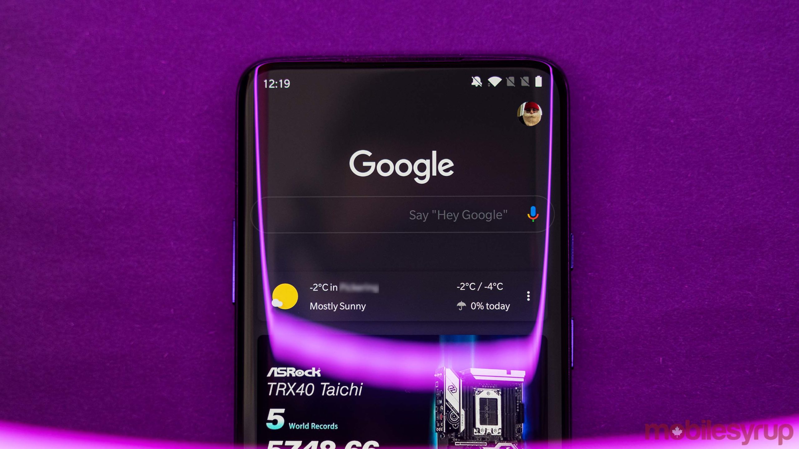
Google is reportedly testing dark mode for desktop web searches, as a few users have encountered the new layout.
9to5Google reports that once dark mode is enabled, the white background switches to a dark gray hue while the Google logo is white as opposed to the standard multi-coloured one. The ‘search by voice’ microphone icon doesn’t change.
The ‘All,’ ‘Images,’ News’ and other filters which are usually colourful appear blue. The black text also appears gray and page names and links appear blue.
Only a few of Google’s desktop webpages have a dark mode option, including YouTube. A dark mode for desktop web searches could be a nice feature for those who favour the option over standard light themes.
It’s worth noting that Google is simply testing the feature now and that it hasn’t rolled out widely. It’s currently unknown whether Google plans to expand the test to more users, but it wouldn’t be surprising if there’s a wider rollout in the coming months.
Source: 9to5Google
MobileSyrup may earn a commission from purchases made via our links, which helps fund the journalism we provide free on our website. These links do not influence our editorial content. Support us here.


