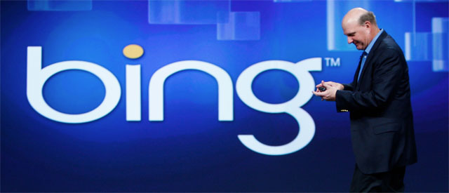
Earlier in the week, we saw Alphabet introduce a new logo for its Google X subsidiary, which, as part of a broader rebranding effort, became known simply as X. Now, Alphabet’s main search competitor, Microsoft, has followed suit and given its search engine a new logo.
More of a slight tweak than complete redesign, the new Bing logo ditches the yellow of its previous iteration for a more readable teal. The proper noun is also now at long last properly capitalized, and the stylized “b” preceding the name looks less like a swan rotated 90 degrees. Microsoft last updated the search engine’s logo in 2013. Its evolution can be seen below.
In an interview with Ad Age, the publication where Microsoft unveiled the new logo, Rik van der Kooi, Microsoft’s corporate VP of advertiser and publisher solutions, reaffirmed the company’s commitment to search, stating Microsoft is “all in on search.”
“We expect Bing to continue to grow and are thrilled with our trajectory,” he added. “We are the only search engine that is experiencing steady, consistent growth and have increased our share for 26 consecutive quarters. And we’re not slowing down.”
[source]Ad Age[/source]
MobileSyrup may earn a commission from purchases made via our links, which helps fund the journalism we provide free on our website. These links do not influence our editorial content. Support us here.


