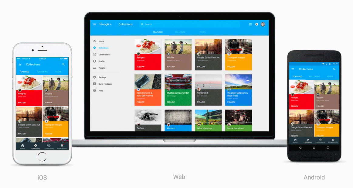
Over the next little while, Google will being to rollout a new redesign for its hardsocial network, Google+. The new user interface focuses on the social network’s Communities and Collections features, two aspects of the product that are well liked by users who have stuck with it.
“Now focused around interests, the new Google+ is much simpler. And it’s more mobile-friendly—we’ve rebuilt it across web, Android and iOS so that you’ll have a fast and consistent experience whether you are on a big screen or small one,” says Eddie Kessler, the director of streams at Google, in the blog post announcing the redesign.
For the time being, those that want to check out the new design will need to opt in by following the instructions found on this Google+ page. An update that brings the new user interface to both the Google+ Android and iOS app is set to release in the near future.
[source]Google[/source]
MobileSyrup may earn a commission from purchases made via our links, which helps fund the journalism we provide free on our website. These links do not influence our editorial content. Support us here.


