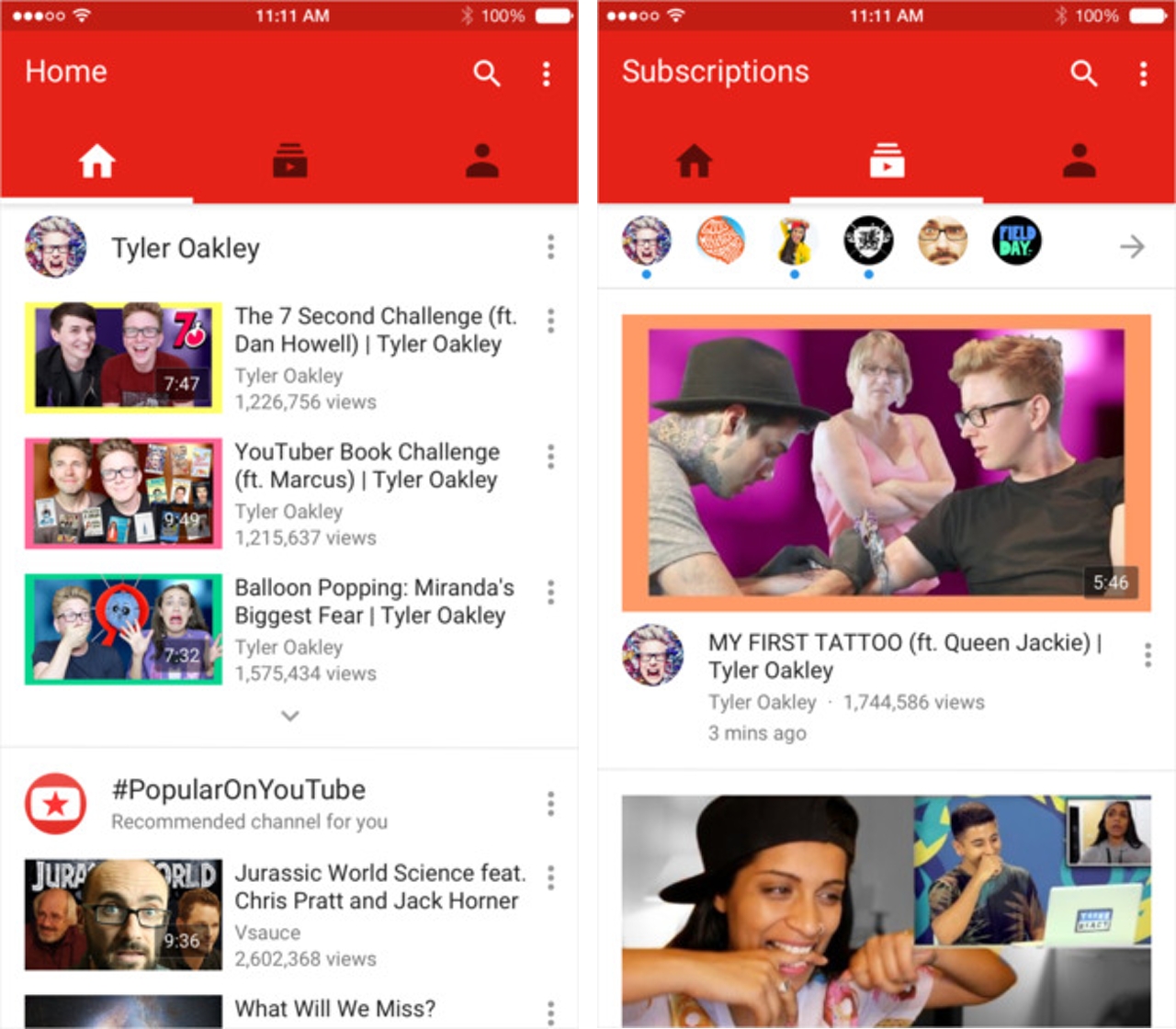
Google has just released a major update for its iOS YouTube app.
Inspired by its Android counterpart, the new app features a Material Design-inspired user interface — as well as a new icon — and is divided into three subcategories: Home, Subscriptions and Account.
The home sections functions much like its web counterpart, showcasing videos that are currently popular on the site, as well as any content the app thinks you will be interested in watching. The Subscriptions section, like the name suggests, contains recent videos from any channels you follow. Lastly, the Account section is where users can access information like their watch history and see any playlists they’ve made in the past.
In addition to featuring a new redesign, Google has updated the app to include in-app video editing functionality. With the limited amount of time I’ve had with the app, it’s fair to say that anyone that’s serious about uploading their videos to YouTube will continue to use dedicated editing software. However, I can see this functionality being useful to those who need to upload a video quickly — in the case of breaking news, for example.
As always, the YouTube iOS app can be downloaded from the iTunes App Store for free.
What do you think of the redesign?
[source]App Store[/source]
MobileSyrup may earn a commission from purchases made via our links, which helps fund the journalism we provide free on our website. These links do not influence our editorial content. Support us here.


