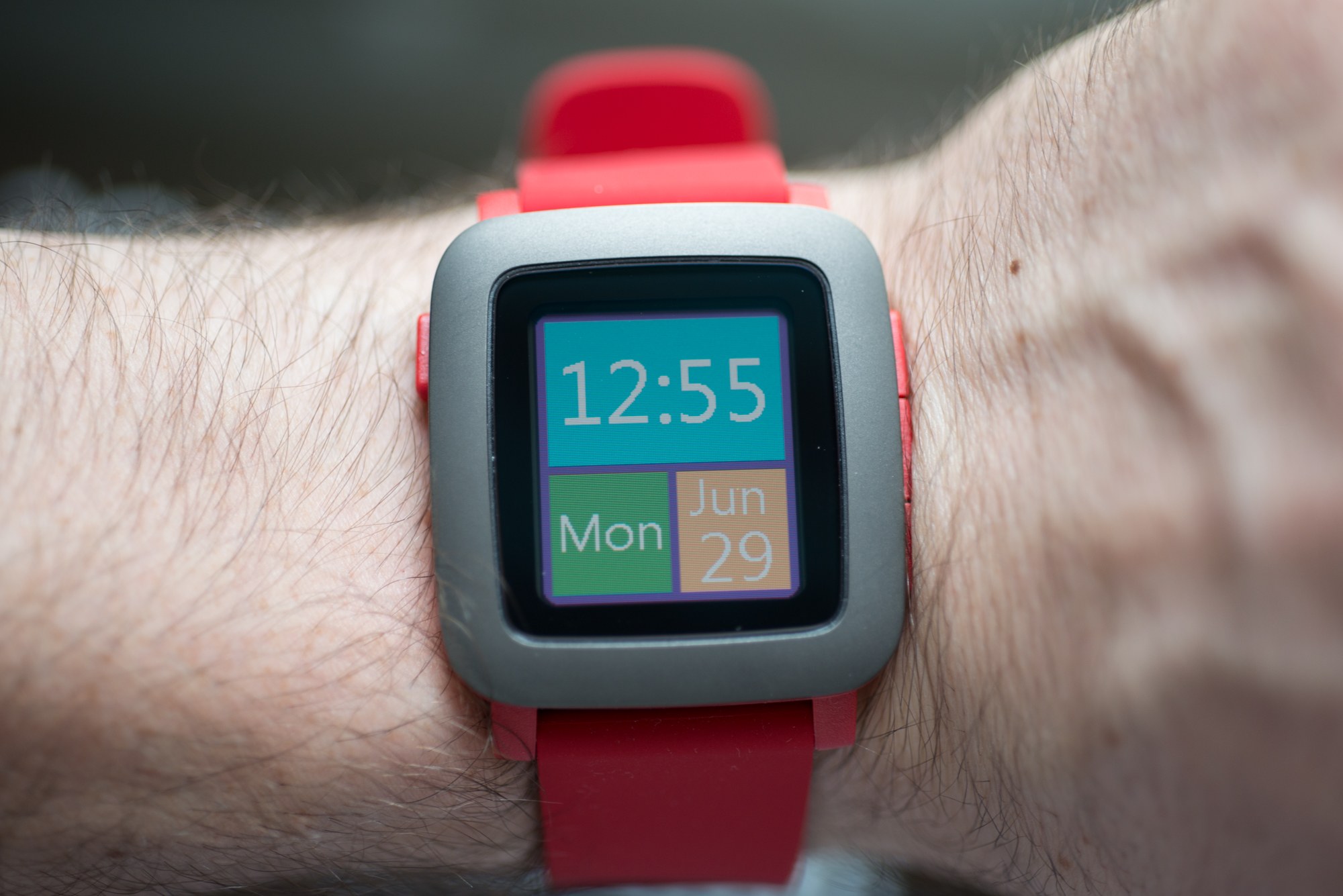
The last year or so has seen an unprecedented amount of interest in wearables, and smartwatches in particular.
But unlike your smartphone, the necessity of a smartwatch is questionable, and the utility often superficial.
The diehards, however, say that once a smartwatch has been integrated into your life, it becomes an invaluable part of its workflow. And Pebble has perhaps the most diehard fans of all.
With the Pebble Time, can the company maintain the momentum it gained from its original smartwatch, released in early 2013? And does it stack up to the current crop of devices from Apple, Samsung, Motorola, LG and other big names? There’s only one way to find out: by wearing the crap out of it.
What Works
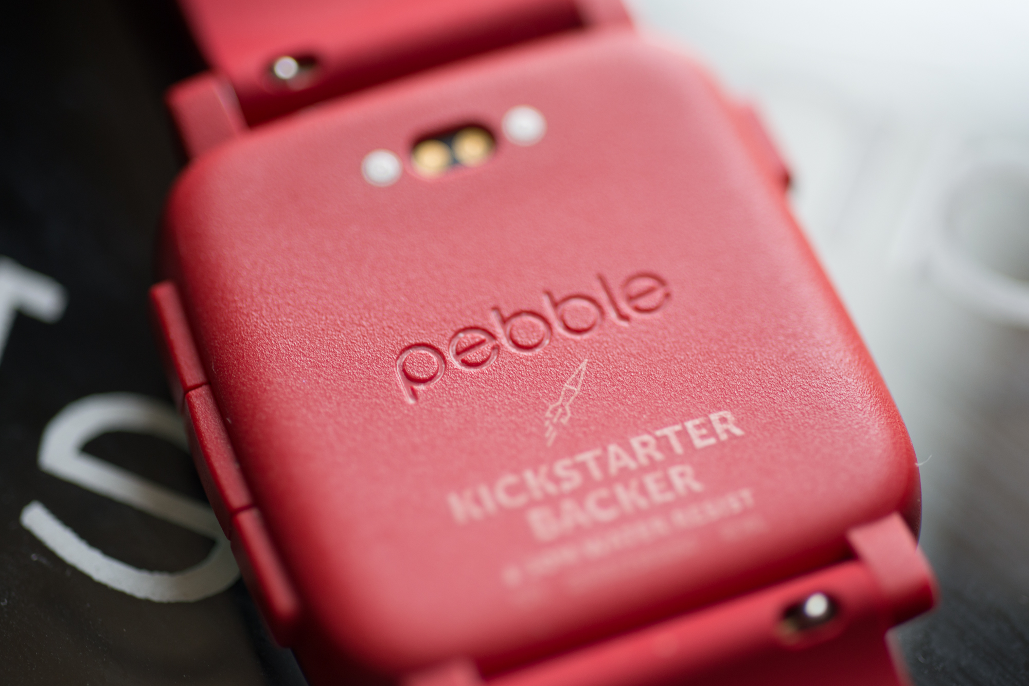
The Pebble Time is a lightweight, water resistant smartwatch with an emphasis on two things: readability and battery life. Those tenets, which were a boon to the first generation Pebble and its more streamlined counterpart, Pebble Steel, are still present here, with a couple of tweaks and improvements.
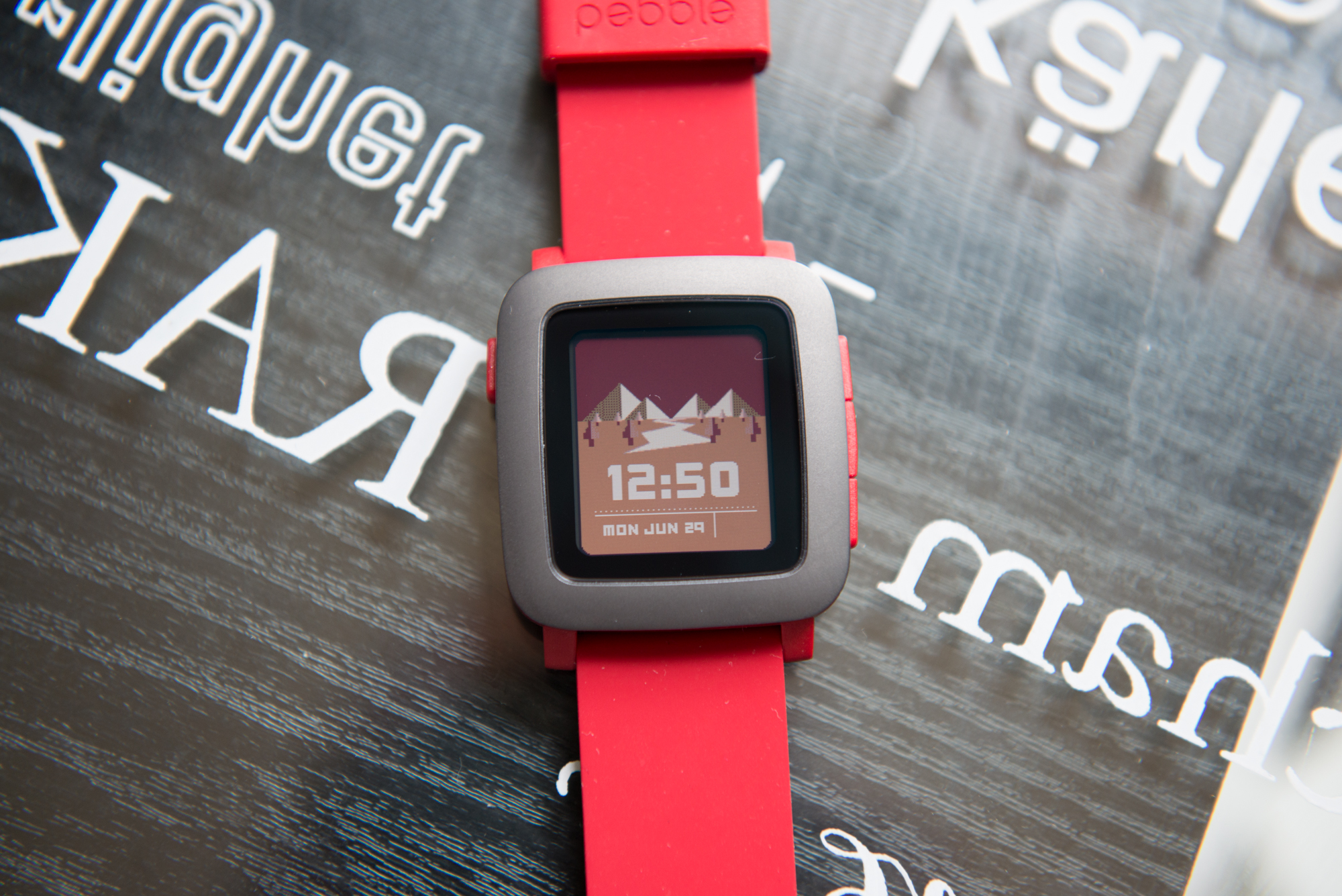
The device still lasts up to seven days on a single charge, but in many cases I received eight to nine days without plugging in. It also has a new colour epaper display that, while catching up to the pack in some ways, disappoints in the realm of contrast and outdoor readability.
The outside of the device is made up of a plastic casing with a stainless steel trim. The screen, embedded within a secondary bezel, is small, but its always-on nature forgives its size. That it is epaper makes it particularly easy to read, since it has much higher levels of contrast than traditional LCD or OLED displays. The colour palette isn’t particularly good – every hue looks like it’s been drowned in sand – but it’s more versatile than the four-shade reality of the original. Ironically, the best experience is still on black and white (or black and grey, more accurately).
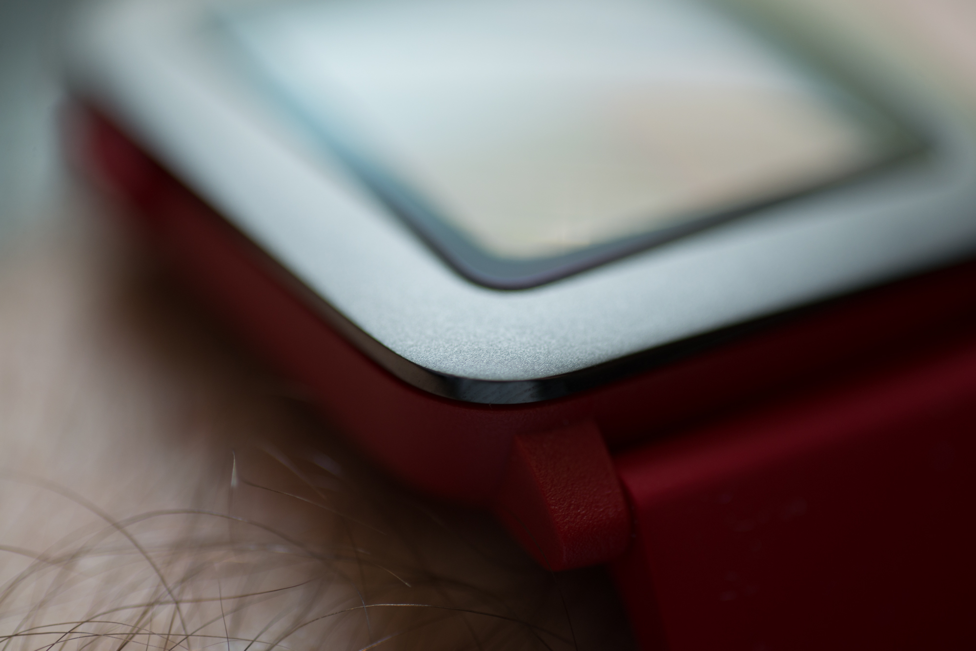
My red version looks a bit juvenile, more like a toy than a premium wristwatch, but Pebble has embraced this “gadget” aesthetic with aplomb, and it’s paid off: I’ve begun to truly enjoy its presence on my wrist. That said, I wouldn’t wear it to a wedding.
The chassis is much thinner than the original’s which, combined with its lightweight nature, helps it practically disappear on the wrist. The four buttons, which stand in for touchscreen navigation, feel considerably more balanced than the original’s, too, less squishy and more punchy.
Pebble has also performed a major update to the software on the Time which, combined with a faster processor, gives the smartwatch a sense of spriteliness and movement that was distinctly lacking from the first-gen model. This initially shows itself in the animations peppered throughout the UI, but it’s also apparent in the immediacy of app loading and watch face cycling.
Speaking of apps and watch faces, the Pebble Time greatly benefits from its new software in those regards. The colour screen allows for much more interesting watch faces, and the improved developer tools have made it easier to design ones with animations and integrations.
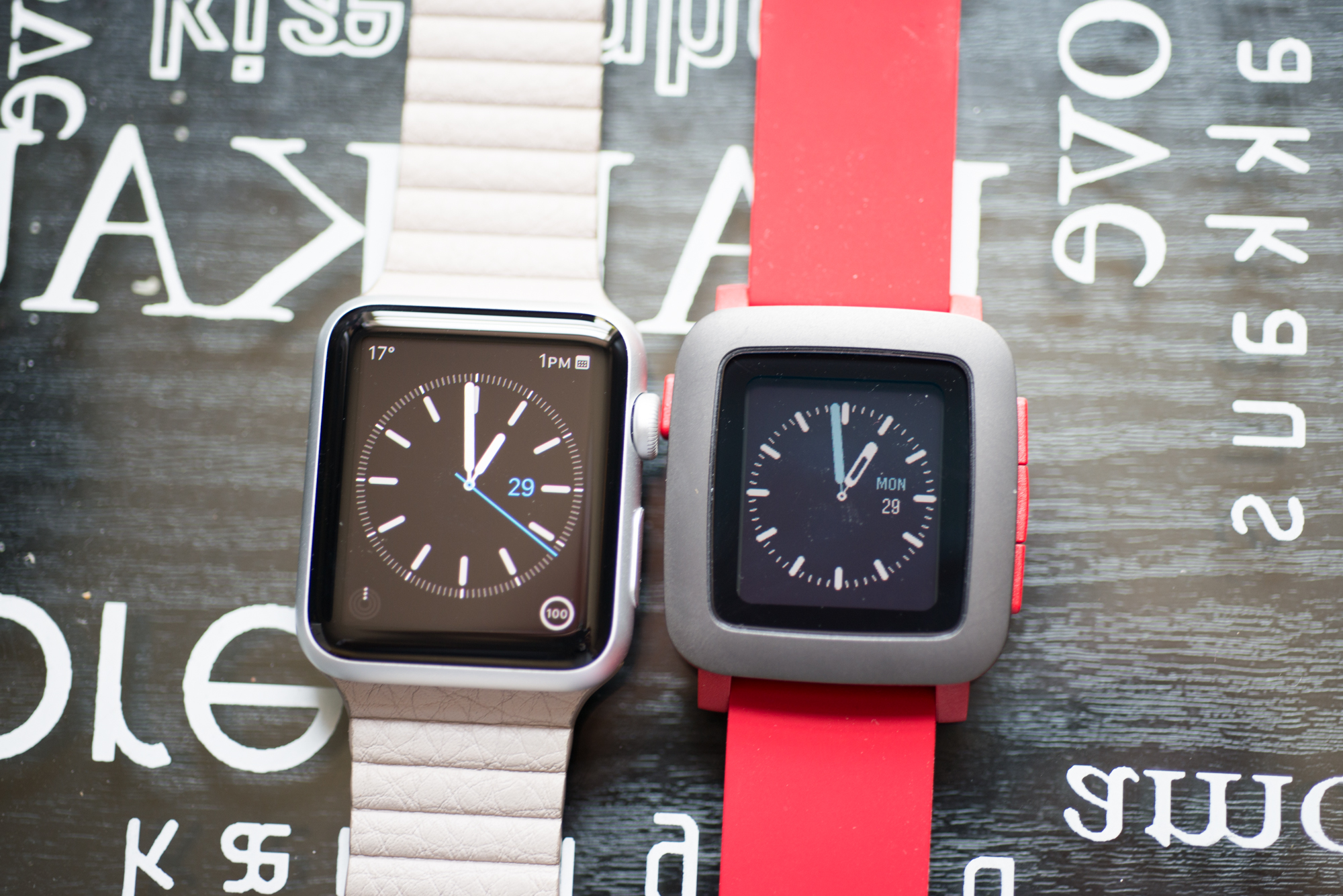
While there are some nice branded watch faces, most of the best ones come from individuals with a passion for the platform, which is in contrast to Google’s partner strategy on Android Wear. There’s also something comforting about being able to see the movement of a seconds hands at all times, which contrasts with both Apple Watch and Android Wear. It’s a great timepiece.
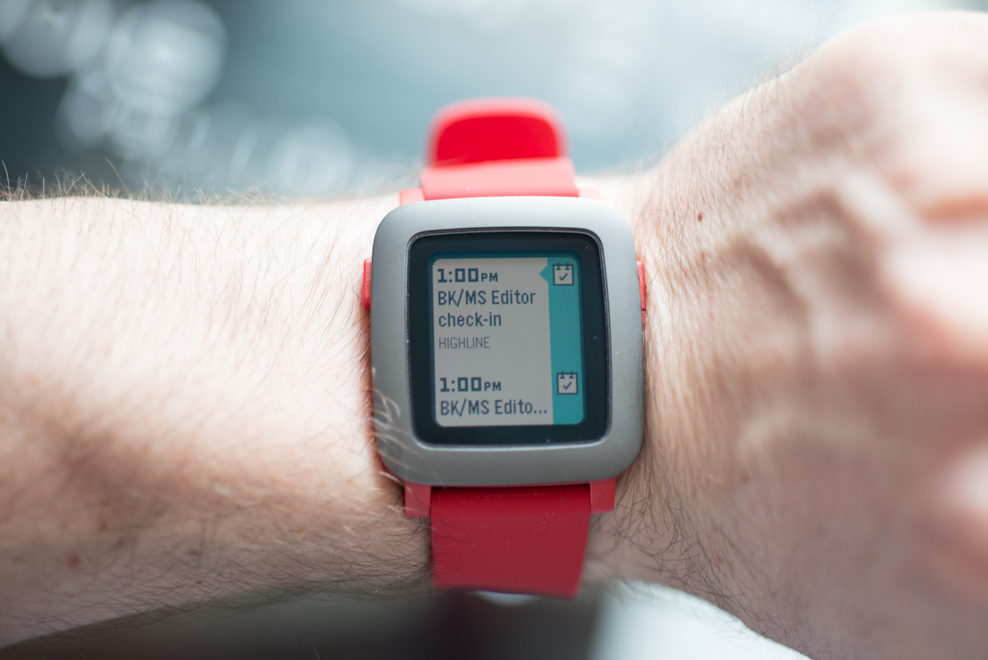
And while apps are a big part of the Pebble Time experience, with over 7,500 to choose from, many of them haven’t been updated to support Timeline, a major tenet of the company’s new operating system. See, Pebble allows developers to tap into its chronological overview of major events, which by default conveys meetings and other important events on the main display.
Pressing the bottom button from the watch face shows the next upcoming meeting and, perhaps if the ESPN app is installed, for instance, the next Blue Jays game. As more apps are updated to support Timeline, the experience is sure to improve, but as it stands it’s merely a convenient way to check upcoming meetings.
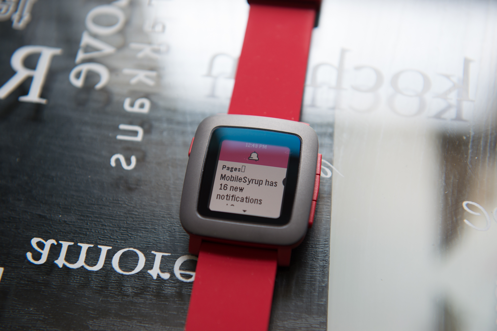
Of course, one buys a smartwatch for notifications, and the Pebble still does those about as well as any device. This time, Android has a distinct advantage over iOS, as Apple still limits the Pebble to seeing and dismissing only the notifications sent to the iPhone itself; unlike with the Apple Watch, there is no granularity in what notifications are shown, nor the ability to action them should the app support it.
The Pebble Time on Android uses the Android Wear API to emulate much of the same experience as one would find on a Moto 360 or LG Watch Urbane. Users can reply to texts or Hangouts messages using canned responses, or using voice, via the newly-added microphone.
There’s a greater sense of control when pairing the Pebble Time with an Android device, and it no longer appears like Pebble has to struggle to keep the device connected, like it did shortly after Android 4.3 was released; Lollipop has cleared up many of Android’s connectivity problems at a system level. You’re still at the whim of the system for notifications, and because Android bundles notifications from the same app – “You’ve received 2 tweets” – you often can’t see the content, which is a problem.
What Needs Work
The Pebble Time feels like it’s very much a smartwatch, not a computer on your wrist the way a Moto 360 or Apple Watch does. That can be a good thing – it’s simpler, and doesn’t require daily charging – but to me it was a distinct step back after using those two platforms for months.
The main issue is that the Time feels, well, anything but timeless. Looking at a Moto 360 or Apple Watch, despite both being first-generation devices, conveys a sense of gravitas and high design; the Pebble Time looks like a bit of a toy.
At $249 CAD, it’s significantly cheaper than many smartwatches out there, but not enough to be a key differentiator in one’s buying decision. No, the success of the Pebble Time’s Kickstarter came from an audience embedded in the company’s beginnings; it’s continued success will need to come from the outside, from people choosing it over the equivalent Android Wear or Apple Watch.
The upside
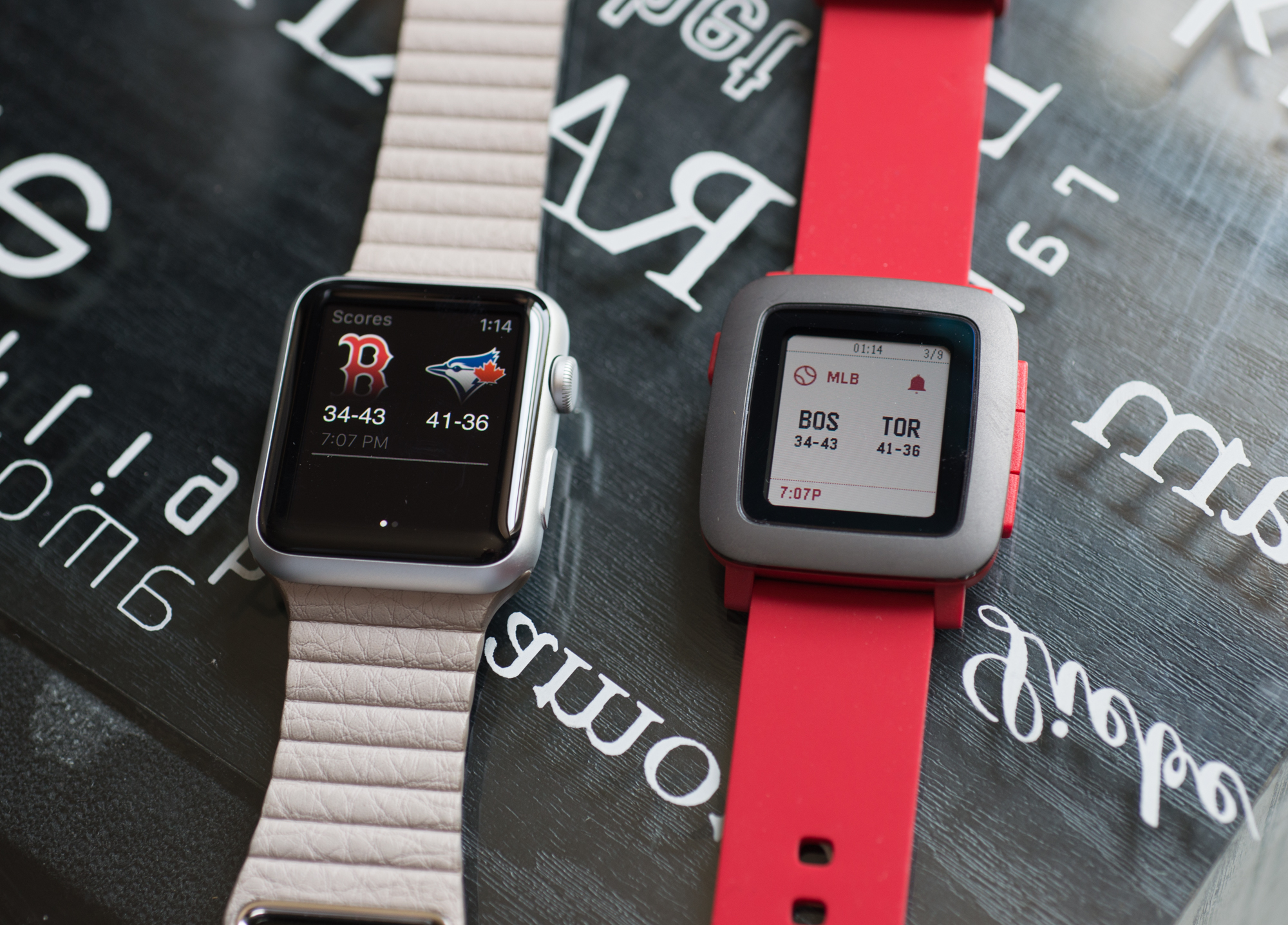
The developer community is fiercely loyal to Pebble, too, and the apps that are on the device – Runkeeper, Swarm, ESPN – are good, if simplistic. But the more I think about it, that’s all I want them to be. I don’t need flashy animations and deep features, I just need the ESPN app to load quickly so I can check the Jays score and get back to my meal, or check in to this restaurant and return to my conversation.
And because the Pebble app on the iPhone and Android is considerably better now than it used to be, administering the smartwatch, be it to add additional apps or watch faces or, on Android, select which apps send you notifications, is a breeze.
Pebble does have a key advantage over most other smartwatches in that it works on both Android and iOS (at the same time, if you’d like!). While it works much better, and is far more enjoyable, on Android, it can seamlessly go between the two different platforms without losing much in the process – most apps and watch faces are transferrable, but the notification feature set is more robust on Android – is a great thing.
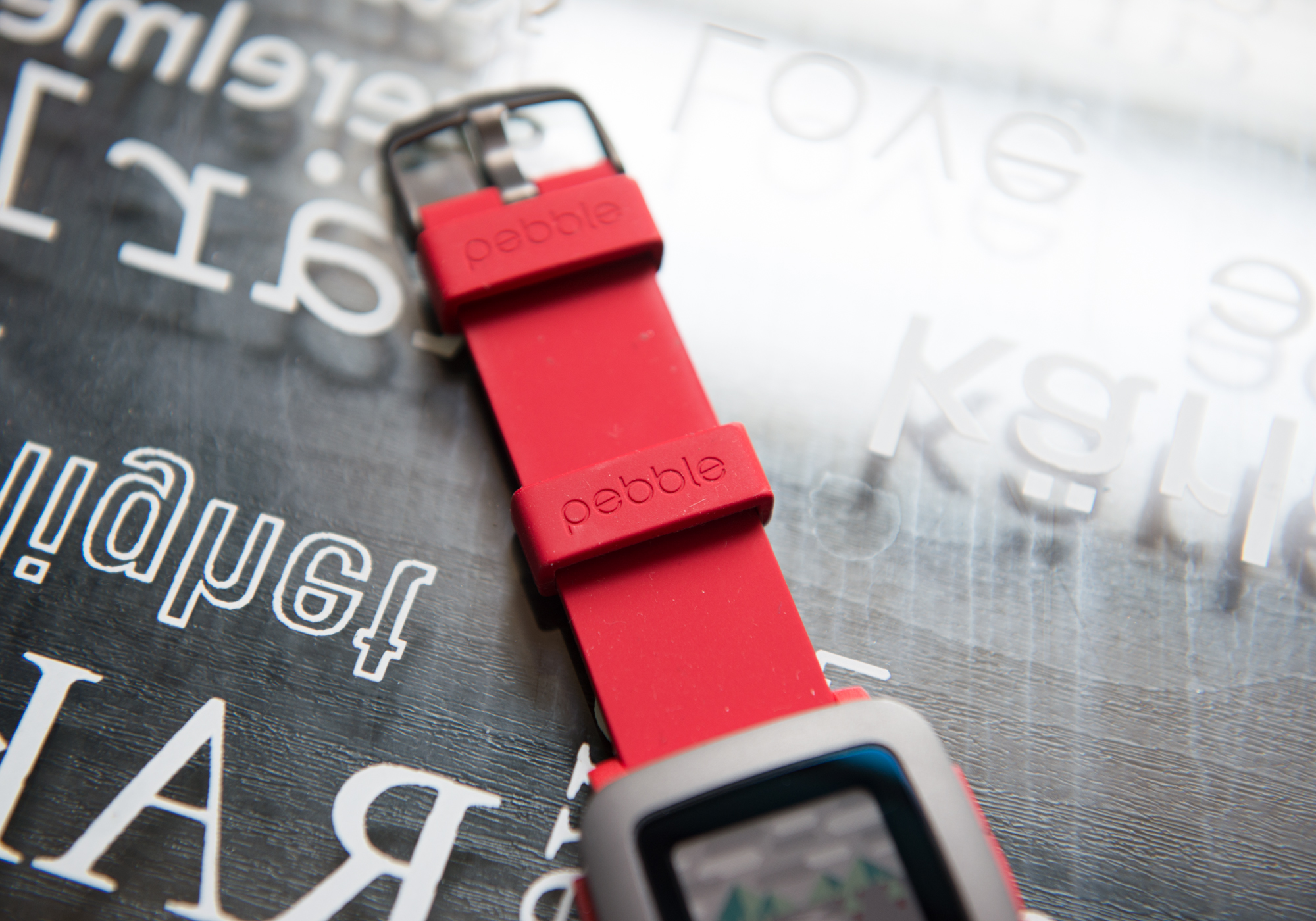
I like the Pebble Time despite its youthful look. I think it’s a great watch that has some decent “smarts,” but its intelligence is not quite at the level of Apple’s and Google’s more robust platforms. Still, its epaper display and seven-day battery life let it act more like a real watch (it’s also water resistant, and its straps can be changed) than either of its main competitors.
The Pebble Time really has me interested in the Pebble Time Steel, slated for shipment later this month. It is in that more premium (and expensive) second smartwatch that I will hopefully see the company live up to its potential. As it stands, while I wouldn’t take the Pebble Time to a wedding, it’s great in just about every other situation.
Pros
- Always-on screen
- Excellent sunlight readability
- Industry-leading battery life
- Big software improvements over first-gen Pebble
- Timeline is a great way to navigate a smartwatch
- Some decent apps and watch faces
Cons
- Feels cheaply made despite its $199 USD / $249 CAD price
- Lacks mainstream developer support compared to Apple and Google
- Poor contrast when displaying colour
- Low-resolution display
- Buttons feel low-tech compared to touch and Digital Crown
MobileSyrup may earn a commission from purchases made via our links, which helps fund the journalism we provide free on our website. These links do not influence our editorial content. Support us here.


