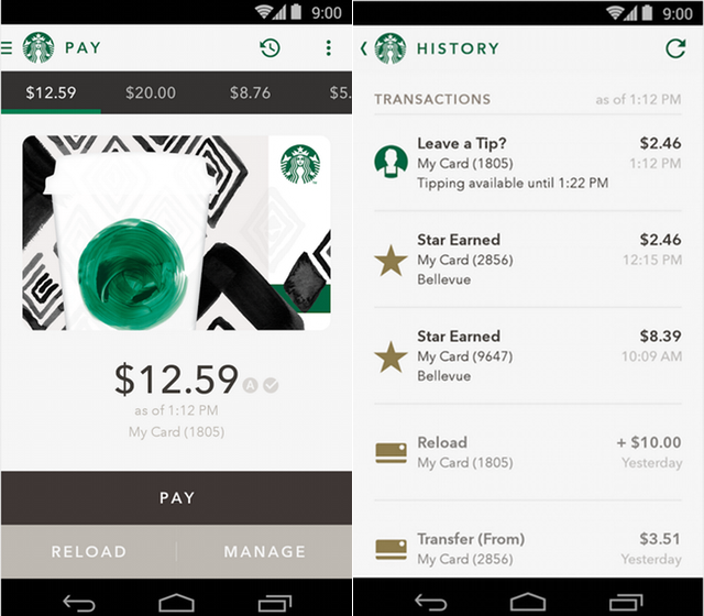
Starbucks has finally brought the design overhaul to its Android app that was promised back in February for the spring season.
With a new interface, shake-to-pay, a more comprehensive history view and plenty of design flourishes, the update was worth the wait.
Canadians don’t have access to the Digital Tipping platform that went live earlier this year in the U.S., but customers will be pleased with the smooth payment process and the updated widgets, which feel significantly more native on the Google Now Launcher.
Earlier this month, Starbucks said that in-app mobile payments now comprise over 15% of its total sales, with 6 million users engaging with it every month.
[source]Google Play[/source]
MobileSyrup may earn a commission from purchases made via our links, which helps fund the journalism we provide free on our website. These links do not influence our editorial content. Support us here.


