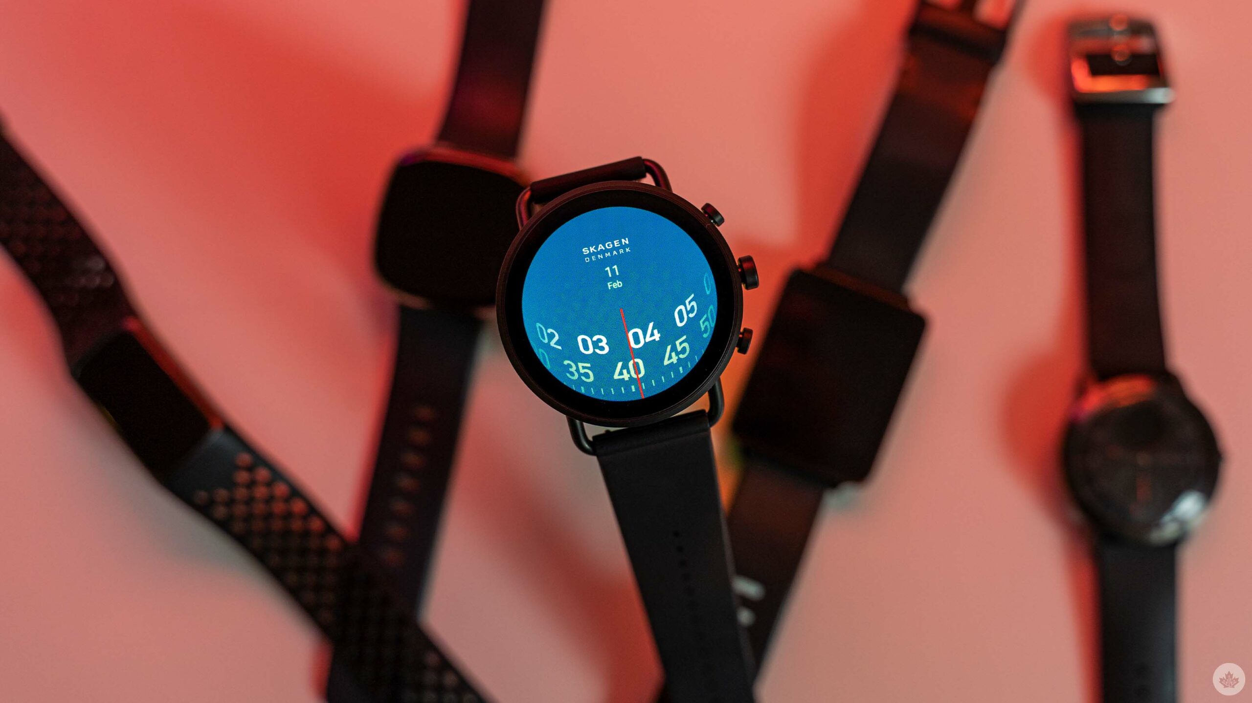
During CES 2022, I wrote about Fossil’s Gen 6 Wear OS smartwatch — the company joined forces with Razer and Skagen to release special versions of the Gen 6 watch with exclusive watch faces and wrist bands. Fossil sent me one of the Skagen Flaster Gen 6 smartwatches to try out and it was thoroughly disappointing.
To be clear, the hardware is fine. Excellent, even. Beyond a few nitpicks, I quite like the Falster. I could definitely see myself happily wearing it if Wear OS wasn’t so awful. Most of the blame lies with Wear OS, although some definitely falls on Fossil for reasons I’ll get into below.
One other important note: The Skagen Falster edition of the watch isn’t available in Canada (at least, not that I could find). That said, aside from some aesthetic differences with the hardware and gratuitous Skagen branding throughout the software, the watch is basically identical to the Fossil Gen 6, which is available in Canada. Much of what I say throughout the article applies to both versions of the watch.
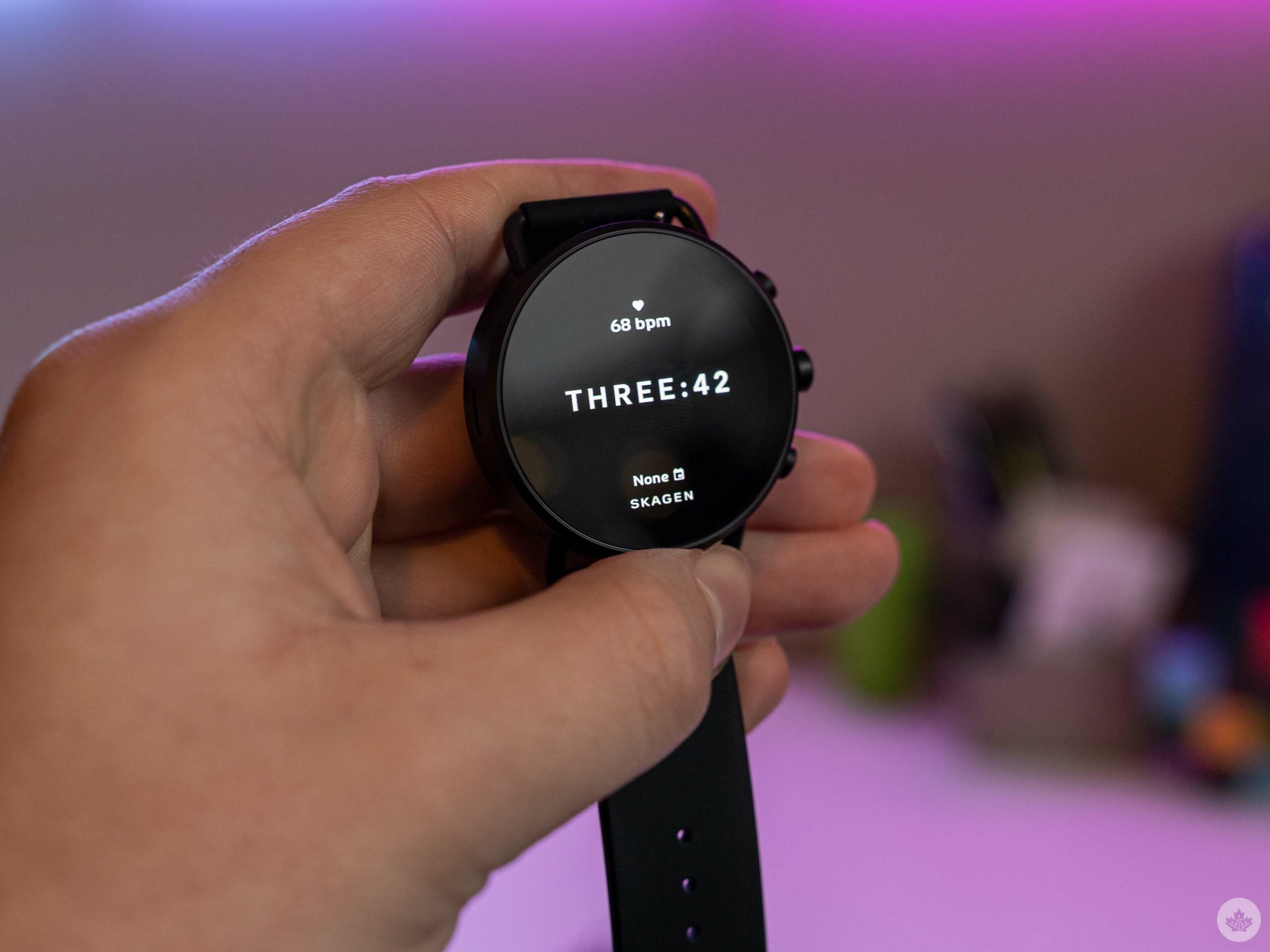
The Gen 6 watch I tried runs the current version of Wear OS, not the fancy new Wear OS 3 seen on Samsung’s new smartwatches and set to get a wider release sometime in 2022. I’m looking forward to revisiting the Falster when that update arrives in the hopes that it might fix the myriad of problems with Wear OS.
This isn’t a review of the Falster Gen 6. Instead, it’s a collection of thoughts on my experience using the smartwatch — my first Android-powered smartwatch since 2014’s LG G Watch running Android Wear — and some hopes for what Google will do with Wear OS 3.
I’m going to focus on two main areas; the hardware, which I generally like, and the software, which leaves much to be desired.
One of the nicest smartwatches I’ve used
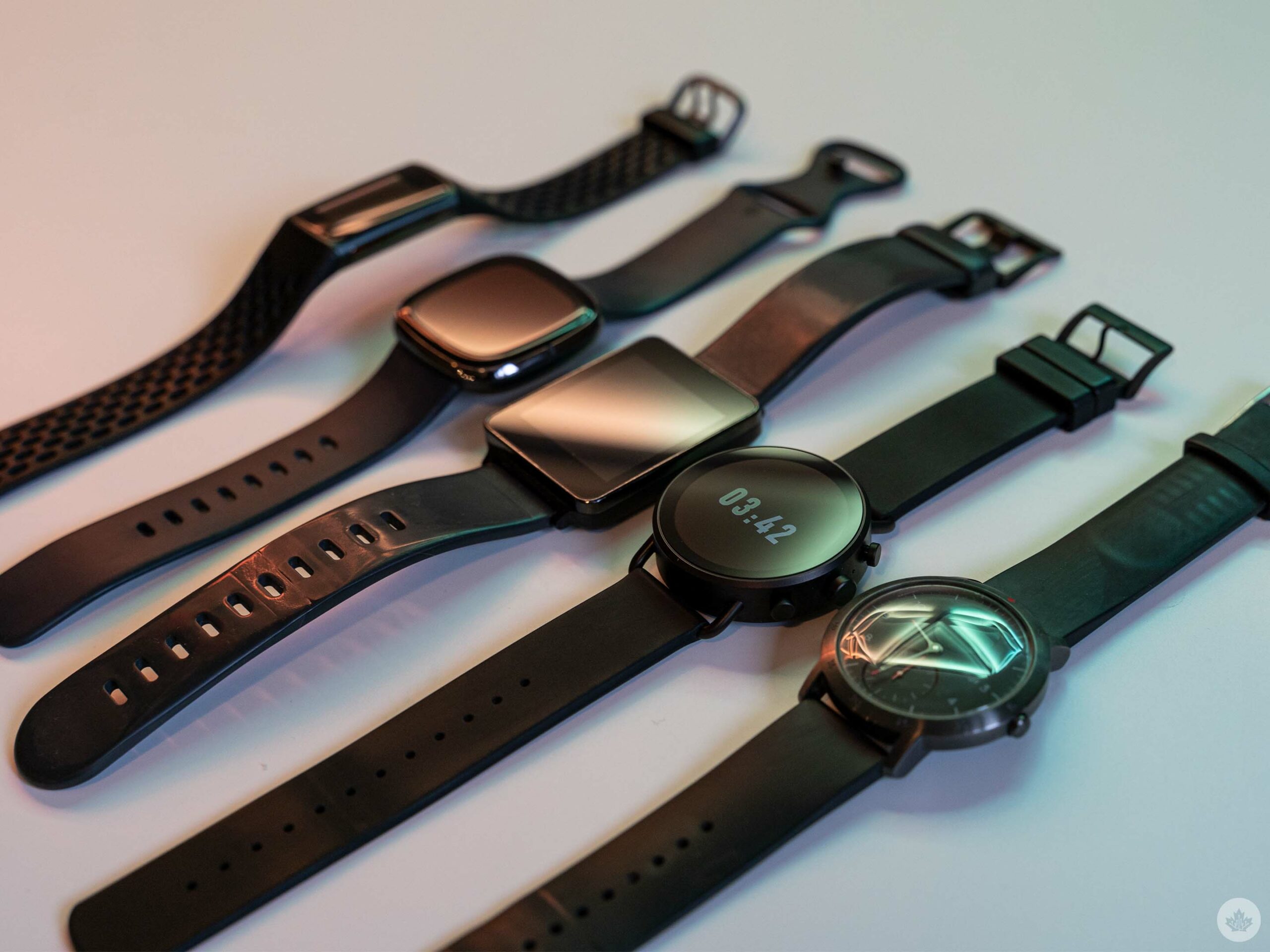
From left to right: Fitbit Charge 5, Fitbit Sense, LG G Watch, Skagen Falster Gen 6, Withings Steel HR Sport
The Fossil Skagen Falster Gen 6 smartwatch (what a mouthful) is a lovely piece of hardware. I think it has a clean look and simple, but elegant, design. I like the matte black finish — it feels nice to the touch, and while it does show fingerprints and smudges, it isn’t terrible in that regard.
One of my few complaints about the watch hardware involves the wrist strap, which has a ribbed design that easily catches the latch and can make it difficult to do up the strap. Still, it’s a minor complaint, and one easily resolved by getting a different band.
Moreover, the buttons on the watch are tactile and clicky. They feel great to press and, thankfully, I found I didn’t accidentally press them often. The Falster watch has three buttons on the right side. The upper and lower buttons can be customized to launch different watch apps or features (by default, the top button launches activity tracking and the bottom launches Google Pay).
The middle button serves multiple functions; clicking it launches the app menu or serves as a back button if you’re in an app, and a press-and-hold launches Google Assistant. Users can twist it to scroll through lists — I wish the knob offered some tactile feedback for this, but it works fine as is. Weirdly, I was able to easily twist all three buttons, but only the centre one registered twisting as an input.
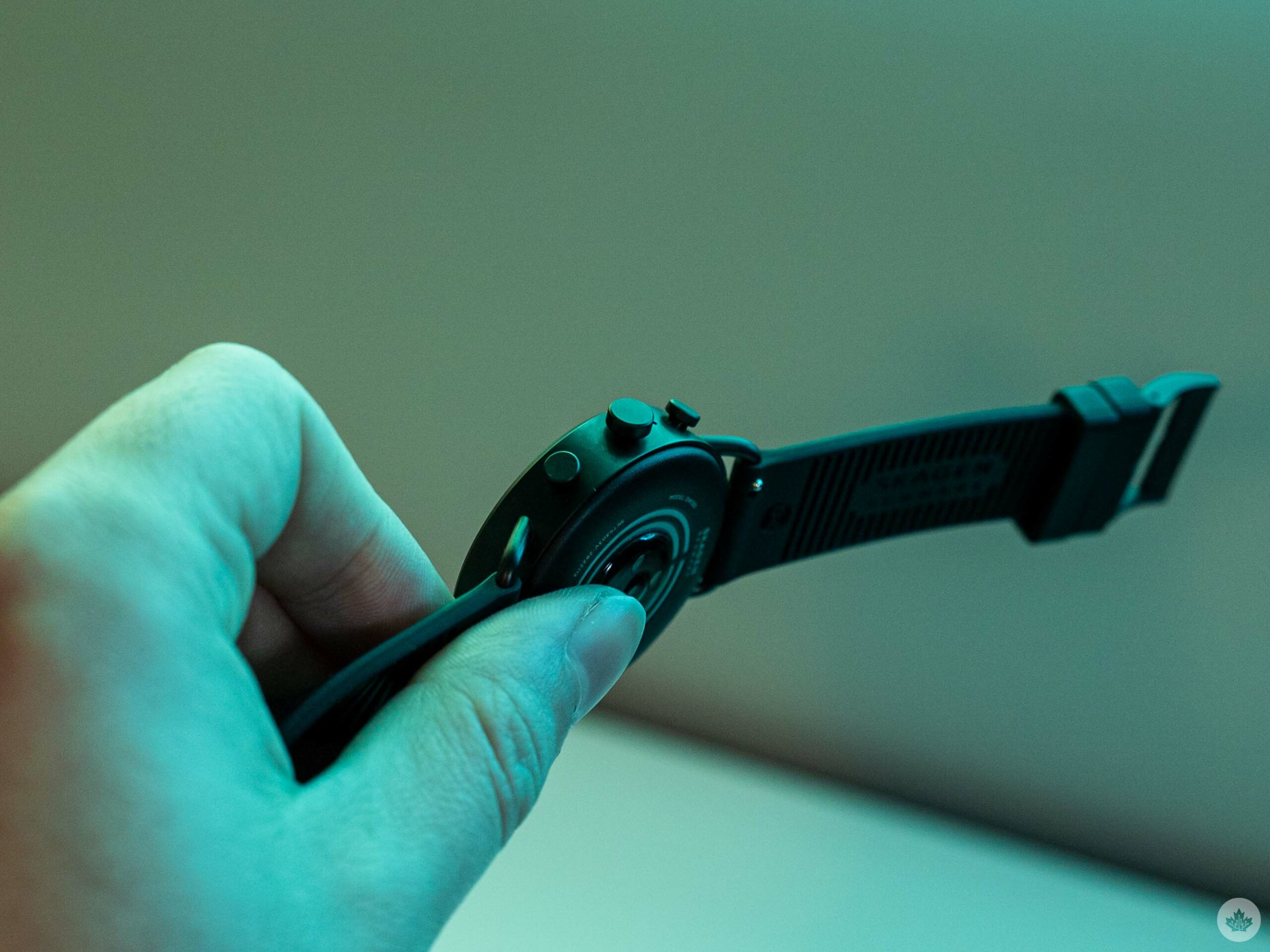
Another minor complaint: the watch body is thicker and heavier than I prefer. After wearing the Falster for a few days, I grew accustomed to the weight. However, I’d still prefer something lighter and thinner, especially because I have fairly small wrists. Unlike some other smartwatches I’ve tried, I also found the Falster uncomfortable to wear while typing — something I spend most of my day doing.
All things considered, I quite like the Falster hardware and would put it ahead of other watches and fitness trackers I’ve tried, including the Fitbit Sense and Charge 5, Withings Steel HR Sport, and the original LG G Watch. To be fair, I haven’t tried an Apple Watch or any of Samsung’s smartwatches, so I can’t speak to how the Falster stacks up to those.
The nicest hardware in the world can’t fix Wear OS
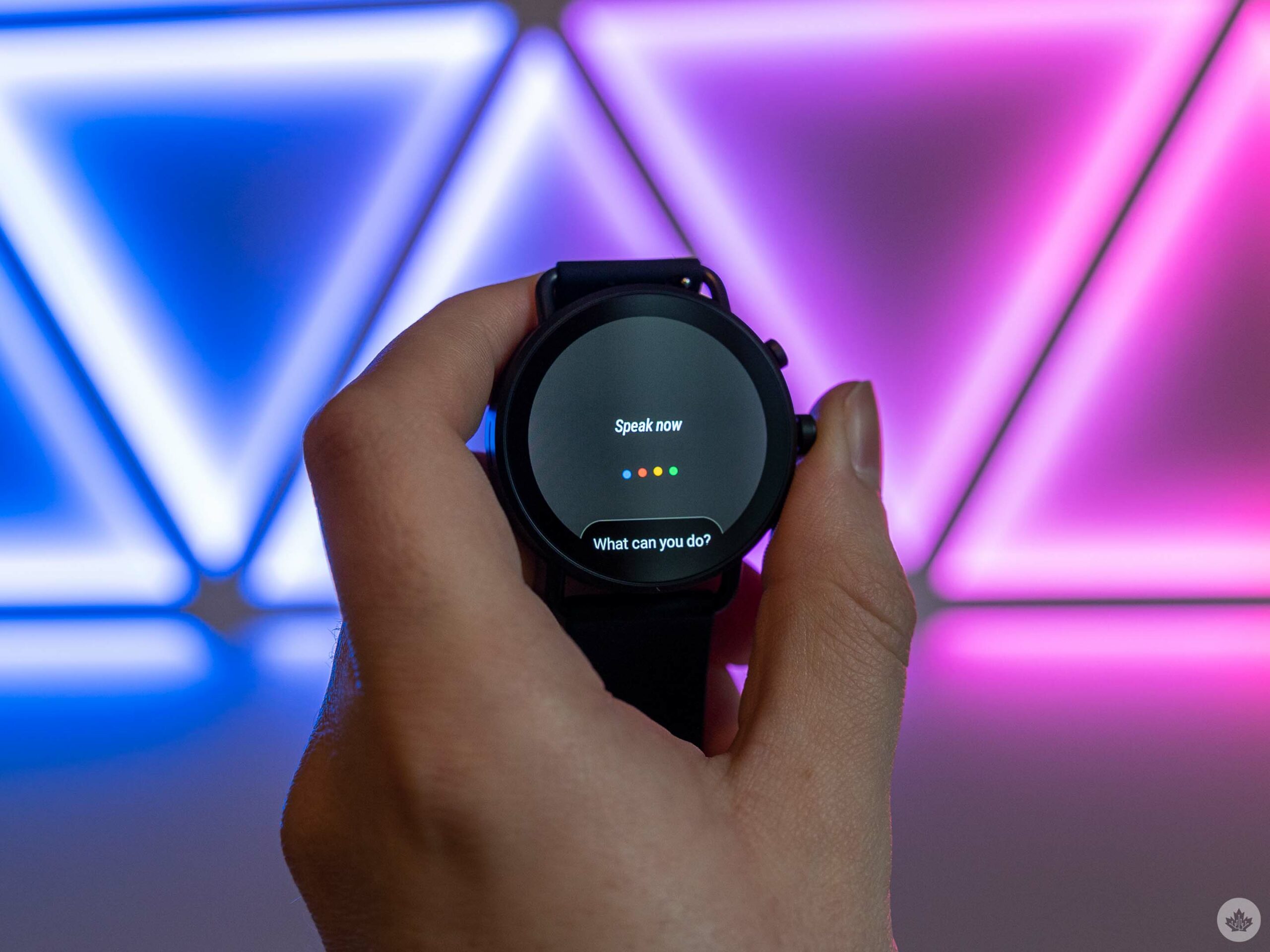
The first thing I did after taking the Falster out of the box was connect the charger and initiate the set-up process so I could connect it to my phone. The first thing the Falster did was lock up on a spinning screen after I selected a language. It failed to progress beyond that and, after waiting close to 30 minutes, I found myself searching online for ways to hard reset the watch.
That should have been my first clue that my experience with Wear OS wasn’t going to be good.
After resetting the watch, I was able to complete the setup process. The second time was a little better, although the watch repeatedly pestered me to connect my Google Account for Assistant even after I’d already completed that step and used Assistant.
Beyond bugs and glitches in the set-up process, Wear OS was often slow and choppy. Plus, getting some of the watch’s features to work properly required jumping through far too many hoops. My first annoyance: in classic Android fashion, Wear OS had two of nearly every fitness app. There were Google Fit apps for things like heart rate tracking and exercise, and then Fossil apps for the same things. Additionally, Fossil’s apps all had the capability to link into Google Fit, which largely made having two versions redundant.
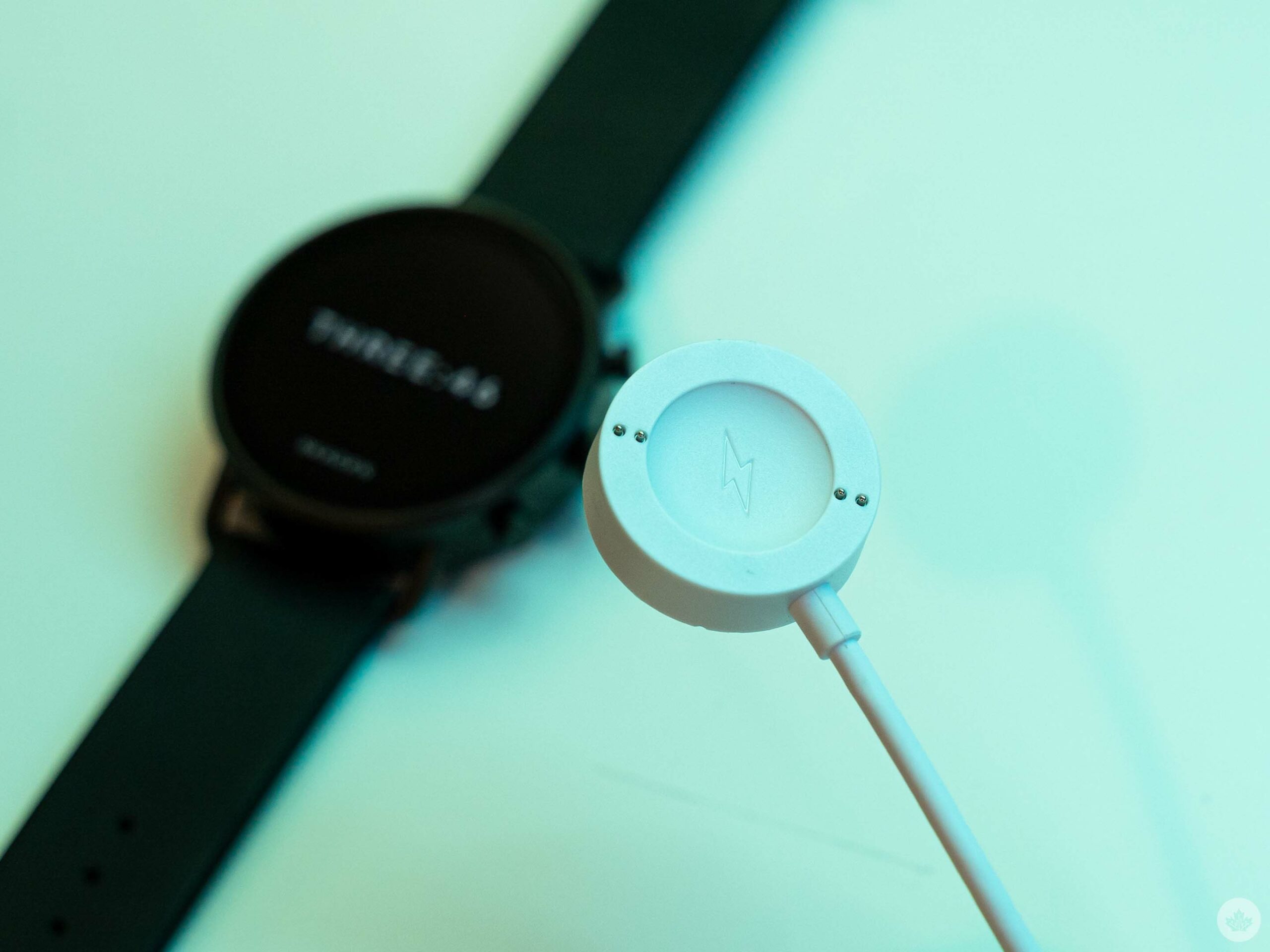
For the most part, functionality overlapped between these apps. However, not for everything — sleep tracking, for example, was a frustrating one to set up. It involved connecting various watch apps to my Google account, which wasn’t particularly easy on a small display. It took me a few nights before I managed to get reliable sleep tracking out of the watch. Once I got it set up right, it did work well.
It’s frustrating after using fitness trackers and smartwatches from companies like Fitbit or Withings, where these things largely worked out of the box, or at most required toggling on a setting. No one should have to dig through settings menus just to enable advertised features of a gadget, especially if you have to do it on a tiny watch screen.
The more things change, the more they stay the same
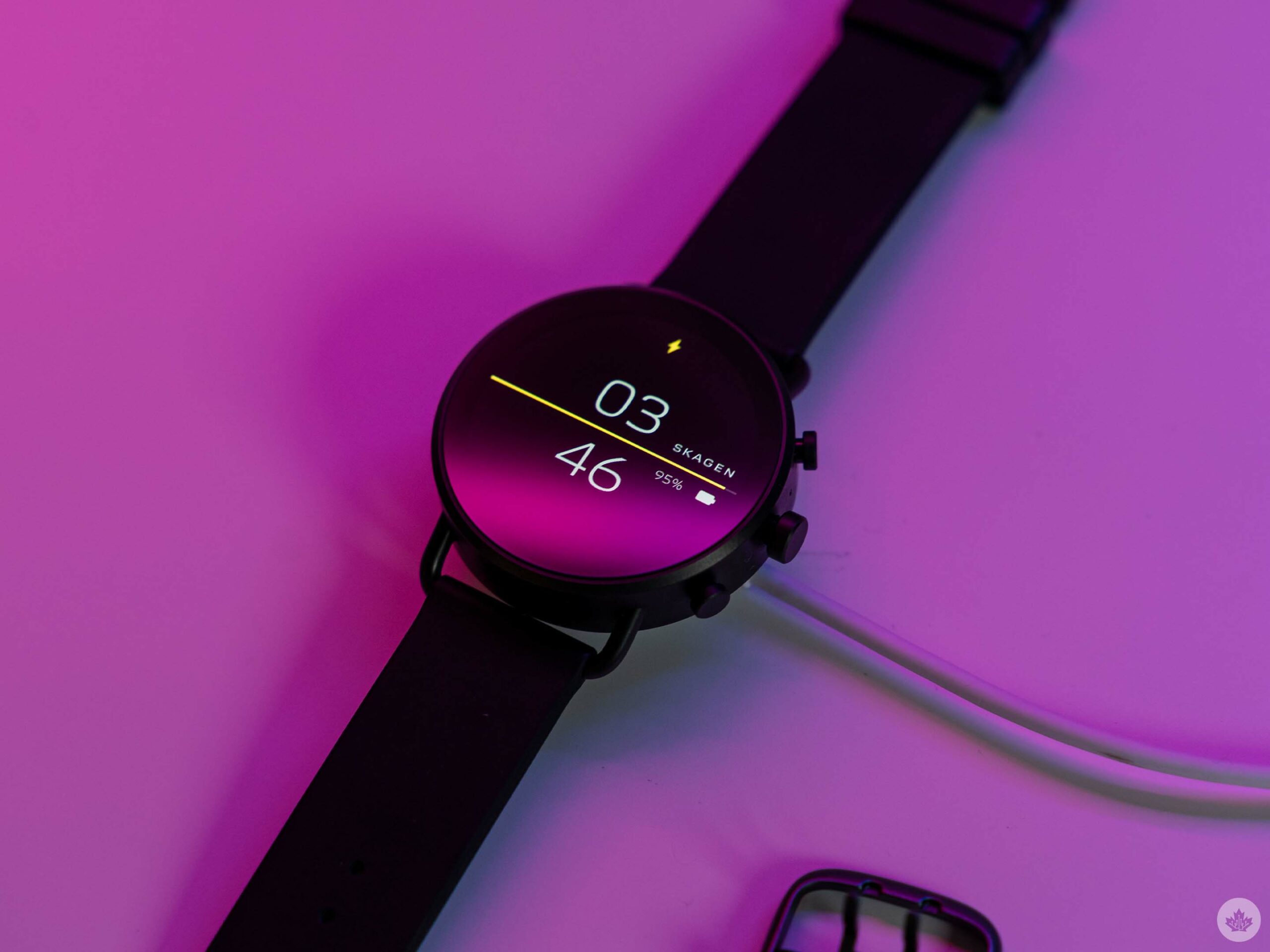
Moreover, as someone who hasn’t used a Wear OS/Android Wear watch since the mid-2010s, I was thoroughly surprised to see how many of the frustrations I had with the earliest Android smartwatch iterations are still alive and well today. Unreliable battery life that barely makes it through one day? Check. Annoying notifications that don’t seem to adhere to any of the settings implemented on my Android smartphone? Check. Lack of proper night mode that turns off the display when I’m trying to sleep? Check. All of these are features readily available on competing devices and I was thoroughly surprised to find them missing on Wear OS.
To be fair, things have improved, but mostly in the looks department. A fresh coat of paint only goes so far in covering up deep cracks.
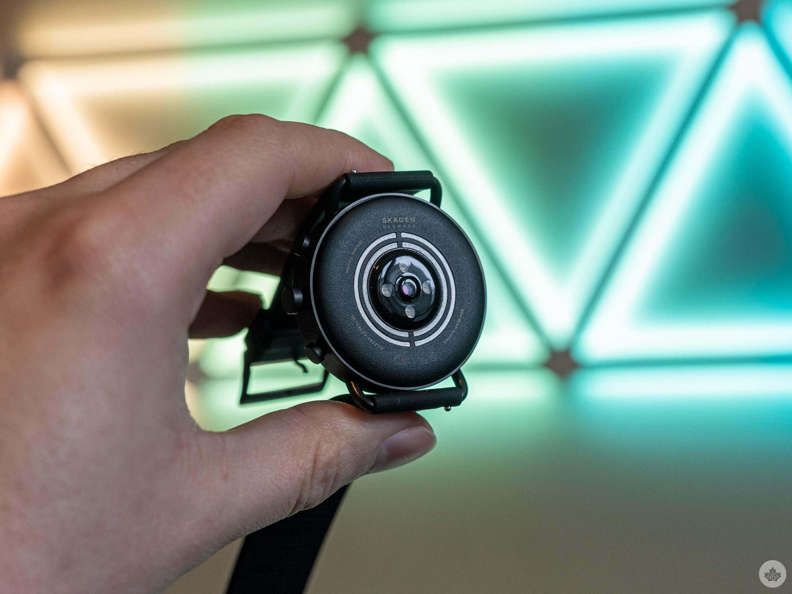
Ultimately, I hope Wear OS 3 will help patch some of these cracks. It definitely seems that way — the big update is expected to bring a new design along with improvements to Google Fit (likely leveraging Google’s Fitbit acquisition). Fitness additions include stress management, an ECG app, skin temperature reading, SpO2, sleep tracking, and more. Supposedly Wear OS will enable longer battery life too, although it remains to be seen if that benefit will only come to new watches to launch after Wear OS 3 arrives.
I think I’ll bench the Falster smartwatch for now and revisit it once Wear OS 3 arrives to see if that improves the software side. I’d hate to see this excellent hardware wasted on subpar software — for now, that seems to be what Wear OS is.
MobileSyrup utilizes affiliate partnerships. These partnerships do not influence our editorial content, though MobileSyrup may earn a commission on purchases made via these links.
MobileSyrup may earn a commission from purchases made via our links, which helps fund the journalism we provide free on our website. These links do not influence our editorial content. Support us here.


