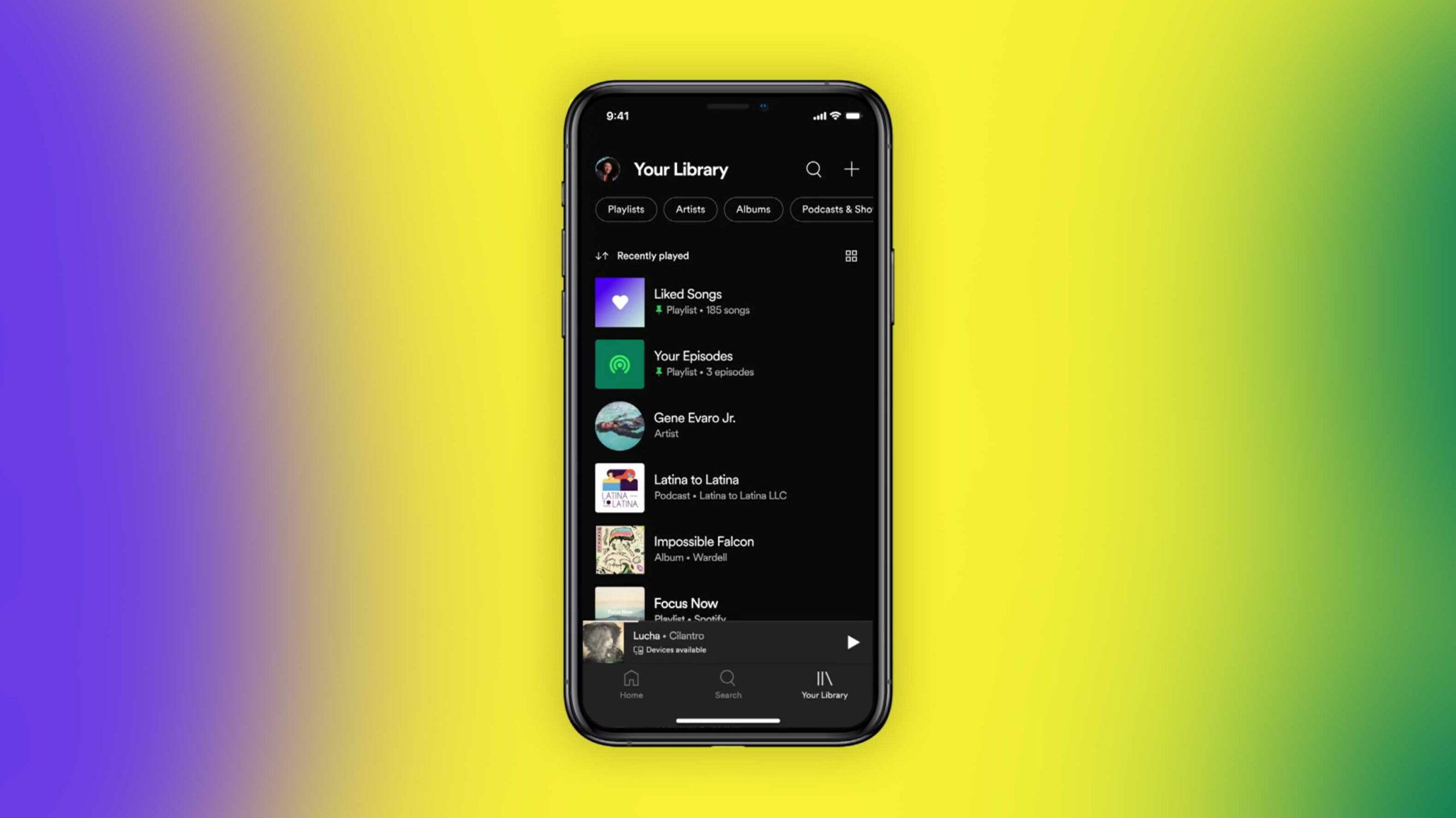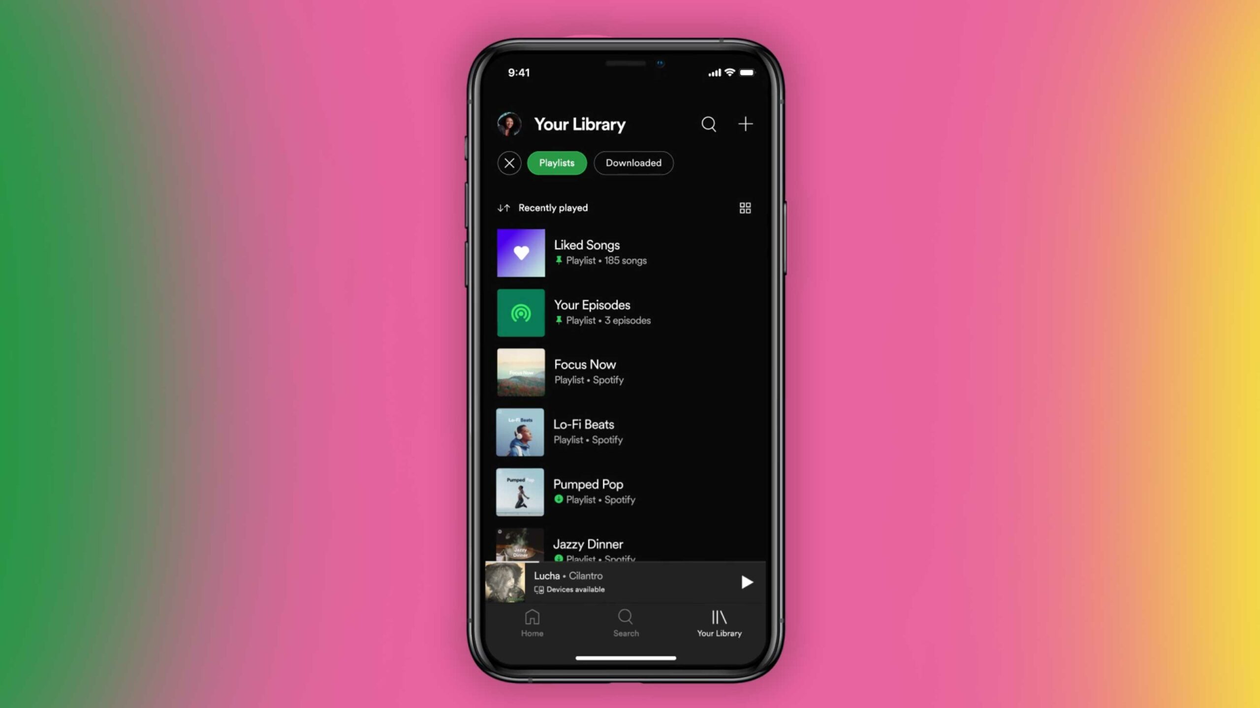
Spotify is adding some new organizational toggles to your music library on mobile that should make it easier to find the music you’re looking for.
Off the top, it’s removing the large ‘Music’ and ‘Podcasts’ headers from your Library on your phone and replaces them with some quick filters, a search bar (that only looks through your library) and a new add playlist button.
These filter bubbles you now see at the top can help you quickly find things like podcasts, downloaded music, albums or playlists. These filters are dynamic, so they can stack. This means if you tap on the ‘Downloads’ filter, you can still add the ‘Playlist’ filter to see your downloaded playlists.
There are also some new sorting options so you can see your library alphabetically, by recently played and by the creator’s names.
One feature that I’m particularly excited about is the ability to ‘Pin’ up to four playlists at the top of your library. Spotify’s press release says you can swipe to the right on a playlist’s name to Pin it.
- There’s also a new grid view that makes it easier to see your music visually if you’d rather look at it that way.
The audio streaming company says that the update is rolling out to all Android and iOS users over the coming week.
This follows a redesign that the company launched on its desktop and web apps a few weeks ago.
Source: Spotify
MobileSyrup may earn a commission from purchases made via our links, which helps fund the journalism we provide free on our website. These links do not influence our editorial content. Support us here.


