Spotify is rolling out updates to its two desktop players that bring the design of both versions of the app more in line with its mobile offering.
To start off, I’ll clarify that the desktop app and the web app are now identical, so anytime I refer to the desktop app from here onwards, I mean “both apps” unless specified otherwise.
Starting today, we’re rolling out a redesigned Spotify app for desktop and web, aligning the experience and making both easier to use than ever before. Get to know the new and improved features. ⬇️ https://t.co/c7yduZgka6
— Spotify News (@SpotifyNews) March 25, 2021
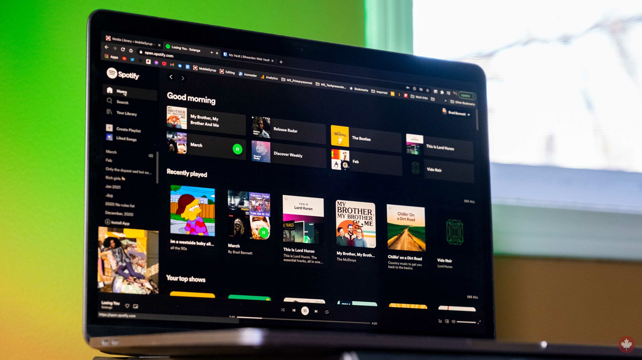
The first change you’ll notice in the new app is that it looks a lot like the mobile version. Things aren’t dumbed down in any way, but the visual stylings are a little blockier with a more modern colour palette.
The next thing you’ll notice is that there’s no persistent search bar anymore. This is probably the worst part of the update and unforgivable in a desktop music app. You have the screen space, shove a search bar in there. I’m only able to get the new design on the web app, so perhaps when the actual desktop version rolls out, I’ll be wrong, but so far, it’s not looking good.
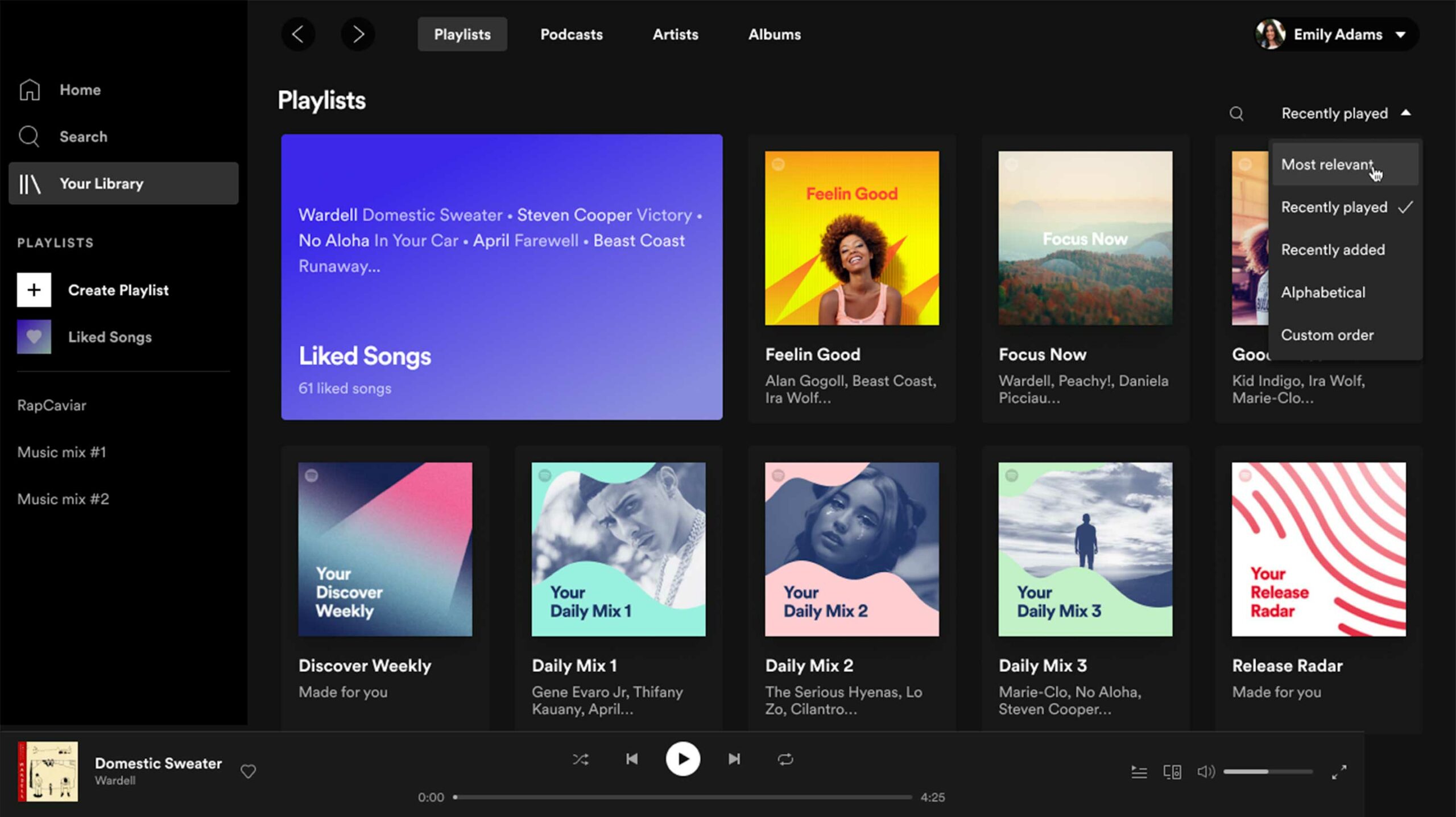
Clicking on the ‘Search’ header opens up a search interface that also shows you all the genres and your recent searches.
Spotify did shove a new search bar within each playlist. This makes it a lot easier to find songs within playlists, and I’m glad the company added it.
The company also highlighted its keyboard shortcuts. So if you hit ‘cmd/ctrl + ?’ you’ll now see a full list of all the shortcuts you can use. My favourites are ‘alt+S’ for shuffle and ‘cmd/ctrl + shift + L’ for search.
So far, the actual desktop version hasn’t rolled out to me. I even uninstalled and downloaded a fresh version, but nothing has changed yet. You can view the new version through the Spotify web app here.
Source: Spotify
MobileSyrup may earn a commission from purchases made via our links, which helps fund the journalism we provide free on our website. These links do not influence our editorial content. Support us here.
