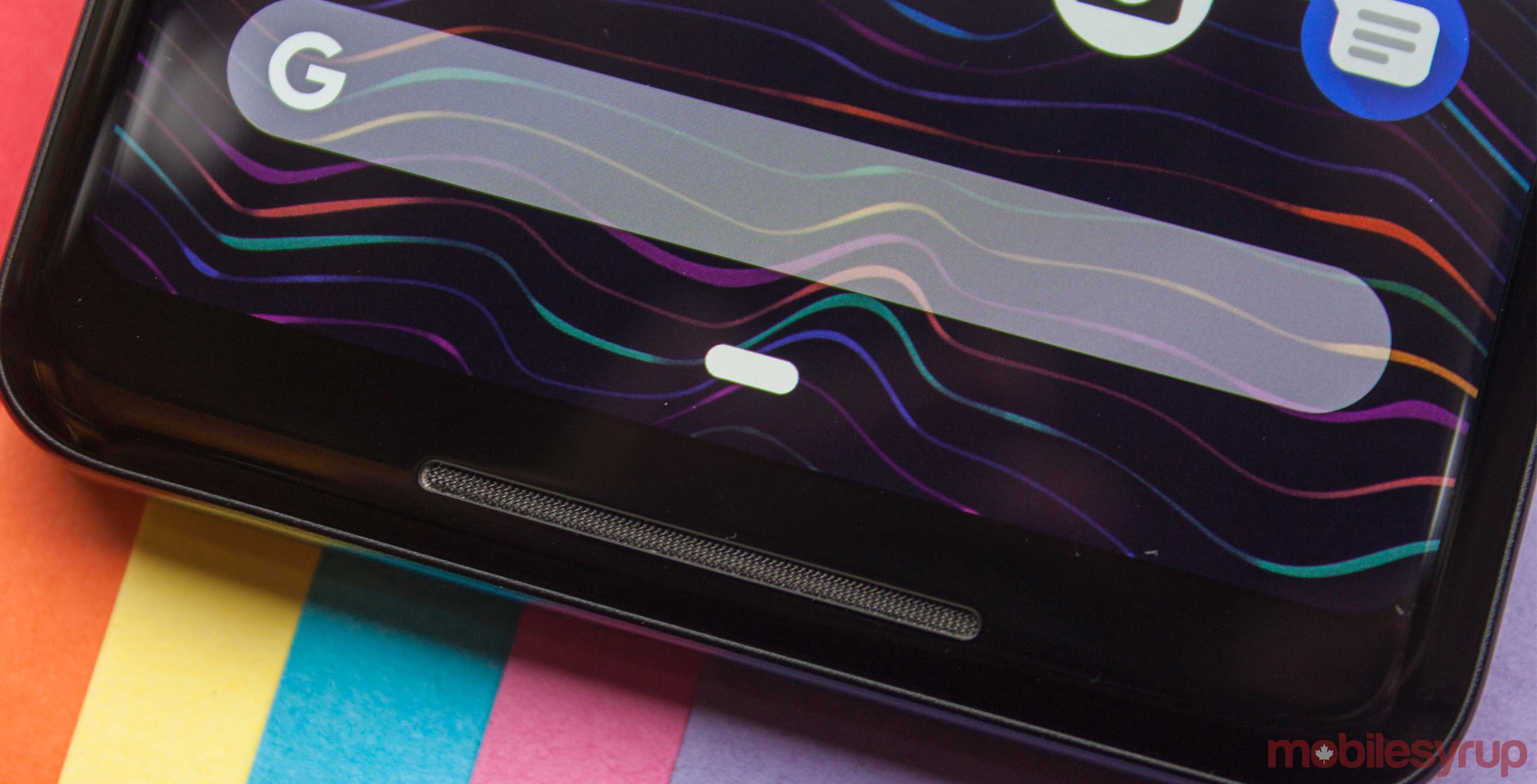
One of the biggest changes in Android Pie is the new navigation system.
Instead of the standard three button system, Android Pie allows people to use a gesture navigation system. Love it or hate it, that system is here to stay.
For devices upgrading from Oreo, there’s a settings option to switch to gesture navigation. However, if you’re getting the Pixel 3 you may not get that option, according to Google’s EK Chung. Chung, who recently sat down with Android Central for an interview, is the UX lead and manager for Pixel and Android mobile.
Initially, the Android Central interview indicated that there would be no option to switch back to the three button layout. However, the article was updated to clarify that Chung said gestures would be the default on Android Pie devices like the Pixel 3.
However, she did not clarify whether there would be an option to switch back.
Why Google’s all-in on gestures
The reasoning for this, according to Chung, is that people find the three button layout more confusing — especially if they haven’t used Android before. It’s a reasonable explanation, especially when you compare the two navigation modes. Google’s gestures narrow it down to one button most of the time — a home button. The button does multiple things, but it’s easy to learn. One tap takes you home and holding it opens Assistant, both actions are fairly simple to learn.
Additionally, Android provides users with a back button only when there’s an opportunity to go back. This can be confusing for some people however. I can already hear people asking me why their buttons disappear.
Finally, the swipe-up gesture to open multitasking builds on behaviour incorporated previously in Android. For at least the last year, a number of devices have had a swipe-up gesture to open the app drawer. Android Pie builds on this known gesture. Swiping up opens part of the app drawer as well as the recent apps. Furthermore, that top row of suggested apps are often all anyone needs. According to Chung, users picked an app from that suggested row 60 percent of the time.
While all that is well and good, the problem is this change isn’t standardized. Manufacturers have the option to ship Pie phones with the three button layout or even their own navigation gestures.
Ultimately, the Pixel 3 should offer users a choice. Having gestures as the default is fine, especially if new users find it easier to use. However, the three button layout has been the standard since 2011’s Galaxy Nexus. Google shouldn’t force long-time users away from that system.
Source: Android Central Via: Android Police
MobileSyrup may earn a commission from purchases made via our links, which helps fund the journalism we provide free on our website. These links do not influence our editorial content. Support us here.


