
Rogers senior vice president of consumer channels Melani Griffith insists that the redesigned Fido store in Mississauga’s Square One shopping centre is only one part of a larger brand revitalization.
Gone are the monochromatic whites and plastic yellows of the past. Instead they’ve been replaced with down-to-earth greys, subtle browns and modernist concrete.
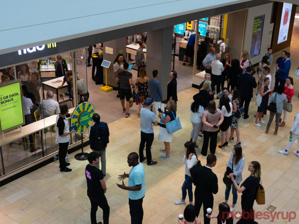
Griffith says that the store is intended to emphasize Fido’s SODA principles: Spirited, Optimistic, Daring and Authentic.
She also says that the store is meant to resemble a modern, urban space, and it shows.
For instance, Fido’s previous store design incorporated a a single long table that allowed sales representatives to hide and minimize customer interaction.

Now, however, sales reps are free to roam and interact with customers in a decidedly open concept space.
“The idea, really the concept, is about as if somebody’s coming into your home, and you’re having them to your home for dinner,” explains Griffith, in an interview with MobileSyrup.
When customers walk into the new Fido store, they’re immediately greeted by eager sales rep looking to provide as much help as possible.
The goal is to move away from what Griffith calls a transactional model to an experiential model.
“What we want is for me to take the time to get to know you, understand what your needs are, introduce you to buying a phone,” says Griffith.
“Buying technology is important. It matters. People will say to you that they use their phones more often than they use their toothbrush, or actually have more phones than they have toothbrushes, which is slightly frightening.”
The new store’s open concept collaboration also allows sales reps to interact with customers in a more friendly, relaxed atmosphere.
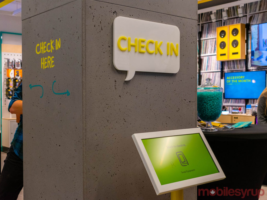
For instance, customers can use a clearly labeled, self-serve ‘Check In’ station to set up a time to speak with a sales rep.
Once it’s time for an appointment, customers then receive text message notifications to inform them that a sales rep is ready.

The store is also equipped with a number of mobile point-of-sales terminals, providing customers the opportunity of paying for products or services wherever they want — rather than having to wait in line to finalize a transaction.
In addition to the open concept space, the new Fido stores emphasize device interactivity.

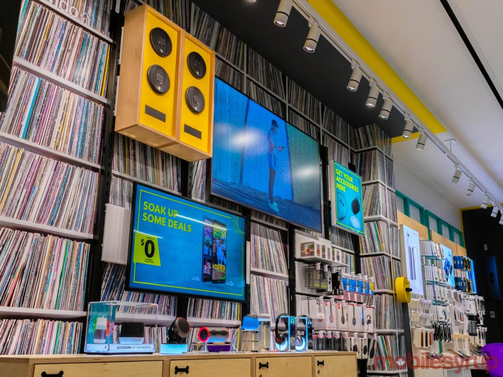
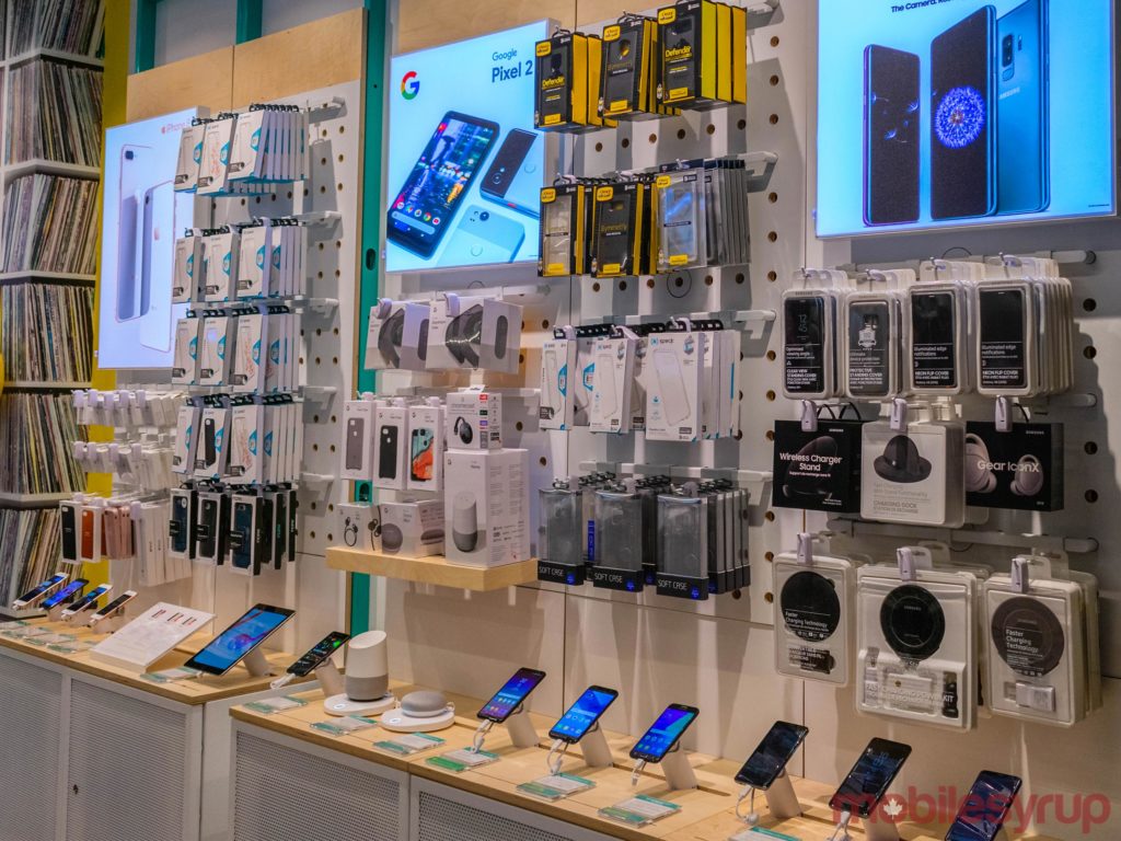
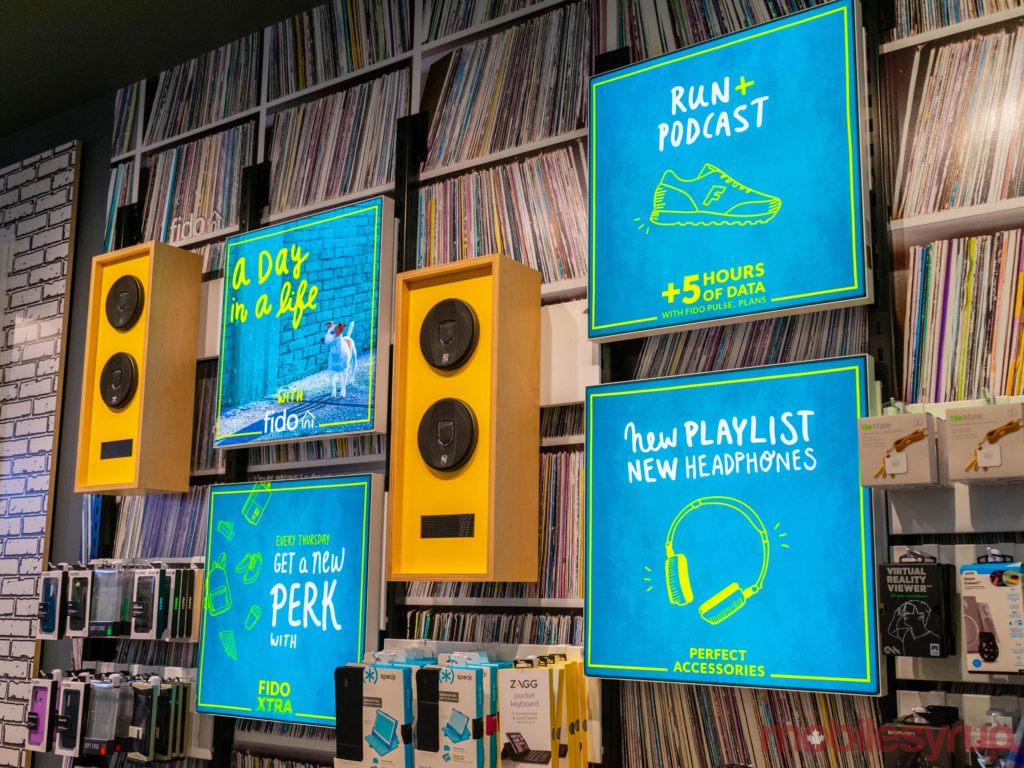
Individual stations set up around the store allow customers to test out the latest devices from Apple, Google, Samsung, LG, Huawei and other top-selling smartphone brands, while accessory stations allow customers to try out speakers and headphones.
“We did that so we could have a tailored customer experience,” says Griffith.
Modularity is also important to the Fido ethos, made evident through the use of digital, rather than paper, displays across the store.
Not only will these screens provide up-to-date information on the latest deals and offers, they can also be updated to reflect community events, holidays and special occasions.
The revised Fido manifesto
While Fido’s Square One location is currently the only retail space that’s been redesigned, the plan is to eventually redesign every Fido location across the country.
“We’ll do five more this year, and a boatload new year,” says Griffith.
Additionally, Griffith says that all Fido employees have gone through the same training, to encourage people-based, rather than transaction-based interactions.
This will no doubt be great news for former Rogers customers looking to make a switch to the carrier’s Fido flanker brand, especially in the wake of a January report suggesting that Rogers call centre representatives are pressured into making sales.

“Some of our hiring practices is now around ‘What’s your personality? What’s your EQ,’” says Griffith.
“Maybe you don’t know much about technology, but we can teach you that. I can’t teach you how to connect with people, so we’re looking for people that are connectors and then we’ll teach you the technology and the industry.”
The new hiring and training process also applies to Fido’s online and call centre representatives.
Fido’s new manifesto not only allows the company to re-examine its brand ideology, it also places some distance between the flanker brand and its parent carrier Rogers.
“The Rogers redesign… is actually really all about the brand attributes around family and home and having a comfortable place,” says Griffith.
“When you walk into the Fido store, the idea’s that you’re in a really cool urban cafe. So that feel, and you can feel it even here in Square One… there’s a much different feel when you walk into the Rogers store than there is in the Fide store.”

According to Griffith, this is all part of Fido’s dedication to SODA.
“That’s the physical manifestation that we tried to create here,” says Griffith.
MobileSyrup may earn a commission from purchases made via our links, which helps fund the journalism we provide free on our website. These links do not influence our editorial content. Support us here.


