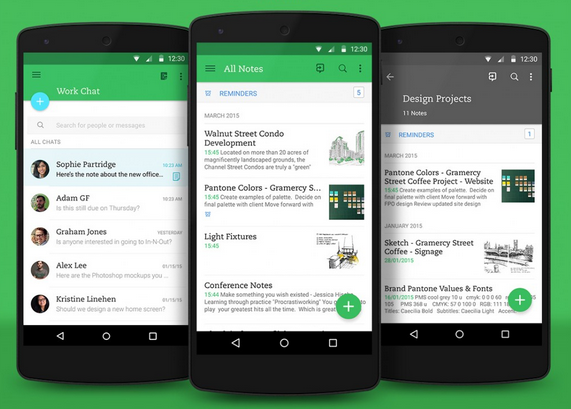
Evernote has just released a massive redesign for Android users that brings the app in line with Google’s Material Design language. The company admits that Evernote 6 was “pretty close from a visual perspective” but this version includes the subtle animations and transitions that have seeped into major Android applications.
Changes you’ll notice beyond smoother transitions and an increased level depth via shadows include a more sparse note editor, as well as more clear communication on who’s present in shared notes, a new customizable note button that acts as a “central point” of action within the app, and the ability to rename and delete tabs. Evernote has also revamped the navigation experience to offer direct access to shortcuts, cleaned up the layout and controls, and squashed some bugs.
Though the company says the app incorporates some changes based on user feedback, don’t expect the Evernote for Android experience to be mirrored on iOS. Unlike Trello, which said recently that it’s using Material Design as the starting point for designing “a more consistent experience across all platforms,” Evernote says the only way to achieve an identical experience across platforms would be through mediocrity. You’d have to give up the opportunity for features that are only possible on a specific OS.
“The fact that Evernote embraces this philosophy is what allows our apps to feel like they were purpose built for the platform, on every platform, which we think improves usability,” said Evernote designer Adam Glynn-Finnegan.
[source]Evernote, Google Play[/source]
MobileSyrup may earn a commission from purchases made via our links, which helps fund the journalism we provide free on our website. These links do not influence our editorial content. Support us here.


