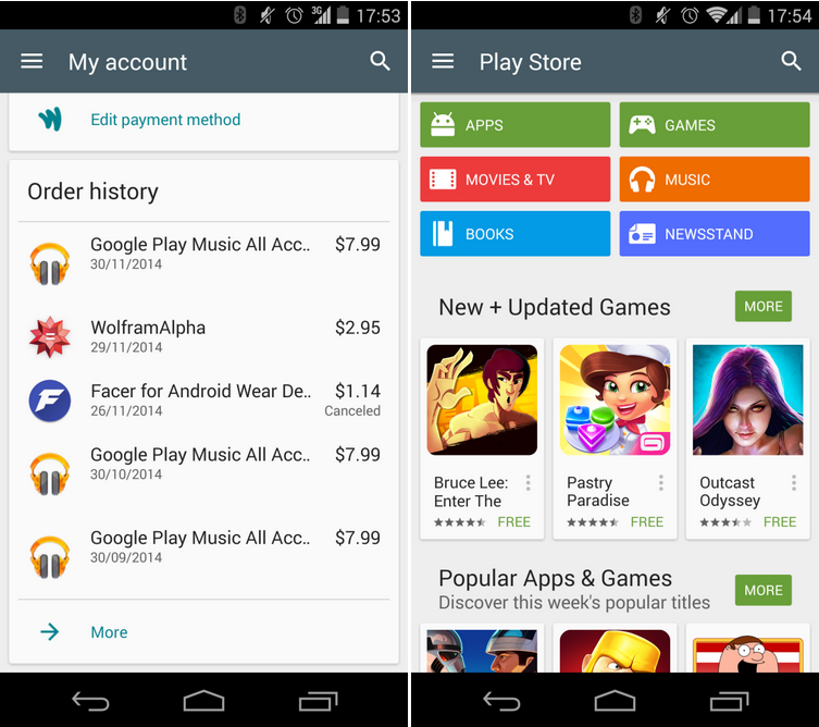
The Google Play Store adopted Material Design in July, just a few weeks after we got our first look at Google’s new design language at I/O. In October, the company added animations and a spiffy new icon, along with a couple of other aesthetic changes. Two months on, Google has announced another new version of the Play Store is rolling out to users. This includes several significant UI tweaks including a full-height navigation drawer and real-time card shadows for Lollipop.
The biggest change is a brand new My Account page that shows you the details of your account including every single application you’ve ever purchased on the Play Store. While it might be a bit embarrassing to see a visualization of all the gem packs you’ve bought over the last five years, it’s also a handy reminder of the apps you have paid for already. As we change our devices or run low on space, it’s pretty common to ditch or lose apps along the way. This offers a way to easily browse and redownload those apps. In addition to this, the My Account page also offers the ability to switch, add, or remove payment methods.
The update hasn’t been rolled out across all Android devices just yet. Google just announced Play Store 5.1.11 via Google+ on Wednesday afternoon so it might take a while for it to reach your device.
[source]Google+[/source][via]9to5Google[/via]
MobileSyrup may earn a commission from purchases made via our links, which helps fund the journalism we provide free on our website. These links do not influence our editorial content. Support us here.


