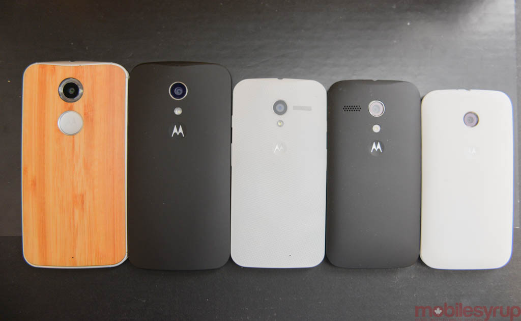
We’re not going to mince words here: the year-old Moto family is growing, and we thought it would be fun to compare all five of Motorola’s latest smartphones in terms of size.
A few things to note: the new Moto G is not only bigger than the original Moto X, but its screen may actually be nicer. It’s also interesting how the Moto E’s design informed that of the new Moto X and G considering those ultrawide grills take away from the minimalism espoused by Motorola last year.
Two takeaways here: the original Moto X is still my favourite smartphone size; its easily used in one hand, eminently pocketable and extremely well-made despite its successor’s metal frame.
And the new Moto G is a marvel in both quality and performance; this thing flies despite its mid-range specs, and will likely be even more popular than the original.
Read More: Hands-on with the new Moto X
Read More: Hands-on with the new Moto G
MobileSyrup may earn a commission from purchases made via our links, which helps fund the journalism we provide free on our website. These links do not influence our editorial content. Support us here.


