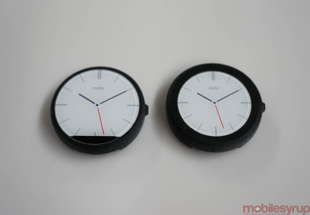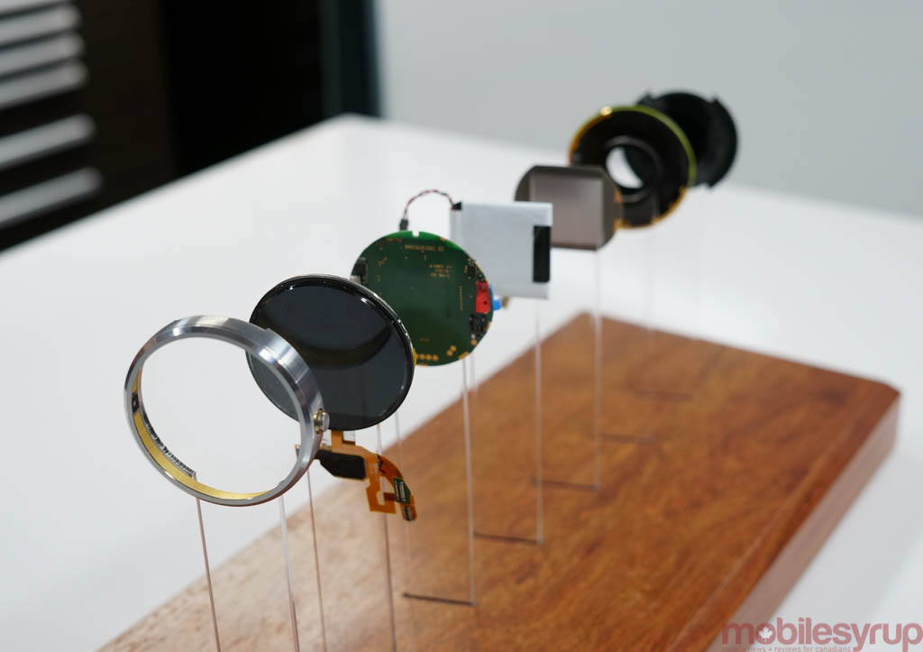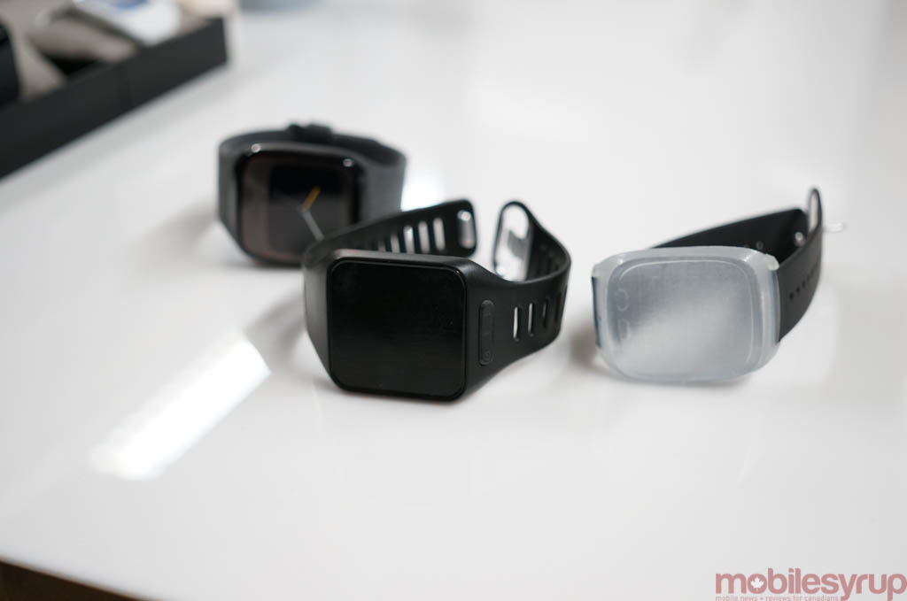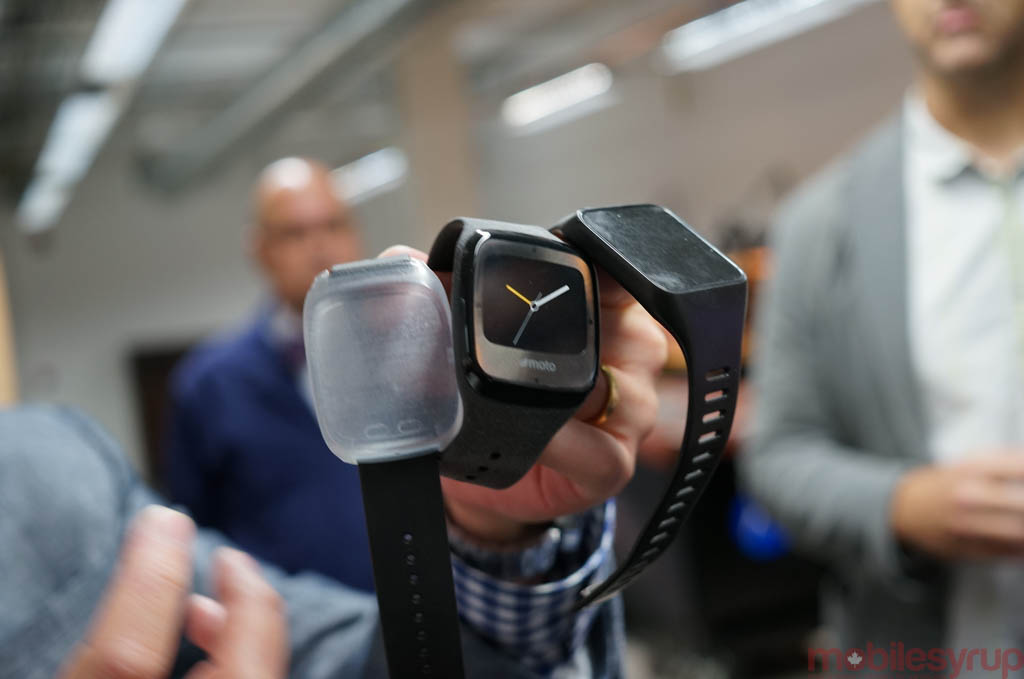
When Motorola began creating the Moto 360, it, like many others working on smartwatches, designed it to be square. Creating a round watch face — a truly round one, the way Motorola wanted it — was too difficult and, excuse the expression, cut too many corners.
So the designers squared the face. But it knew, deep within the walls of the Merchandise Mart, a cavernous building in downtown Chicago, that square wasn’t good enough.
Subsequent designs, once the decision to make it round was finalized, housed many of the necessary components in a thick border around the circular face, but that, too, was deemed unfashionable.
Motorola wanted to create a timepiece, not a smartwatch, something that people would be proud to wear in public, casually or formally, and knew that started with an edge-to-edge display.
The problem with such a decision is that the front-facing components — the ambient light sensor, for instance — needs to go somewhere, so Motorola opted to design the Moto 360 with a small black bifurcation towards the screen’s bottom.
Admittedly, it’s not the most graceful solution, but Jim Wicks, head of experience and design at the company, said it was the best it could do with the technology currently available.
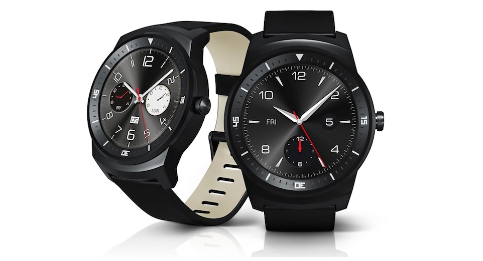
One might say that LG figured out how to create an edge-to-edge round display with the G Watch R, but you’ll notice it has a similar edge to one of Motorola’s early prototypes: the etched numbers around the screen’s border serve a purpose of hiding the front-facing components.
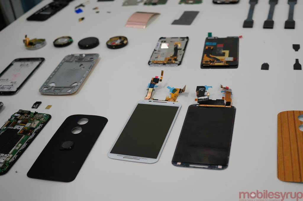
As we toured the facility, a three-floor expedition during which Motorola gave unprecedented amounts of access to its offices, its labs and its staff, it became clear that the company was in it to sweat the small stuff.
After enduring layoffs, a CEO change and two acquisitions in as many years, the new Motorola has no other choice: it creates products that its employees would want to use.
Rick Osterloh, President and current CEO of Motorola Mobility, thinks that the strength of this year’s product line is up there with any of his competitors. The new Moto X, refreshed Moto G and gorgeous Moto 360, along with the ambitious Hint Bluetooth earpiece, combine to create an ecosystem of products that are at once design-forward and cost-conscious.
He admits that Motorola can’t compete with Apple and Samsung on what is quickly becoming a race to secure, or create, the highest-end components in the industry, so it needs to use off-the-shelf components and a team of plucky engineers to create bespoke solutions on a budget.
The Moto X’s ability to hear wake-up commands even when the screen is turned off is not a technological leap, but a strategic investment in l0w-cost, low-power chips that work alongside the same Qualcomm processors that most smartphones use today. And Moto Display (formerly Active Notifications) is merely an ingenious way of using low-power AMOLED displays to their fullest potential.
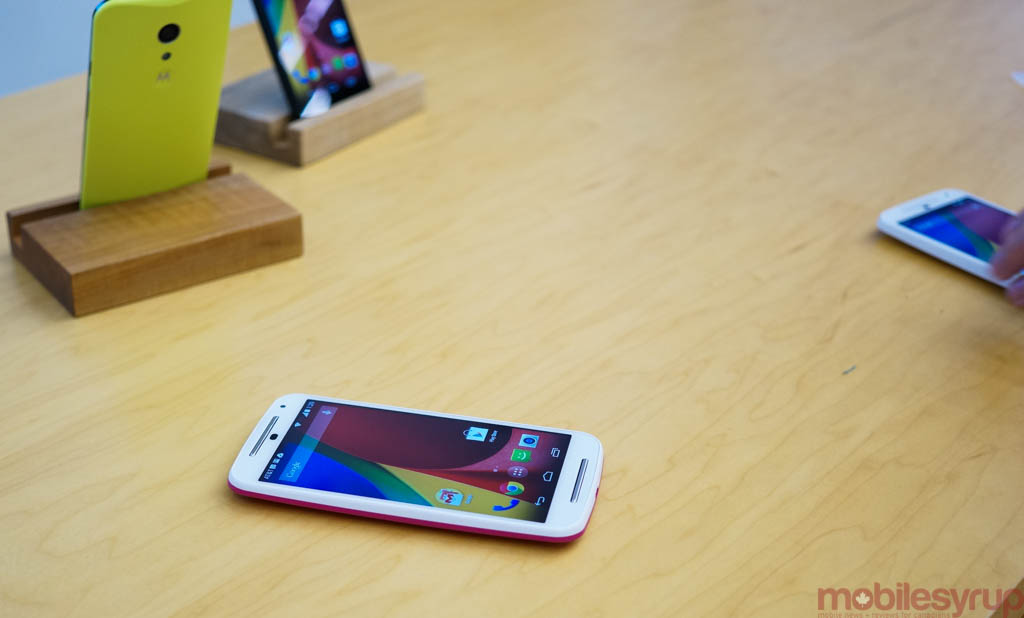
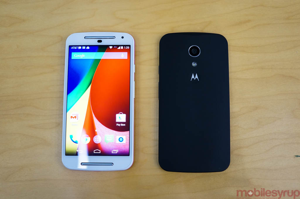
Digging even further, what struck me about the new Moto G isn’t its technological superiority but its lack thereof. It’s so unequivocally an instrument to command actions of other developers that it hews the very idea of a smartphone down to a single point.
Aside from Motorola’s keenly-focused first-party apps, the company doesn’t add superfluous features or modify the software. This is the purest form of Android you’ll find for $200, a key reason for its worldwide success; it just works.
Many people will have opinions about Motorola’s strategy, but the grand takeaway is that focus trumps power: the company doesn’t feel the need to outperform its competitors on specs. The new Moto X has a comparatively smaller battery, for instance, than Samsung’s or LG’s flagships, but reckons it can compete, cycle for cycle, on uptime because there are no background services vying for the user’s attention.
There aren’t two app stores or galleries, nor unsolicited notification solutions or built-in news aggregators. Nothing is wasted; everything is used. It’s the most Apple-like approach to building hardware in the Android ecosystem, and that strategy seems to be paying off.
I learned a number of things about how smartphones are built during my time at Motorola, like how its engineers can predict the exact shape a crack will take based upon the height of the drop and size of the screen glass. How a metal frame can better absorb the impact of a fall, and that a larger device allows the force to spread more evenly, leading to fewer shattered displays.
I learned how difficult it is to program an always-on audio service to separate ambient noise from an intentional action that could be coming from any direction.
I learned about how much prototyping goes into a new product, and that the leather used on the back of the new Moto X is sourced from a local Chicago tannery.
Perhaps most importantly, I learned that Motorola is painfully aware of its former hubris, a once-American success story reduced to an upcoming subsidiary of a Chinese giant, but plans to keep building nonetheless. The strategy, like the products, are ambitious and imperfect, but are created with the kind of limited resources that keep its employees sharp.
MobileSyrup may earn a commission from purchases made via our links, which helps fund the journalism we provide free on our website. These links do not influence our editorial content. Support us here.

