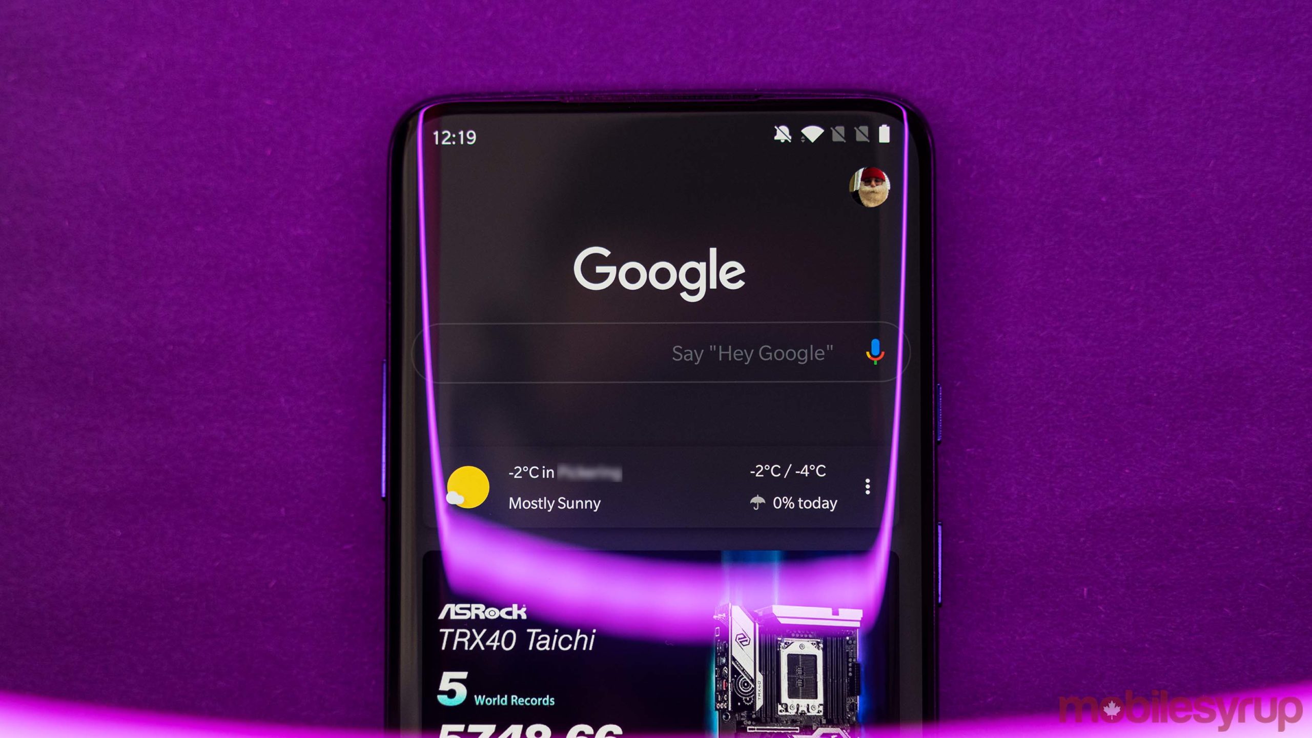
Google is running another test, this time with a new look for its mobile search results.
As spotted by SEO Roundtable, Google Search on mobile began adding background header images to certain ‘idea’ search terms. For example, searches for ‘flower ideas,’ ‘Christmas ideas,’ ‘creative ideas’ and other similar terms surface results pages with a related image behind the Google logo.
Further, the test saw the top of the results page, which usually includes the search bar, the Google logo, your account picture and search categories like ‘Images’ and ‘Videos’ get longer than usual to make room for the background image.
Although it may not seem like it, this is a significant change for Google. Aside from the odd Google Doodle, the search giant has kept its results page relatively minimal for the last several years. Search has almost always been the colourful Google logo, a search bar and the results on a blank white backdrop.
Adding a large header image to search results shakes things up significantly and I quite like it. It adds a small bit of flair to searching the web.
However, not all aspects of the change are great. Along with the new header images, Google reportedly tested adding featured images to each search result, making for a much more visual results page. To me, it just makes everything look more cluttered and confusing.
9to5Google notes that the background headers test is only live on Google’s mobile website on Chrome, and doesn’t show up in the Google app on Android or iOS. In my testing, the header images weren’t available on my devices at all. Likely, that means I’m not part of Google’s A/B test. Your mileage may vary with this test.
Source: SEO Roundtable Via: 9to5Google
MobileSyrup may earn a commission from purchases made via our links, which helps fund the journalism we provide free on our website. These links do not influence our editorial content. Support us here.


