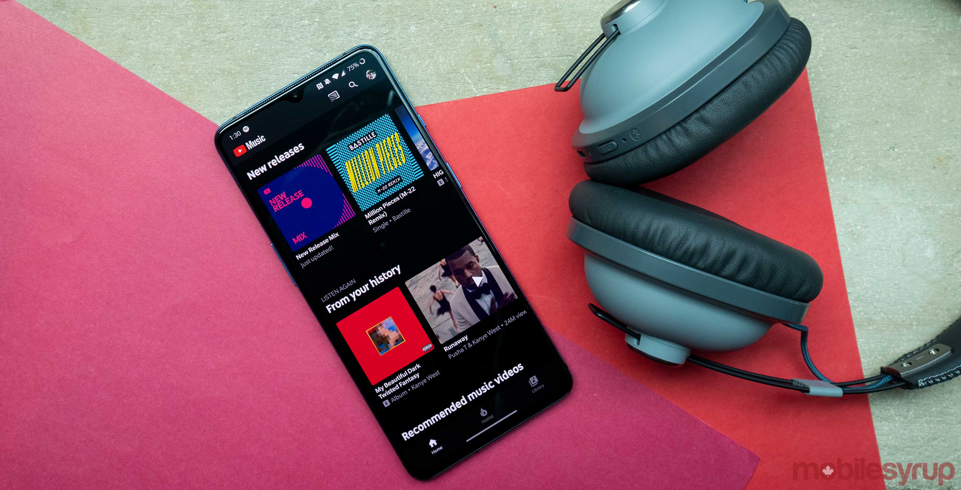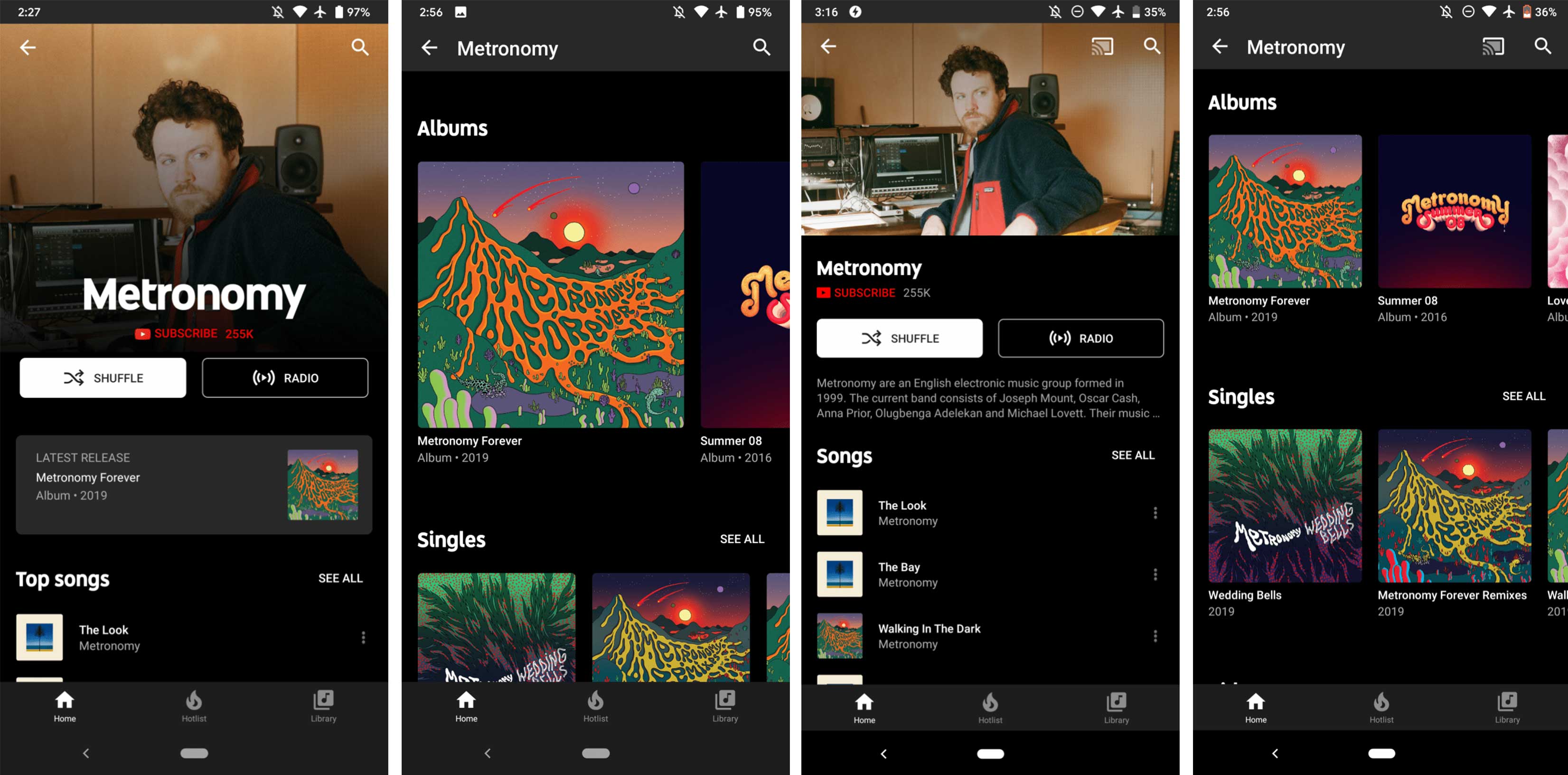
YouTube Music is rolling out a nicer looking artist page within the app that features a larger profile picture and moves the about section to the bottom of the page.
While this isn’t one of the updates to YouTube Music that users were hoping for (uploading your own music files, anyone?), it’s still a nice visual change to the relatively new music streaming platform.
This change was first spotted by 9to5Google, and the publication also mentioned that Google is testing a similar version of the redesign for its webpage, but it hasn’t rolled out yet.
Beyond the new look, there’s now a ‘Latest release’ box at the top of the artist page highlighting said artist’s newest album or single.
This new change helps make the artist profile picture stand out more, and it crops in closer on their faces, which is nice and more immersive. The list of albums has been made a lot larger as well.
9to5Google says their app is on version 3.37, although this is likely a server-side update since no one at MobileSyrup has the update yet.
Image source: 9to5Google
Source: 9to5Google
MobileSyrup may earn a commission from purchases made via our links, which helps fund the journalism we provide free on our website. These links do not influence our editorial content. Support us here.


