Yahoo has had a tremendous, and tremendously frustrating year. The company failed to meet earning expectations in its latest quarter, with lower revenue and flat profit over the previous Q2.
The company’s main concern? Like Google, turning web advertising revenue into the equivalent on mobile. The company claimed 450 million active mobile users during its earnings call, and even used the Mail app as an example of that mobile-first success, but until recently Yahoo’s mobile strategy was not quite in focus.
We got a taste of it during Google I/O, when I went to a party to publicly launch one of the company’s most recently acquisitions, Aviate Launcher. A party for a launcher? It makes sense if you look at it in the context of Yahoo’s overall mobile strategy, which is keeping customers using Yahoo services for longer. And the most lucrative real estate on an Android device these days? Other than the Google search box (see why it just released Google Now Launcher for all devices?): the home screen.

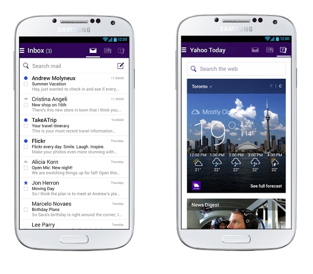
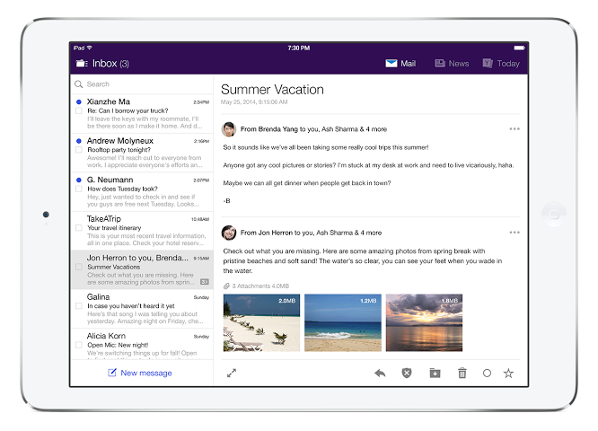
Which brings us to today’s announcement. Like Aviate, Weather, Sports, News Digest and Yahoo’s mainline app, Mail is trying to break out of its single-purpose shell. and to that end the company has added two new columns of information to the home screen. While users will open to a traditional inbox, swiping to the right reveals a list of stories from Yahoo’s front page, while scrolling again offers Today, an amalgam of Yahoo’s ever-widening ecosystem, including Weather, News Digest and Flickr.
The idea here is to convince people to stay within the app for longer — for metrics, yes, but also to get people accustomed to using the other services. News Digest in particular, which launched an Android app and a Canadian edition earlier this year, has been a great source of pride for the company. Users can scroll through the eight curated articles in the Mail app and tap to open, or download, the Digest itself. The Yahoo Today screen also includes a search bar, which opens up results within the app.
“We’ve heard from consumers that they want more things to do in the application,” said Russ Smith, Product Manager for Mobile Communications Products. “Sometimes people just refresh the app even when there’s no new email.” Something to do: while many productivity apps are meant to be used in a “get in, get out” scenario, email clients tend to be sources of comfort for people, and Yahoo is capitalizing on that success.
The update affects both iOS and Android versions, the latter of which Yahoo says it worked with Google on to ensure design guideline compatibility. Android has become an increasingly important part of Yahoo’s strategy, with app updates now coming at or around the same time as their iOS counterparts. “In the global space, Android is the biggest [mobile] player,” said Smith, referring to markets outside of North America where Google’s platform has upwards of 80% market share.
Yahoo Mail, like many other recent Android apps, has an austere quality in its design that is intended to make it run optimally on low-cost devices in emerging markets. For example, unlike Gmail or Mailbox, Yahoo Mail does not use the “swipe-to-archive-or-delete” mechanism, opting instead for less animation-intensive “hold-to-activate” trope.
The company also promises that at some point in the future the Stories pane will be personalized with Canadian content, but at the moment it reverts to a generic American feed.
The Android version will roll out over the next week, but iOS users can grab the new version today.
[source]Google Play, App Store[/source]
MobileSyrup may earn a commission from purchases made via our links, which helps fund the journalism we provide free on our website. These links do not influence our editorial content. Support us here.


