The first time I realized the triage potential of a smartwatch, I was walking home from the grocery store with two bags in each arm, and a wrist vibrating because three separate family members were trying to get in touch at the same time. It was a small thing, to alleviate that anxiety, but it meant a lot in the moment.
That’s what these gadgets, and this burgeoning industry, will eventually fall to: a value-add to your existing smartphone, and to the platform that it runs. Android Wear was sprung on us like a summer rain shower, but behind the scenes, Google had been working its prototype magic for years.
Now that Android Wear, Google’s official platform for wearables, is here and on our wrists, how does it work? How does it run? And, more importantly, how does it feel?
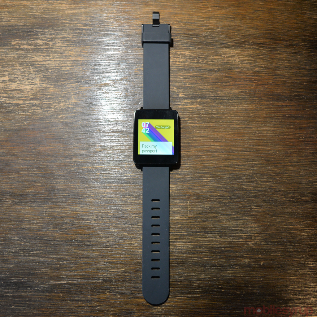
A corridor to your smartphone
Think of your smartphone as a wide-open plain, an expanse that is untamed and often unrelenting. Android Wear attempts to siphon all that chaos, through notifications and purposeful apps, into a single corridor.
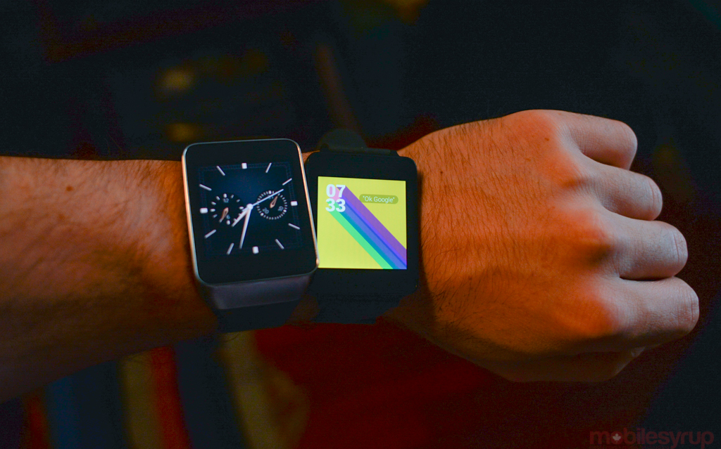
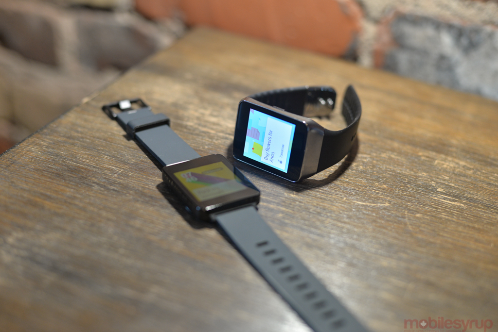
On its own, an Android Wear smartwatch, such as the LG G Watch or Samsung Gear Live, is a timepiece, and not a very good one; individually, they’re homely, and there are only a few functions one can perform when disconnected from its base, the Android smartphone. But when it is connected, Wear mirrors any notification actively received by an Android device; it’s the perfect triage workflow.
But if that’s all Android Wear did, it wouldn’t be too dissimilar to Pebble, or the early incarnations of Samsung’s Gear series. Google, however, takes advantage of bi-directional content avenues that either don’t exist on its competitors, or work poorly: voice, and the Knowledge Graph.
To understand how Google intends to make Android Wear stand out from the competition, we have to go back to Google I/O 2012, with the introduction of Android 4.1 and Google Now. What was at first a bizarre string of content cards has expanded to become a voice- and text-friendly assistant, the kind that tells you things it thinks, based on machine learning, you need to know. It does this using location and context; if you’re standing by a bus stop, it will show you the upcoming travel time; if you have an appointment, it will offer route advice; if you’re a stock holder, it will inform you of important changes to its price.
The austere beauty of Google Now is that you don’t need to work hard to make it work for you; it just sends you important snippets of information, as if by magic. This dynamic, for the most part, translates well to the watch, but like the platform as a whole there are lingering issues that need to be worked out.
Notification Heaven
Android Wear is very good at notifications. Developers don’t even need to change anything in their apps for simple notification mirroring; at their most basic, apps show the full notification, with vertical scrolling, and via a swipe to the right the option to open it on the phone. Using the newly-released SDK, devs can then augment their existing apps to offer on-watch actions, such as voice-based replies or sharing intents, or create mini apps similar to what we’ve seen from Pebble, Samsung and Sony.
All Android Wear devices follow a strict hierarchical flow: the watch face is at the top, with notification cards a vertical swipe away, ranked chronologically. As users scroll down through the stack of cards, some Google Now-generated, others app-generated, they have the option of swiping left to see more content. Often this comes in the form of expanded previews, like a full email or Hangouts conversation. Other times, as in Gmail, users will have large, single action buttons: in the case of Gmail, again, these take the form of Reply, Archive and Open on Device.
This is really the first problem with Android Wear: what if my typical Gmail action is to delete and not archive? Well, Google does not let you alter those three base functions, so you’re out of luck.
Voicing Your Commands
Indeed, Android Wear constantly extracts an unsteady tension between being too strict — necessary for a small screen platform, I’d say — and not consistent enough.
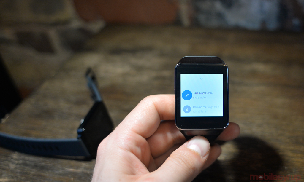
When I mentioned that the watch face sits at the top of the hierarchy, it only reveals half the truth: tapping on the screen brings up the Google Now voice prompt, which can also be activated by saying, “OK Google” at any time. Voice actions take the form of “Take a note…” or “Remind me to…”, but also “Send an email,” or “Compose a text.”
Google’s voice recognition is, for the most part, quite good. It’s due to the infancy of the platform itself that one’s voice doesn’t always extract the proper effect.
For example, Google Maps is integrated into Android Wear, allowing users to “Navigate home,” or “Find the closest gas station.” The problem here is twofold: Google often mixes letters and numbers, so “Navigate to 900 Queen St W” becomes “Navigate 2900 Queen St W”; and driving directions always take precedence.
The latter can be solved with a bit of semantic tweaking: “Walking directions 900 Queen St W” initiates the correct search on the device. The former, however, is more tricky: yes, Google’s voice recognition is good, but with voice there is zero room for error. Make one mistake and a user is likely to get fed up and type the request directly into his phone.
Appy Together
This inconsistency is compounded in Android Wear’s nascent selection of grab-bag apps: some support only tap actions; others only voice; others both.
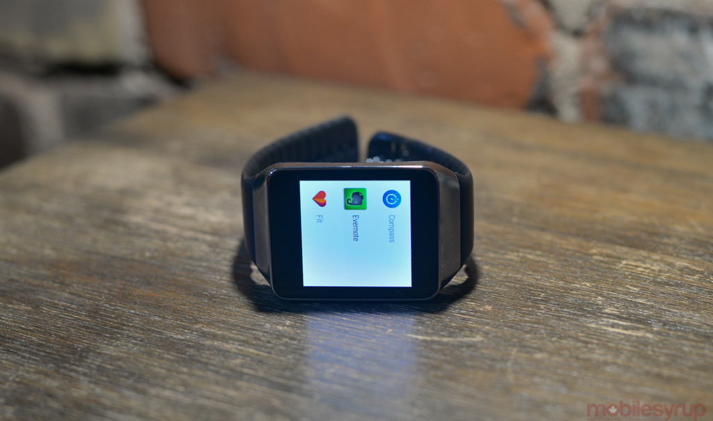
The app situation is interesting, since there is a bimodal means of accessing them, one seemingly preferred over another. Unlike Android proper, the app drawer is hidden at the bottom of a non-editable list of commands, found by tapping the voice search button and scrolling down to the bottom.
It’s clear that Google wants Android Wearers to interact with apps when they arise, or by voice — scrolling to meet them head-on is both onerous and unadvisable.
There are currently 30 or so apps that have been updated to support Android Wear, the most useful of which mirror smartphone functionality without cumbersome interface or design. For example, PayPal has developed a Wear app that, with a tap, showcases stores that accept mobile payments and make it easy to check in and complete a transaction. Lyft, a US-only taxi-on-demand service, lets you hail a cab to your location.
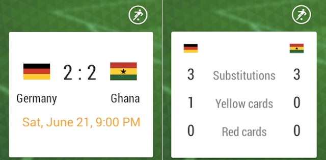
Other apps, like OneFootball Brasil, pushes soccer information in real time, with cards that end up being much more detailed than Google’s own.
Apps like Evernote Wear tap into Google’s built-in Defaults functionality, allowing users to set where a note is saved — “Remember to get a car wash” — with a voice prompt. This functions identically to Android proper’s settings, but all the Defaults are set in the Android Wear companion app.
Android Weary
Android Wear requires your smartphone to be running 4.3 Jelly Bean to run, since it relies on Bluetooth LE to communicate. It also requires the latest version of Google Search and Play Services.
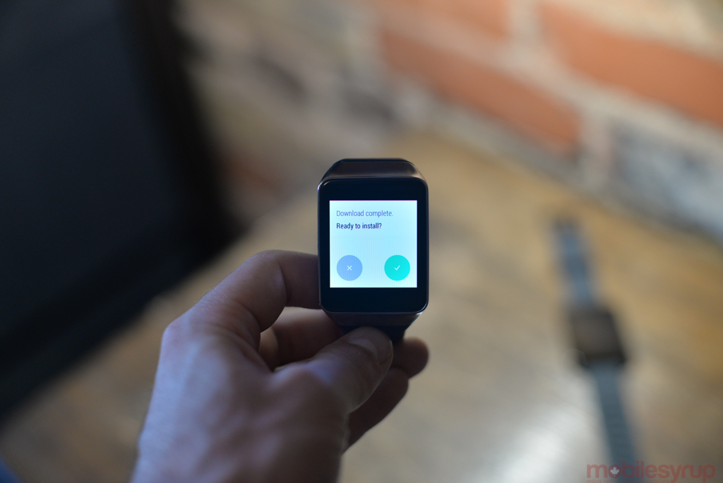
While the watch’s underlying software itself can be updated — both the G Watch and Gear Live already received a small OTA update — because Wear relies so heavily on mirroring Google Now cards, improvements can be pushed behind the scenes. As we’ll see later, Android Wear itself cannot be modified by the OEMs who create the watches, so all users will have an identical experience, with a few small caveats.
What this all adds up to is a promising start; Android Wear provides by far the best notification extraction of a smartwatch ecosystem to date. Unlike Samsung’s Tizen-powered Gear series, it does not limit users to one type of smartphone, and unlike Pebble it can display more than a few lines of text.
But there are some serious functionality issues, at least in the first generation of the product. Once you’ve dismissed a notification there is no way to recover it — and it is far too easy to accidentally dismiss a notification. Doing so also dismisses it on the accompanying phone, making it particularly frustrating when you think you saw something and want to see it again.
Even more egregious is the too-broad app notification blacklist. By default, Android Wear mirrors every notification, including those you don’t care about. As a heavy user, that proved frustrating. Google Now is seemingly smart enough to offer cards only when I want to see them, but many times a notification on my phone is not important enough to be conveyed on my wrist. The Android Wear app offers a blacklist, but that blocks all notifications from an app, not necessarily certain interruptions within one.
Clearly these considerations were made for the sake of simplicity, but such granularity should be offered in the future as a way to mitigate overwhelming users with unnecessary notifications.
LG G Watch
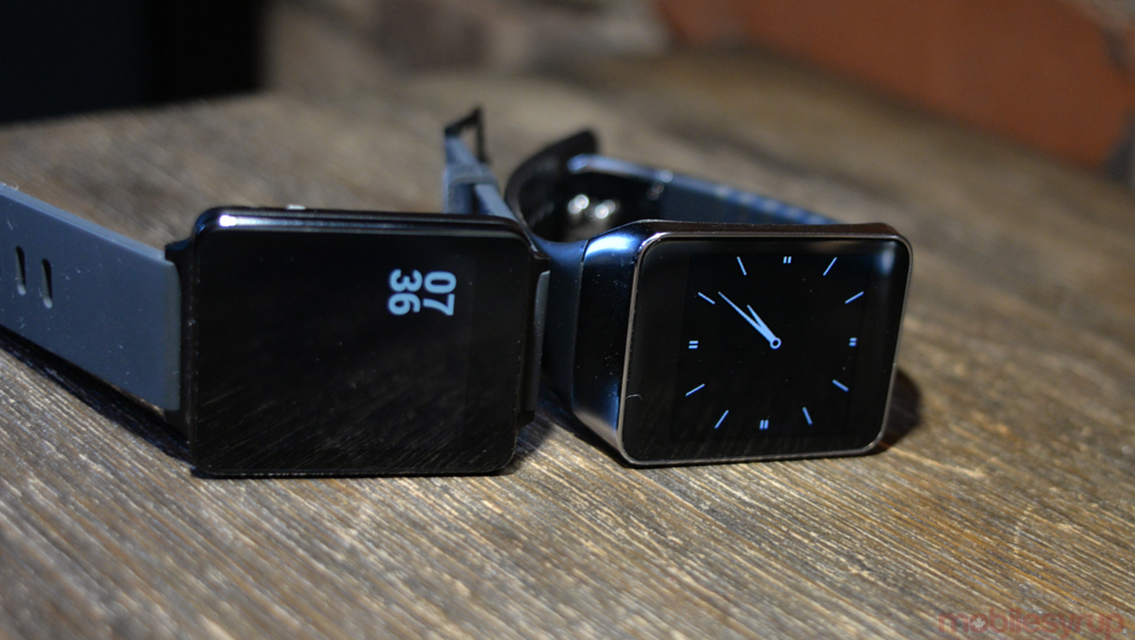
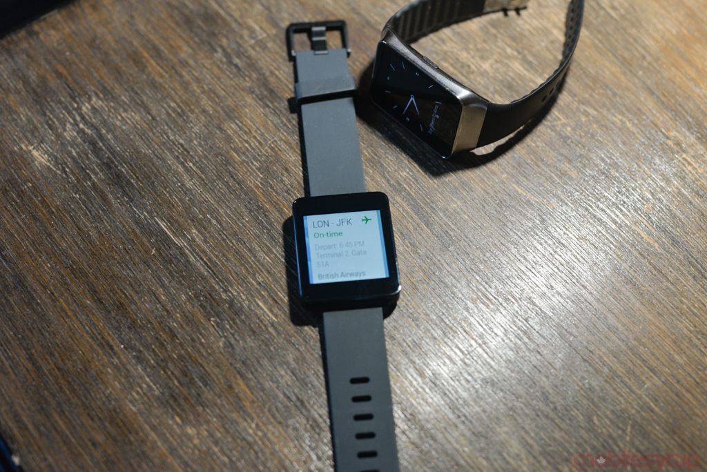
The squatter, simpler and more utilitarian of the two Android Wear devices currently available, the LG G Watch is a bland, black square with a 1.65-inch 280×280 pixel IPS display and no buttons to speak of.
Its utilitarianism is an advantage in a few ways: it’s more comfortable to wear, as the built-in rubber strap is more flexible and arguably looks better on the wrist. (Both watches have replaceable straps, though.) It also has a larger battery — 400mAh to the Gear Live’s 300mAh — and is more viewable in sunlight thanks to the stronger backlight.
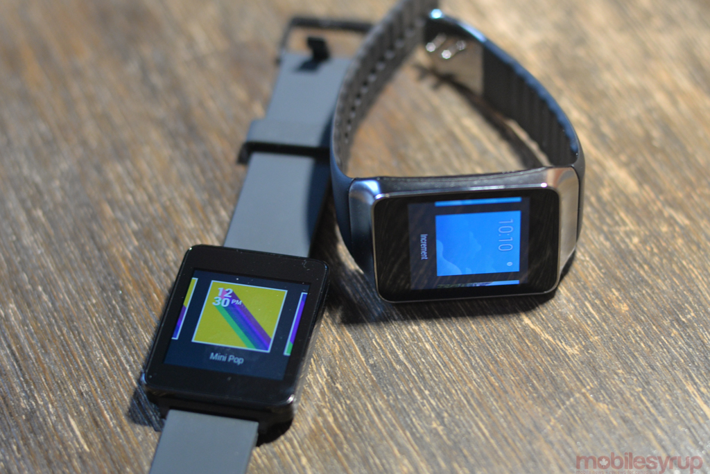
Those advantages over the Gear Live extend to the included watch faces: they are so much nicer than the uninspired preloads on the Samsung, it’s almost enough to change my recommendation. Almost.
Because the software is identical on both watches, the hardware differences between the two are paramount: as we’ll get to in the next section, Samsung has had enough time to sort out its usability issues, and the Gear Live feels like more of a fully-formed product than a technology demo. LG being first out of the gate means that the G Watch was likely designed as a reference platform for Android Wear itself, and was meant to showcase its capabilities rather than draw attention to the watch’s design.
There are no buttons on the G Watch, either: users can set the screen to stay on at all times, sucking battery due to an always-on backlight, or take advantage of the accelerometer to turn the screen on when lifting the watch. The motion is both natural and reliable; I never faced the issue of having to tap the screen to turn it on because it didn’t detect the upward movement of my arm.
Samsung Gear Live
The Samsung Gear Live is the better of the two smart watches, but barely. Both sport quad-core 1.2Ghz Qualcomm Snapdragon 400 SoCs, 512MB of RAM and 4GB of internal storage. The GPUs inside each differ — the Gear Live uses an Adreno 305 while the G Watch has a Mali-400 — and neither takes advantage of all four cores, likely for energy reasons, but performance is identical.
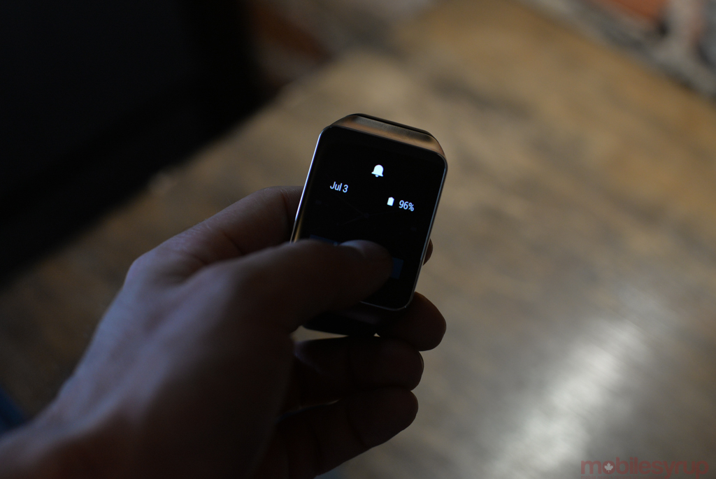
The Gear Live has a slightly smaller, higher-resolution screen than the G Watch — 1.63″ at 320×320 pixels — but the most important difference is the technology: like the Gear 2 and Gear 2 Neo, it uses Super AMOLED technology rather than IPS. This means that when the watch is “resting,” displaying a monochrome image, the large swath of black pixels are not using any energy.
If you’ve worn a Gear 2 or Gear 2 Neo, you know what to expect here: the Gear Live is practically identical but for a realignment of the single button, which has moved from below the watch face to the right side. Unlike on the Gear 2, the button is used to turn the device on and off rather than return to the home screen, and its new placement affords the watch a cleaner look overall.
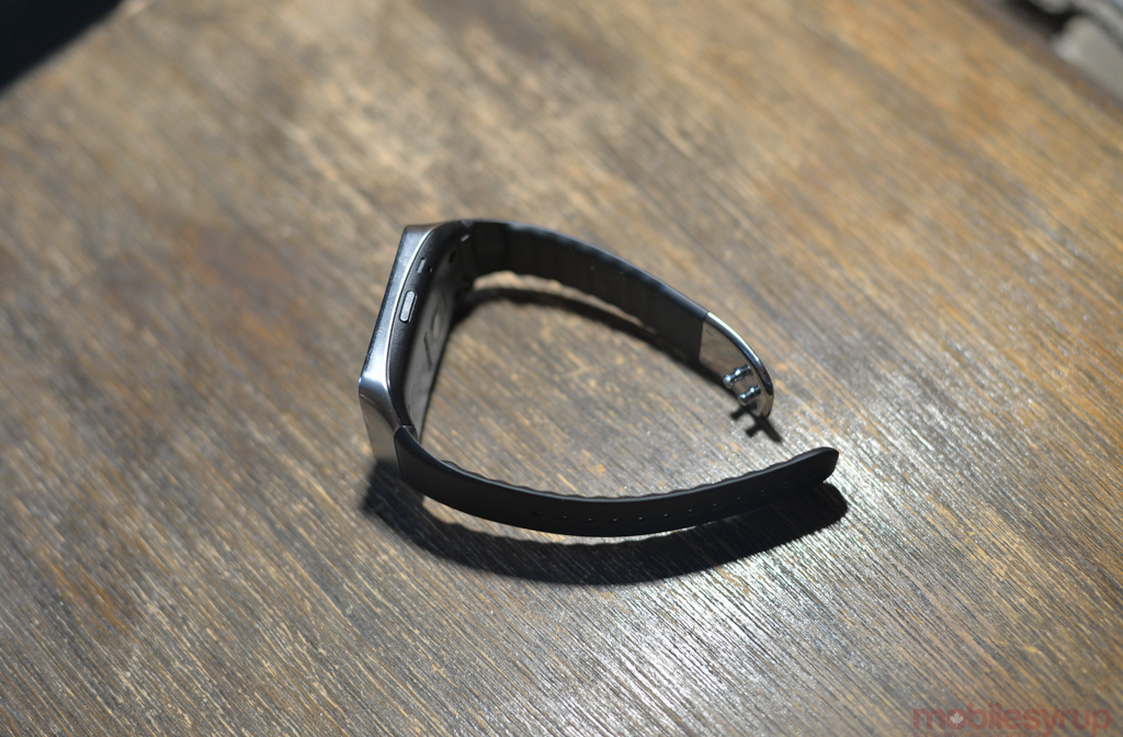
The watch strap is identical to its Tizen counterparts as well, and, while replaceable, is one of its most frustrating inclusions. It uses rigid, cheap-feeling plastic teeth make it impossible to rest flat on a bedside table or desk, and runs counter to the rather premium-feeling metal composition of the watch itself.
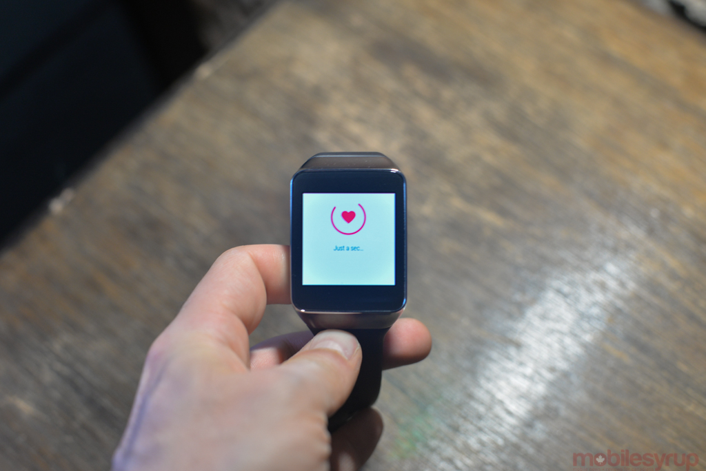
While easy enough to replace, the watch strap would be better suited for a health-related device. In fact, it’s Samsung’s inclusion of a heart rate sensor, the same one that graces the Galaxy S5, Gear 2 and Gear Fit, that created the need for such a strap in the first place.
The heart rate sensor, while still relatively unreliable (see our Galaxy S5 review for more on that), is more useful on a watch than a smartphone. It doesn’t like movement or sweat, so it’s still not exercise-friendly (it will often ask you to stop moving and wipe your wrist, which is not ideal when trying to gauge performance during a run) but is better than nothing, I suppose.
The Gear Live is the greater of two evils when it comes to usability in direct sunlight: both watches are practically unusable on a bright day, and neither offers an ambient light sensor to automatically boost brightness. This means that in order to transition effectively from a room, for which maximum brightness is usually too high, one must dig into the Settings menu and adjust it manually.
Battery Life
While uptime has proven to be ample for those who don’t mind charging every night, neither the G Watch nor the Gear Live will last more than 36 hours. This contrasts with Pebble’s five-day-plus battery life but diminished functionality and returns us to the argument of what we want in such devices.
In the early days of smartphones, users often decried their battery life, comparing them to the week-long charges of their monochrome Nokia bricks. We’re entering the same period for wearables, except that at this point smartwatches are deemed unessential by all but early adopters.
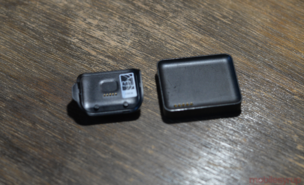
I have no inherent issue with having to charge my smartwatch every night, but take issue with the form their charging takes. Both the G Watch and Gear Live use POGO pins for charging, thanks to inherent water resistance that precludes on-device charging ports, but their docks, if they can be so called, are either clunky or cheap, and both far too easy to lose.
The Gear Live comes with a tiny clip that attaches to the POGO pins and houses a microUSB port. It works without issue but I will almost certainly lose it within the week and need to buy three more. The G Watch’s charging dock is better designed, allowing the watch to rest on top of it in one orientation. Neither, however, rival native wireless charging, which the Moto 360 is rumoured to have.
As for the watches’ battery life, the G Watch’s larger battery cell offered 20% better battery life in our benchmarks — five hours to the Gear Live’s four — but that was during sustained usage and does not mirror real-world use.
On days where the devices received a relatively high number of notifications, where the screens turned on every few minutes to display a notification, the G Watch edged the Gear Live by just over an hour. On days with lighter usage, the Gear Live, thanks to its Super AMOLED screen, had a three-hour edge.
Neither lasted more than 36 hours when connected to a smartphone, even with minimal notifications, but the Gear Live has proven better suited to my light-to-medium style of usage.
A Work in Progress
It’s clear that this is just the beginning: Android Wear, like Android itself was a few years ago, is teeming with potential. Today, the experience is bogged down by inconsistency and a relatively narrow set of supported actions, but viewed as a highly-capable medium for notification triage it’s clear Google has a winner.
Android has always done notifications better than any other smartphone platform, and Google’s ability to “sell” Android Wear to consumers will rest on how well it can convince them that its platform doesn’t need to end at the smartphone.
Like Samsung’s Gear series, Android Wear is a platform play, a means of enticing consumers to stick with Android itself. But whereas Samsung has yet to make a compelling argument in that regard, Android Wear’s bimodal combination of reliable voice and familiar touchscreen actions could make all the difference.
The LG G Watch is available for $249 and the Samsung Gear Live is available for $219.99 from Google Play.
MobileSyrup may earn a commission from purchases made via our links, which helps fund the journalism we provide free on our website. These links do not influence our editorial content. Support us here.

