One thing in mind
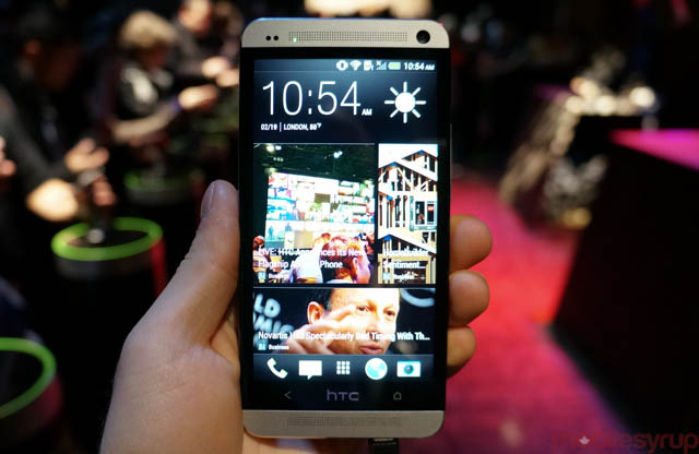
The HTC One is here. It’s a gorgeous 4.7-inch device with a 1080p screen and a new Qualcomm Snapdragon 600 processor. While the hardware specs were not the main focus of the press conference, the company has both hardware and software prowess in the bag.
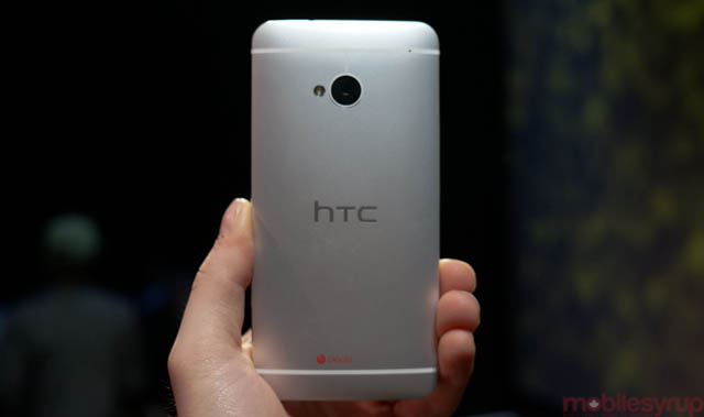
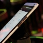
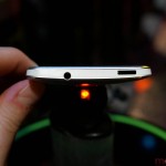
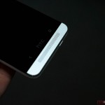
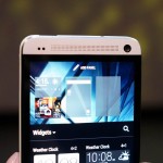
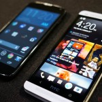
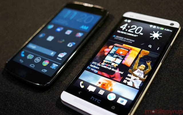
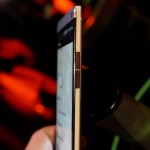
HTC wanted to avoid “hand overload,” and designed the One to fit as comfortably in one hand as possible. It’s only slightly larger than the One X at 137.4 x 68.2 x 9.3mm (the One X is 134.8 x 69.9 x 8.9 mm) and slightly heavier at 143g than the One X’s 130g. But the phone does not feel bigger, thanks to an edge-to-edge Super LCD3 screen with Gorilla Glass 2 and an Ultrapixel camera that does not protrude. In fact, the One embodies a design ethic that even Apple would envy, with smooth curves along its all-aluminum sides, manufactured using precision diamond-cutting tools. If it all sounds a bit hyperbolic, just wait until you feel one yourself — it’s very, very nice.
A Snapdragon 600 processor and 2GB RAM accompany either 32 or 64GB of internal storage (no SD slot, unfortunately), a 2300mAh battery, dual front-facing speakers, dual microphones, an infrared sensor built into the top-left power button, and finely-hewed volume buttons.
Simplify, and then do it again
HTC had a plan to simplify the user experience with Sense 5.0, which takes shape in BlinkFeed, the default homescreen view, and the lack of a dedicated multitasking button. Indeed, the One only has two capacitive buttons on the bottom, Back and Home. To reach the multitasking menu which, like so much of Sense 5.0, eschews 3D in favour of clean, flat, high-resolution assets, you double tap on the home button. To get to the Google Now search interface, hold down the home button.
You can do away with BlinkFeed if you so desire, but its Flipboard-like aesthetic treats you as a rapid consumers of information; it sources, consolidates and immaculately presents content from up to 1400 sources. It may not replace your dedicated news reader, but it certainly appeals to the news hoarder in me, and since it’s always available it stands to reason I’ll end up using it a lot.
The app drawer has been overhauled, too, with a vertical grid design that allows you to create folders. Of course, the regular home screen is available to you (up to four maximum) for a legacy Sense feel, but the whole thing runs at a clip you wouldn’t believe. This thing is crazy fast.
Cameras, Zoe and Passion
The One is not only immaculately designed, but it attempts to do as much as possible behind the scenes. The Ultrapixel camera, for instance, takes Zoes, a combination of still photos and short bursts of video which it then combines into a short movie clip with titles, music and seamless edits. We’ve yet to see what the experience is like in the real world — all the examples we saw were heavily doctored, we imagine — but in theory Zoe sounds like a potent combination of Vine and BlackBerry StoryMaker (hattip to Techcrunch’s Chris Velazco for the analogy).
We’ve also yet to see real-world photo quality, but curated examples from HTC point to amazing low-light performance and incredibly fast shutter speeds. One of the first things we plan to do is compare the One to the Lumia 920 and iPhone 5 in a photo and video quality shoot-out, so stay tuned for that.
How it stacks up
We won’t be able to tell for some time whether the One competes with Samsung’s upcoming flagship, or whether it bests Sony’s Xperia Z in features, smoothness and usability. But HTC has done its homework here: it has created a device sized perfectly for today’s market without alienating its core group of loyal buyers. The 4.7-inch screen size is certainly big enough, and the 468ppi screen is insanely gorgeous. This is easily the best mobile display on the market.
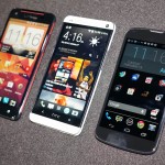
We’ll have to see how the Snapdragon 600 chip and 1080p display holds up our retinue of battery tests — that’s the big question mark here — but Qualcomm is promising 40% better speeds and improved battery life over its predecessor, the quad-core Snapdragon S4 Pro. We’re also curious to know how quickly the One will see Android 4.2 or above, since HTC has performed immeasurable surgery to Android 4.1.2 Jelly Bean. The operating system, for better or worse, is basically unrecognizable from stock. This is the farthest from a Nexus device you’ve ever seen the company produce.
But since HTC desperately needs a hit, and this is its flagship phone, we’re happy to see it launching on multiple carriers at the same time in Canada. It will fit in very nicely on the shelves of Rogers, Bell and TELUS, and Virgin customers finally have a great Android flagship for 2013.
MobileSyrup may earn a commission from purchases made via our links, which helps fund the journalism we provide free on our website. These links do not influence our editorial content. Support us here.

