One can’t even begin to write about BlackBerry 10 without acknowledging its near-mythical importance to RIM BlackBerry as a company. From its roots as an embedded operating system at QNX to its unused potential as the brains behind the PlayBook, the underlying code of BlackBerry 10 is a legacy unto itself, a proud and lasting statement of steadfastness in the face of certain bankruptcy.
But here we are, and as we glimpse something special in the opening of a new door, BlackBerry 10 needs to stand naked and resolve itself to evaluation and criticism. After two long years of development, does the operating system scream BUY ME! at the hordes of skeptical Android and iOS users? Does it whisper tantalizingly at the 80 million current BlackBerry users to “upgrade, upgrade!”? Recognizable as both a modern operating system and a subtle homage to the existing BlackBerry OS, BB10 is not necessarily a revolution, but a polished and focused evolution of what we understand as a communications platform.
Interaction & Hub(ba Hubba)
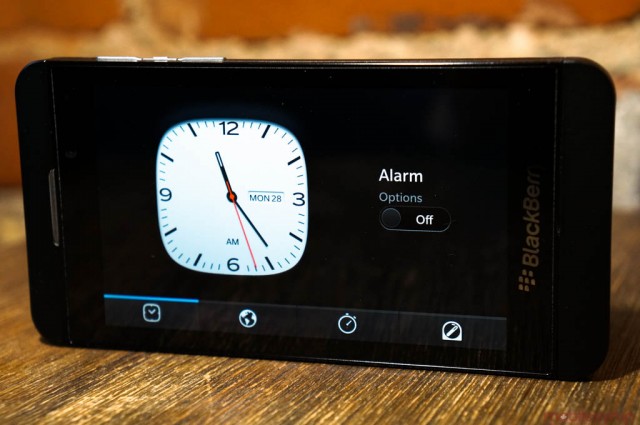
A new operating system is nothing without a clean, intelligent method of interaction, and BlackBerry 10 feels about as fluid as any out there. It is not only consistently smooth, but that it relies heavily on gestures affords it a sense of pace, a constantly moving organic thing that is truly satisfying to behold. The home screen is broken into three main areas: an horizontal app list with optional folders on the right, an eight-pane multitasking window that scrolls vertically (two sets of four Active Panes) and the Hub, a constant reminder that the blinking red light will never go away.
The Hub is where you’ll spend much of your time, composing emails, texts, Tweets and BBMs. There native apps for each of the aforementioned actions but for email, which is firmly entrenched in the depths of the Hub as the Ring was bound to Mordor. It’s a place you’ll come back to, and often: the ease at which you get to the Hub is why BlackBerry 10 feels so darn addictive.
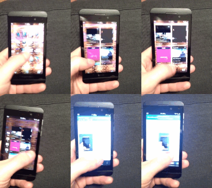
At any time, and from any app, you can swipe from the bottom of your phone’s screen to “peek” at your notifications (a familiar BlackBerry “Spark” star will alight any unread notifications) and, from there, swipe to the right to enter the Hub. You can glance at your consolidated content or take a deeper dive; much of the Hub is customizable, from which accounts appear in the larger list to how often each account is checked. More accounts = shorter battery life, so be cognizant of your addictions. Of course, for worker bees, the Hub will also be the place to check your BES emails and other client-related content.
Documents such as PDFs, DOCs and XLS files can be opened natively, while other file formats rely on third-party applications for compatibility. In addition to swiping left and right — BlackBerry Hub contains a number of nested screens that omit the regular on-screen back button; this is only an issue at first, and becomes second nature once you acquire a taste — you can often swipe down from the top of the screen to access any menus.
On the home screen, you swipe from the top as well to see the quick settings menu, which is sure to confuse the heck out of Android loyalists. There will also be the occasional right-side swipe, such as in the case of text selection. Then there is the occasional… eh, you’ll figure it out.
The whole enterprise takes a few hours of adjustment and, in the case of the accidental virtual back button, there’s a whole lot to be confused about. It seems intuitive until you realize that some apps are Android ports that implement an entirely different set of gestures. There’s no doubt that BlackBerry thought through its design ethic here quite well — nested left-side navigation bars and horizontal gestures are consistent throughout most apps, first-party and otherwise — but there is definitely a sense of discombobulation, jabbing at the display violently until it does something.
That’s not to say this is worse than how we find things on Android or iOS: the former created a virtual menu bar that few developers care to use, and the latter buries the majority of its app settings outside the app itself. Ultimately, though, BlackBerry 10 feels new because it feels fast — quicker than any mobile operating system on the market.
After the adjustment period — you’re going to miss a Home button for a while, trust me — it actually becomes much more intuitive to swipe from the bottom because, once finished, your thumb naturally rests in the middle of the screen, waiting for its next task.
 Multitasking… Wait, what did you say?
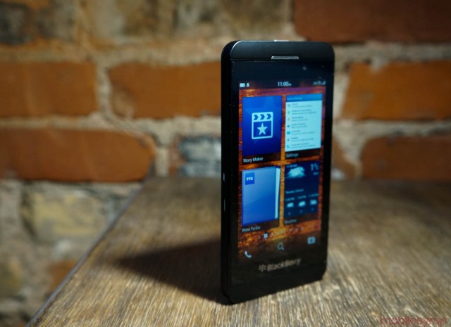
The multitasking menu takes its cues from the PlayBook OS, but improves upon it in a number of substantive ways. Referring to its eight (potential) panels as Active Panes, the windows have the capability of showing pertinent information depending on the context. For example, the Weather Network app displays the current temperature, while the Phone app shows the last three callers. The problem with this is that not all apps tap into this API, so you’ll see just as many static, blown-up app icons as you will interesting content.
That said, the fundamental multitasking system is the best in the industry. Apps re-open quickly, always back in their previous position, and though there is a limit to eight processes, I rarely felt disadvantaged by this number. It strikes the right balance between Android and iOS.
BlackBerry KeyBoard
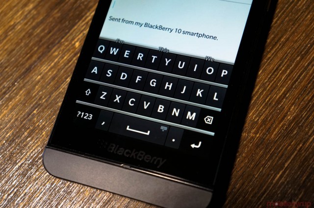
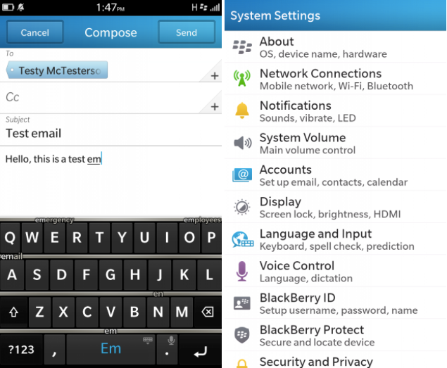
At the core of every BlackBerry user are two twitchy thumbs. While the virtual keyboard won’t have people screaming, “I don’t need QWERTY,” it’s pretty damn good. In fact, it’s like the best software keyboard currently on the market.
It has SwiftKey technology that does two things: it predicts your next word, often with eerie accuracy; and it has an uncanny ability to autocorrect even strings of misspelled words. BlackBerry took everything into account here: quick access to the symbols menu by swiping down quickly on the keyboard; hold down on a key to quickly capitalize; swipe to the left to delete the last word; double tap the space bar to insert a period. This is a BlackBerry keyboard, down to the satisfying virtual “tap” sound. It’s a truly satisfying experience, and I found it to be more conducive to long-form typing than the iPhone or Windows Phone keyboards. Its only true competition is SwiftKey on Android.
The only issues I had with the keyboard were above the keys themselves: text selection is hit and miss, often acting erratically depending on the app being used. Ideally, selecting text should be easy: hold down on a word to select it; continue holding it for a right-select menu to appear. These toggles include mainstays like Select All, Cut, Copy, Paste, etc., but the actual text selection mechanism is finicky. I often couldn’t move the blue cursors to cover the text I wanted, or once I lifted my finger it would disappear. Usually, after selecting the text I wanted the keyboard would disappear (tapping on the screen clears the selection) so the only way I could delete the text was to cut it. Older BlackBerries never had this issue, as the trackpad was fantastic for this purpose. I’m sure BlackBerry can fix these issues with an update, but the broken text selection really hampers the “getting stuff done” motif.
Apps, traps and lacks
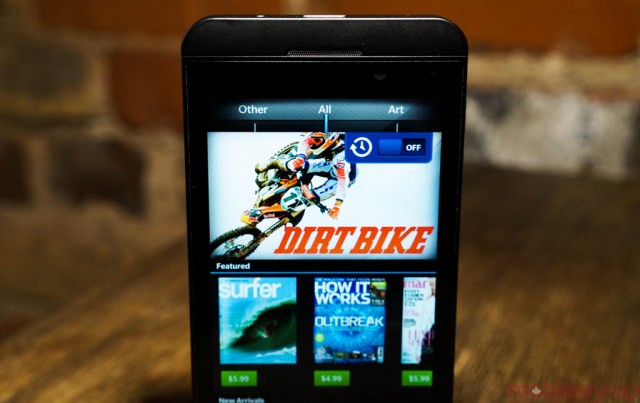
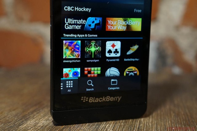
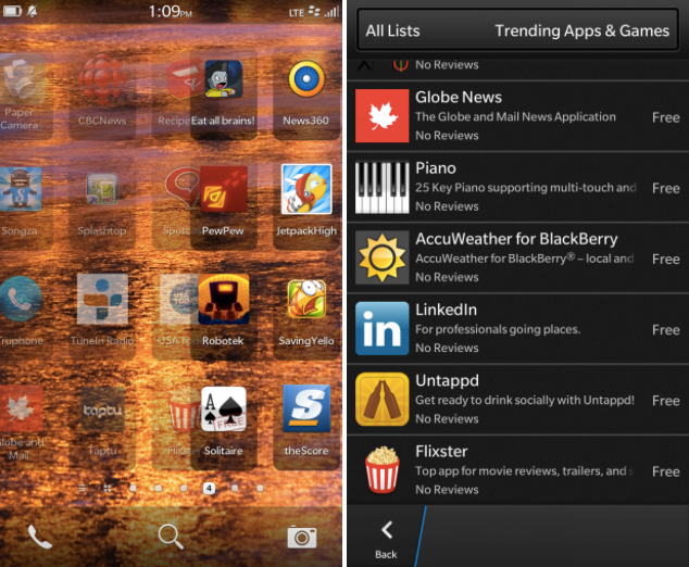
There is no shortage of apps on BlackBerry 10, especially for a platform that just launched. But the quality of the apps varies wildly in quality, and you don’t know whether you’re downloading one created specifically for the new platform using BlackBerry’s native Cascades architecture, or if it’s an Android or HTML5 port. In other words, there are some great apps but — and this is not unique to BB10 — most of them are terrible.
Launch titles such as Twitter, Facebook, LinkedIn and Foursquare, which are installed on the device, integrate well into the Hub, but there are some serious problems with each.
Twitter doesn’t have multiple account support, and while the app performs well, its touch targets are extremely finicky. It uses the gesture-based Cascades to slide back and forth between screens, but tends to miss or misrelate certain taps. Notifications also take a while to come through to the hub; when receiving mentions or DMs, they’ll always come through immediately on iOS and Android, but there is a several minute delay when pushing to the BlackBerry Hub.
Facebook is even worse with notifications, making it impossible to have a real-time conversation over the service. Status update comments and private messages only refresh every 15-30 minutes, and they’re all clumped together using the same timestamp. Going into the app reveals a design similar to iOS and Android, and the performance is excellent, but the feature set is lacking. Like early versions of the Android and iOS apps, you can’t directly access Facebook Events, pushing you to the (admittedly excellent) browser. The problem is that, by default, Facebook still considers BlackBerry 10 to be a “basic HTML” browser, so you have to deal with a low-bandwidth mess.
Foursquare often doesn’t find a GPS signal; Google Talk signs you out after a few hours. There are plenty of other examples of bugs in native apps, but the big issue is developer laziness.
All those “port-a-thons” sounded great in theory, but it looks like many of the 70,000 apps are merely ports of Android apps. Companies like CBC seem to have gone in both directions, creating native programs for News and Radio but porting over its almost-unusable CBC Music app from Android.
It’s impossible to tell whether you’re downloading, or potentially paying for, an Android port. IM+ Pro, for example, is taken from Android despite its hefty $4.99 price. The BlackBerry 10 Android runtime is fast but it by no means emulates native performance. And, due to its lineage, it doesn’t play nicely with notifications in the Hub. You’ll occasionally get pinged on new messages, but more times than not you’ll have to re-open the app to force a notification. It’s a bit of a mess.
There’s no doubt that BlackBerry taught man to fish instead of just giving him a nice supper — there are so many ways for developers to create apps — but at the end of the day this may discourage well-known devs from writing good code. If it’s easier (and equally profitable) to port an Android app, why build one natively? Cascades is so good — just look at the Hub itself for proof of this — but there are too many examples otherwise. There are also a number of PlayBook apps that are available for download, unchanged, on BlackBerry 10. These apps just don’t work; they are usually formatted for landscape, with tiny assets and no unified design ethic.
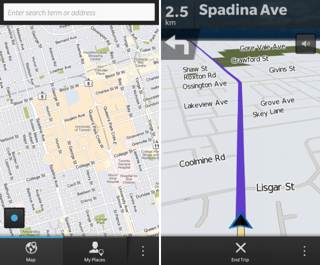
Maps
BlackBerry comes with its own set of tools, one of which is a Maps app with turn-by-turn navigation. It’s good, but not great, with an awkward design and no vector-based graphics. There are also no walking or biking directions. Basically, it gets the job done.
Remember
With Evernote integration, Remember is a decent little to-do app. All my previous Evernote notes were not formatted properly, so they are basically useless to look at. Any note can be saved locally or to Evernote for future reference, but it’s not a sufficient replacement for a dedicated app for the service.
BBM
The new version of BBM is definitely the most thoroughly-realized messaging tool on any platform. It includes instant messaging with read/write receipts, VoIP audio calls and a new BBM Video mode with screen sharing. Putting aside the fact that total usage has dropped considerably as consumers turn to multi-platform solutions like WhatsApp and Kik, not to mention the rise of iMessage, BBM is still the strongest game in town.
Its interaction with the Hub is also extremely useful, as it’s a cinch to check whether you have a new message without having to disrupt what you’re doing.
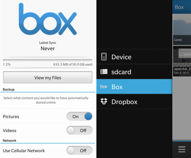
Dropbox and Box
One of the most rewarding features of BlackBerry 10 out of the box is integration with cloud storage services Box and Dropbox. These tools have become increasingly important in the daily lives of “productive” mobile phone users, and BlackBerry 10 allows users to upload photos and video to the services as well as access important files through the integrated file browser.
There are some limitations, namely the inability to automatically upload photos on Dropbox (Box has this function for some reason), as well as an inability to set a default storage folder (it always default to the root folder, which is annoying) but their presence is definitely appreciated.
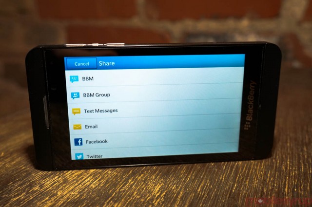
Sharing menu
You can share to BBM, SMS, Email, Facebook, Twitter, Dropbox, Box and many other services straight from the many apps in BlackBerry 10. This includes the excellent photo gallery and editing suite, which makes it easy to quickly share your photos, videos and edits to various social media hubs.
The sharing menu is also open to developers who want to integrate the feature into their own apps, or allow users to share to those apps from other places in the operating system.
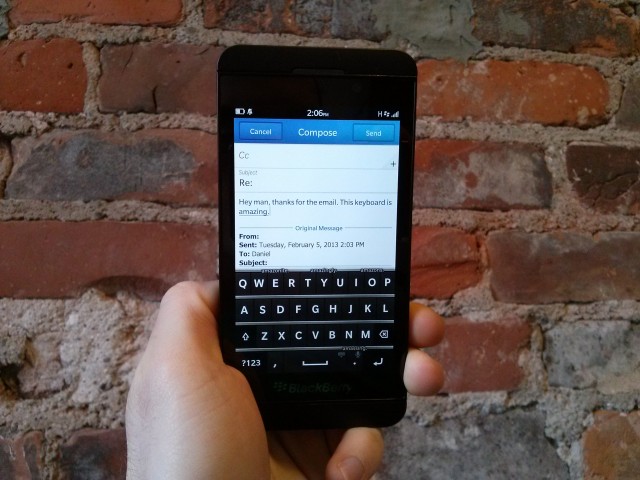
BlackBerry 10 deals with email like a ninja. It supports nearly every standard imaginable, consumer and enterprise alike, and automatically synchronizes calendars and contacts based on the what the service supports. For example, when you first sign in with a Gmail account, it adds email with IMAP, calendar with CalDAV and contacts with CardDAV. No manual settings at all. BlackBerry does have Gmail label support, though, but it does have extensive IMAP folder options as well as nested conversations (off by default).
Email notifications are adjustable to some extent, but the granularity you found in BlackBerry OS — different types of notifications for various alerts or alternate email accounts — is coming in a future update. Nevertheless, the red LED blinks until you show the phone some attention, and the ability to check email via the Hub from any app is certainly a boon to the ecosystem.
Despite a lack of a hardware keyboard, the Z10 proved to be far more conducive to long-form emails than the iPhone or any SwiftKey-powered Android device, and that’s owing to the care BlackBerry took in crafting the overall system.
Calendar & Contacts
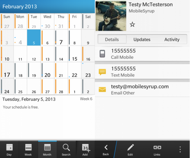
Like email, BlackBerry 10 has excellent calendar and contacts apps, the latter of which consolidates your various email and social network contacts into a single contact card with status updates and “live” activity.
The calendar will only sync with the main CalDAV calendar, but otherwise displays an extraordinary amount of information in a small space. Navigation can be broken into day, week, month and your next event is always available in the BlackBerry Hub by swiping down at the top of any screen.
Camera, Gallery & Story Maker
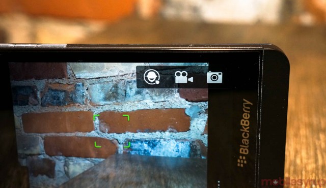
As stated in the Z10 review, the BlackBerry 10 camera is powerful, but the first BB10 phone does not take great photos.
The method of taking photos is extraordinary simple — one touch on the screen and it’s done. There are a few things to tweak, but you’re not going to find ISO/metering/contrast/brightness settings here, just a few Scenes to choose from, and the ability to shoot in Burst or Stabilization mode.
TimeShift is an intriguing feature, but is unlikely to sway many users to use it as it must be explicitly enabled; having it as a setting within the main camera mode would have been more conducive to using it, in my opinion.
The Gallery and Story Maker apps are highly-polished, but the former only shows a small number of the recently-shot photos, and pictures are separated between those stored on the main device memory and on the microSD card. It becomes a bit messy and confusing after a short time, especially if you’re swapping storage locations.
I also encountered a strange bug where all my friends’ Facebook avatars were stored in a Miscellaneous album that polluted my main photo feed. I could not delete the album despite trying several methods; it seems that the photos are considered part of the BlackBerry’s system files and cannot be removed.

Story Maker is a lovely little app that takes advantage of the BlackBerry 10’s new high-quality 1080p video capabilities. That it’s free and comes with the phone is delightful, but it’s not going to replace anybody’s desktop suite; it’s simpler than Apple’s $4.99 iMovie for iOS, but you can’t complain about the price.
BlackBerry 10: Business or Pleasure?
Ultimately, the success of BlackBerry 10 lies in its ability to court not only the increasingly app-hungry business market, but the millions of former users recently defected to other camps. It’s encouraging to see, at least in Canada, that up to 50% of BlackBerry Z10 preorders are from non-BlackBerry users, but those early adopters will not win the company back its market share.
BlackBerry 10 is a well-designed operating system that caters to the twitchy-thumb, blinking-red-light-obsessed market in ways that iOS and Android never will. After using it daily for two weeks it has become not only familiar but comfortable to use as a daily driver.
Its app selection is still lacking, and that is unlikely to change soon, even with the proliferation of Android on the platform, but its core feature set is extremely solid. It still does productivity as well or better than BlackBerry OS, but is no longer encumbered by performance issues. The BB10 virtual keyboard is a miracle and will go down as the best in the industry; combine it with a fantastic set of first-party apps, extraordinary email support and a Hub that keeps all your important data in one place and you have a heck of a foundation.
But BlackBerry 10 is still quite buggy. Rotation from portrait to landscape takes too long on most occasions, and returning to the multitasking window from a landscape-only app is more trouble than it should be. Android-based apps sometimes don’t start until you reboot the phone, and text selection is finicky and inconsistent. The menu system on BlackBerry 10 lacks coherence: sometimes you swipe from the top of the screen; some apps integrate it as a three-dot menu on the right side.
Media playback, while reasonably smooth, doesn’t play nicely with some apps: TuneIn Radio often muted itself after a few seconds, while YouTube videos were often choppy in the browser. Speaking of the browser, it is full of excellent design but lacks a “close all tabs” feature, and HTML5-based websites still serve up basic HTML versions.
These are issues that will be worked out over time; more importantly is the need for native versions of our favourite apps such as Instagram, Netflix, Flipboard and others, to grace the platform.
$BBRY: Buy or Sell?
BlackBerry 10 is going to be successful, of this I have no doubt. But whether it will find success in the smartphone market is still up in the air; it’s more likely to fit in within car dashboards and embedded systems. It’s not that the operating system doesn’t impress — it surely does — but it doesn’t do enough things better than the incumbents, iOS and Android, to unseat them. Canadians will flock to the first two BlackBerry 10 devices because they are great products, and because the carriers are behind them.
But, once the hype dies down, will these phones — and software behind them — change the smartphone industry? I hope so, but I remain cautiously optimistic.
What Works
* Intuitive navigation using gestures
* BlackBerry Hub is an amazing notification centre
* First-party apps are top-notch
* Email support is still industry-best
* Virtual keyboard is incredibly accurate and adapts to your typing over time
* Native apps made with Cascades are nicely-designed and perform well
* Has potential to be disruptive to the market if the app catalogue is sufficiently built up
What Needs Work
* Camera software is simple and finicky
* Lots of bugs remaining in final software
* Third-party app selection relies too heavily on Android ports and shortcuts to HTML5 web pages
* Not as tweak-friendly as BlackBerry OS
* Initial reports point to underwhelming battery life in first devices
MobileSyrup may earn a commission from purchases made via our links, which helps fund the journalism we provide free on our website. These links do not influence our editorial content. Support us here.

