HP has taken a beating in recent years. Best known today in the consumer market for making inexpensive laptops and printers with touchscreens, their bread and butter is now in the Enterprise. They’ve dipped their toes into the high-end consumer market, however, with the Envy line of laptops, and since their purchase in 2010 of Palm, they have expanded into the growing and increasing lucrative line of tablets.
When the TouchPad was revealed earlier in the year, rabid consumers lusting after new dimensions hailed it the one and only iPad competitor. Granted, this was before the iPad 2 was announced, but the cries were loud: webOS in tablet form was its Platonic ideal, the incantation it was designed, nay born, to take. Well, here we are, and the TouchPad is here. In fact, it’s been here for a while, but we’re reviewing only now. There is method to our madness, so read on to find out whether the TouchPad lives up to its massive hype.
Specs:
– webOS 3.0.2 for Tablets
– 9.7″ 1024×768 IPS capacitive display
– 1.2Ghz dual-core Qualcomm Snapdragon APQ8060 SoC
– 1GB RAM / 16GB, 32GB internal storage
– 1.3MP front-facing camera for Skype calls
-6300mAh battery
– WiFi (b/g/n), Bluetooth 3.0, A-GPS
– 240 x 189 x 14 mm
– 740g
The Tablet
Firstly, a public service announcement. We resisted reviewing the TouchPad until the first OTA update was released in early August. When the device was initially launched in Canada in early July, it shipped with software that could only be called buggy and unflattering. We knew that this highly-anticipated patch would fix many of the rough edges that emerged in the shipping software, and thought it prudent not to knock off any points unnecessarily for minor quibbles that were soon to be fixed.
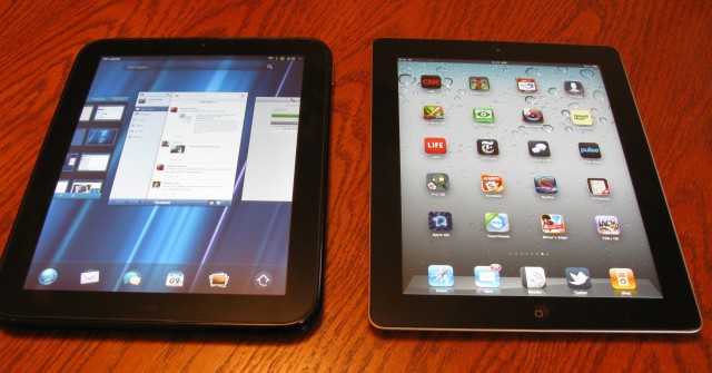
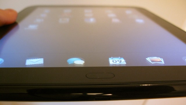
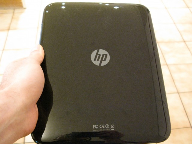
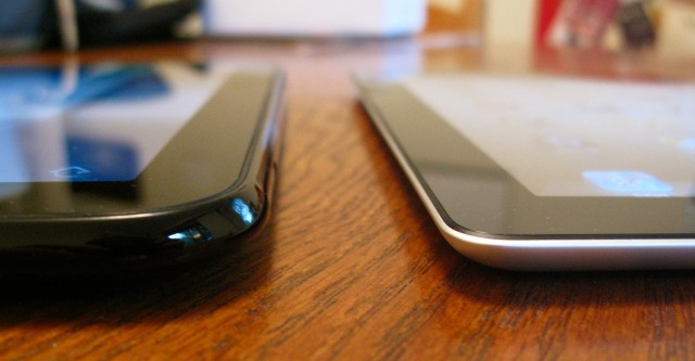
Now, the TouchPad is running webOS 3.0.2, and things seem a whole lot smoother. Hardware-wise, though, the device is identical, so let’s take a walk around the black beauty. At 9.7″ diagonal, and a 4:3 aspect ratio, the TouchPad reminds us of the (first) iPad. Not a bad thing, the all-black design has rounder edges and a nicer home button, but could otherwise be easily confused with Apple’s first-generation tablet. Its back is made of a glossy plastic that has a penchant for hoarding finger oil, so come prepared with a cloth (which HP generously ships with the device).
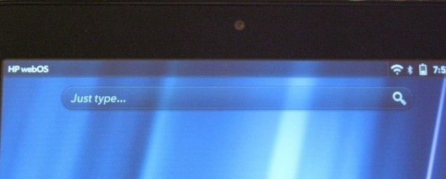
A 1.3MP camera sits above the screen, and though only compatible with Skype at the moment, its integration into the OS is buttery smooth. The rest of the hardware is fairly unassuming: a volume rocker on the right, a 3.5mm headphone jack on the top; a dock connector on the bottom; and three Beats Audio speakers to round out the experience (to ensure stereo sound in either portrait or landscape). Note that these are by far the best tablet speakers we’ve ever heard, though Dr. Dre should have convinced the team to make the back less shiny. As it exists, the camera-less backing is somewhat homely, but is easy to grip.
At 740g, or 1.6lbs, it’s also slightly heavier than the first-gen iPad and significantly more than the second, along with the Samsung Galaxy Tab 10.1 and myriad other Android tabs. Is this significant? Well, now that we’ve seen what manufacturers are capable of designing, yes. It’s truly one of the TouchPad’s biggest issues. One hundred grams in the grand scheme of things is unlikely to sway you one way or another, but to customer going into a retail store and comparing HP’s product to its competitors will likely come away thinking the TouchPad is too heavy.
One benefit of the TouchPad’s size and weight is the inclusion of the aforementioned Beats Audio speakers, which sound fantastic. We were very happily able to let the TouchPad replace our laptop, and in a pinch, our iPod dock, when playing music in the included app, as well as third-party software like TuneIn Radio. It’s obvious that HP wants the TouchPad to come across as a premium entertainment product, and in many ways this shines through the speakers.
There were some quality control issues we experienced with our review unit. Part of the Gorilla Glass covering the left side of the LCD display protruded 3-4mm from the edge, almost like wood expands when wet. Try as we might, we could not get the screen securely back in its housing. We’ve heard intermittent anecdotes of this sort since the TouchPad’s release in June, but are happy to hear HP is replacing the units without fuss.
WebOS 3.0
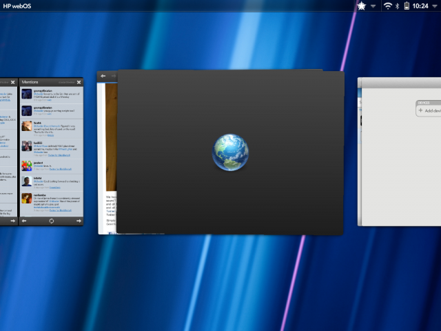
Much of webOS’ attraction to users was its fluid and intuitive operation dynamics that optimized workflow and allowed quick access to multiple apps using the swipe-and-card system. This has not changed in its third iteration, but has been tweaked somewhat for the tablet experience. Gone is the gesture area so familiar to Pre and Pixi users, replaced instead by a “home” button and multi-plane swipe support. Because the device can be used in any orientation, swiping up on the screen from any point will cause the current app to minimize or maximize depending on its state. Minimizing it will zoom out to a card view that can then be swiped up once more (on the screen this time) to end the process, or horizontally to change the running app. This multitasking system, often imitated, has been the cornerstone of the webOS experience since day one, and it still shines today.
Furthering the card experience is the ability to group these processes together into stacks. For example, instead of a new tab opening in the web browser, it will open in a new card that is by default stacked to its peers. This can be un- or re-stacked accordingly, and the whole dynamic is just about the easiest way to navigate we’ve ever used on a mobile OS.
Notifications and Launcher
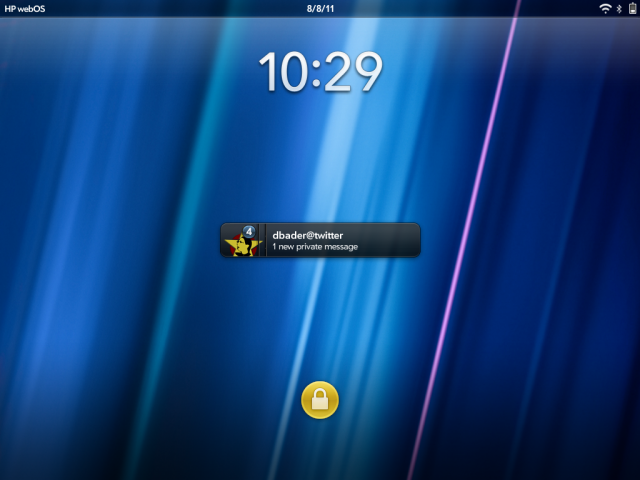
Notifications are treated somewhat differently from the phone version, too. Emails, downloads and any other chirps appear on the top-right of the permanent status bar, and are stacked according to application. They can easily be swiped away, though only one-by-one. They appear in an elegant, unobtrusive way that does not disrupt the workflow, and after several seconds retreat to their single-icon place until you wish to deal with them again. The lock screen also shows the most recent notifications, stacked on top of one another. If we weren’t aware of iOS5 and its Notification Centre, we’d likely say that webOS currently has the best notification system around but, well, we can’t.
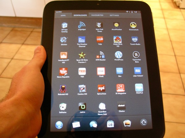
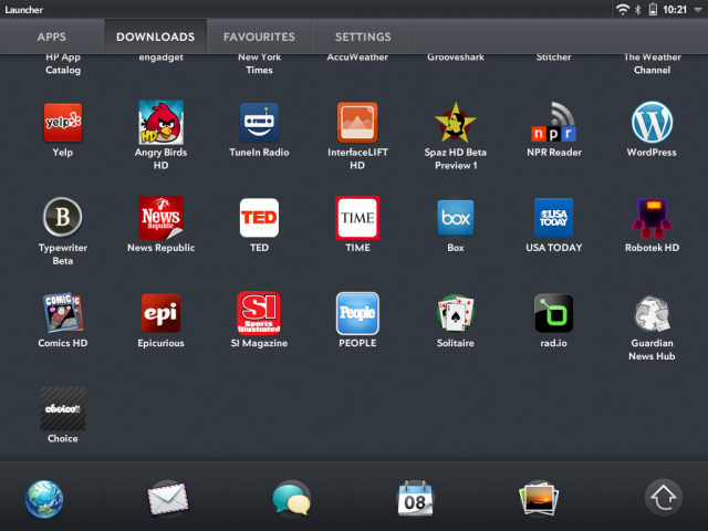
The launcher is equally austere: a customizable five-icon row at the bottom of the screen, regardless of orientation, with an arrow leading to the “drawer” for lack of a better comparison. Divided into four categories, Apps, Downloads, Favourites and Settings, icons can be moved to wherever nomenclature suits your needs, but they cannot be changed, nor added to.
Synergy
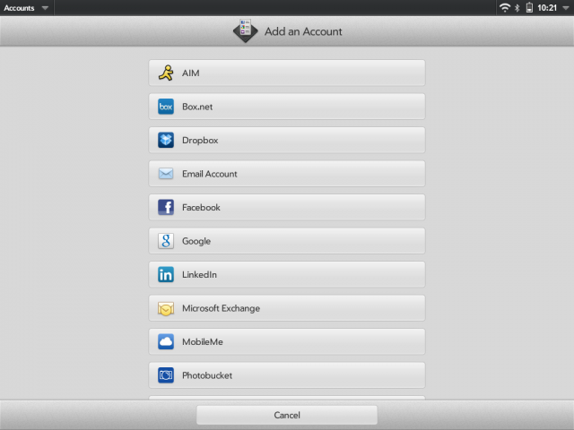
One of the more pervasive aspects of webOS, and therefore its most interesting, is Synergy. Originally Palm’s data/service/content synchronization system, it has evolved into the most efficient way to amalgamate all your services into one area. Got a Facebook and Google account? Your events show up effortlessly in the Calendar App. Got Skype, AIM and a webOS phone? All three services’ chat windows are consolidated and organized in the Messaging app. It’s genius and it’s fantastic and one of the reasons to own a TouchPad. Well, when it works. Supporting the popular to the esoteric, Facebook to Snapfish and everything in between, the integration is breathtaking.
We had issues with Synergy before the software update, and they didn’t go away after the fact. When logged into two Google accounts, we only saw the calendar entries for one. When attempting to delete one and re-add it the app crashed repeatedly and wouldn’t let us re-add until the device was restarted. We also couldn’t get one of our Microsoft Exchange emails to sync with Synergy, whereas it had no issue with the iPad’s native Exchange support.
Browsing
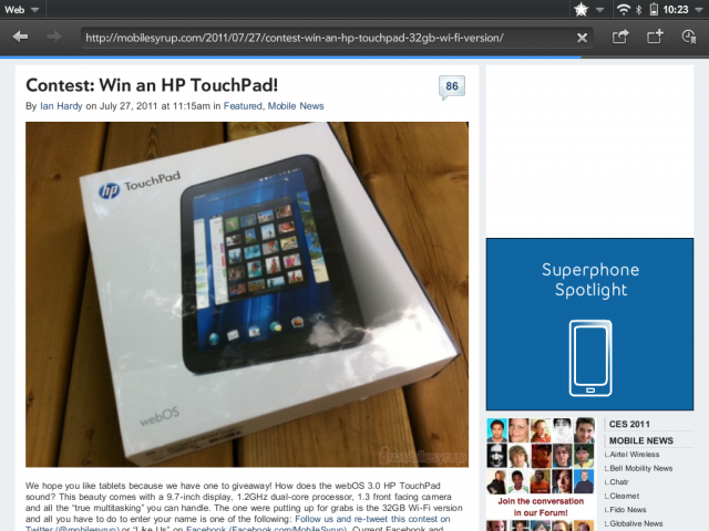
Browsing on the TouchPad is a lesson in reward versus frustration. In general speed was good over our WiFi connection: pages loaded about the same speed as on the iPad 2, if not a little faster. Flash support is not quite where it is on Honeycomb, but it generally works on lower-resolution clips, but pages like NYTimes.com, which have a lot of pre-loaded Flash content, were barely able to keep up with our finger.
In fact, at times the browser would just ignore our input altogether, choosing to save its pent-up kinetic energy to shoot to the top or bottom of the page when convenient. HTML5-heavy pages like New Twitter look great on the TouchPad, but functionality is iffy at best. Even more frustrating, though no fault of HP, is that most websites optimized for the iPad render desktop versions on the TouchPad, likely due to a proprietary userstring. Honeycomb’s browser fixes this by allowing users to customize their userstring to mimic the iPad; we’d love to see this implemented here.
Menus and the Back Button
We had love for the Pre. The Pre 2, even more so. Its gesture area was like a MacBook gesture area shrunk down to a fine point and optimized for mobile. But it was not to be on the TouchPad, and it has been replaced with a Back button that developers choose to place somewhere near the oriented bottom. While the implementation has somewhat more cohesion than the average Honeycomb app, the Back button, and if fact a number of the TouchPad’s input processes, are fractured and inconsistent.
Many apps use the sliding fragments implementation, which (much like the Twitter for iPad app, to give you some context) allows to horizontally swipe windows into view. This is displayed most assiduously in the native Email app, which like an accordion, is divided into three panels, though the rightmost panel can scroll left to take up the entire screen.
Native Apps
Without overburdening you with detail, we’ll say this: care has been taken to assure a robust out-of-box experience. While the rumours of not being able to create documents in the provided Quickoffice app are true, implementation of email, calendar, contacts, browser, messaging, memos, maps, music, gallery and even Facebook, are all top-notch. Many of the applications use the same two- or three-pane system, though some, like the Calendar, use context cards that overlap the main display. Much of the interaction is reminiscent of the iPad, but the TouchPad is certainly less of a blank slate than Apple’s tablet. Indeed, without downloading a single app from HP’s limited App Catalog, you’re able to do most things a full-sized laptop would allow.
Maps is provided by Microsoft’s Bing Maps service, and it’s excellent, with smooth transitions and accuracy. We only miss the Street View feature from Google Maps, and the turn-by-turn navigation found on Android, but for basic directions it is fine.
The included Facebook app is the best in the business, incorporating the Cards system in a wholly satisfying way. The Photos & Videos app is equally stunning: not only does it consolidate pictures from Google (Picasa), Facebook, Photobucket and others, the two-paned interface is smooth and powerful. You can select multiple images, from multiple services, and add them to various albums. We were able to take all the screenshots snapped for this review (with the built-in home-power shortcut) and add them to a Facebook album in two clicks. We would have liked to see support for Flickr, along with newer services like 500pixels or imgur that have open API’s but the homebrew communit will surely bring these features as time goes on.
General Performance and Display
Much ado has been made about the TouchPad and how it compares in performance to the iPad 2. We can get it out of the way now: the experiences are not the same. Whereas the iPad 2 and iOS 4 provide a generally trouble-free, wait-free experience, the TouchPad’s graphics-heavy interface gets occasionally sluggish, bogged down by some mystery beast inside the machine.
Considering it has double the RAM of the iPad and 200Mhz on each core, it is surprising that the software cannot keep up. We undoubtedly noticed a vast improvement in smoothness and app loading times with the update to 3.0.2, but too many times, even now, we were frustrated by agonizing loading times or a stuttering scrollbar interrupted by a phantom process. It’s so unfortunate, too, as for the most part the TouchPad took what we threw at it without complaint. But one too many times we had to wait for the UI to catch up with us, and instead of waiting we put down the tablet and picked up our iPad. We fear too many customers will do the same.
As stated, the 9.7″ IPS display is practically identical to the iPad’s — that is, in all but brightness — and as a result viewing pictures and movies is a treat. Colours are vivid and blacks dark, and the only issue we had was when attempting to view the screen in direct sunlight. Maximum brightness is low, considerably less than the iPad, Samsung Galaxy Tab 10.1, HTC Flyer and the BlackBerry Playbook. Perhaps an attempt to shore up battery life, indoors it was not an issue; outside was a different story, as the glossy, reflective screen was overwhelmed by natural light.
Keyboard and Miscellaneous
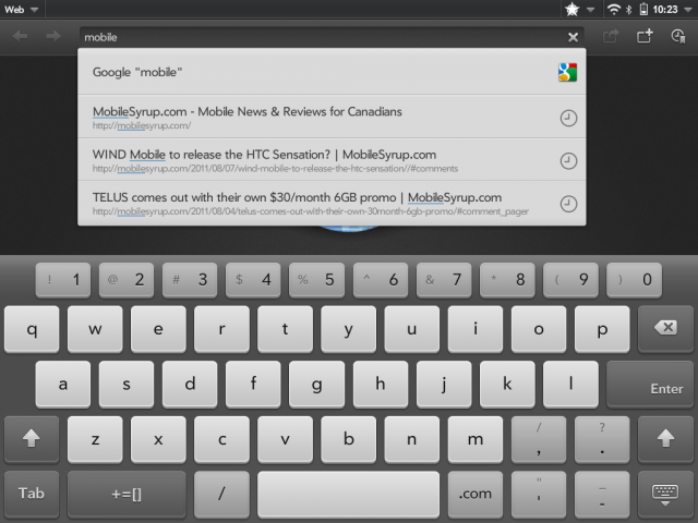
The TouchPad’s keyboard is fantastic. More versatile than the iPad’s and far more accurate than Honeycomb’s, it provided three size options along with a dedicated number row. Although occasionally exasperated by the autocorrect function, for the most part we didn’t have to worry about incorrect spelling, and when the dictionary didn’t have a replacement the one-tap correction method proved to be an excellent consort. This was something HP got right, especially considering the early webOS builds were completely missing virtual keyboard functionality.
Skype support on the TouchPad is integrated right into the device: simply sign in and it syncs up your contact list to the Messaging app, as well as to Phone & Video Calls, depending on your desired activity. Over WiFi quality was generally good, though much more grainy than an equivalent Facetime chat. We also experienced audio delay problems over Skype, but the complete integration charmed us more than it offended.
Bluetooth integration is robust, too. Whether connecting a wireless keyboard or a webOS smartphone, connectivity was problem-free. One of the more interesting inclusions is the ability to sync the upcoming Pre 3 to the TouchPad, allowing you to text/call/chat with people through the native Messaging interface. Similarly, you are able to touch the Pre 3 to the TouchPad’s screen and share web pages and other media over Bluetooth.We don’t yet have a demo unit to test this feature, but we anticipate great things.
Battery Life
One area in which the TouchPad exceeds expectations is in battery life. Often matching or surpassing our iPad 2, we hardly had to worry about the device on a day-to-day basis, filling it up about once a week. For modest users, charging it every three days or so will be the ticket, but with the optional inductive charging dock it’s exceedingly easy to just stand the device before bed, and by morning it’s ready to go.
We were able to loop a movie (Rango, if you must know!) for approximately 8.5hrs before the TouchPad shut off. Very respectable battery numbers.
Accessories
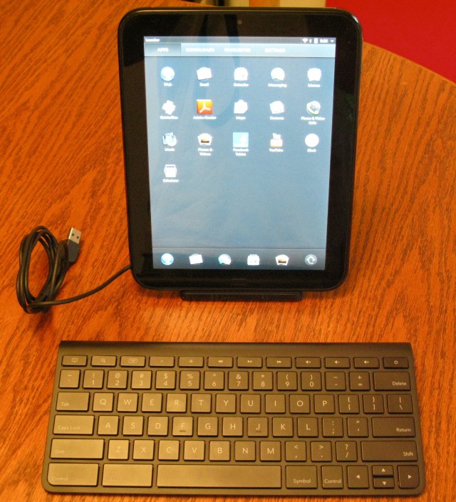
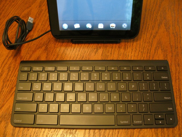
We had the chance to test three first-party accessories for the TouchPad: the Charging Dock ($69.95); the Wireless Bluetooth Keyboard (69.95); and the Standing Case ($49.95). Of all the accessories, I liked the case the least, with its flapping canvas front, though unlike the iPad 2’s Smart Cover this one covers the back. It admittedly adds the least amount of bulk possible, and offers two standing positions depending on whether you want to type, or watch a movie.
The typing angle was a little bit shallow for us; we’d have preferred the ability to customize it, but for the most part it enabled us to do some basic typing on the TouchPad’s excellent virtual keyboard. At $49.95, however, the canvas and-plastic build quality feels cheap, and not worth the investment, unless you really need to do some serious typing.
The Charging Dock is just cool, and not only acts as a movie-watching stand but charges your TouchPad or connects it to your computer without hassle. At almost $70, it’s a big investment, though arguably, when paired with the wireless keyboard, could be one worth pursuing. The keyboard is also quite good, with clicky keys that are easy to touch-type on. Build quality on both these accessories is also high. Generally, though, we weren’t big fans of the physical keyboard/on-screen interaction mix. There is too much awkward tapping at the screen when vertical, trying to select text boxes or move to another screen. But since the WordPress app is great, and the multitasking so intuitive, we can see the TouchPad/Wireless Keyboard combo being used instead of a netbook in some cases.
Apps and the Developer Community
Apps? Oh, yes, the little pieces of code that sell iPads and leaves other platforms in the dust. While HP anticipates a hearty and sincere effort to bolster the desolate App Catalog, if the Touchpad’s slow adoption rate is any indication it will take longer than they think.
There are some decent titles already in the store, from recognizable cross-platform developers to ones coming from the older generation webOS community. Angry Birds, Kindle, Time Magazine — these are all here and ready to be used. Missing are the stalwarts of iPad fame: Netflix, Twitter for webOS, Reeder. More important than the apps is the potential to make money from HP’s App Store. In order to spur adoption for customers and developers alike, HP is offering $50 to spend in the store for all early adopters.
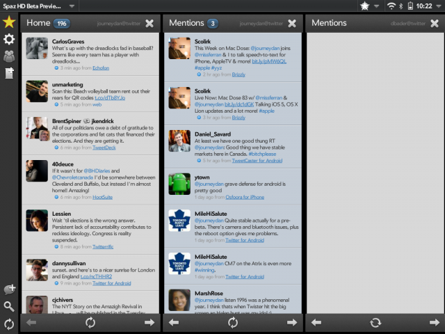
We also found apps such as WordPress, Spaz HD for Twitter, and even native Facebook, to act erratically and at times agonizingly slow, necessitating a reboot of the device to get things working smoothly again.
In webOS Internals and Preware there is an active and growing homebrew (read: jailbreak) community, though HP and Palm before them were much more open to hackers tweaking the internals of the webOS source code than Apple will ever likely be.
Conclusions
The road to TouchPad has been paved with rocks and shards of glass. While we are finally here, nestling the portly device in our weak arms, we cannot help but feel a mixture of resentment and disappointment, with a hint of impatient exasperation, at the finished product. What could have been the first true contender to the iPad’s dominance is instead a fat, bald beta, clearly a first-generation product that, like the Samsung Galaxy Tab 10.1 did, should have gone back to the drawing board and be re-designed, optimized and, ultimately, finished, before it was released.
As it is, the TouchPad, even with the 3.0.2 update, is a mess of beautiful contradictions: its operating system is one of the finest examples of touchscreen modality we have on the market, an artist’s rendition of a bright future in which we swipe, type and scroll our way to content consumption and productivity. Perhaps this is what the next-generation TouchPad will be, and we await it as eagerly and impatiently as we did the first.
Until then, even at the sizeable discounts currently being offered by HP and its affiliated retailers, we are reticent to recommend it. If you are set on it, however, be patient, be thoughtful, and for goodness sakes, write an app or two. Gosh knows HP could use the numbers.
The HP TouchPad is available for as low as $399.99 for the 16GB version and $499.99 for the 32GB version. A 4G-capable version will be coming to select carriers later in the year.
Rating: 6.5/10
Pros:
– Luscious 9.7″ screen has beautiful colours and excellent viewing angles
– Wonderful speaker quality makes mincemeat of its competitors
– Robust native apps
– Excellent service integration with Synergy
– Best multitasking in the business
– Great battery life
– webOS 3.0 is truly an upgrade, a stunning piece of architecture…
Cons:
-… with crumbling bricks that don’t always cohere
– Heavy, belligerent design
– Plastic is a magnet for fingerprints
– Lack of third-party apps or developer interest
– At times slow
MobileSyrup may earn a commission from purchases made via our links, which helps fund the journalism we provide free on our website. These links do not influence our editorial content. Support us here.

