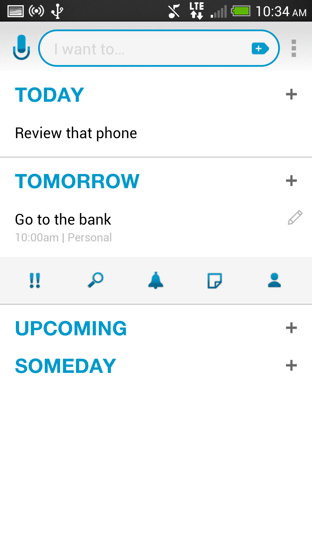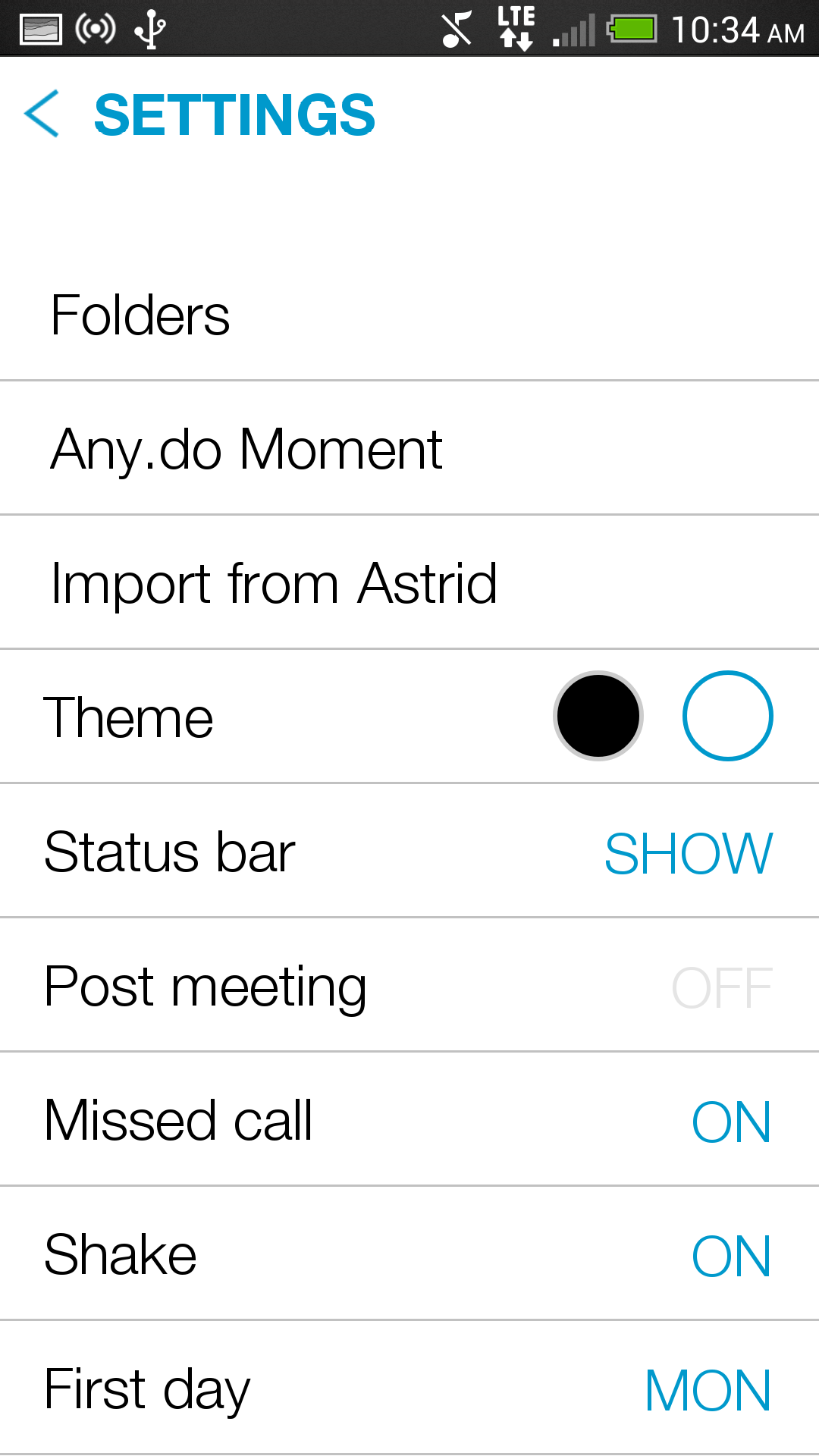

Any.Do, the popular task app that just raised $3.5 million in funding, has revealed a cleaner, revamped UI in its iOS and Android apps today.
While not a huge departure from previous versions, the gesture-friendly interface is now more minimalistic (if that’s even possible) and user-friendly, focusing on one-tap or single-gesture movements to actions various tasks.
The app also received a new logo, again focusing on simplicity, in its drive to curate the perfect productivity experience on mobile. Along with competent offline Chrome web, Any.DO has released a new Content Provider service for Android developers to integrate a user’s tasks or notes into third-party applications. This is the first step towards Any.DO becoming a platform of sorts, more than just a set of standalone apps.
Any.DO is also about to launch a new calendar app, Any.DO Cal, though details are sparse at the moment.
MobileSyrup may earn a commission from purchases made via our links, which helps fund the journalism we provide free on our website. These links do not influence our editorial content. Support us here.


