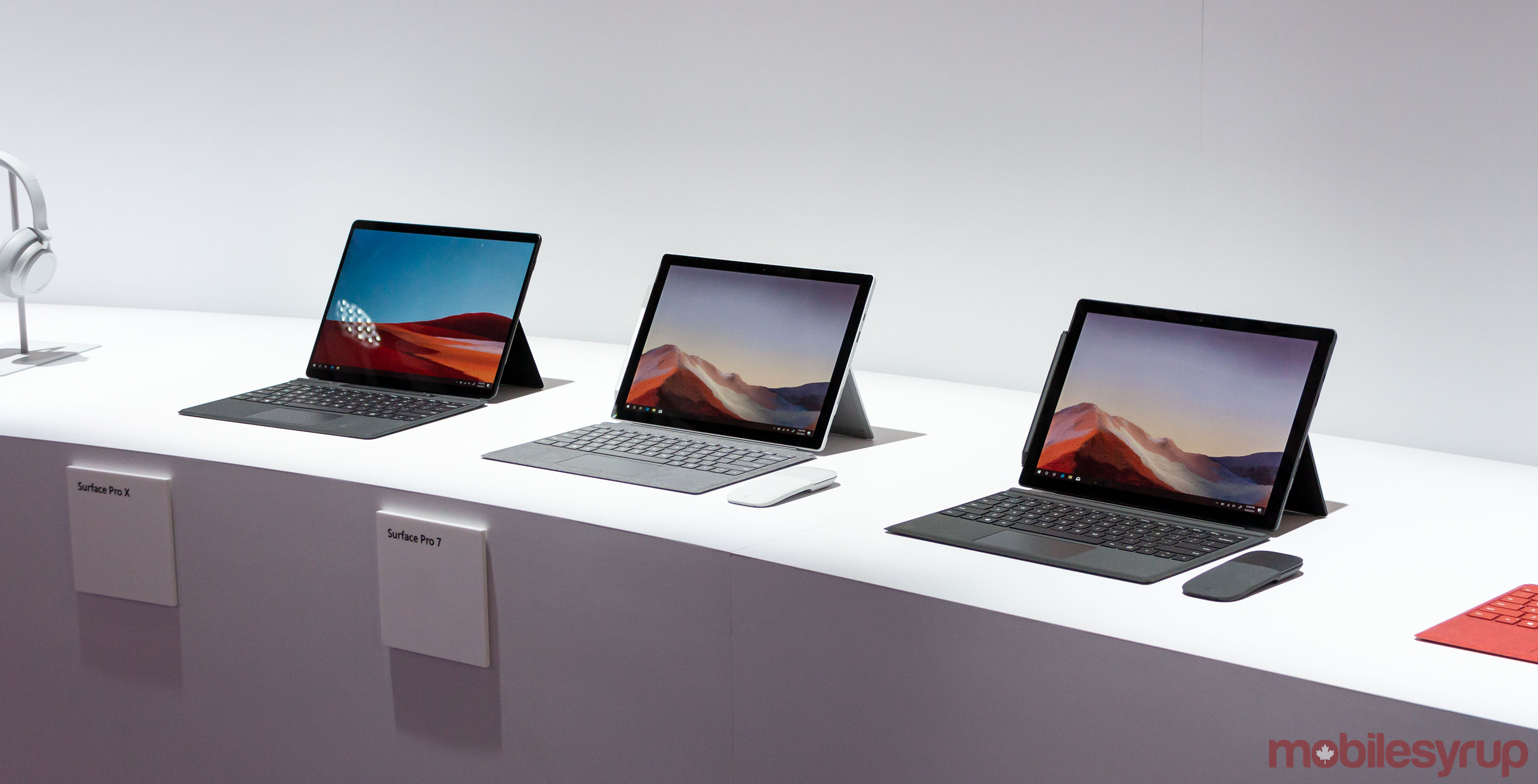
At its New York event on October 2nd, Microsoft announced a slew of new products. Some announcements, like the Surface Neo and Duo, are peaks into the future of Surface. Others, like the new Surface Pros and Laptops, are more immediate changes — welcome changes, to be sure, but ones that feel out of place with what’s to come.
Namely, the Surface Pro X, which should have been the most exciting device of the day. Now it feels like a stepping stone for Microsoft, but an important one nonetheless.
The Surface Pro 7 and Surface Laptop 3, on the other hand, are less critical. With both products, Microsoft iterated on solid design and produced quality of life updates that most users will be happy to have, but these changes don’t demand an upgrade.
I had an opportunity to go hands-on with the new Surface products. Below, you’ll find my initial thoughts about the Pro X, Pro 7 and Laptop 3.
Surface Pro X — Microsoft dabbles in custom silicon
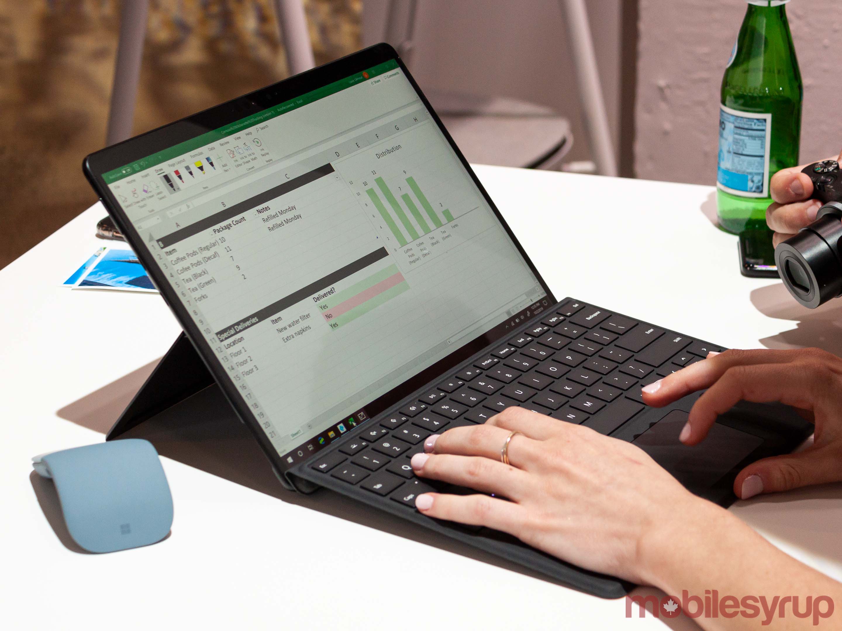
The Surface Pro X is the thinnest, most portable and fastest Surface Pro yet.
It’s a bold claim, especially considering the struggles ARM-based Windows devices have had in the past. However, Microsoft seems to believe that its custom chipset, the SQ1, will fix that issue.
Developed in partnership with Qualcomm, the SQ1 runs at seven watts, much higher than most ARM processors. According to Microsoft, this enables the Pro X to run faster than last year’s Surface Pro 6.
The SQ1 brings support for other technologies, like LTE, while also allowing for a thinner, lighter design and longer battery life. Interestingly, ARM chips don’t natively support conventional PC technologies like NVMe PCIe support for SSDs. That was one of the challenges Microsoft had to overcome with the SQ1.
However, there’s more to a device than just the chip and, in the case of the Pro X, things like app compatibility and software are crucial. Past ARM-based Windows devices struggled with performance because of the x86 app architecture. Most Windows apps run on x86, which means they either don’t work, or don’t work well, on ARM. Windows devices using ARM can emulate x86 to run the apps, but this typically means worse performance.
This time around, the SQ1 makes it so you can’t tell the difference if an app is emulated or not. That’s hugely important, if true, because it means users get the benefits of ARM without sacrificing performance or compatibility.
In my brief time with the Pro X, it blasted through Excel datasheets and churned through 3D renders without a hiccup. Impressive as it was, it was a controlled demo on the showroom floor. It remains to be seen how well it performs in a real-world environment.
The best looking Surface Pro
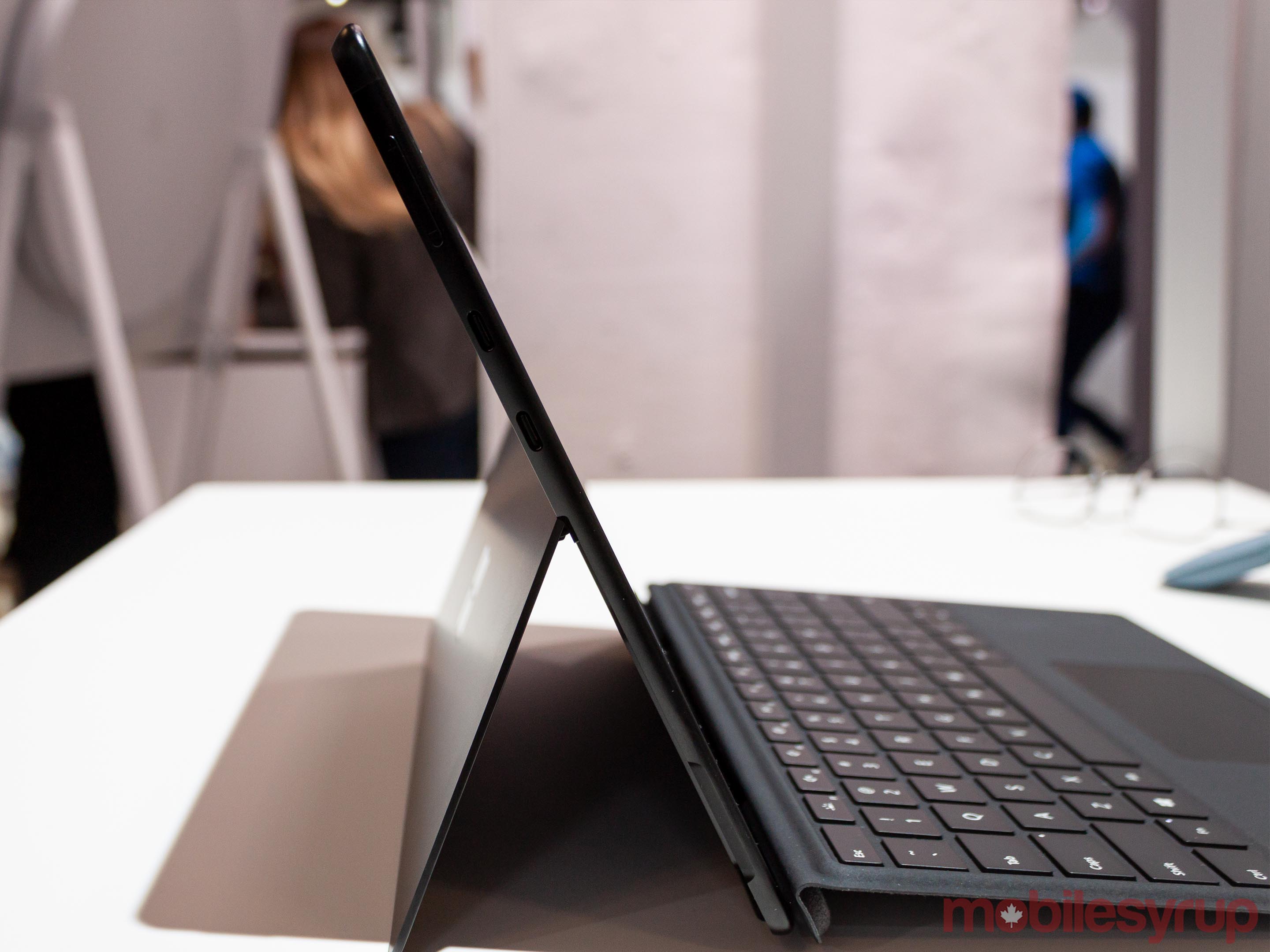
The Pro X also proved to be the best-looking Surface Pro. It sports a new design that feels like a cross between the Surface Pro 7 and the Pixel Slate.
Microsoft made the Pro X slim and sleek. At just 7.3mm, it’s incredibly thin. In hand, it felt sturdy and unmistakably Surface.
The display is also fantastic. The company shrank the bezels to get a “13-inch screen in a 12-inch form factor.” Microsoft’s Surface line has had excellent displays for a while now, and the Pro X is no exception to this rule.
However, the screen isn’t the only place that saw a refresh. Microsoft rejigged the Type Cover for the Pro X to include a spot to store the new Slim Pen. It’s a brilliant addition, and one people have sought for some time.
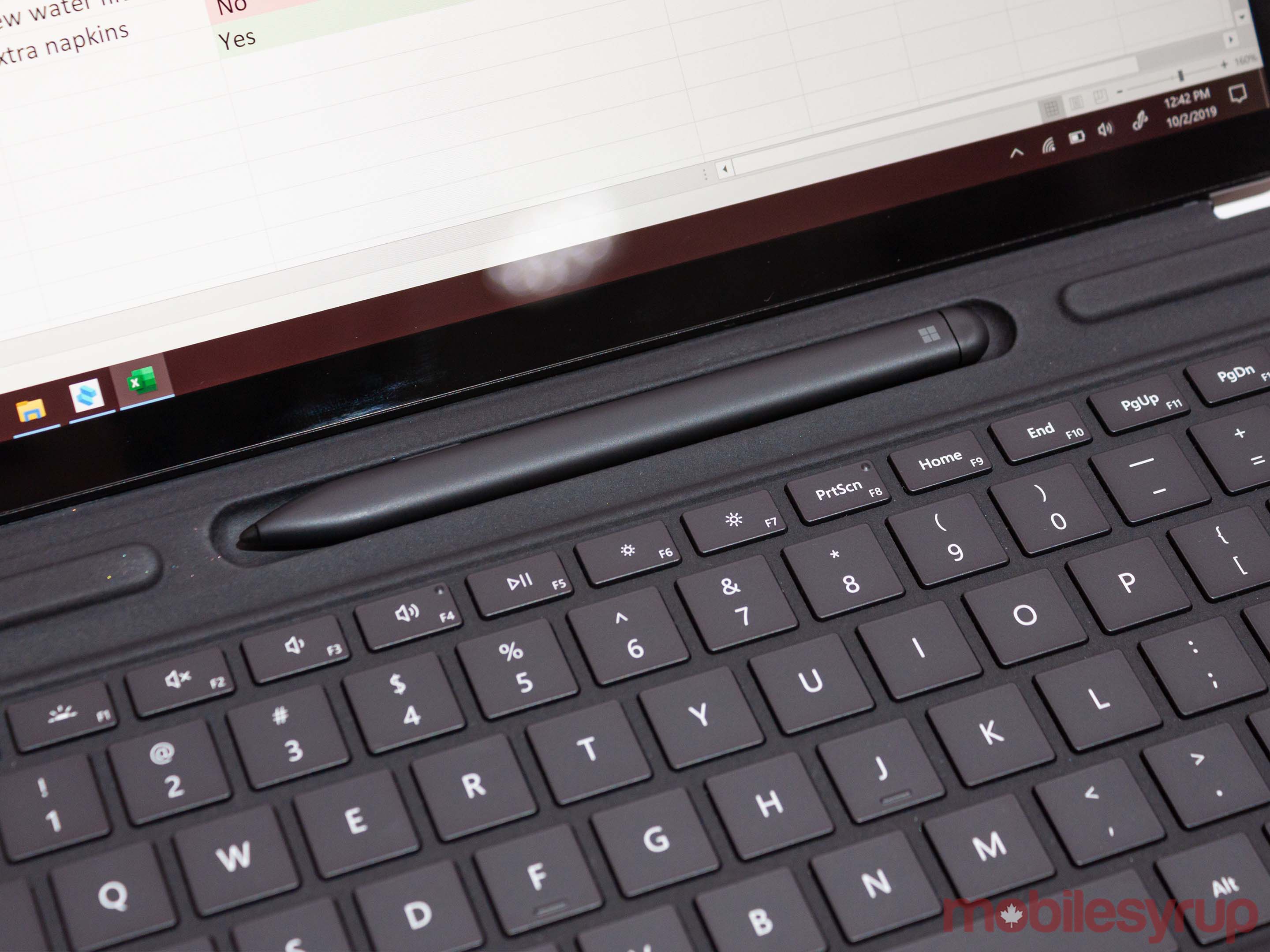
It was baffling that Microsoft didn’t do the same for the Pro 7. A spokesperson at the event told me that the company viewed the products as fundamentally different. The Pro 7 (more below) is for the business or corporate users. It maintains a lot of the function and form of past models so that it sustains compatibility.
The Pro X, however, is all about mobility and creativity. Microsoft sees it as the device for the consumer on-the-go, the person who needs to create everywhere and anywhere.
While that’s the reasoning behind adding storage for the Pen to one device and not the other, it also reveals the ethos of the Pro X. It’s set up as the ultimate on-the-go computer for creating and doing in every situation.
My concern is where the Pro X will find itself next year when the Surface Neo arrives.
Surface Pro 7 — Familiar territory
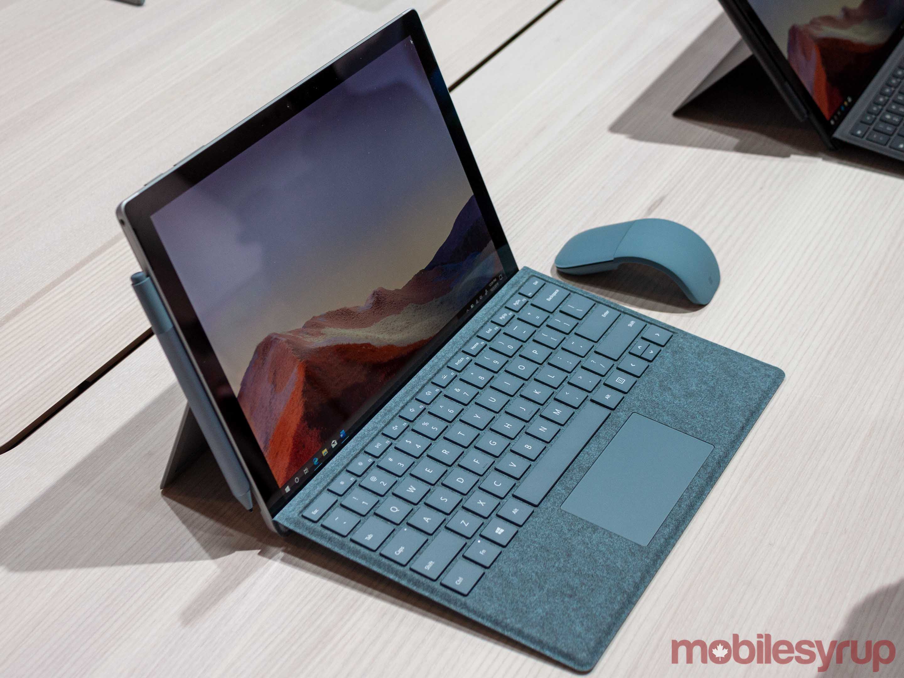
The more things change, the more things stay the same. Such is the story of the Surface Pro 7. You wouldn’t be remiss to say it’s the Pro 6 with a USB-C port and a faster processor.
However, I don’t think that’s necessarily bad. The Surface Pro 6 was among the best Windows machines of last year.
The Surface Pro 7 fixes the areas where the Pro 6 suffered and improves on areas we didn’t even realize needed improvement.
For example, the Pro 7 adds USB-C. That’s a huge bonus, especially on a device like the Surface Pro, which has limited ports. With USB-C becoming the standard, more and more things work with it. By extension, less tech uses standards like USB-A.
That said, Microsoft didn’t get rid of the USB-A or Mini Display Port either (the same cannot be said for the Laptop 3). The Pro 7 keeps the Micro SD card slot as well, making it the most connectable Surface.
Speaking of ports, Microsoft also added fast charging to the Surface Connect charging port. The company claims that all its devices can charge to 80 percent in about an hour — the Pro X does it a bit faster than the Pro 7 and Laptop 3, however.
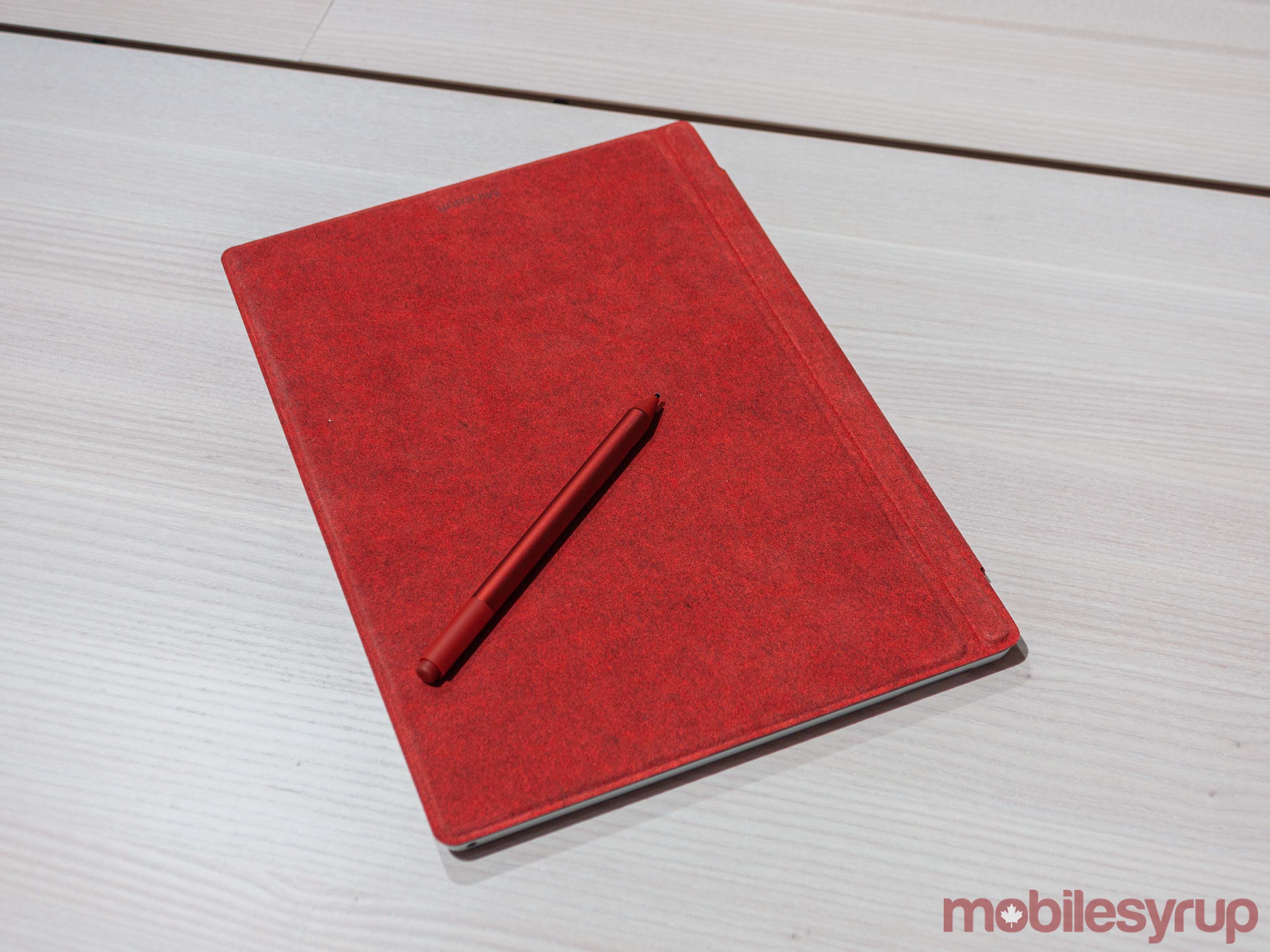
The company also added dual far-field studio microphones to the new Surface line, which helps with voice recognition.
Beyond that, Microsoft didn’t change much. The Pro 7 comes in several variants using the latest Intel i3, i5 or i7 processors, which should offer about two times the performance. Both the i3 and i5 variants maintain the fanless design. Additionally, the Pro 7 comes in new colours as well.
While it may be easy to find the lack of change in the Pro 7 disappointing, it’s important to remember where it fits in Microsoft’s lineup now. The future is clamping down on the Surface Pro 7 from both sides. Meaningful change to the Pro 7 may no longer be the way forward.
Surface Laptop 3 — Bigger and more MacBook than ever
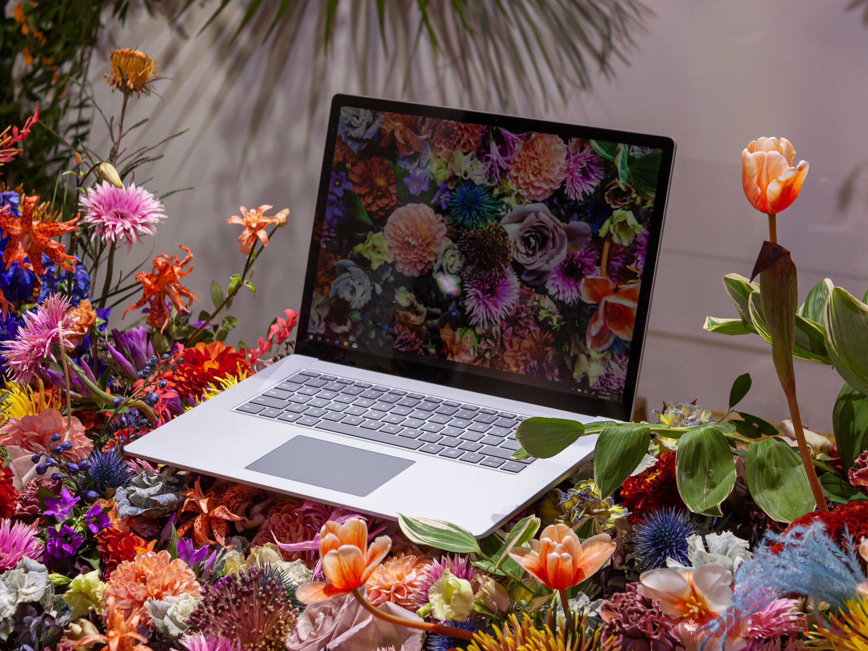
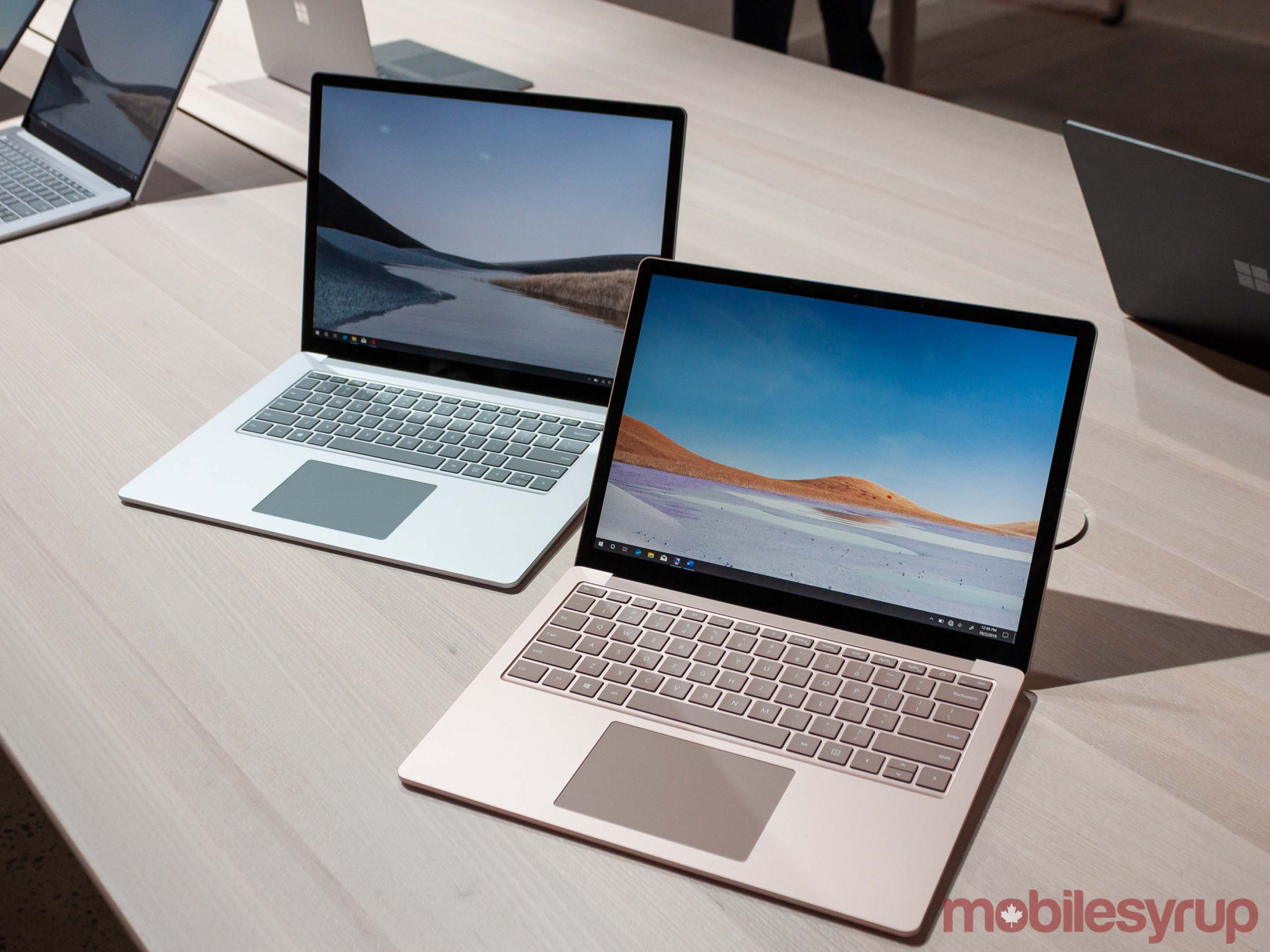
When I first laid eyes on the 15-inch Surface Laptop 3 in the new Sandstone colour, I wondered who had left their MacBook on the display table.
This isn’t a bad thing though. The Laptop 3 is a beautiful device, it just looks a lot like Apple’s popular laptops, especially in the new ‘machined aluminum’ finish. While I like the new look and appreciate the choice between fabric and metal, it’s worth noting that the Laptop 3 loses some of its identifiable charm in the exchange.
Looks aside, the Surface Laptop 3 is in a similar boat to that of the Surface Pro 7. While I doubt that traditional laptops will disappear anytime soon, the Laptop 3 now finds itself in a precarious new position with the future closing in. Again, Microsoft played it safe and rolled out iterative yet important updates.
First up, there’s now a 15-inch option alongside the 13.5-inch Surface Laptop 3. Aside from a bigger screen and newer internals, the 15-inch Laptop 3 doesn’t offer much over its smaller brother. The displays are functionally identical aside from the size. Both offer the same resolution and aspect ratio, Microsoft’s traditional 3:2. It doesn’t use the extra space to offer more ports or a bigger battery.
How the 15-inch does differ is the processor. Customers can get the bigger Laptop 3 with AMD’s Ryzen 5 3580U or Ryzen 7 3780U mobile processors. Commercial customers can also get the new 10th Gen Intel CPUs in the 15-inch if they prefer. The smaller laptop only offers the new Intel CPUs.
How the new Ryzen processors impact performance remains to be seen, but Microsoft says the Laptop 3 is twice as fast as the Laptop 2.
Ports, touchpads and more
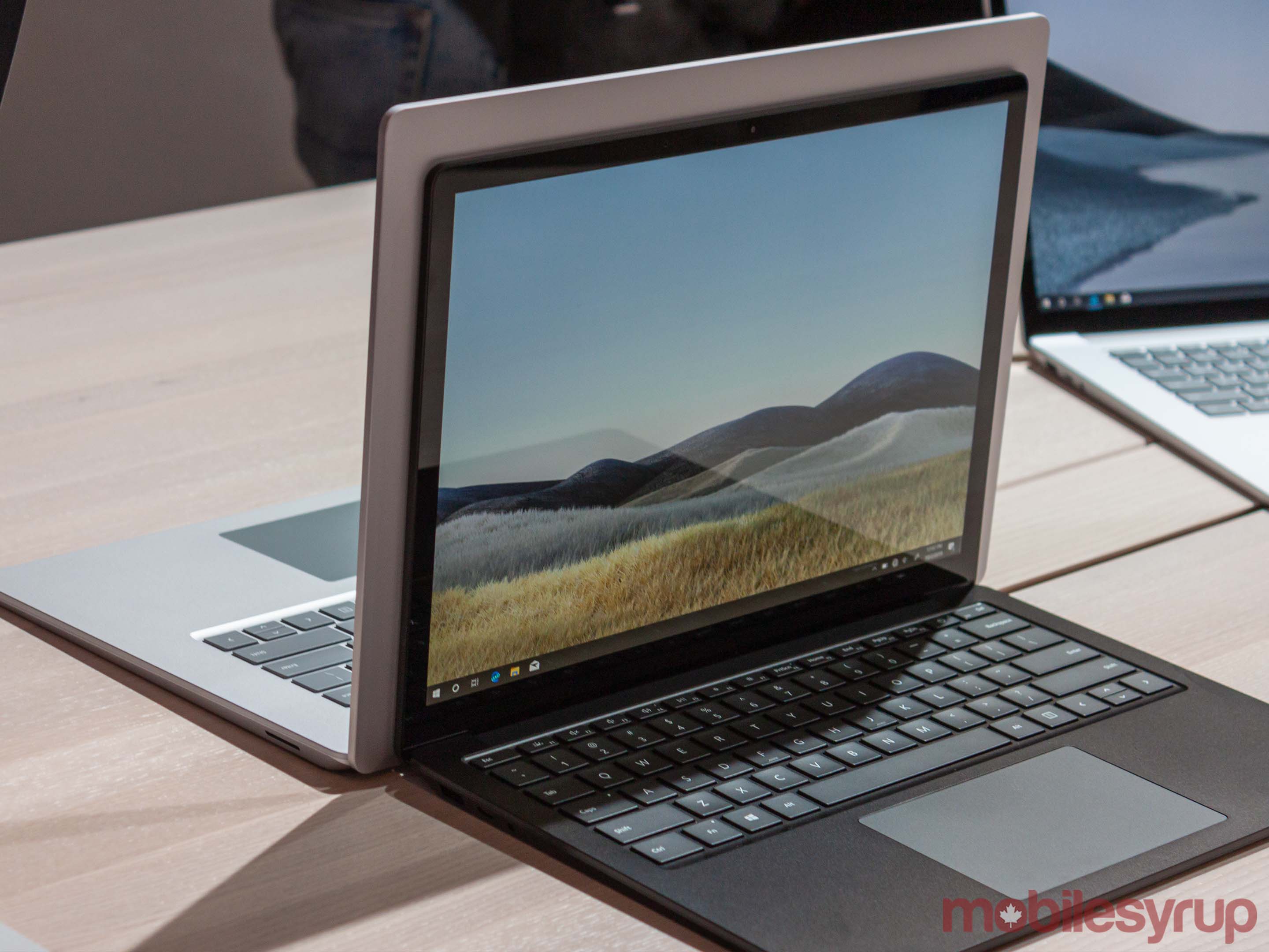
As for ports, the Surface Laptop 3 trades the Mini Display Port for a USB-C port and keeps the USB-A port. Aside from the 3.5mm headphone jack and Surface Connect port, which now includes fast charging, that’s all you get. While USB-C is welcome, the lack of IO is still disappointing.
One crucial change Microsoft did make with the Laptop 3 is it increased the touchpad by about 20 percent. Windows laptops have had laughably small touchpads for some time and this change was very needed. However, on the 15-inch Laptop 3, the touchpad still looks small due to the bigger size of the rest of the computer.
Another welcome change is that the Laptop 3 is now more serviceable. While this won’t directly affect most customers, Microsoft designed the laptop so the bottom could be opened more easily for repairs. It also means parts of the computer are reusable. For example, the top of the Laptop 2 had to be thrown away if it was serviced because it couldn’t be reused. The Laptop 3’s new design allows the top to be kept and used again.
While repairability is important, that doesn’t mean the average person should go and open things up. Microsoft made it clear that these changes were designed for its service teams, and while customers could open the devices, it doesn’t recommend that they do.
Beyond that, little else has changed. Microsoft talked up the excellent keyboard, which is still very good and now very quiet too. It also added dual mics for better audio recognition.
Ultimately, the Surface Laptop 3 offers important changes to the Surface Laptop formula, but Microsoft isn’t breaking new ground here. If you have an ageing device and you’re looking to upgrade, the Surface Laptop 3, as well as the Pro 7, is more than capable. However, Laptop 2 and Pro 6 owners likely won’t need to upgrade this year.
MobileSyrup may earn a commission from purchases made via our links, which helps fund the journalism we provide free on our website. These links do not influence our editorial content. Support us here.


