Instagram is working on a “visual refresh” of its branding. A blog post from the company revealed a tweaked logo as well as a new typeface and new full-screen marketing layouts.
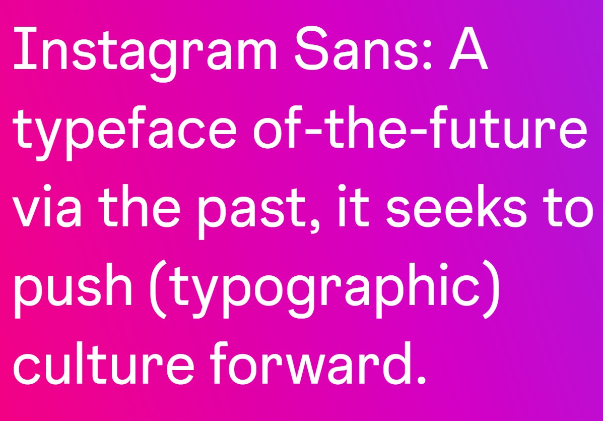
Instagram writes that it hopes to put “content at the center” of its brand “with a focus on simplicity and self-expression.” The new typeface, named Instagram Sans, was crafted in partnership with language experts worldwide, allowing the company’s global community to “express themselves on [the site] in places like Stories and Reels.”
As for the slightly-tweaked logo, the gradient is now a bit more vibrant. The company writes this move was to make the brand’s identity “illuminated and alive.”
The new marketing layouts come as the site has been testing a full-screen feed akin to competitor TikTok. The new feeds see captions overlayed atop posts, with the text moving as users scroll down the page.
This effort comes as the company aims to retain users in the competitive social media space. Users will soon see these changes across the platform and on their phone’s home screen with the new brighter logo.
Image Credit: Instagram
MobileSyrup may earn a commission from purchases made via our links, which helps fund the journalism we provide free on our website. These links do not influence our editorial content. Support us here.


