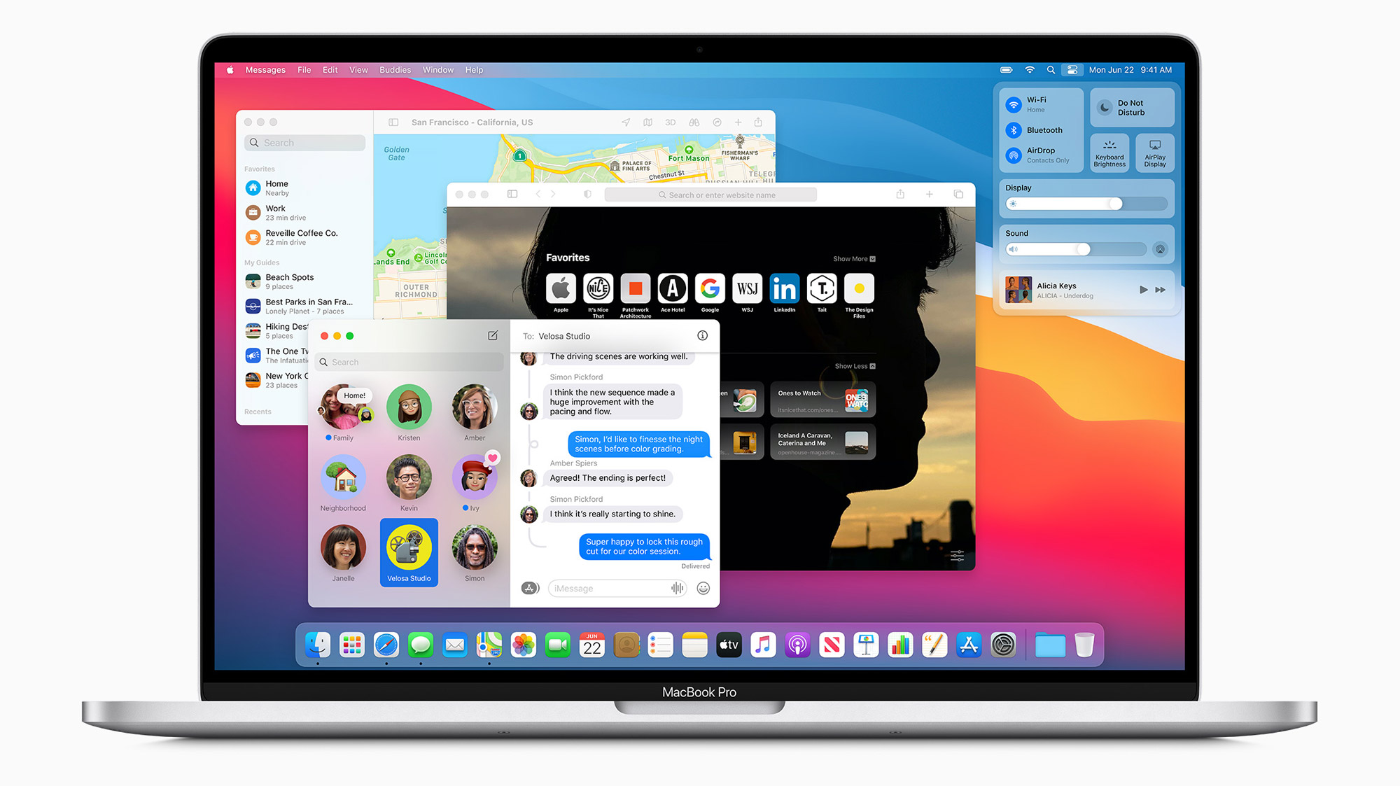
Apple announced its all-new macOS Big Sur release at WWDC 2020.
From an updated design to a more powerful Safari, there is a lot to highlight in the new macOS release.
Design
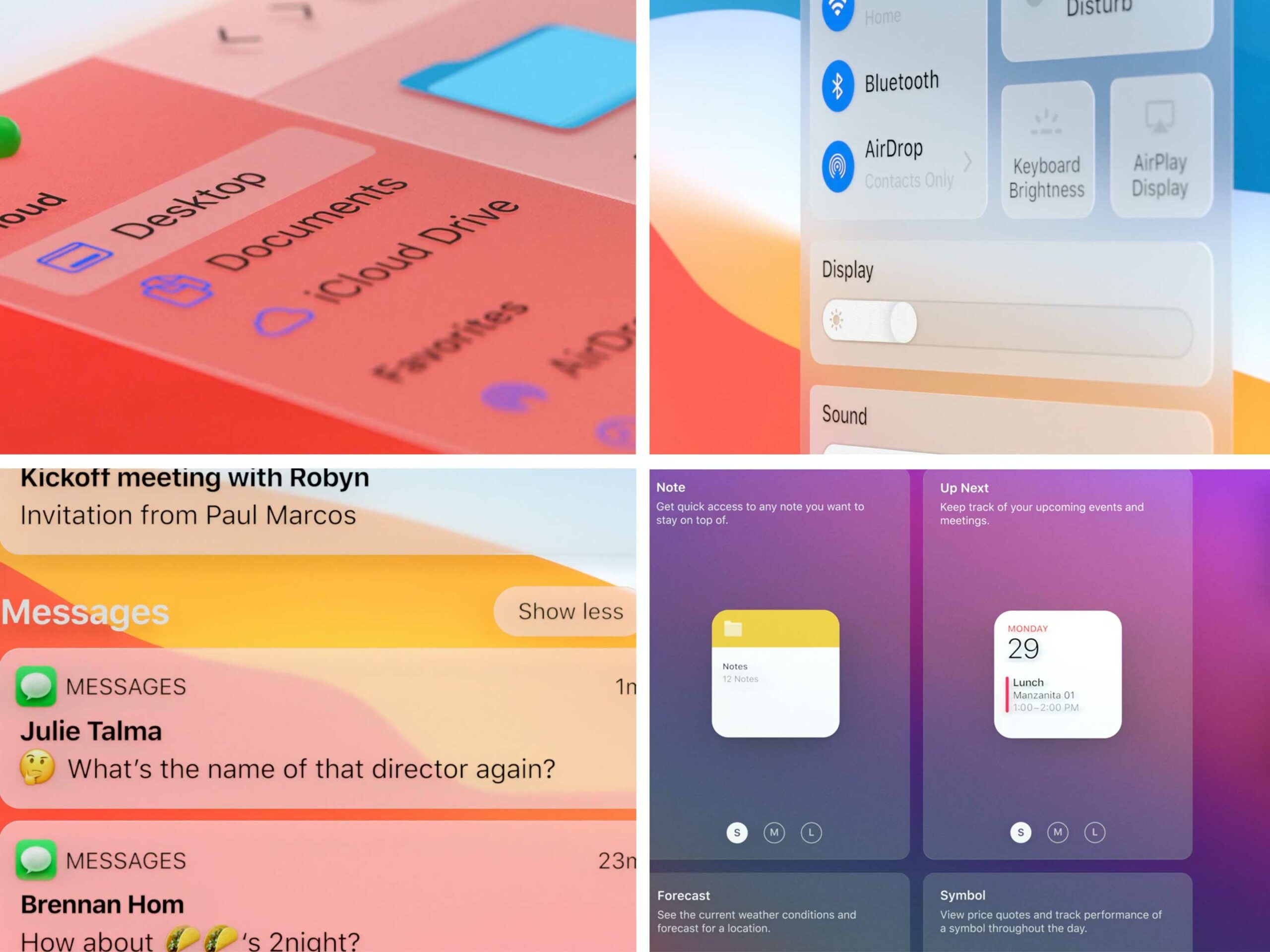
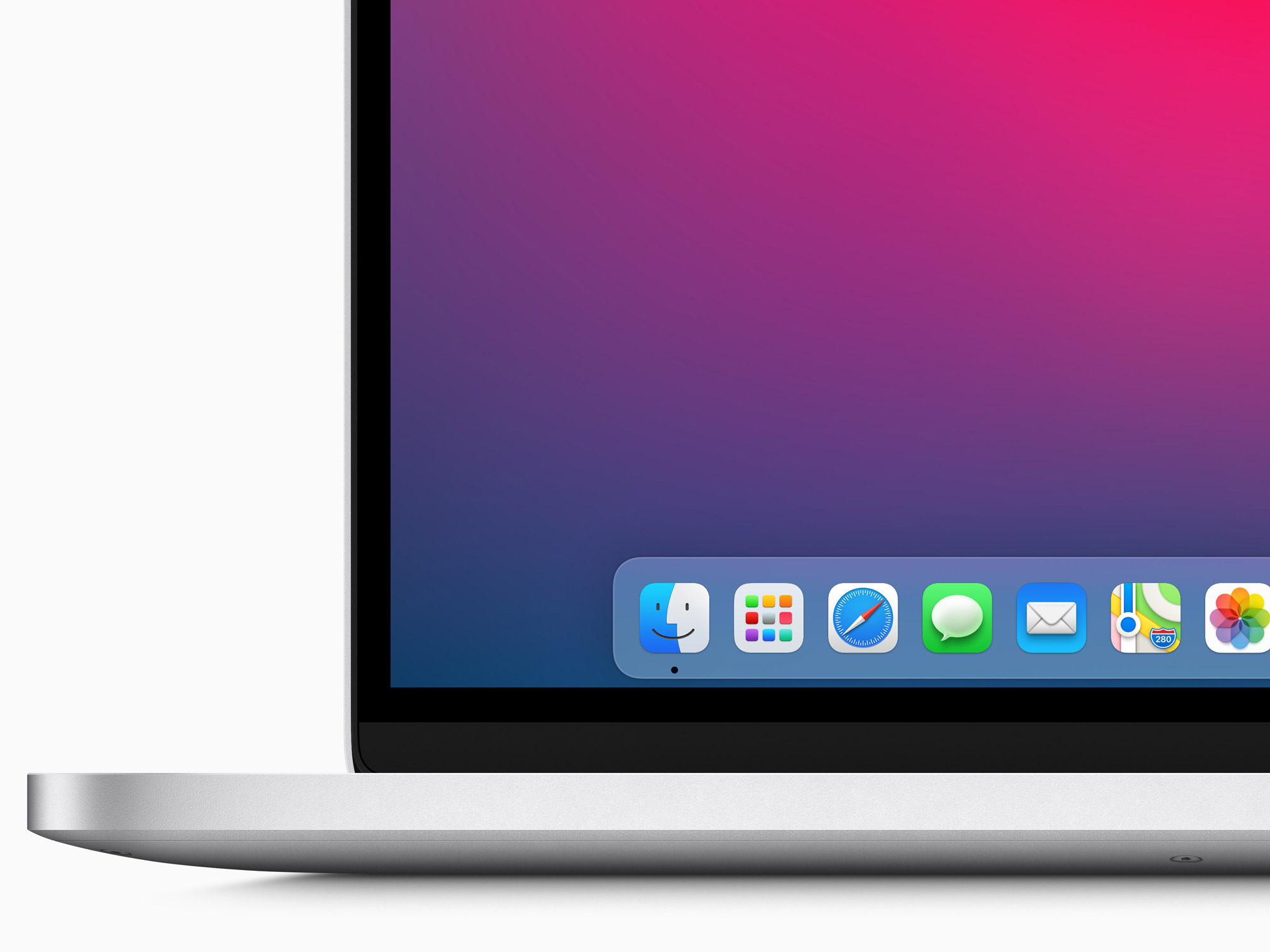
Apple announced the biggest change to macOS’ design in years. That includes more rounded icons, consistent symbols and more. The company also remastered all its sounds. Further, it refreshed the macOS icons to more closely resemble those on iOS, while still keeping some of the classic macOS flair.
One of the most significant changes in the new design is with windows. Now, app windows feature semi-transparent sidebars and new top-to-bottom interfaces that look incredibly slick.
Apple says it refreshed the design for every app in the OS. Additionally, the company updated the menu bar so it’s translucent like other elements in the operating system.
Control Center and Notification Center
One of the best parts of iOS is Control Center, which makes it easy for users to access all their controls like brightness and volume in one place. Now, it’s also on macOS Big Sur.
Likewise, Apple revamped Notification Center with Big Sur, which features the redesigned widgets seen on iOS 14 as well as a slick new look. Users can access the new Notification Center by clicking the time in the top-right corner of macOS Big Sur.
Apps on Mac
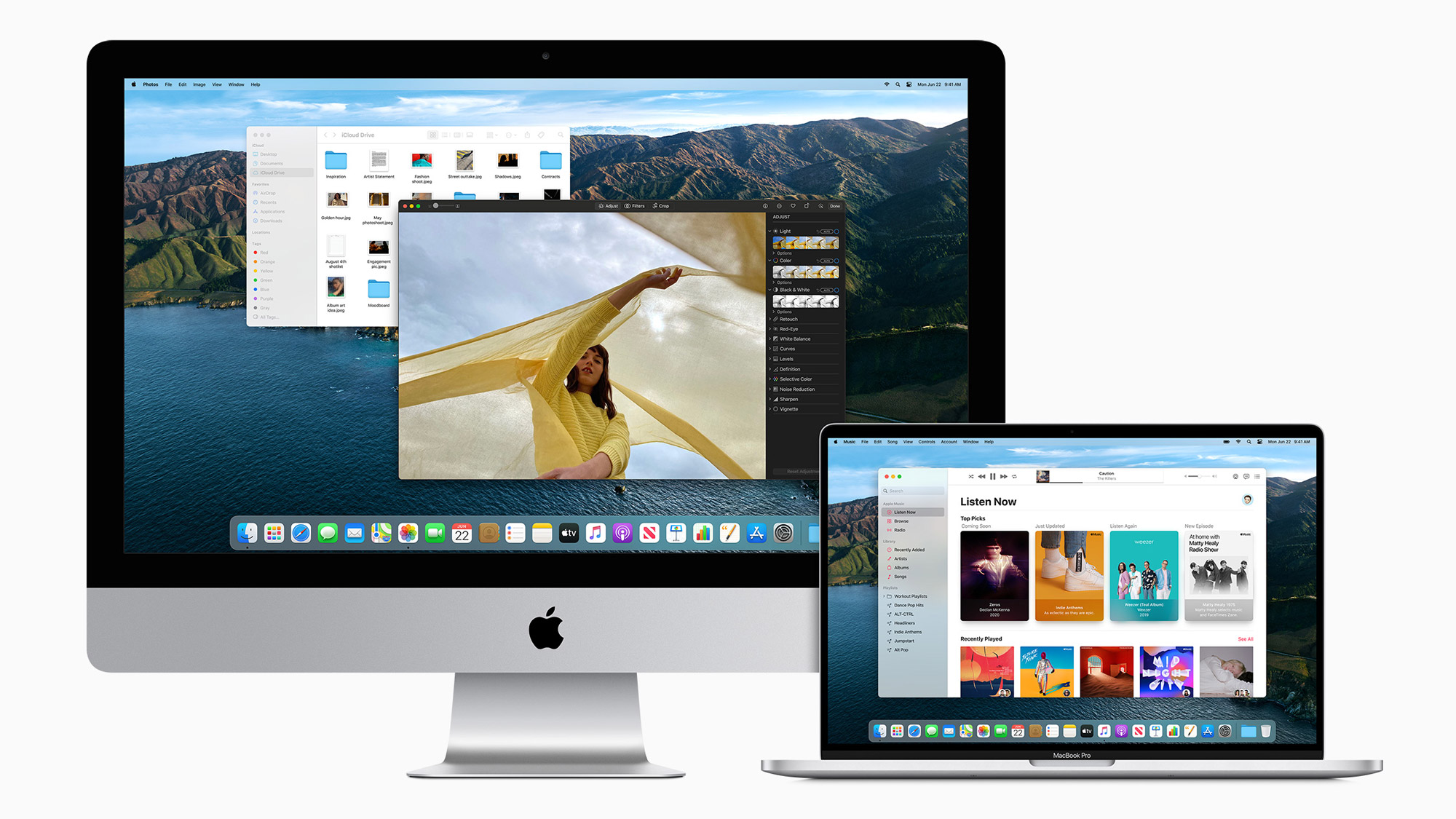
Apple added several small tweaks to Messages to improve the overall experience. For one, the app now boasts an improved search function, a better photo picker and more. Additionally, Messages on Mac includes the same pinned conversations feature announced on iOS 14.
Apple Maps on macOS Big Sur is getting plenty of new features as well, including all those announced for iOS 14.
Interestingly, Apple says both Maps and Messages are among many apps built using Catalyst, which makes it easy to create full-fledged macOS apps with ease.
Safari
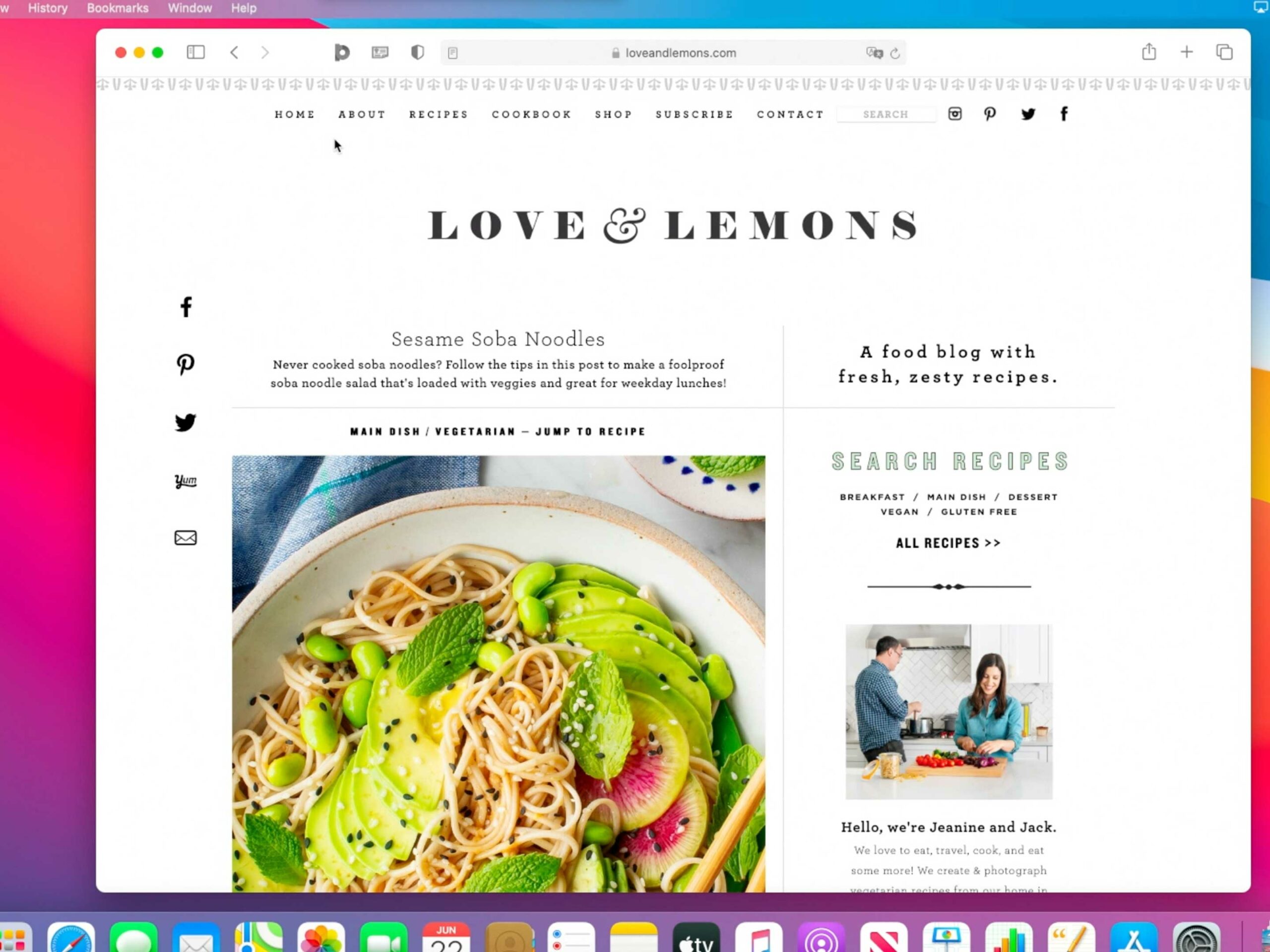
Apple claims Safari is on average over 50 percent faster than Google Chrome while still offering great privacy.
Now, Safari includes a new privacy shield that users can click to get an overview of how the browser protects them, similar to Firefox. There’s also an improved password manager and better extensions too. Users can also find new extensions from the Mac App Store.
Speaking of extensions, Apple has clamped down on privacy here as well, letting users restrict which sites extensions can work on and when extensions can interact with pages. Extensions get their own toolbar buttons as well.
There are plenty of new customization features for the new Safari start page too. From custom backgrounds to favourites and pinned apps, there are lots of ways to make Safari yours.
Safari also revamped its tabs features to make managing them easier with new ‘previews’ when you hover over a tab, easy ways to close them and more.
Designed for Apple’s silicon
Apple is making the pivot to custom silicon for its Mac line. Part of that transition means adding all new features in macOS Big Sur to help developers switch their apps over.
For example, Apple says its Xcode platform makes it easy for developers to recompile their code for the new systems-on-a-chip (SoC). Apple says Microsoft also has its Office apps updated to work on Apple’s new silicon. Adobe is working to bring Creative Cloud to Apple silicon as well. Apple showed off Adobe Lightroom and Photoshop running on its new Apple Silicon.
For a full rundown on Apple’s transition to custom silicon, check out MobileSyrup’s full coverage here.
Members of Apple’s Developer Preview Program will be able to access a developer beta of macOS Big Sur starting today, while a public beta will arrive next month on Apple’s website.
Apple says Big Sur will be available as a free software update in the fall. You can learn more about everything new in macOS Big Sur here.
MobileSyrup may earn a commission from purchases made via our links, which helps fund the journalism we provide free on our website. These links do not influence our editorial content. Support us here.


