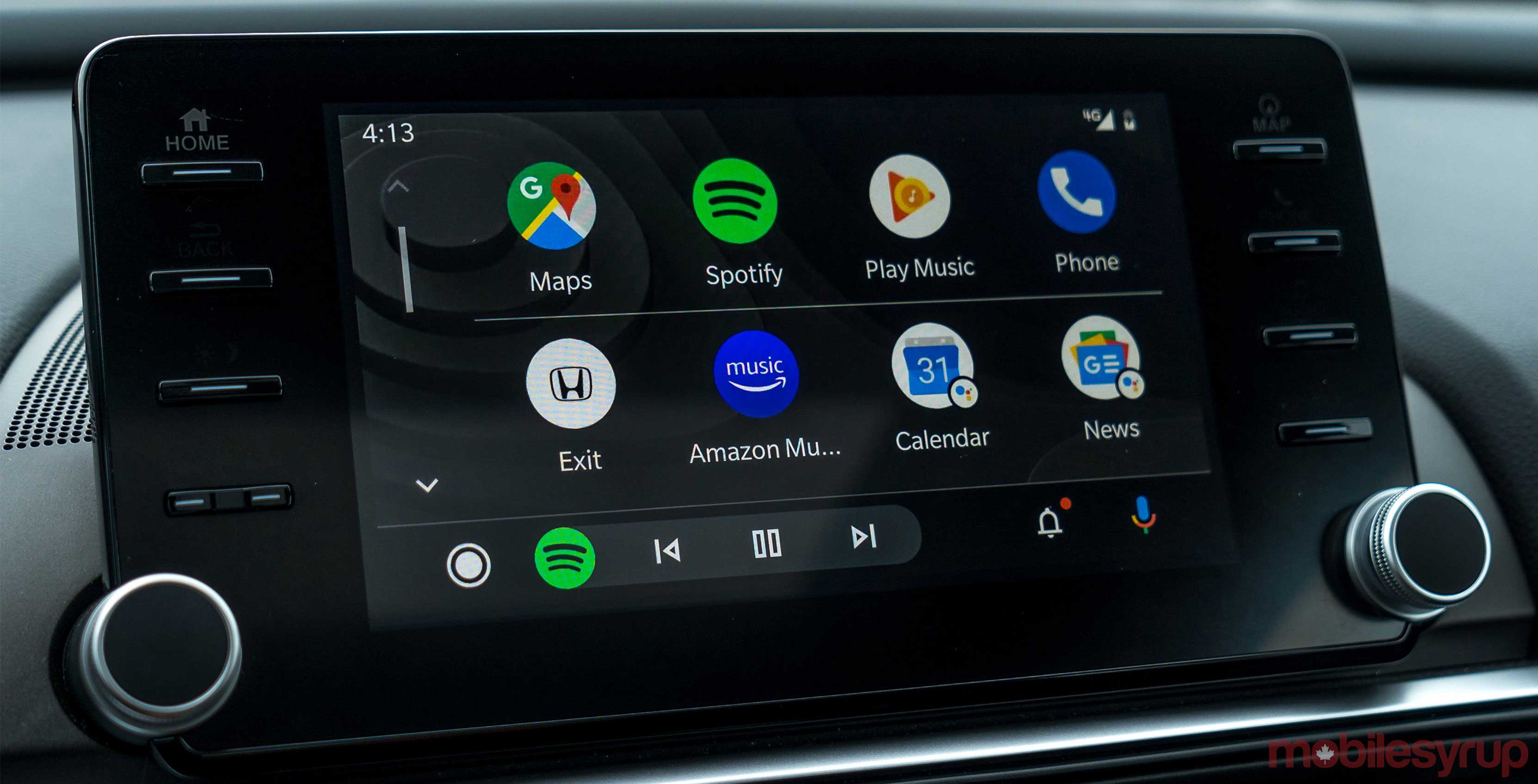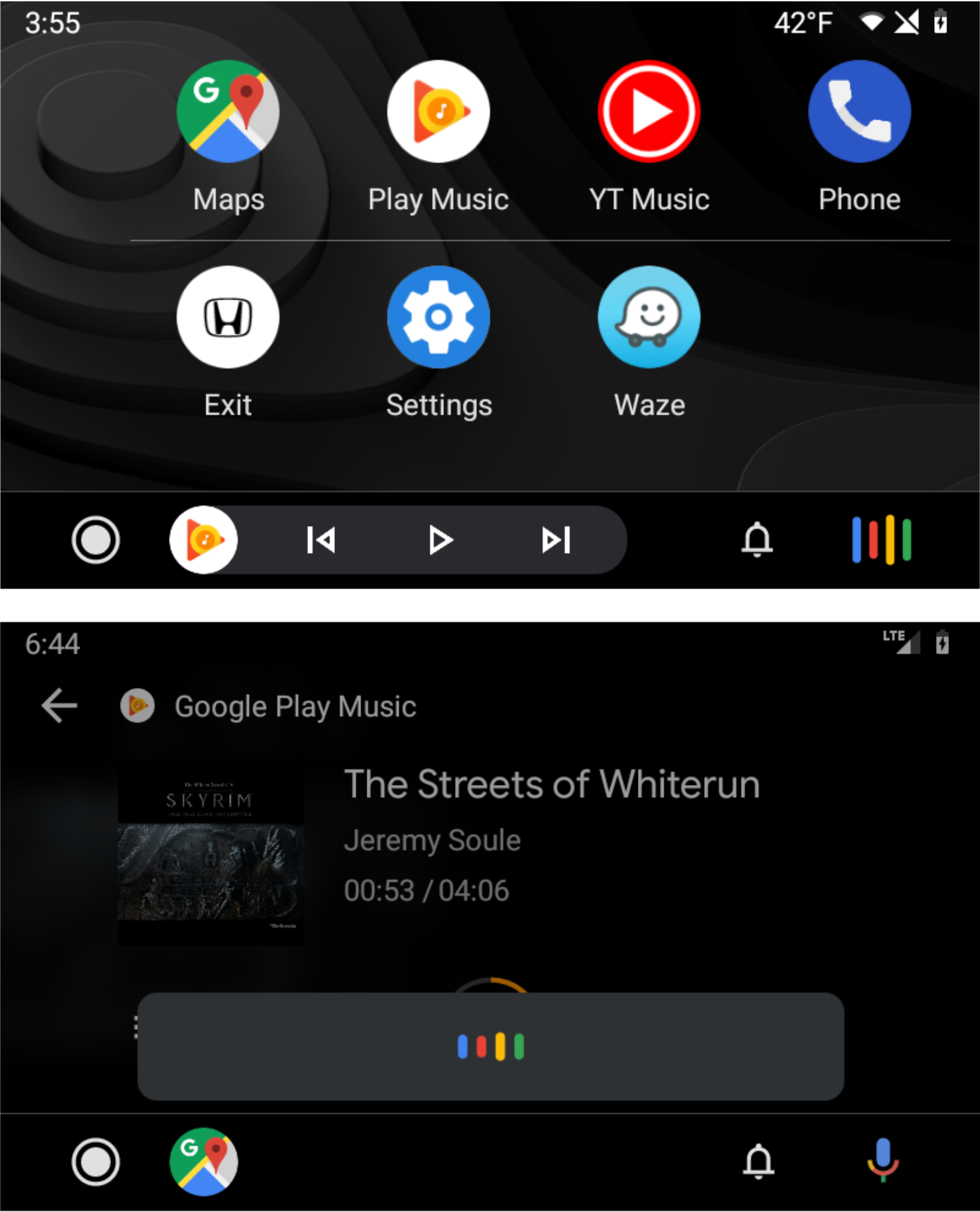
The Android Auto team seems to be workshopping a few new Assistant interface designs to make it take up less of the in-car screen.
Google has slowly been refining Android Auto since it updated it this summer and the latest version of the app hides a few more tweaks, according to Android Police.
Traditionally, when you trigger the in-car version of Google Assistant, it drops down from the top of the screen and covers about a quarter of the display.
The first of the two new additions move this to the bottom of the screen and make it slightly smaller. This design looks nicer, but it still covers a lot of the screen, so it doesn’t seem like the perfect update. However, unlike the current version, you will be able to see the Google Maps navigation box.
The other version that’s reportedly being tested replaces the tiny microphone icon in the bottom left corner with the Google Assistant waveform when you trigger it. In my opinion, this is a nicer alternative since it doesn’t cover some of the screen with a grey box.
Since both of these are being tested, users might not have the new look right away, or ever.
What is available is the ability to customize your launcher and view a small weather icon in the status bar.
To customize your launcher, you need to open the app on your device and enter the settings. Once you’ve opened the Settings, choose the ‘Customize launcher’ option. Then you can select and deselect what apps you want to appear on your in-car home screen.
The weather toggle can be enabled in Settings as well, but for me, it was on by default.
Image source: Android Police
Source: Android Police
MobileSyrup may earn a commission from purchases made via our links, which helps fund the journalism we provide free on our website. These links do not influence our editorial content. Support us here.


