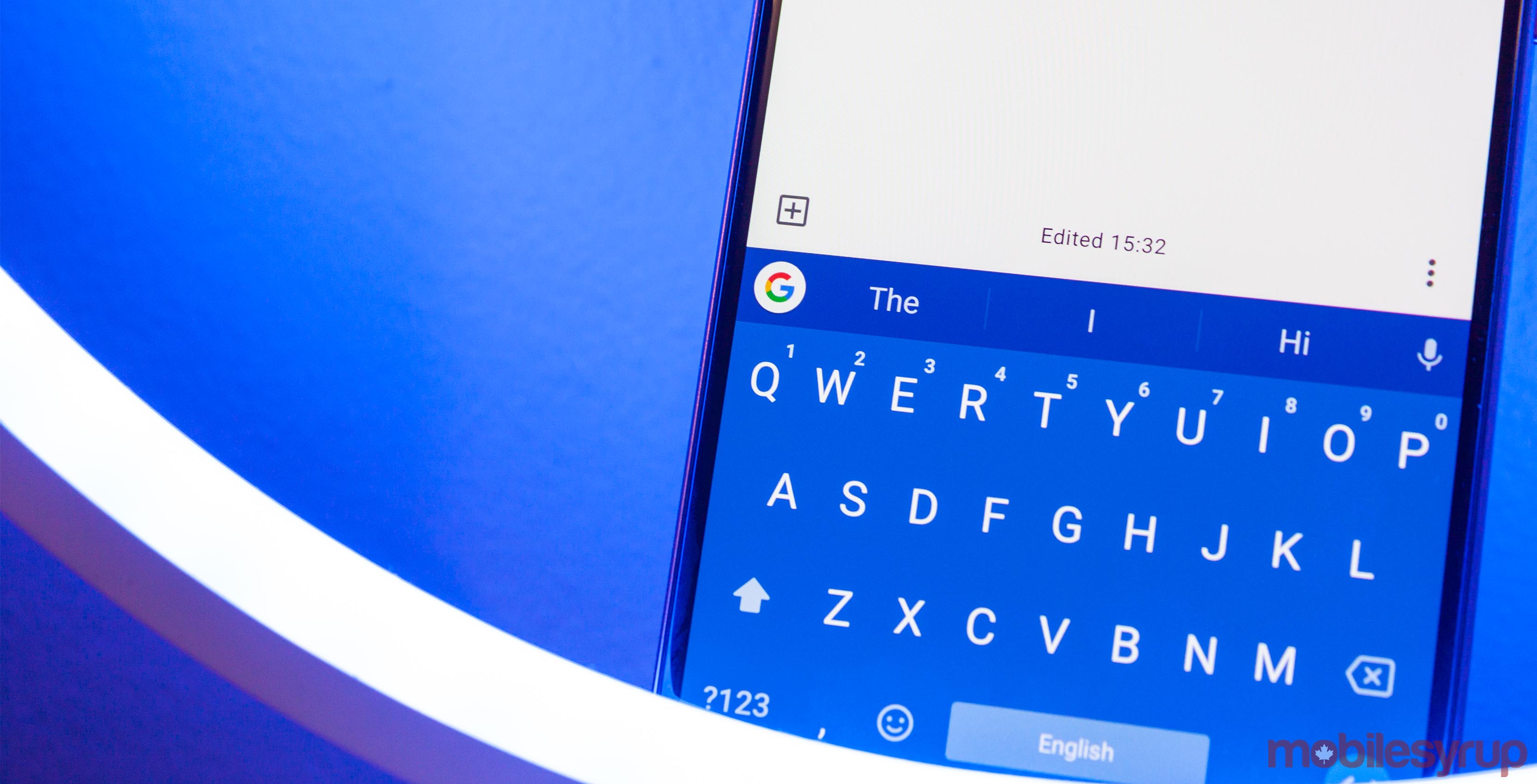
Gboard has gotten a small server-side visual update that brings the keyboard more in line with Google’s new version of Material Design.
There’s isn’t much that’s significantly different in the update, beyond some minor tweaks.
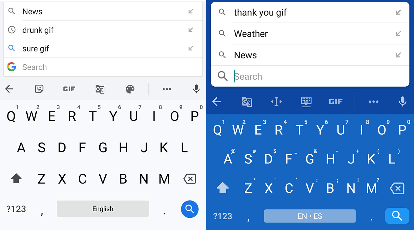
The easiest way to tell if you’ve gotten the server-side update is the new ‘enter’ button in the bottom right corner. The new button is a rectangle with rounded corners instead of a circle like before.
Google has also done away with the search UI’s sharp corners, replacing them with rounded corners instead.

Gboard’s old search UI (left, white) vs. new search UI (right, blue)
Cards and GIFs also feature the new rounded-corner UI. Further, GIFs have switched to a vertical scrolling menu.
On top of the visual tweaks, Google has added new emoticons to Gboard. These leaked in a previous app teardown, but have now made their way into the keyboard.
![]()
Along with the expanded emoticon options, there’s now a list of categories at the top of the keyboard to make it easier to find the emoticon you need.
As with most server-side updates, there’s nothing you can do to speed it along. You’ll just have to wait until Google decides to bless your phone.
Source: Android Police
MobileSyrup may earn a commission from purchases made via our links, which helps fund the journalism we provide free on our website. These links do not influence our editorial content. Support us here.


