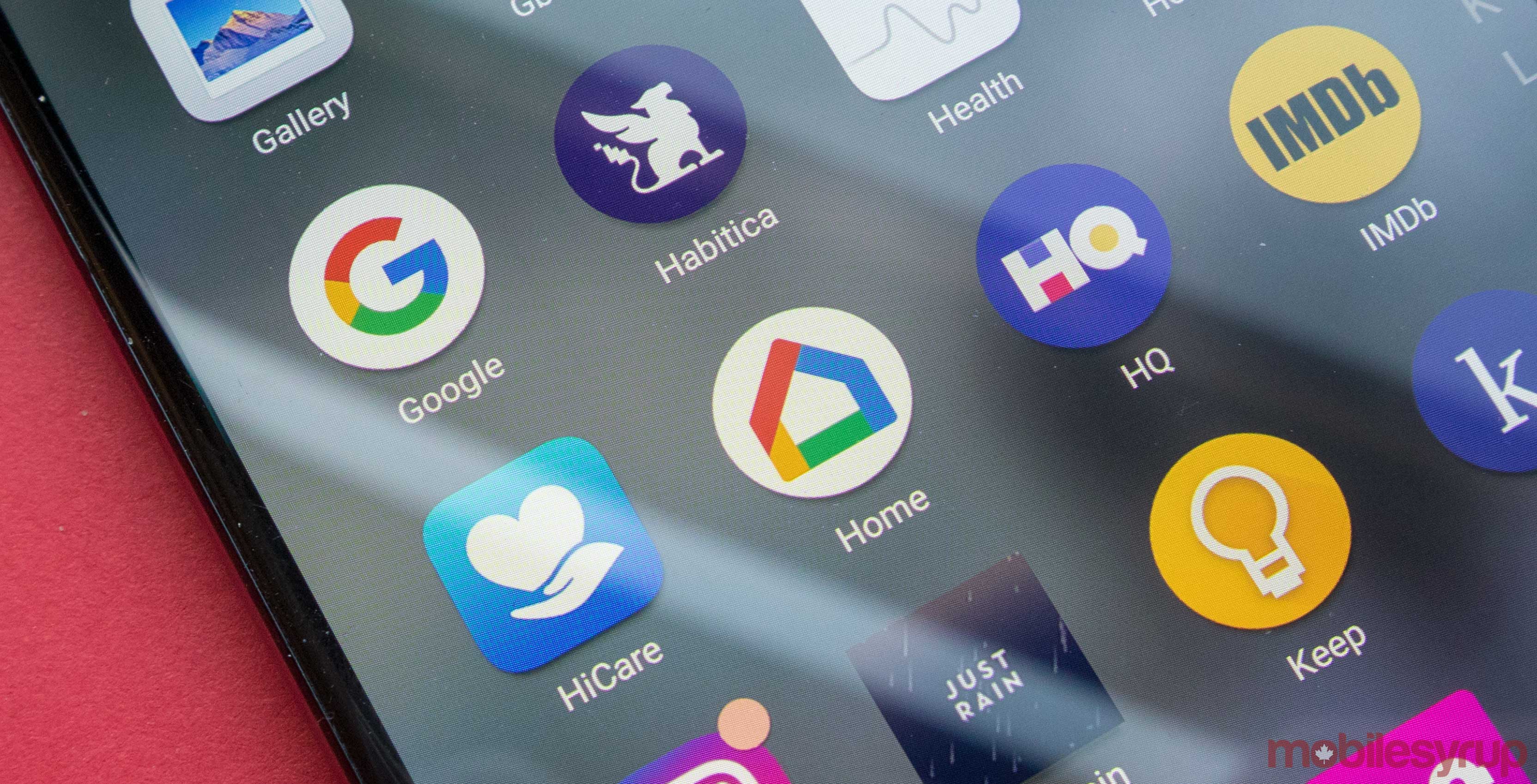
Google launched the Home app alongside the Chromecast in 2013 and its grown so much since then that the company is now updating the app’s design.
XDA Developers notes that the recent code found inside the app changes how users interact with some of the deeper functions present in the Home platform.
The most notable change is that Google has nixed the side panel menu in favour of an overhauled navigation bar along the bottom of the app.
The ‘Devices’ screen has been overhauled the most, with Google opting to use icons to represent its connected devices instead of the large cards it features now.
Most of the other elements in the app seem much cleaner now with significantly less noise involved. This means that it will hopefully be more easy for people to use.
Source: XDA Developers
MobileSyrup may earn a commission from purchases made via our links, which helps fund the journalism we provide free on our website. These links do not influence our editorial content. Support us here.


