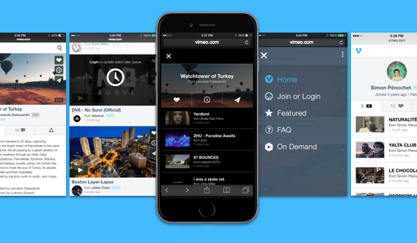
Vimeo has announced the launch of a brand new mobile version of its website. This redesign, Vimeo hopes, will offer a better experience by cutting down on the number of features crammed into the experience.
The video sharing service is now focusing on watching and sharing on mobile. Everything else you’re using to seeing on Vimeo from your phone has been deemed too much of a distraction for the mobile experience.
The streamlined UI offers easy access to featured videos, the site’s FAQs, on demand content, and the log-in screen via a slide-out panel on the right side of your screen. Search is up top, navigation (forward, back, share, etc) is down the bottom, and you can also now ‘like’ videos and save them to Watch Later, even when you’re not logged into your account.
As if all that weren’t enough for one update, Vimeo has also tweaked performance so that the whole site runs faster, too.
[source]Vimeo[/source]
MobileSyrup may earn a commission from purchases made via our links, which helps fund the journalism we provide free on our website. These links do not influence our editorial content. Support us here.


