Over the last 18 months, the mid-range smartphone market has become increasingly more interesting. Gone are the days when mid-range meant old software and even older hardware.
Phones like the Moto G have revolutionized the category. This is partly due to the fact that smartphone hardware has evolved to the point where the fastest processor, the highest resolution display, the biggest camera sensor doesn’t always mean the best experience.
More often, people look for a balance. They weigh up what’s important to them, be it the display, the camera, storage capacity, or something else, and try to find the phone that best suits those needs. The average consumer doesn’t need a high-end phone. They need a device that meets their needs without breaking the bank.
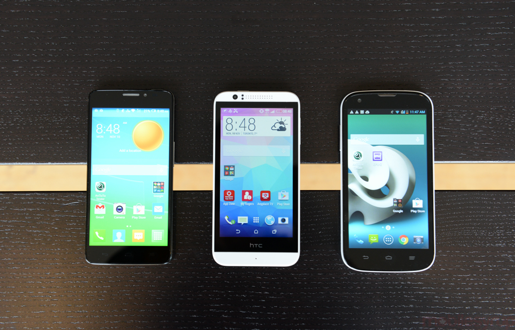
With this in mind, we took a look at three low-cost smartphone options from across the Big Three. The first is the ZTE Grand X, which is available on Bell and Virgin Mobile for just under $150 off contract. The second is the HTC Desire 510, an entry-level phone available through Rogers and Fido for $200 no term. Lastly, we have the Alcatel OneTouch Idol X+, which is a $300-$350 phone from Koodo and TELUS, respectively.
ZTE Grand X
Let’s start with the ZTE Grand X and work our way up to the more expensive models.
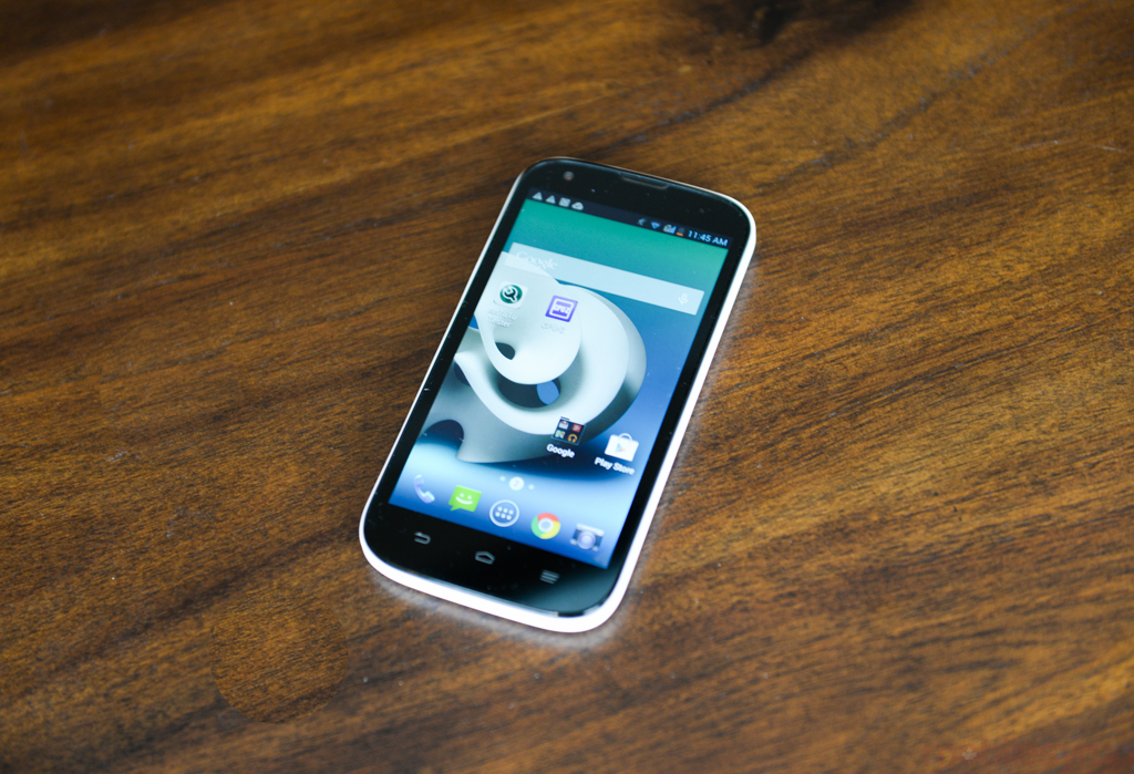
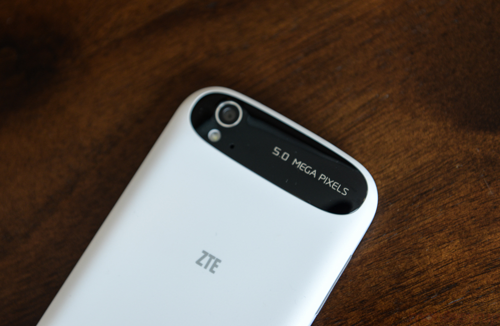
The ZTE Grand X packs a 5-inch 720p display with Gorilla Glass, a quad-core 1.2 GHz CPU, 1GB of RAM, 1.3 GB of internal memory (expandable via microSD), a 2,400 mAh battery, a 5MP camera in the back capable of recording 1080p video, a 1MP sensor up front, and Android 4.3 Jelly Bean.
Design
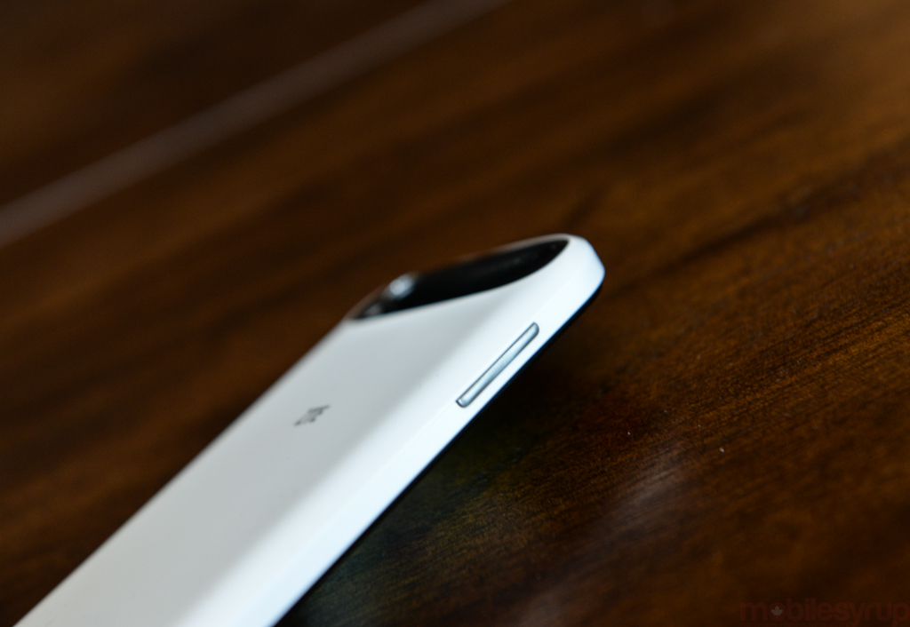
The ZTE Grand X is a bulky affair with matte plastic backing and rounded corners. It doesn’t feel overly large in terms of size, but the phone is chunky. More than one of us here in the MobileSyrup office commented that it feels like the Grand X is already dressed up in a protective case. The good news is that the added bulk and use of thick plastic mean the phone feels very solid. Bizarrely, the volume rocker and power button are inconsistent in that the power button is slightly more recessed and therefore a little less satisfying to press.
Display
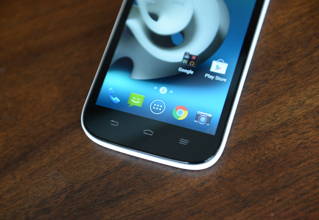
The ZTE Grand X display provides pretty accurate colours that are just a little bit more washed out than we’d prefer. This means the colours aren’t as vivid as they perhaps could be, but upside is that the whites are crisp and clean with no tinges of yellow. The viewing angles are also excellent, something that we had major issues with on the Desire 510.
Going back and forth between the three phones, the ZTE Grand X display leaves little rooms for complaint when it comes to general browsing and social media, though you might want to look elsewhere if you plan to watch a lot of movies or TV on the device, as this is where the aforementioned washed out colours really become apparent.
Camera
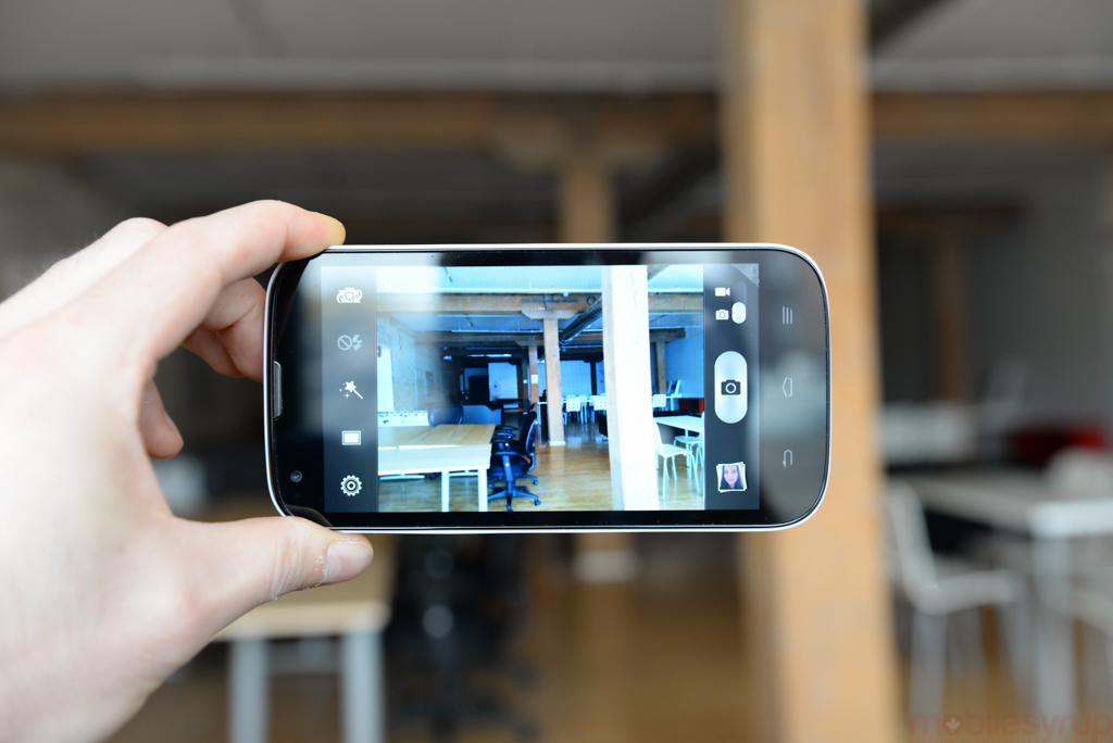
The ZTE Grand X’s 5MP camera performs admirably for a $150 phone, but it’s easily the weakest link when assessing the phone as a complete package. You can adjust settings like ISO, white balance and more within the camera app but using it as a point and shoot is hit and miss.
When taking photos in natural light, the image on screen is over-blown and not at all representative of the resulting photo. This is, of course, preferable to the opposite. We’d rather the photo look better than we expected, not worse, though it could be frustrating to have to check each picture to ensure you got the shot.
This effect is way less noticeable when taking photos of indoor scenes or in low-light. Low light images are grainy with a lot of noise, and we saw a lot more noise than we expected in the indoor shot, which featured both a decent amount of natural light as well as artificial light from overhead bulbs. Close up shots were just okay. The tap-to-focus helped enormously and cooperated almost all of the time.
Performance and Battery Life
Performance with the Grand X was more than satisfactory, although there were some hiccups here and there throughout our time with the device. It sometimes took just a little too long for the accelerometer to kick in and rotate the screen, for example, or the camera app was a bit sluggish in switching from the rear-facing to front-facing cameras.
Overall, real life performance was better than I expected for a device priced so competitively. I found that the ZTE Grand X had no problem lasting a full day with normal use, and I never had to turn to my USB port for charging during late nights at the office. In benchmark testing, of the three devices, the Grand X actually lasted the longest, sandwiched between the Nexus 4 and the Note 3.
Software
In terms of software, the Grand X runs Android 4.3 with a custom skin on top. Thankfully, this custom UI is relatively unobtrusive, so Jelly Bean shines through. Though Android 4.3 is starting to show its age in terms of design, it still accounts for more than 50% of Android installs, so it’s not truly out of date in that sense, and still offers a decent smartphone experience in terms of usability.
Conclusion
The major blemishes on this device’s record are the lack of 4G LTE and the less-than-stellar camera. That aside, the ZTE Grand X is a great budget device and a decent solution if you’re looking for a starter smartphone with access to popular apps as well as internet browsing. Just don’t forget to pick a MicroSD card before you start using the device. You won’t get very far without it.
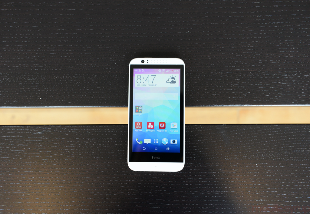
HTC Desire 510
The HTC Desire 510 sits in the middle of this mid-range trio as far as price is concerned, but it doesn’t fare as well when it comes to camera and display.
Let’s start with specs. The HTC Desire 510 is based on Qualcomm’s quad-core Snapdragon 400 clocked to 1.2GHz, running alongside 1 GB of RAM, 8GB of storage, a 4.7-inch 480 x 854 display, a 5MP camera in the back, a VGA camera up front for selfies, and a 2100mAh battery.
Design
The HTC Desire 510 is unmistakeably HTC. Though it loses out on the Boom Sound audio bequeathed to this year’s flagship HTC One M8, it carries the same aesthetic all wrapped up in a shiny, plastic chassis. It’s a little thicker than we’d like (though the added bulk does avoid the ‘bar of soap’ slippery aspect of the One M8) and the bezels are massive compared to the other two devices in this roundup. There’s a lot of extra phone here.
Display
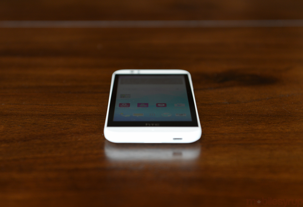
The display is my biggest beef with the Desire 510. Manufacturers setting out to make a budget handset, and in this case a low-cost 4G handset, are forced to make compromises along the way in order to keep the price within the boundaries of budget-conscious. With the Desire 510, HTC took things a little too far and compromised too much on the display.
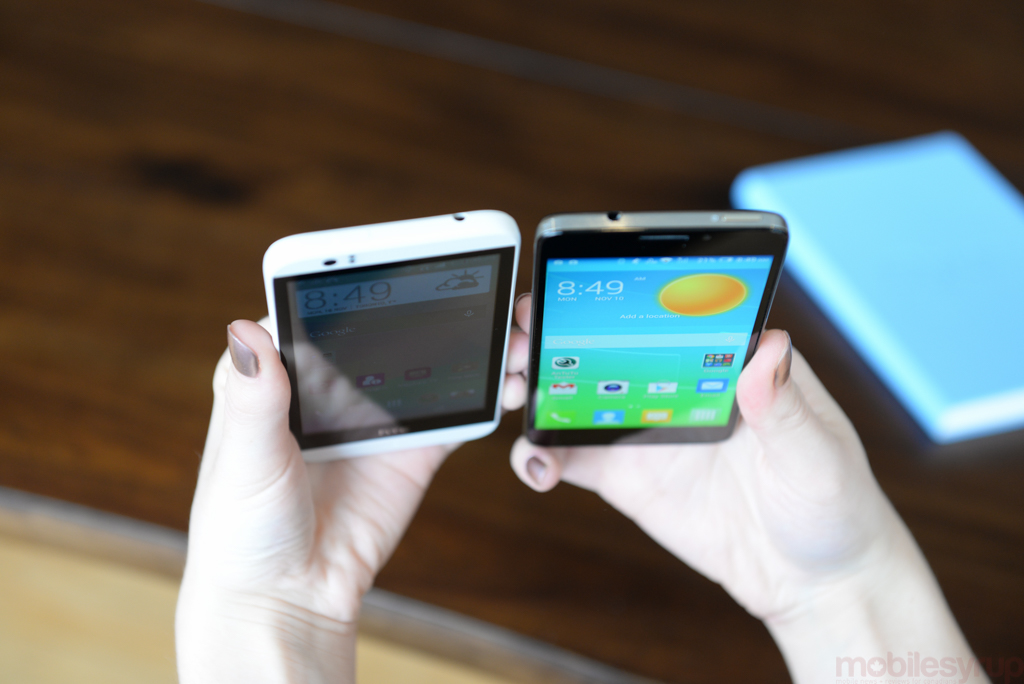
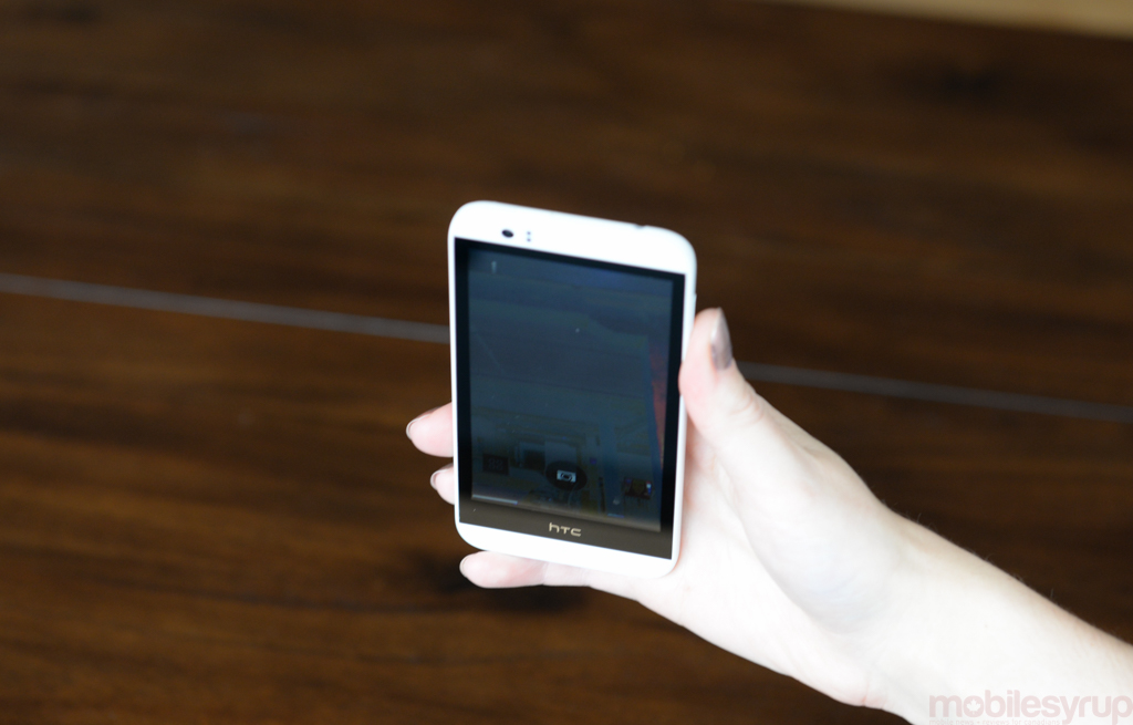
The viewing angles on the Desire 510’s FWVGA display are criminally bad, and we were constantly reminded of this fact while using the phone. Unless the device was held just above chest level and at exactly the right angle, the display would throw back distorted colours and elements of ghosting.
Tilt the phone just a couple of inches towards you and the display starts to go very black from the top down; just a couple of inches back and you get washed out colours and white creeping up from the bottom. This problem is somehow less evident, and, in fact, entirely forgivable when you tilt the phone from side-to-side. The colours wash out to some extent but it’s not so bad that you can’t tell what you’re looking at.
However, the top-to-bottom colour shift is bad enough that it affects all aspects of interaction with the phone. App icons that change colour depending on whether you have the phone down in your lap or are resting your elbows on your desk are jarring but not a big deal. Watching videos, playing games, or reading is another story entirely. That said, these disfigured experiences are nothing compared to how the display affects the camera.
Camera
The HTC Desire 510 was never going to go toe-to-toe with the flagship smartphones in terms of picture quality, but the phone’s camera falls flat well before you hit the capture button — because of the screen. Because of the aforementioned poor viewing angles, users are basically left to guess when taking portrait photos of anything that isn’t directly in front of them at chest height. Want to take a picture of delicate crown mouldings on the ceiling? Hope you like Predator Cam! How about a selfie from a slightly raised but more flattering angle? Enjoy your four-colour-heat-map mode.
As for the pictures themselves, the results are varied. The HTC Desire 510 fared okay in bright natural light and indoors, but dimly-lit shots were the noisiest of the three devices. Close up shots were let down by the fixed focus display. All told, the camera on the Desire 510 is probably on par with the camera on the Grand X. Their strengths lie in different places and they both fall short in certain environments.
All is not lost, though, as HTC allows for manual adjustments of the ISO, EV, and white balance. This will allow you to tweak things a bit to get the most out of the camera on this device. All told, the display is really the biggest issue in taking photos, because it prevents point-and-shoot photography. You really need to check each photo (at just the right angle) after it’s captured to ensure you’ve gotten the picture you want.
Battery Life and Performance
The good news is that this phone clips along at a great pace during every day activity. We had no problems switching back and forth between different applications, and though the North American variant misses out on the 64-bit Snapdragon 410 that powers the European Desire 510, our unit didn’t skip a beat in the few days we were using it. Battery life was also more than sufficient. The device lasted all day with normal use and battery to spare. In our benchmark testing, it clocked in just below last year’s Galaxy S4.
Software
The Desire 510 runs Android 4.4 KitKat with HTC’s Sense 6, which is relatively pleasant to use. BlinkFeed is accessed via a swipe to the left and offers access to the kinds of updates you might browse on the bus or subway (social, news, calendar, etc.), as opposed to more important information like email. The only downside is that BlinkFeed’s otherwise very attractive tile-based interface feels a little bit cramped on the 510’s low-res 4.7-inch display, and the messaging, camera, dialer, and browser apps sit on top making things feel a little crowded.
Conclusion
The HTC Desire 510 is a tough sell based on the display alone. The phone performs well, and battery life is great. The camera produces decent photos for an entry-level device, and Sense 6 does a great job of providing a HTC-branded experience without getting in the way of Android. But the fact remains that even those looking to spend as little as possible on a smartphone shouldn’t have to settle for this display, especially when cheaper devices (like the aforementioned ZTE Grand X) offer more for less.
The Alcatel OneTouch Idol X+
The Alcatel OneTouch Idol X+ is the most expensive phone in this category, so it should come as no surprise that it surpasses the HTC Desire 510 and the ZTE Grand X in a number of key areas. Still, there is room for improvement.
The Ido X+ has a 5-inch 1080p display, an octa-core Mediatek MT6592 chip clocked to 2GHz, 2GB of RAM, 16GB of internal storage (expandable via MicroSD), a 2500mAh battery, a 13.1MP camera in the back, a 2MP camera up front, and Android 4.4.2 with Alcatel OneTouch’s own UI on top.
Design
The Alcatel OneTouch Idol X+ is extremely light (126g), and though it packs a 5-inch display, can be easily held and used in one hand without discomfort. This is thanks to the phone’s slim build, its light weight (the ZTE Grand X is a full 50g heavier), and relatively small bezels. The Alcatel OneTouch Idol X+ is both thinner and narrower than the Desire 510, despite the larger display, and only 0.02 inches taller. This is an extremely compact phone.
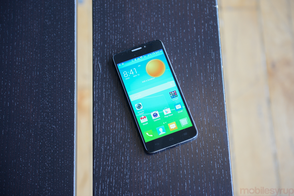
The device’s body is plastic with a glossy back that attracts fingerprints, but overall the phone feels very sturdy, and we didn’t panic when we dropped it on the floor or knocked it off the desk. Our biggest problem with the design was actually the SIM and MicroSD slots. These are protected by small flaps that flick open when you drag your nail across a raised bump on one end of the flap. Nail biters, be aware: we had zero joy trying to open these little flaps with just a finger or thumb. You need a nail or a pen to really press down on that little nub.
Display
The Alcatel OneTouch Idol X+ features the only 1080p display in this round-up, and it’s a real treat. The screen displays vivid colours, though they were sometimes a little bit on the cool side, with whites occasionally showing up as tinged slightly purple. This was the best display of the three devices, however, and easily the most pleasant for watching media.
Camera
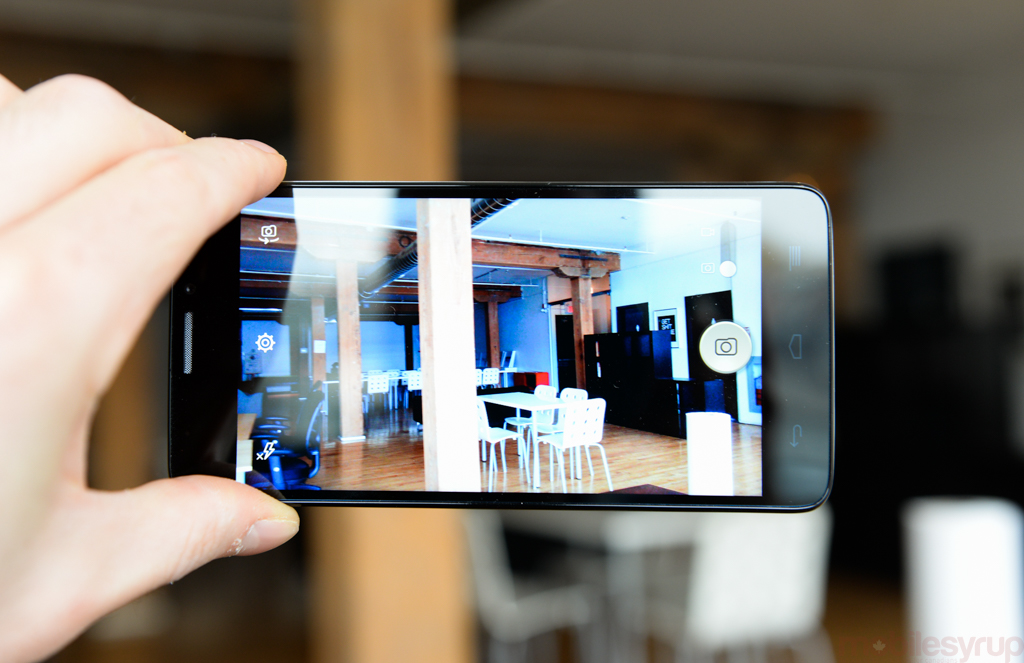
Again, the extra money you spend on this device will get you a bit more oomph in the camera department. That goes for both the front-facing and rear-facing sensors, as the cameras on the Idol X+ win hands down compared to the Grand X and the Desire 510. Indoor photos from the 13MP sensor offered true-to-life colours and photos captured in natural light, during the day, in front of a large floor-to-ceiling window offered bright, vibrant colours with plenty of detail. Low-light photos were a touch noisy and lost some of that detail, but were overall satisfactory for photos taken without flash. Close up shots were hit and miss but helped by tap-to-focus. Again, you can adjust ISO and exposure, though it’s not really necessary if you just want to point and shoot; the phone does a decent job all by itself.
Battery Life and Performance
Performance on the Alcatel OneTouch Idol X+ wasn’t an issue, though web browsing sometimes caused hiccups rendering pages or scrolling quickly up and down. The phone never took too long to catch up and these moments were rare, but something we noticed over time.
Battery life was not quite what we expected in the benchmarks. Our first test put it just under the Nexus 4, but two after subsequent runs it registered just below the Nexus 5. But benchmarks aren’t everything and our experience in practice was similar to the other two devices in this review.
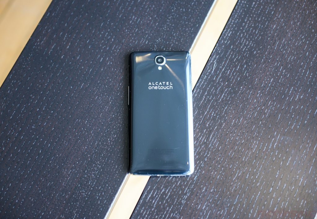
The Alcatel OneTouch Idol X+ didn’t ever die on us during the day, or even before bedtime, with moderate use. If you intend to work the phone a little more intensively with a lot of video or gaming on the daily commute, your mileage will vary, but that goes without saying.
Software
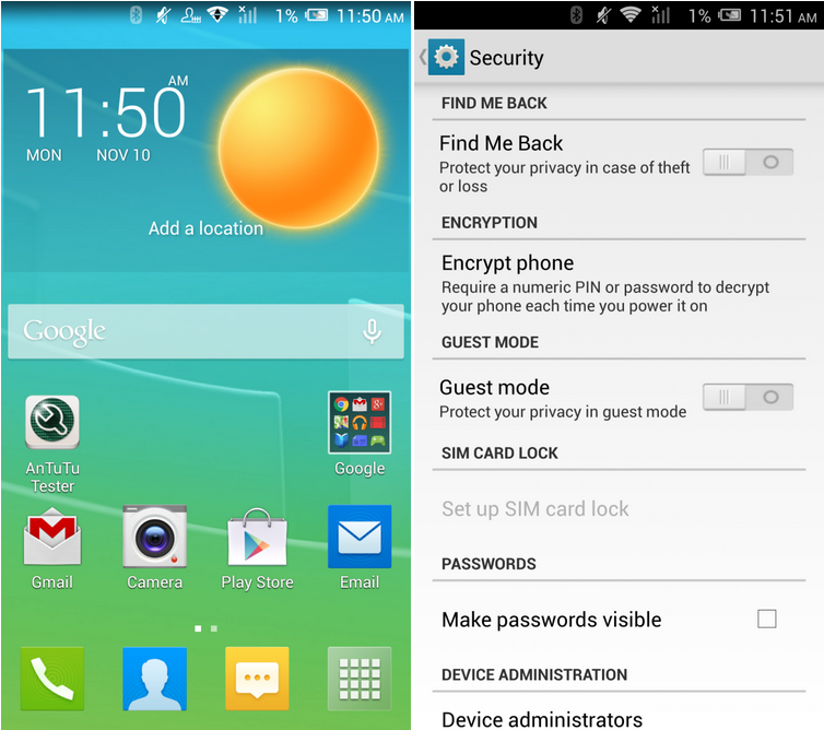
The Alcatel OneTouch Idol X+ runs Alacatel OneTouch’s own custom UI on top of Android 4.4.2 KitKat, but the company hasn’t messed around too much with customizations. There’s a lot of bright colours and the animations are smooth, but Alcatel OneTouch doesn’t shove its own experience in your face on top of Android.
Some of the apps feel a tad unnecessary and didn’t add much to the experience (seriously, do we need a custom browser?), however, the settings menu did offer easy access to nifty features that first time smartphone users will likely appreciate, like phone encryption, ‘Find Me Back,’ (which protects your data in the event your phone gets lost) and Guest Mode for when you’re not ready to provide someone else with full access to your phone. Some of these features are offered by Google, but are perhaps not so easy to find for first time Android users.
One major problem was that we couldn’t adjust the apps on any of the home screens or even within the app drawer. The apps on the home screens didn’t respond to the usual long press, so we couldn’t move them around or take them away, and trying to add an app to the homescreen or remove an app from a folder didn’t work either.
Update 25/11/2014: Following a factory reset, app reorganization on the homescreen works just fine. If you do encounter this problem, try resetting the device.
Conclusion
Overall, the Alcatel OneTouch Idol X+ is a great device for someone that’s looking to upgrade to their first smartphone or downgrade from a pricier device that they’ve realised they don’t necessarily need. The downside is that it’s not exactly cheap at $350/$300 off-contract and there are better phones out there for that kind of money. In my mind, if Alcatel OneTouch had compromised on specs a bit more, they could have offered a decent phone for a really competitive price. As it stands, it doesn’t feel right recommending the Idol X+ when devices like the OnePlus One exist for the same money.
Final Thoughts
While it might seem that limiting your budget means limiting your choices, that couldn’t be farther from the truth. The above smartphones are just a handful of the entry-level and mid-range devices you have available to you when searching for a budget friendly phone. To me, they’re an example of a cross section of the options in this segment outside of popular choices like the Moto E and the Moto G.
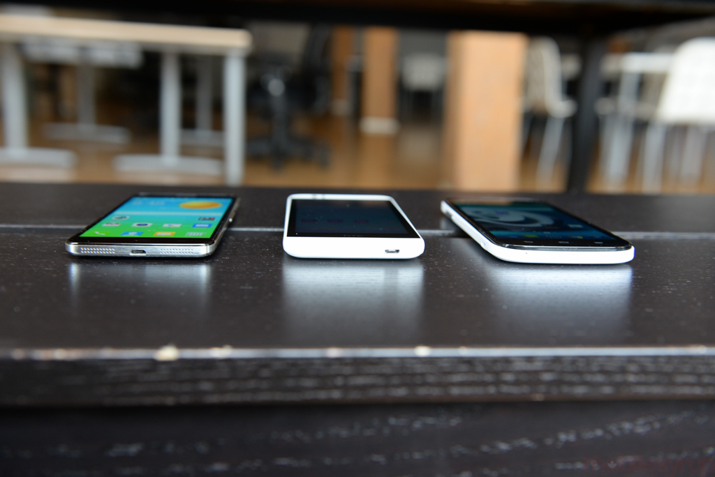
As these phones demonstrate, mid-range phones will often come with a couple of positives and one main flaw or compromise that drag the device down. The goal is to find the flaw that you’re willing to live with.
The ZTE has long lasting battery is great and that price is unbeatable, but it’s bulky and is saddled with a less than satisfactory camera.
The HTC Desire 510 offers great battery life and a UI that serves as a seamless stepping stone to vastly superior (and more expensive) higher-end HTC devices. Sadly, the phone is poisoned by the display.
The Alacatel OneTouch Idol+ is a great device all around and is our favourite of this round up, but it’s also $300 no term on Koodo, or $350 on TELUS. That pushes the boundaries of ‘budget,’ especially when you consider low-cost flagship phones like the OnePlus One are in the $350 range and offer superior build quality and a better software experience on a flagship phone.
With the Idol X+ spec sheet, one could argue that the Idol X+ is a low-cost flagship, and it sort of feels like that’s the direction Alcatel OneTouch is trying to take this phone, but it doesn’t do enough in terms of design and build to really compete with others in that category. Thus, we have a situation where it sits almost unfairly at tip-top of the lightweight category but struggles to compete with the welterweights.
All of this is to say that even if you’re not planning to spend hundreds of dollars, you should still do your research. Figure out what your priorities are, be it camera, display, or battery life, and find the phone that best serves your needs without compromising too much in other areas. Most important of all, you shouldn’t ignore phones that might be positioned a little higher or lower on the scale than you originally planned. As companies experiment with specs and pricing, the lines between low-end, mid-range, and high-end are blurrier than ever.
Disclaimer: The final score you see is not representative of any specific phone. It’s merely a placeholder.
MobileSyrup may earn a commission from purchases made via our links, which helps fund the journalism we provide free on our website. These links do not influence our editorial content. Support us here.

