MobileSyrup is a place for tech enthusiasts to come learn about the latest news, read the latest reviews, and engage in conversation with like-minded people.
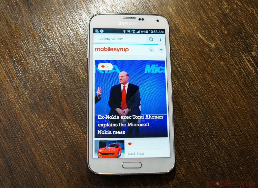
With our recent site relaunch, MobileSyrup 3.0, we decided to adopt a new layout, as our previous version had become limiting from a content perspective. The new site, we believe, is modern, fresh, and adds a dose of much-needed colour.
However, the feedback we received indicated many readers found the UI difficult to navigate, leaving them frustrated and confused. This is the opposite that we wanted to accomplish. We want MobileSyrup to be a place where you can consume the latest mobile news, tips, and reviews without friction.
Over the coming weeks, we’ll be making changes to the layout, such as adding the latest news in a list view format, making the titles on the homepage bigger with a description of the article, embedding a time stamp on each article, darkening the font within the article, and fixing the errors in text wrapping on Internet Explorer.
Again, this is an evolution of the site and we’re listening and looking for your feedback.
Update – August 22nd: We’ll be making some adjustments to the site over the next few days and hopefully have them all completed by Friday. The most important change will be on the homepage as it’ll list the latest news in chronological order, reduce the “featured” post images so less scrolling will occur, embedd timestamps, and darken the font in articles. — Ian
MobileSyrup may earn a commission from purchases made via our links, which helps fund the journalism we provide free on our website. These links do not influence our editorial content. Support us here.


